9. Apps Guide
This guide provides details for using L7|ESP via a browser-based user interface (UI). L7|ESP's UI is accessible from any web browser that supports HTML5 and JavaScript.
9.1. User Interface (UI)
L7|ESP's browser-based user interface (UI) was developed to streamline user interactions to allow users to quickly access any area of the software. To simplify usage, L7|ESP uses a few common UI design elements. These UI patterns make navigating different areas of L7|ESP easier. Once you learn how the design elements function, new areas in L7|ESP are easy to explore.
9.1.1. Tags
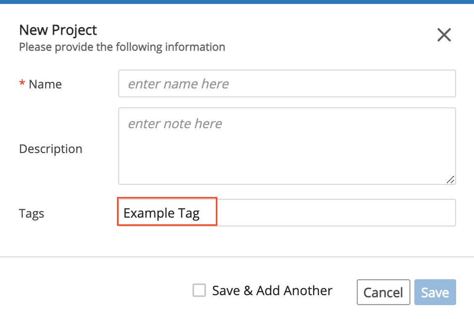
Tags may be added to any Resource (e.g., Entities, Projects, Experiments, Protocols, Pipelines, Tasks, etc.) to link items together.
To add a tag, enter a term in the Tags field.
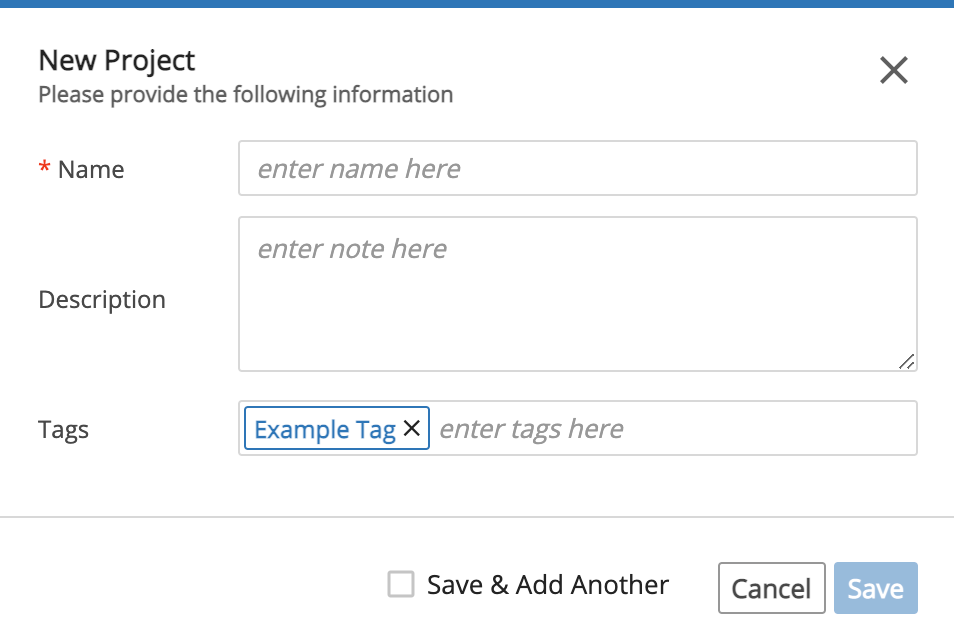
Then click the Tab key or Enter key to submit the Tag.
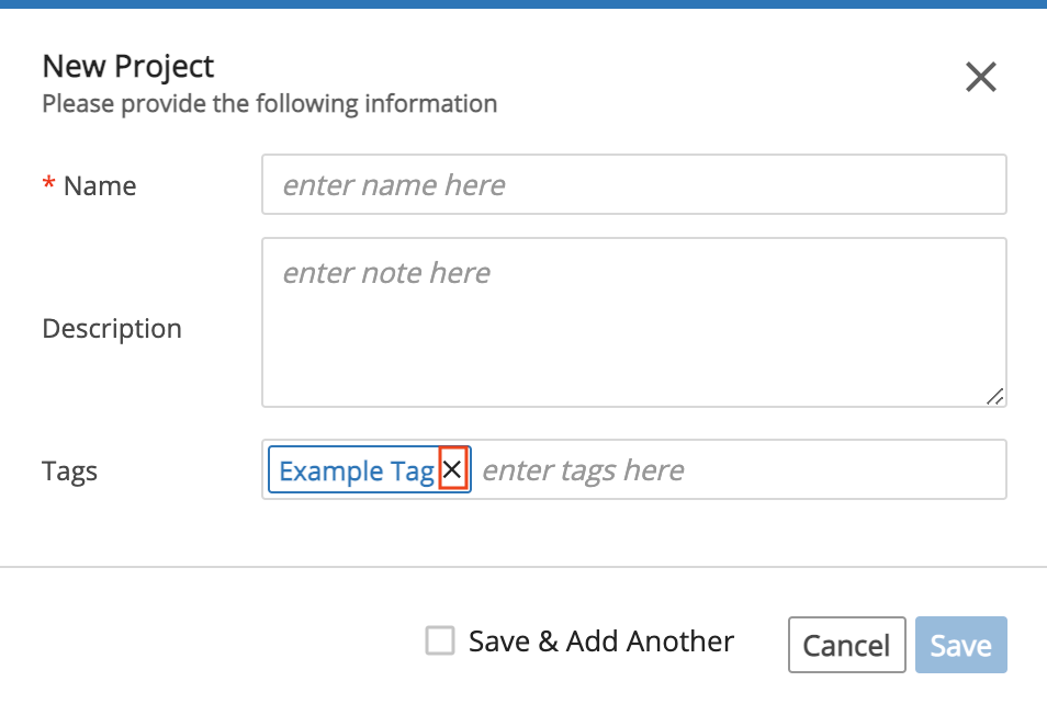
To remove a tag, click the X next to the Tag.
9.1.2. Spreadsheet-Style Tables
Spreadsheets are one of the most commonly used tools for traditional LIMS solutions as they provide a highly efficient UI for entering large amounts of tabular data. To leverage user familiarity with spreadsheets, L7|ESP uses spreadsheet-style tables in areas where efficient data entry is necessary or where large amounts of tabular data are presented to the user. L7|ESP uses ag-Grid for the spreadsheet-style table.
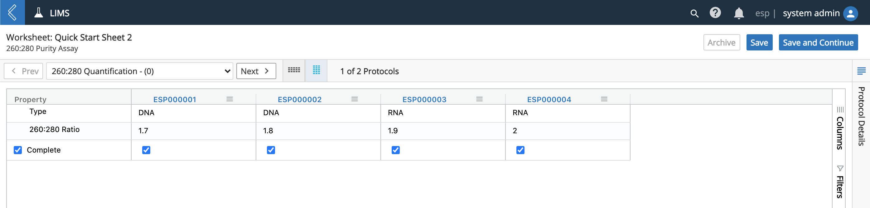
The most common use of a spreadsheet-style table is when entering data in a Worksheet in the LIMS app. Each row contains data for an Entity and each field is defined as a Data Field for the Protocol.

You can click the Vertical View icon to change the display of the table.
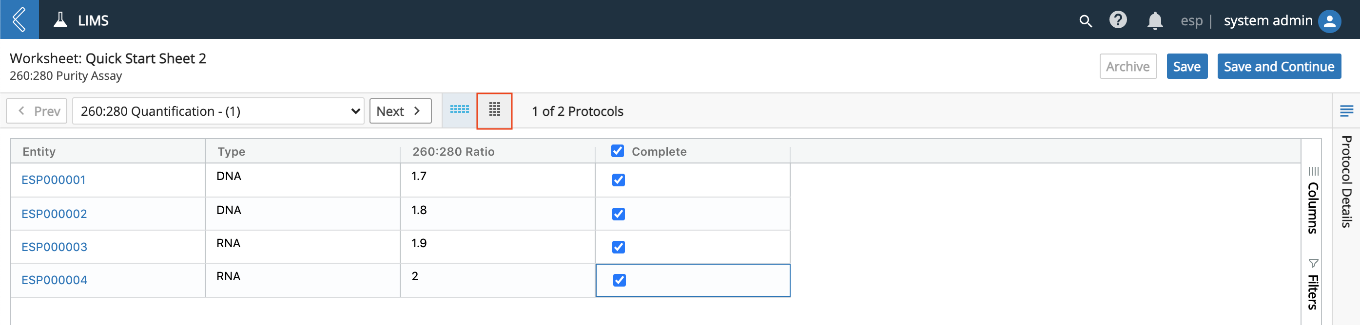
As shown below, clicking the Vertical View icon flips the rows and columns.
9.1.3. Notifications
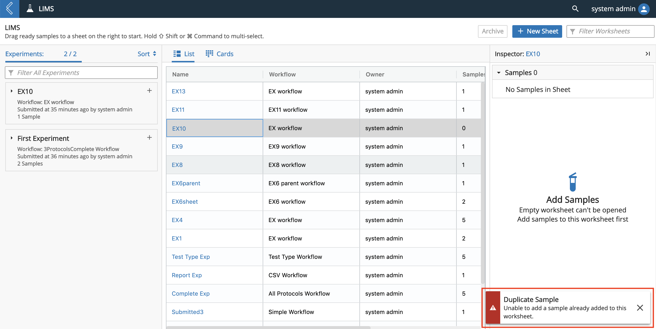
Success notifications and error/warning notifications appear in the bottom right corner of your screen.
In the example below, an error/warning notification appears when a user tries to add a duplicate Entity to an Experiment in the LIMS app.
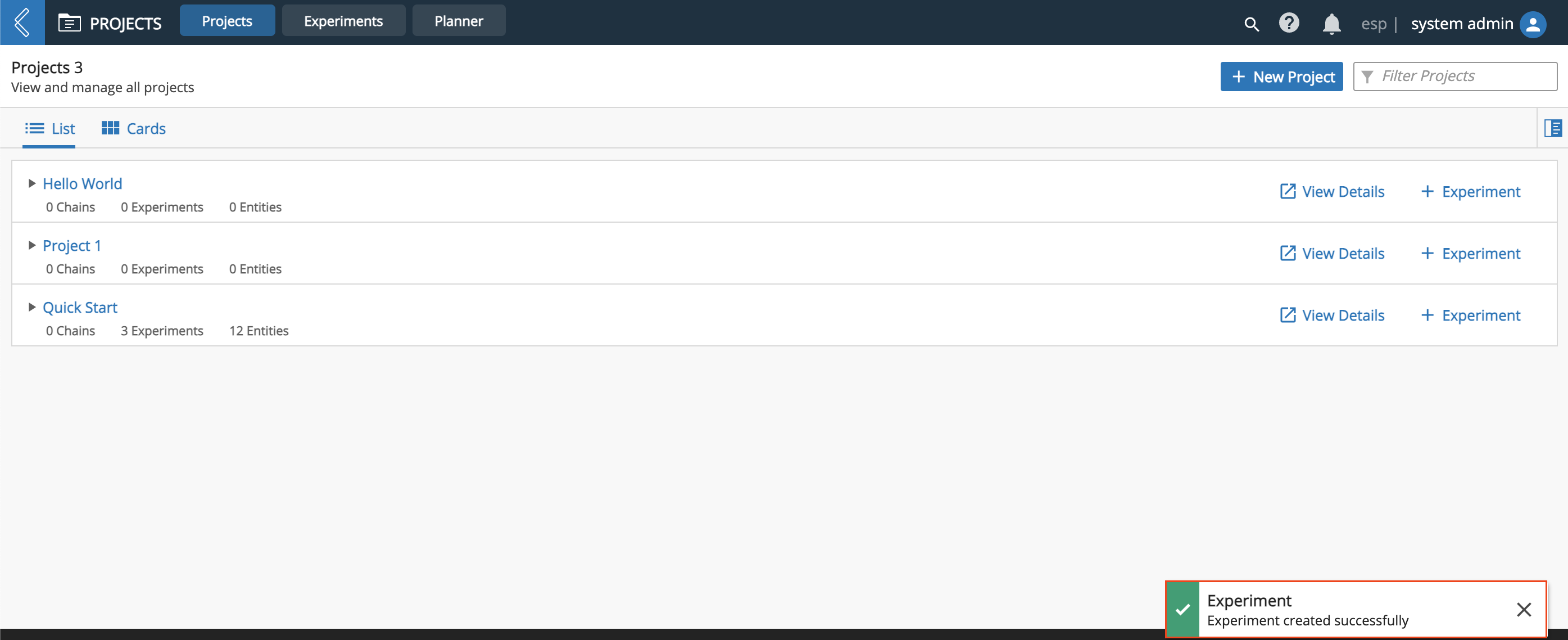
In the example below, a success notification appears after a user creates an Experiment for a Project in the Projects app.
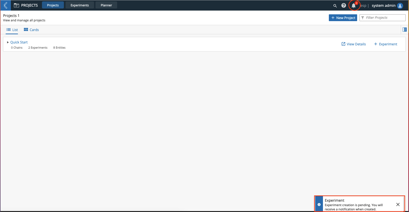
In the example below, a pending notification appears after a user creates an Experiment for a Project in the Projects app, which may need more time to process. When the Experiment is generated a notification will appear in notification icon (circled in red).
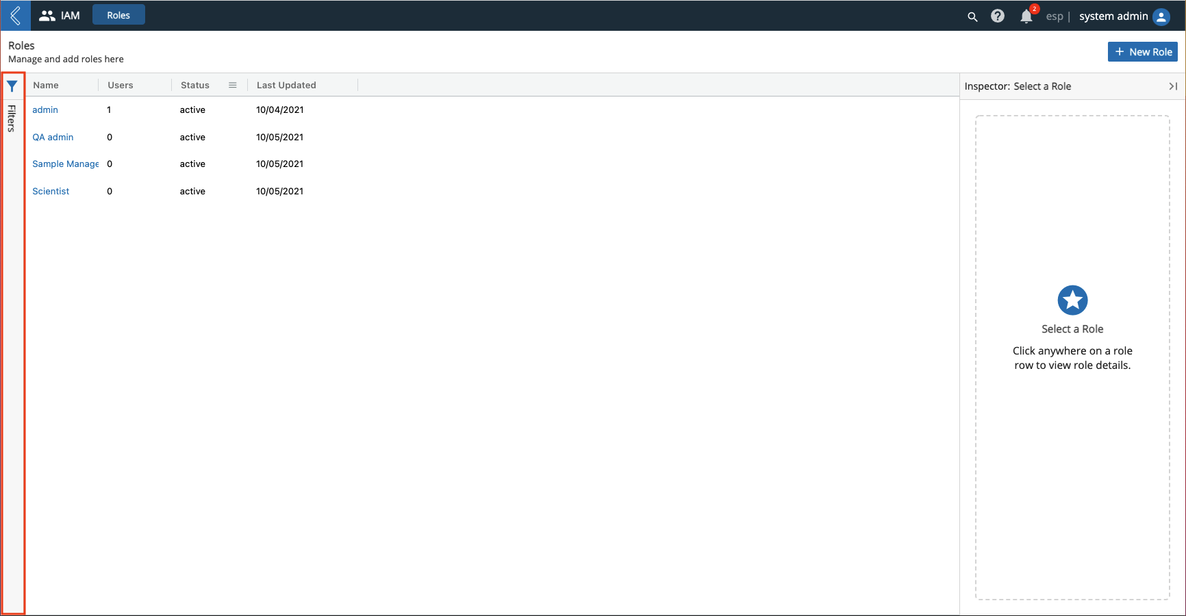
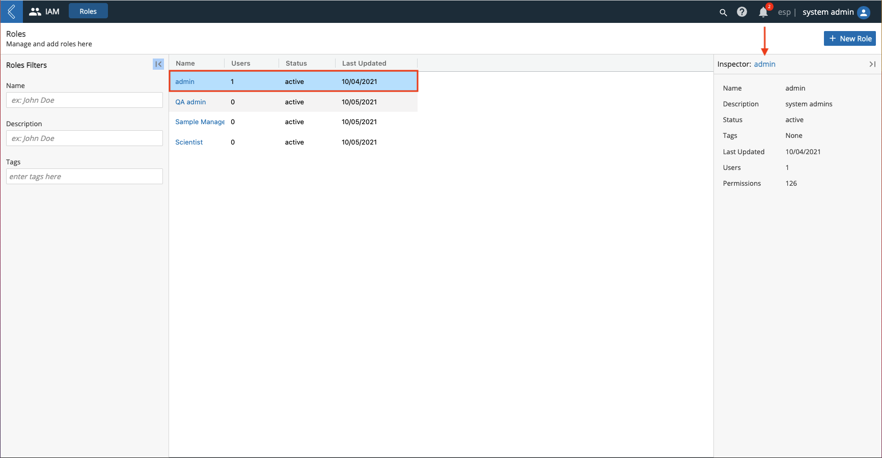
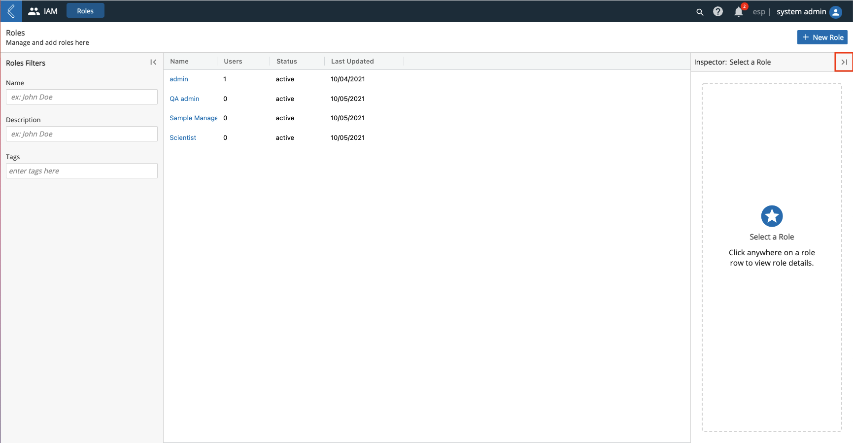
9.1.4. Canvas/Inspector Theme
Many pages in L7|ESP use a Canvas/Inspector layout theme. In the Canvas/Inspector theme, the Canvas is located on the left and displays a work area or list view (boxed in red in the image below) and the Inspector is located on the right and displays details of the elements listed in the Canvas (boxed in blue in the image below).
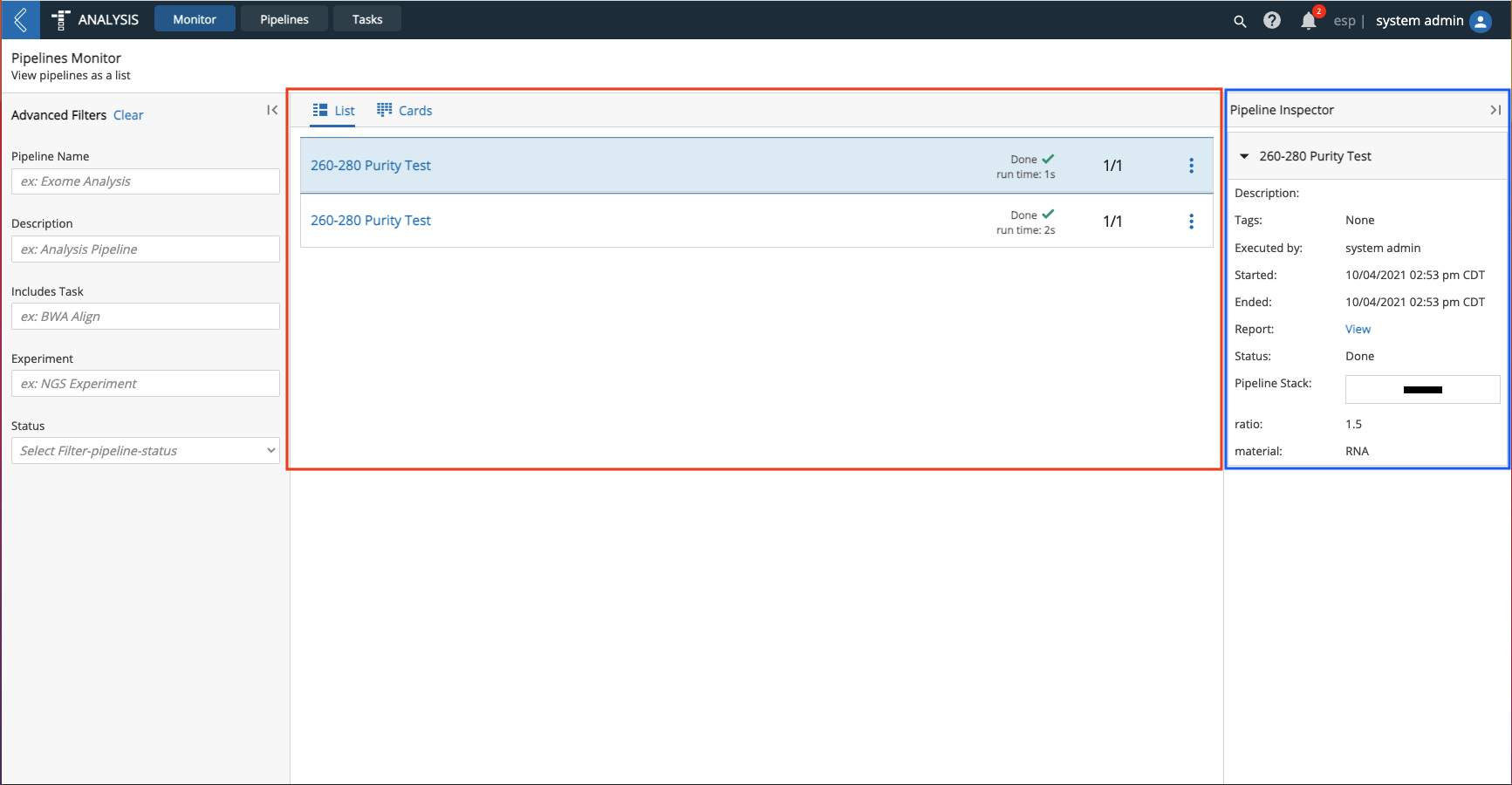
The images below demonstrate two (2) different instances of the Canvas/Inspector theme.
The Experiment Monitor uses the Canvas/Inspector theme to display a list of Workflow tracks in the Canvas and details for the selected Workflow and Protocol in the Inspector.
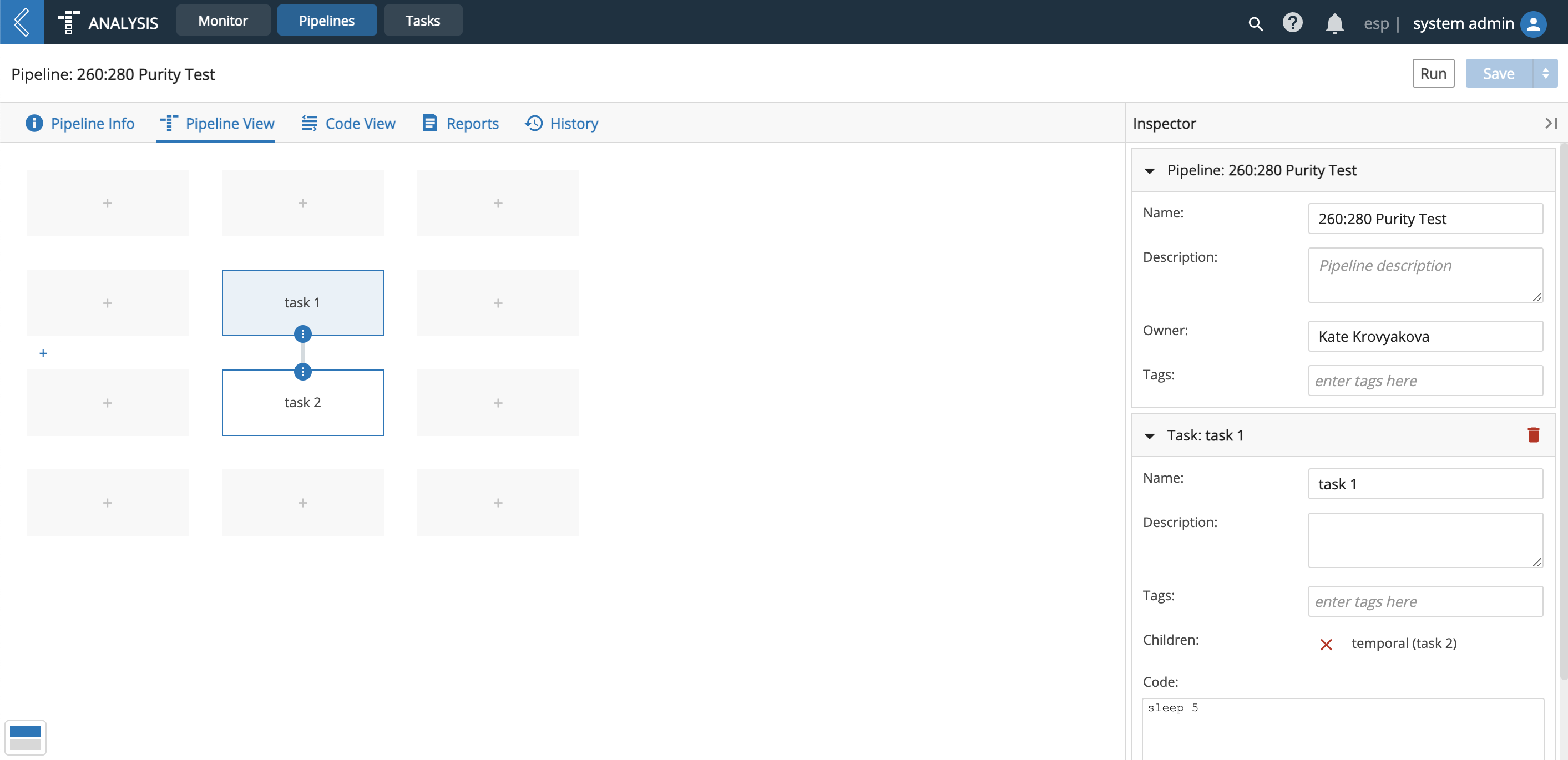
The Pipeline Builder uses the Canvas for building Pipelines and the Inspector for displaying and editing details for the Pipeline and Tasks.
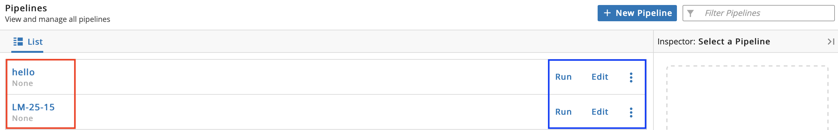
9.1.5. List Bars
Items in lists are often displayed using List Bars that provide additional content and controls related to the item. List Bars always show the item's label on the left (boxed in red in the image below) and include controls on the right (boxed in blue in the image below). Additional content may be displayed in the center of the bar as well.
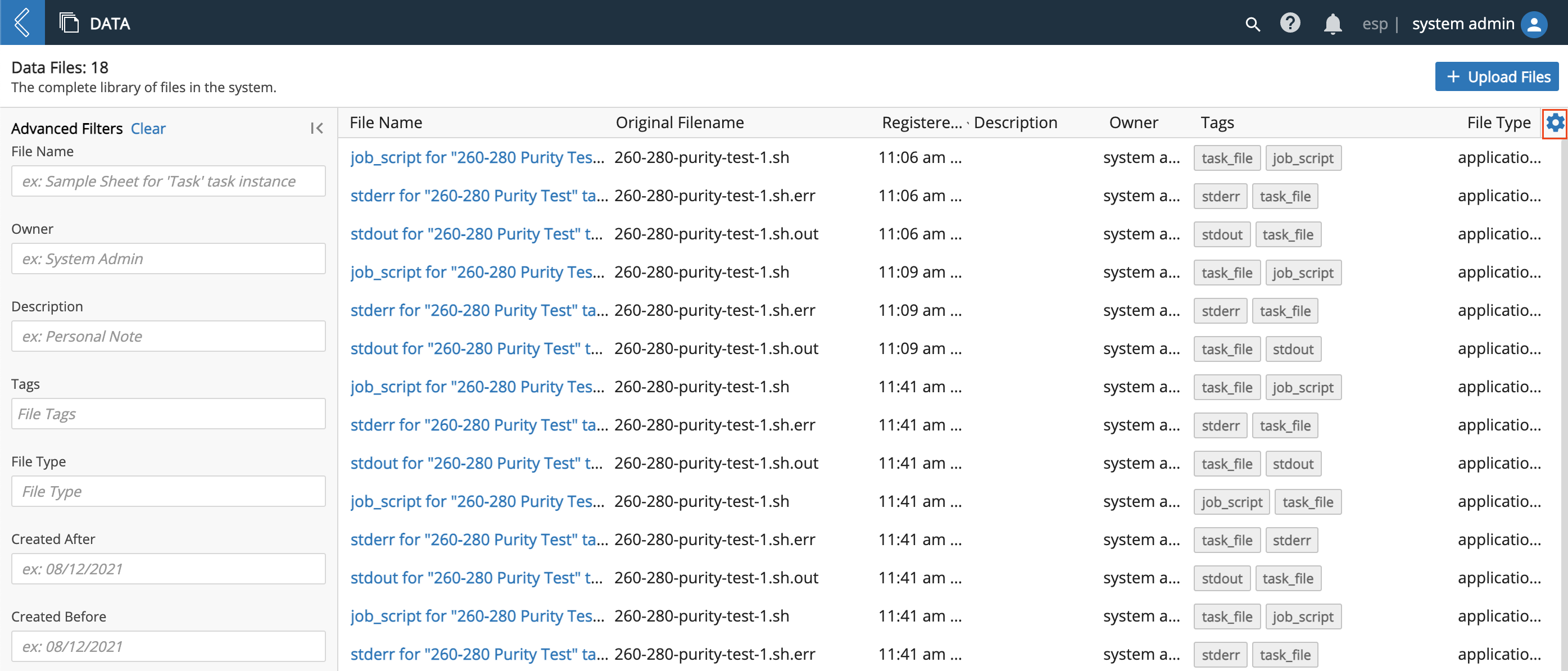
9.1.6. Column Management
Manage columns by clicking the gear icon (boxed in red).
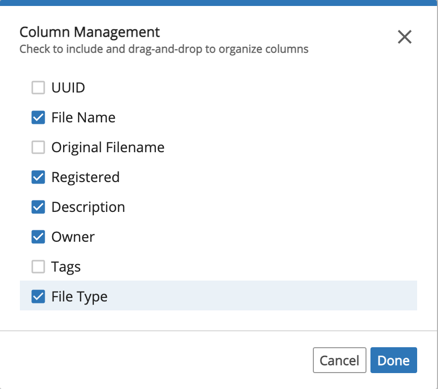
In the Column Management dialog, check the column titles you would like visible. You can also arrange the order of the columns by dragging and dropping the column titles. Click Done.
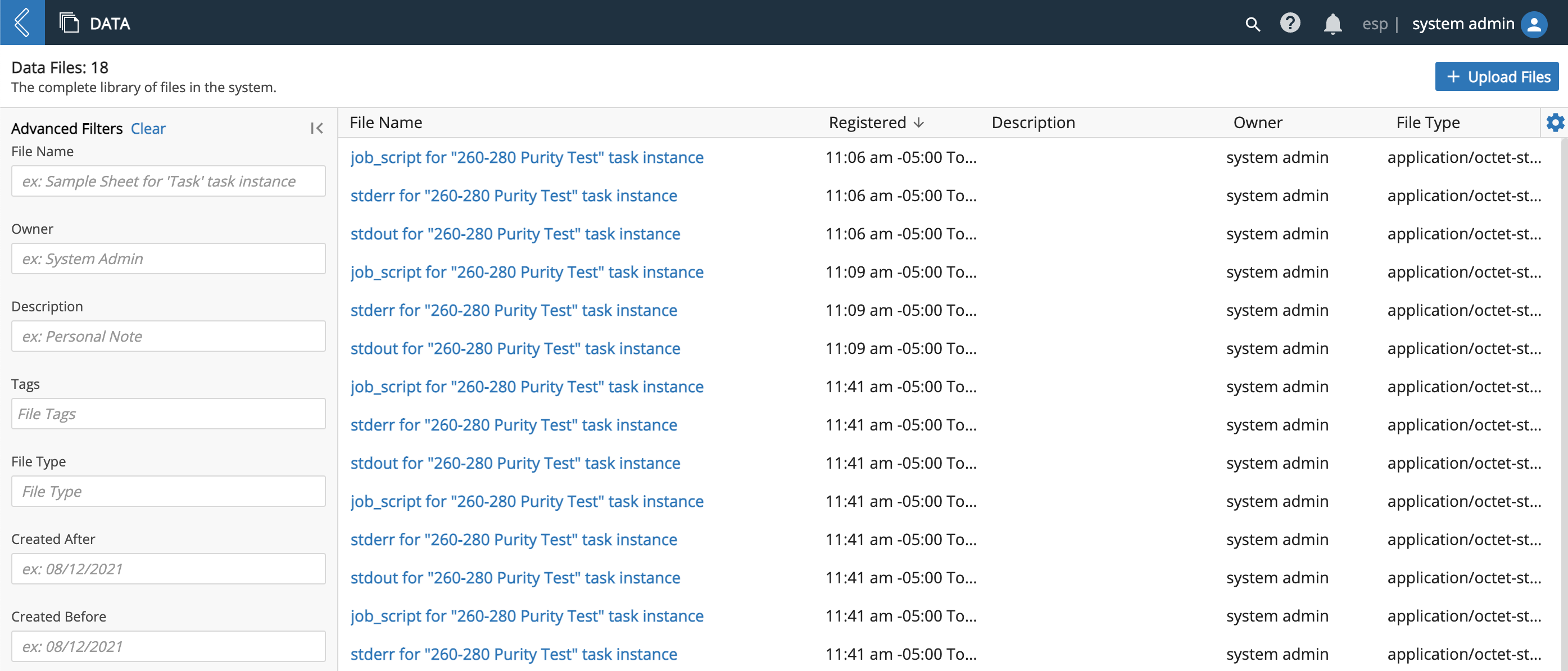
Observe how the columns have changed.
Columns can also be pinned.
9.1.7. Tabs
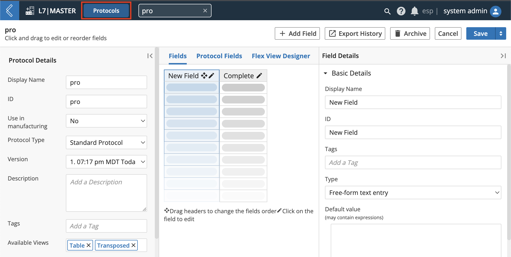
L7|ESP allows you to easily toggle between items by creating tabs.
For example, from the Protocol management page, in the L7|Master App, open a Protocol. Observe that the title of the Protocol is the name of the tab.

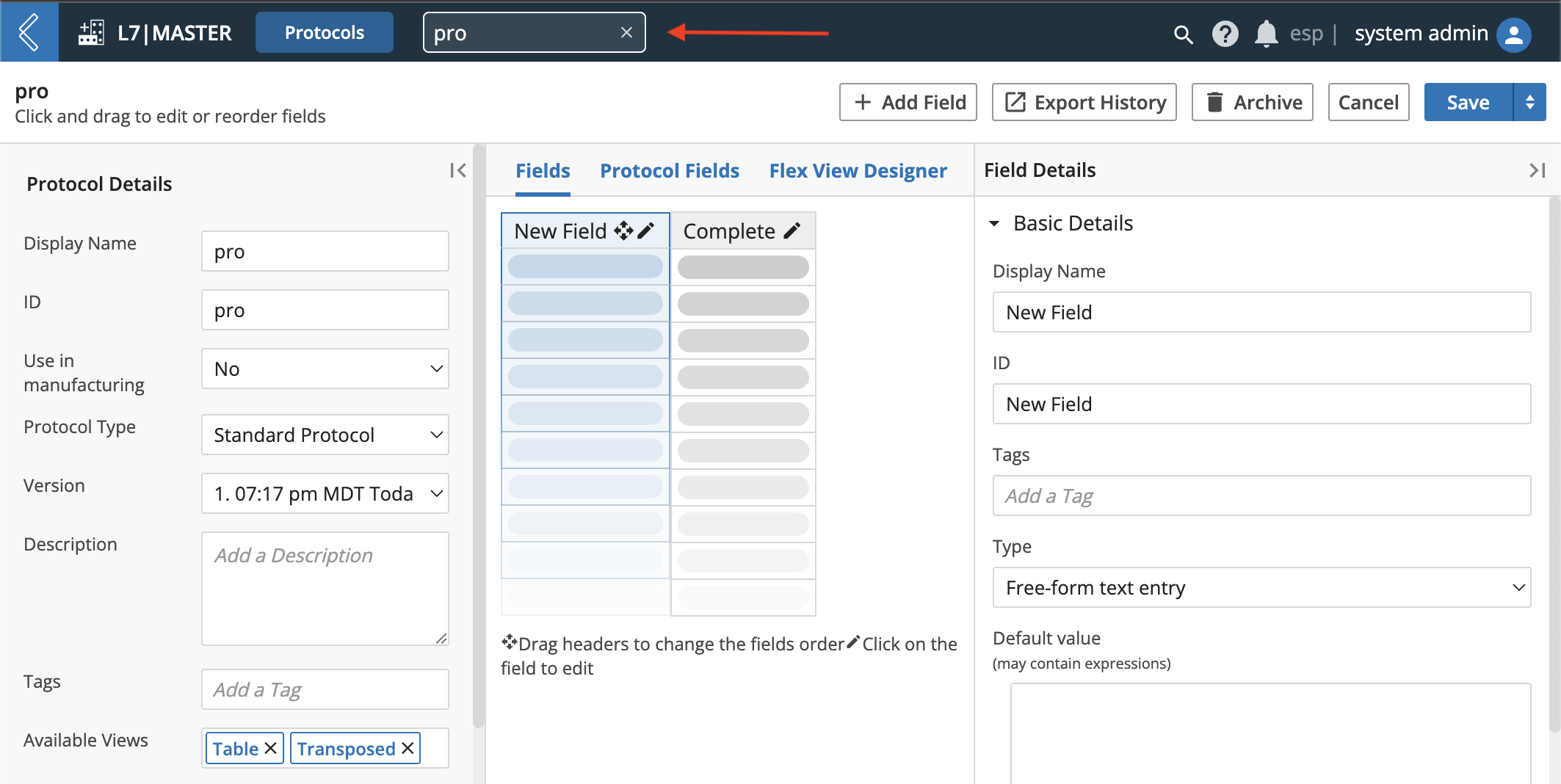
Click Protocols or the back button to return to the Protocols management page.
Observe that the Protocol tab remains available.
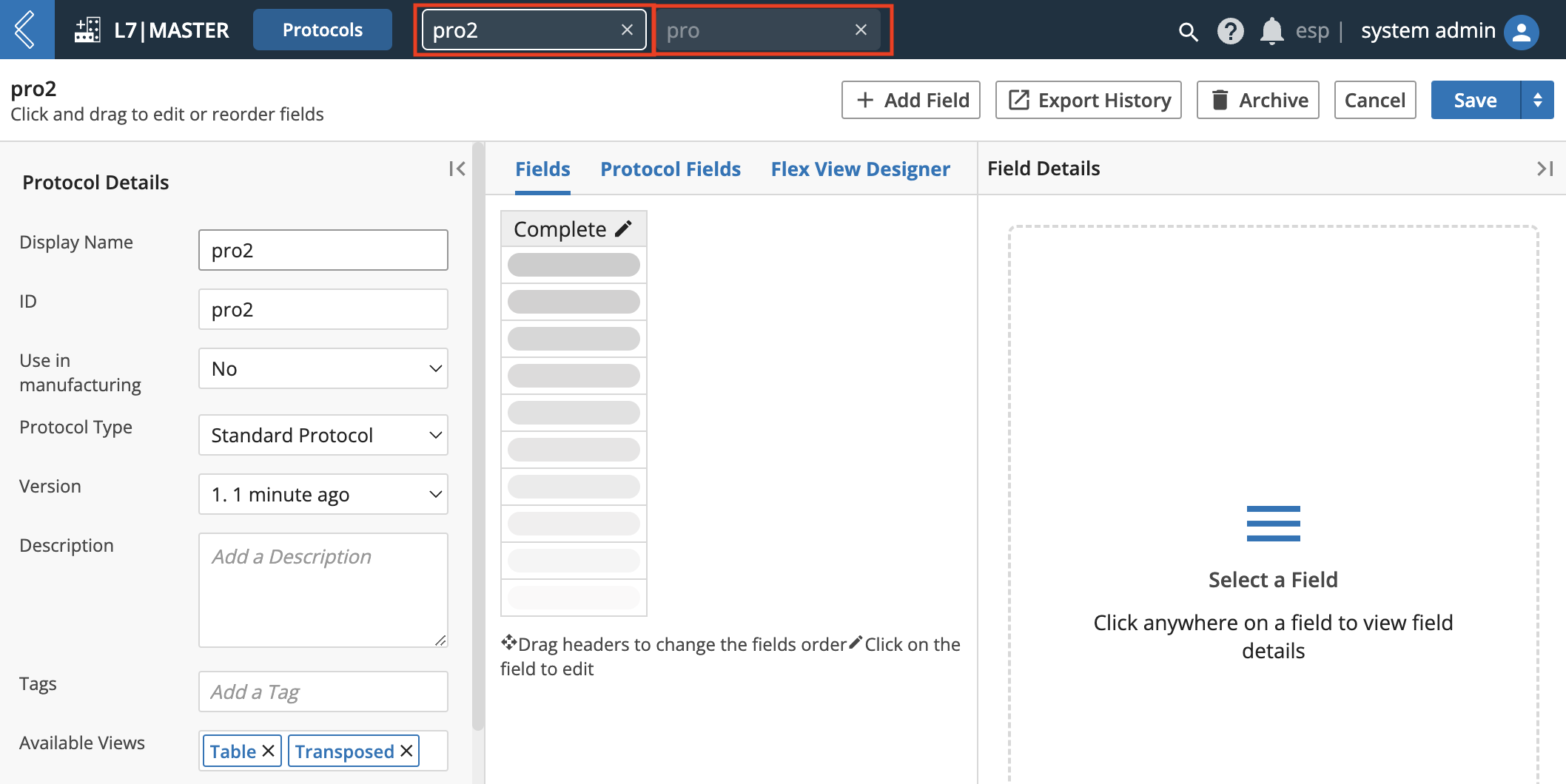
Open a different Protocol. Observe that the new Protocol tab is available in addition to the previous Protocol tab. This allows you to easily switch between tabbed items.
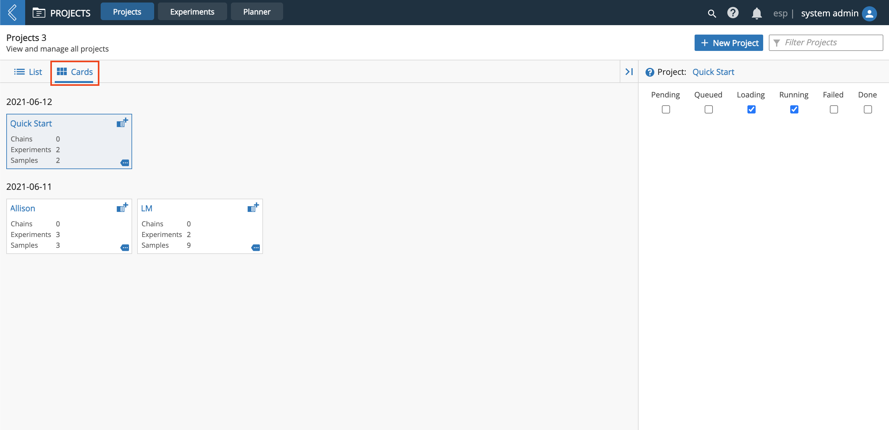
9.1.8. List View vs. Cards View
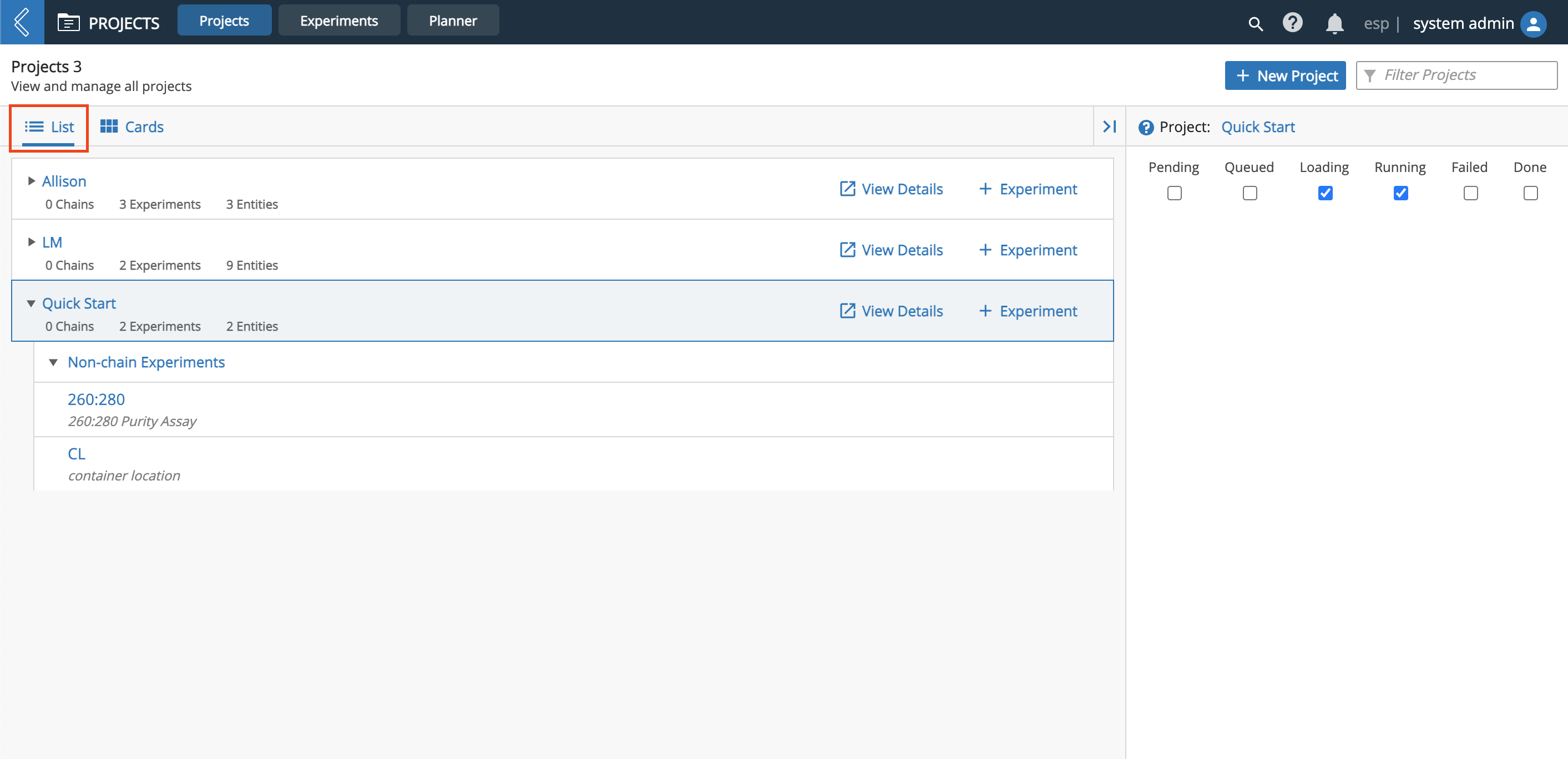
You can change the way that applicable pages are organized by toggling between List view and Cards view.
For example, in the Projects app, List view displays each Project as a row. You can click the row of a Project to reveal more information about that Project, including the associated Experiment(s) with clickable links.
Click Cards to change to the Cards view, which displays each Project as a box. The Project box summarizes information associated with that Project (i.e., Project Name, number of Chains, number of Experiments, and number of Entities). You can click on the Project box to populate the Inspector on the right with that Project's associated Experiment(s).
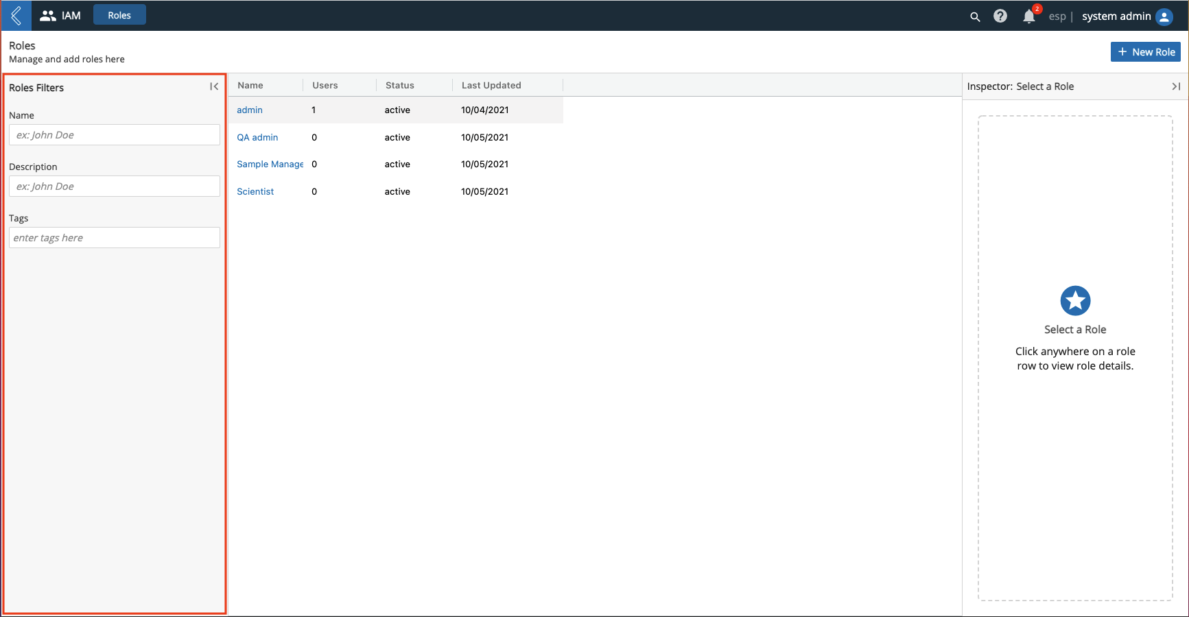
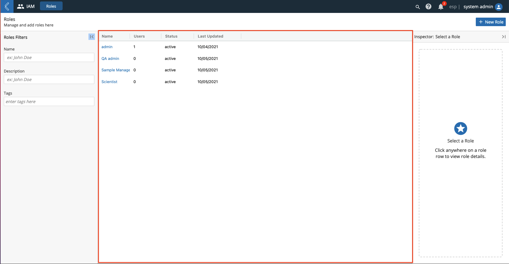
9.1.9. Filters Panel
On the left side of applicable pages is a Filters panel, which is used to find specific items related to the page. For example, the Roles management page allows you to filter by Name, Description, and/or Tags, which are the most relevant attributes when searching for a specific Role.
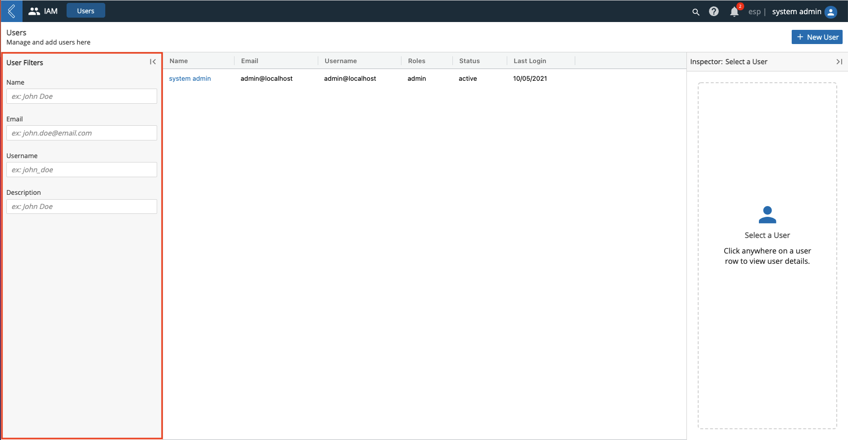
The attributes you can filter by vary per page to optimize your search. For example, the Users management page allows you to filter by Email in addition to Name, Description, and Username.
You can collapse the Filters panel by clicking the Hide Panel icon.
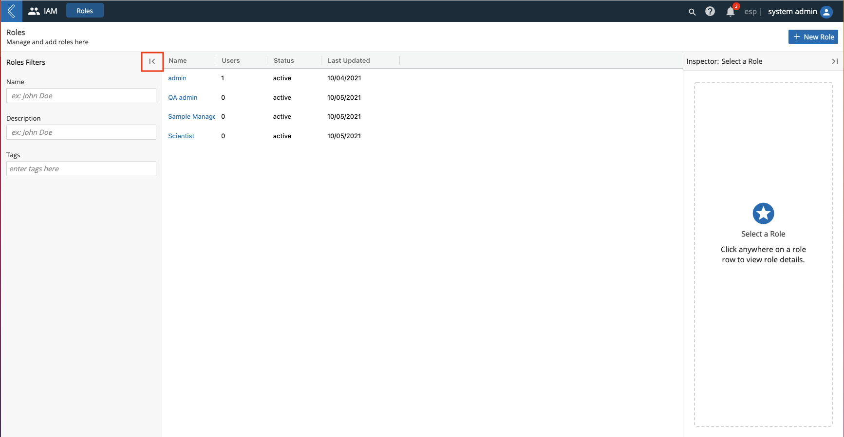
You can maximize the Filters panel by clicking anywhere on the minimized Filters panel.
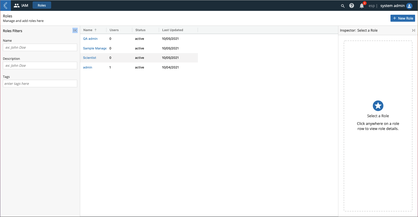
9.1.10. Library
In the center of applicable pages is a list, or library, of all items related to that page. This list is defaulted to organize the items alphabetically by Name. Each row represents a different item.
You can reorganize the list by clicking a column title (column titles vary per page). For example, if you click the Name column title, then the list is re-organized in reverse.
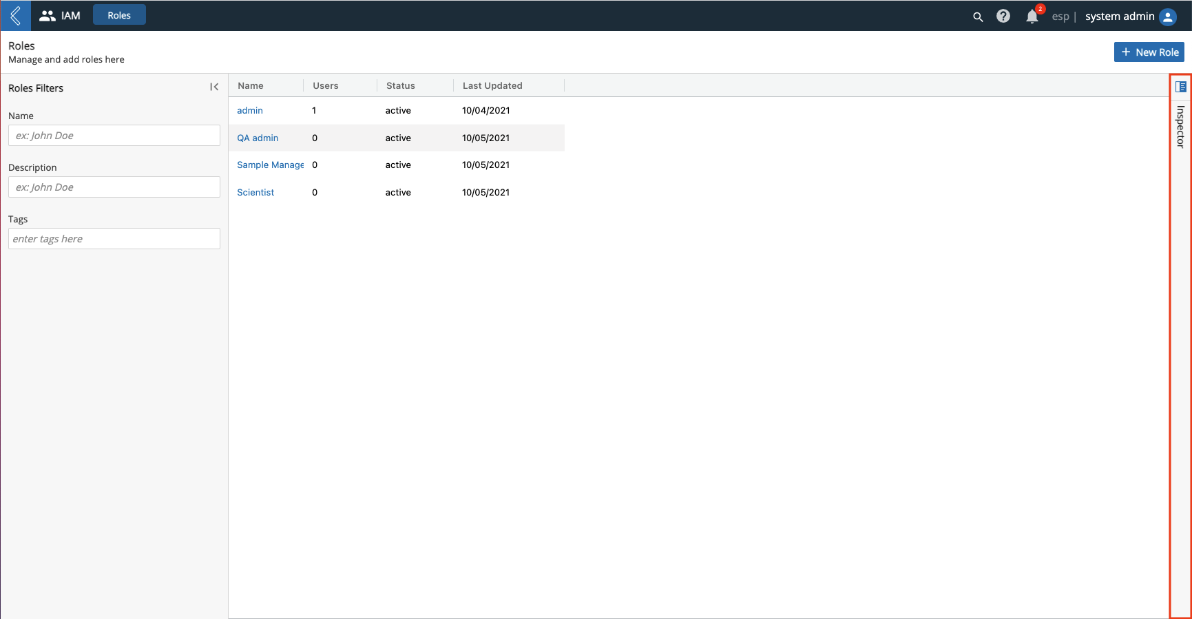
9.1.11. Inspector Panel
On the right side of applicable pages is the Inspector panel.
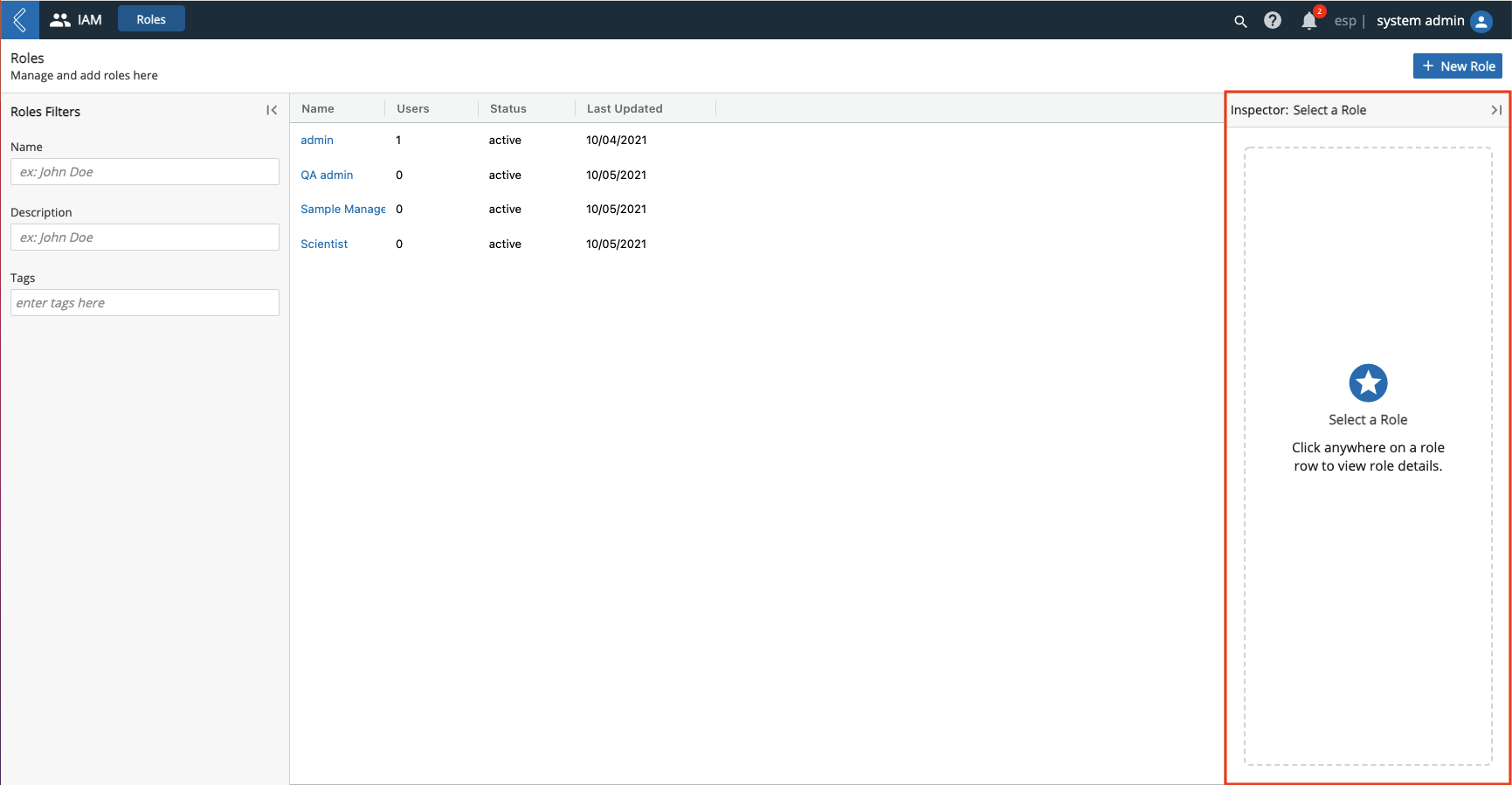
Click the row of any item in a list. Details regarding that item will appear in the Inspector panel.
You can collapse the Inspector panel by clicking the Hide Panel icon.
You can expand the Inspector panel by clicking anywhere on the collapsed Inspector panel.
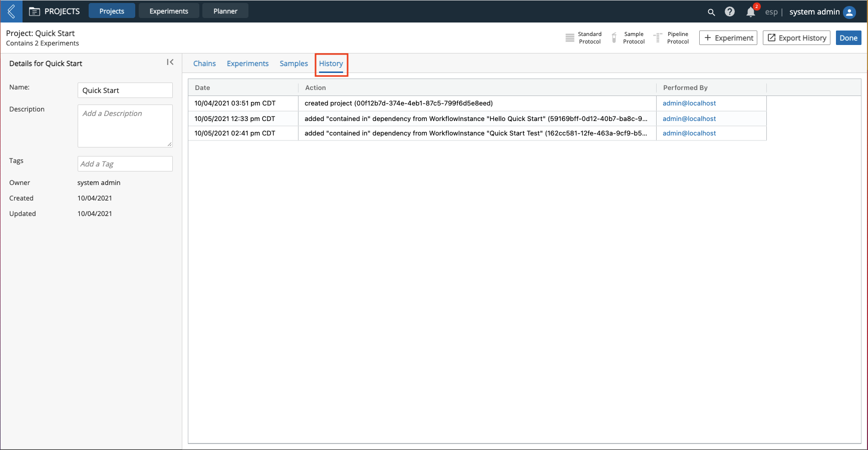
9.1.12. History
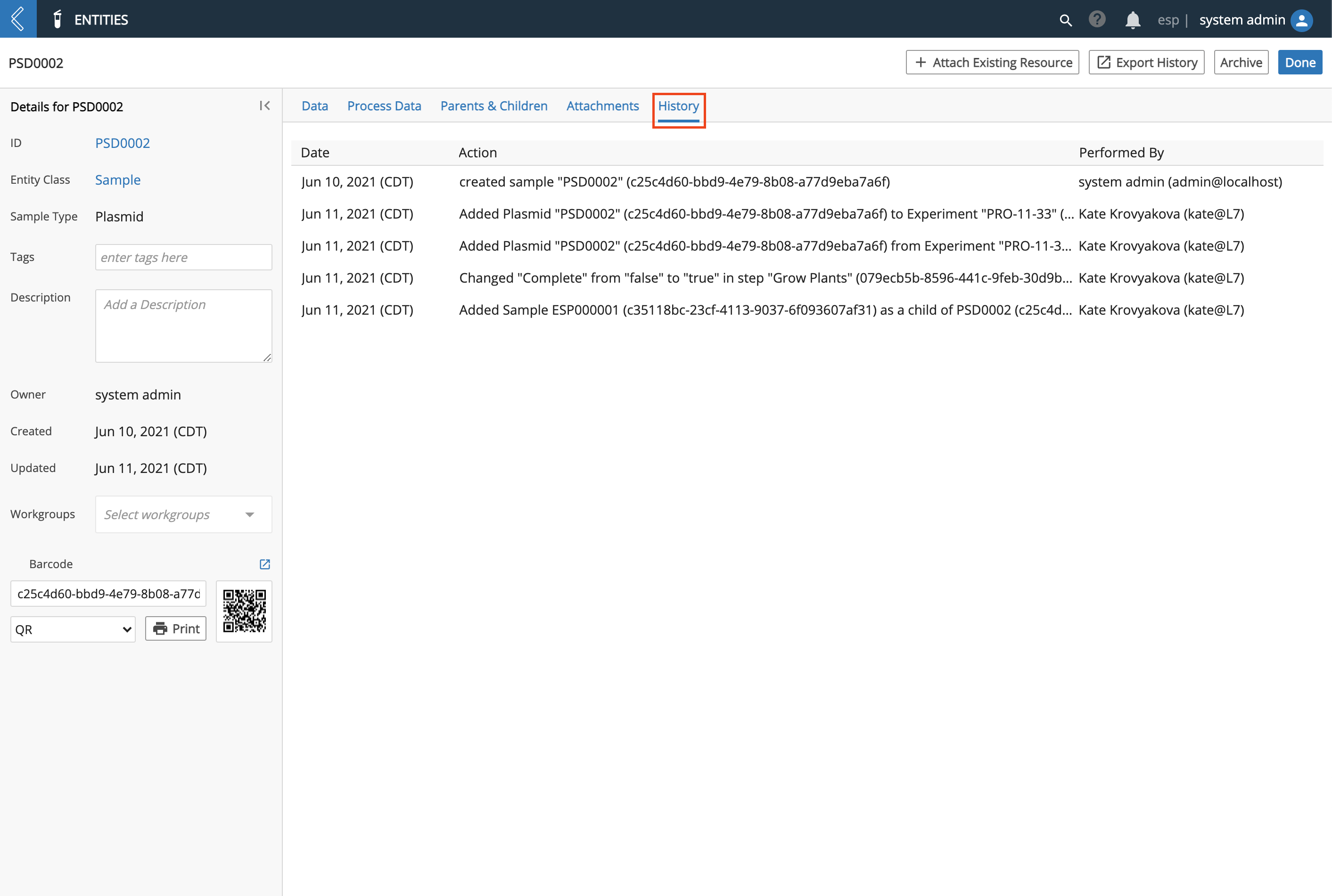
Applicable pages have a History tab, which can be used to view an audit history of the actions performed related to that page. The audit history includes the Date the action was performed, a description of the Action, and an Performed By to indicate who performed the action.
9.1.13. Save Options
After creating or updating an item, there are multiple Save options available.
Click Save to Save your work and stay on the same page.
Click Save and New to save your work and automatically be taken to a blank + New page of the respective item.
Click Save and Done to save your work and automatically be returned to the respective management page.
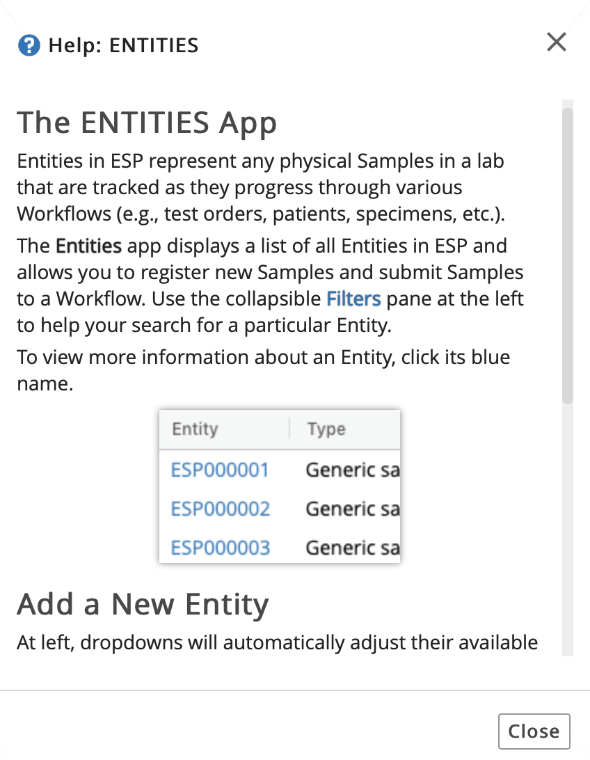
9.2. Context Help
Context Help is available on various pages throughout L7|ESP. To access Context Help, click the question mark icon on an applicable page in L7|ESP.
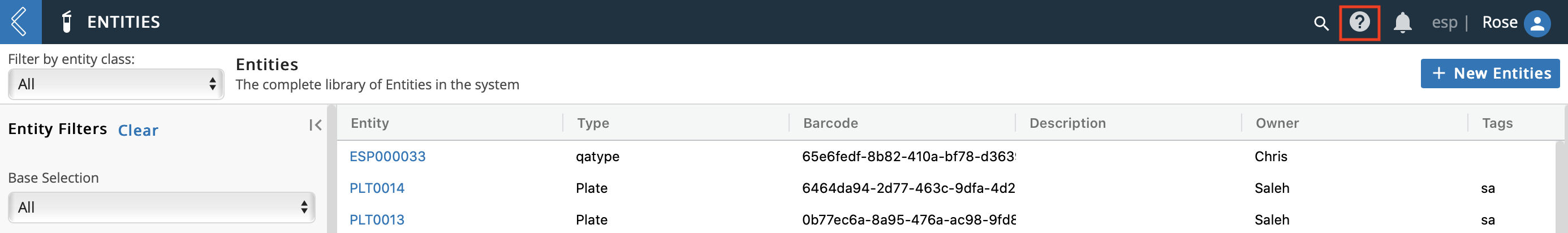
A Help dialog will appear with information and instructions related to the page you are on.
9.3. Apps Tray
The Apps Tray can be accessed from any page in L7|ESP.

The Apps Tray is a side window that allows you to easily and quickly navigate to other apps/areas in L7|ESP. It also displays your Recent Activity with clickable links.
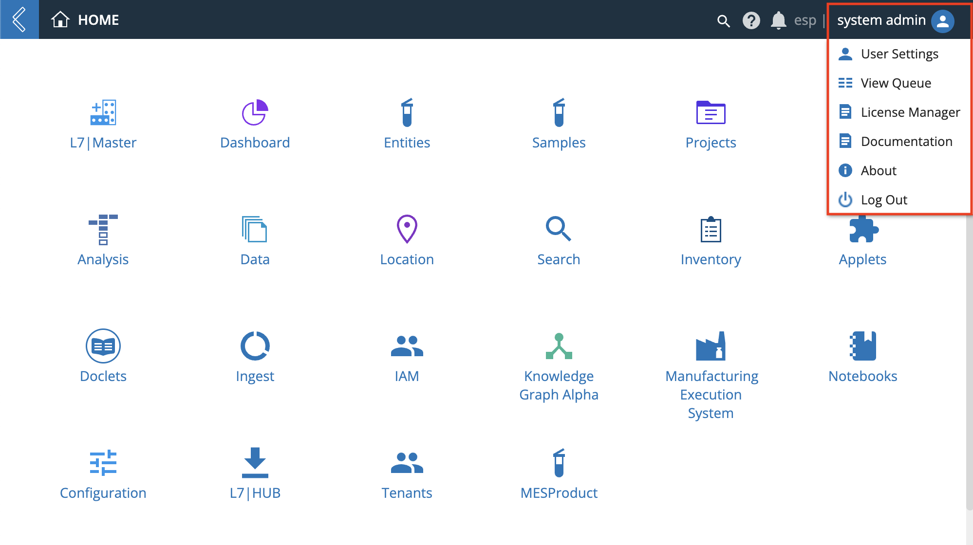
9.4. Manage your Profile
The Profile icon can be accessed from any page in L7|ESP and allows you to view and manage your profile.
The Profile icon has the following functionality:
User Settings, which includes:
Profile tab that has the following information about your account: username, email, name, a link to change your password, language, the app(s) you have permission to access, the Role(s) you are assigned, and the Workgroup(s) you belong to.
Security tab with a feature to generate an API key for security purposes.
Sessions tab that allows you to view information about your active session.
License Manager, which shows current license settings, the expiration date of the current license, and the ability to apply a new license file.
Documentation, which takes you to the L7|ESP User Documentation.
About, which displays the L7|ESP version, contains a link to L7 Informatics' website, and a Contact Us link.
Log Out, which ends your L7|ESP session and takes you to the login page.
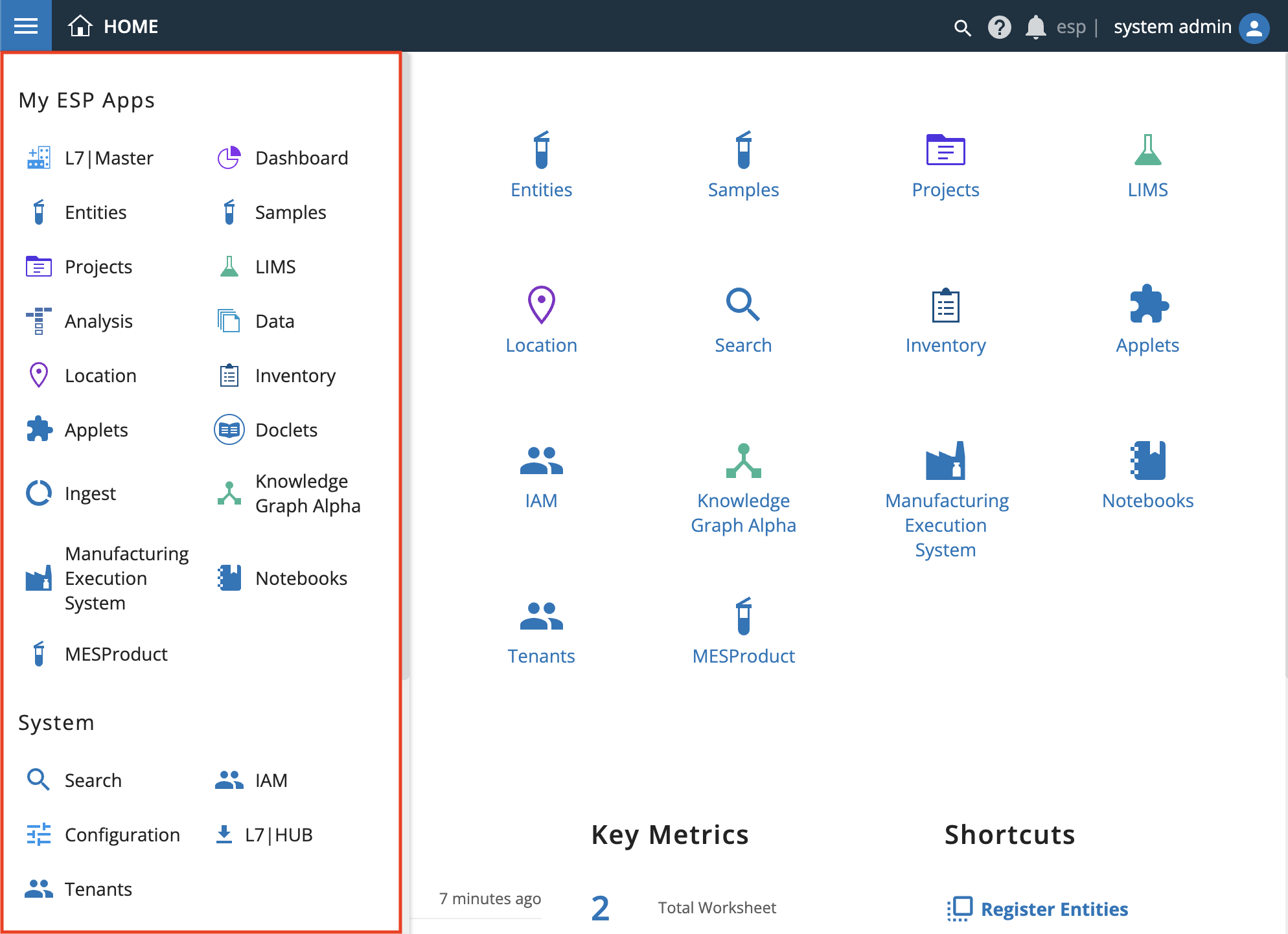
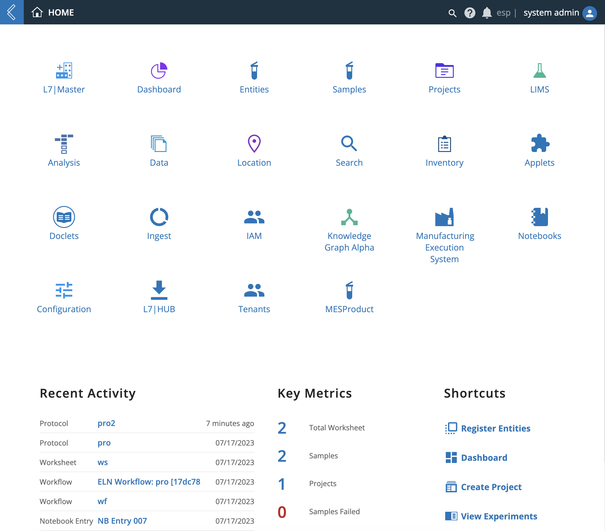
9.5. Home Menu
The Home menu displays the following:
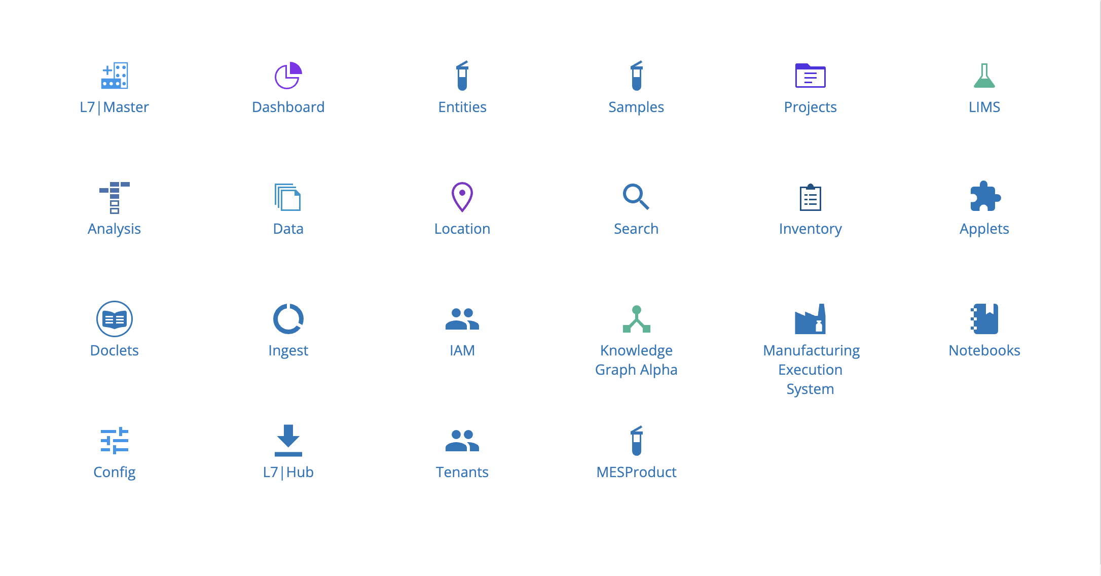
L7|ESP's applications. Based on your assigned Role(s) and Workgroup(s), only certain apps may be visible to you.
Recent Activity, which displays your most recent, major updates to L7|ESP with links so you can easily navigate to view the update.
Key Metrics, which are customized to each customer.
Shortcuts, which are Role-specific.
9.6. L7|Master App
From the Home menu, click L7|Master. Refer to the L7|Master Guide for instructions on how to use the L7|Master app.
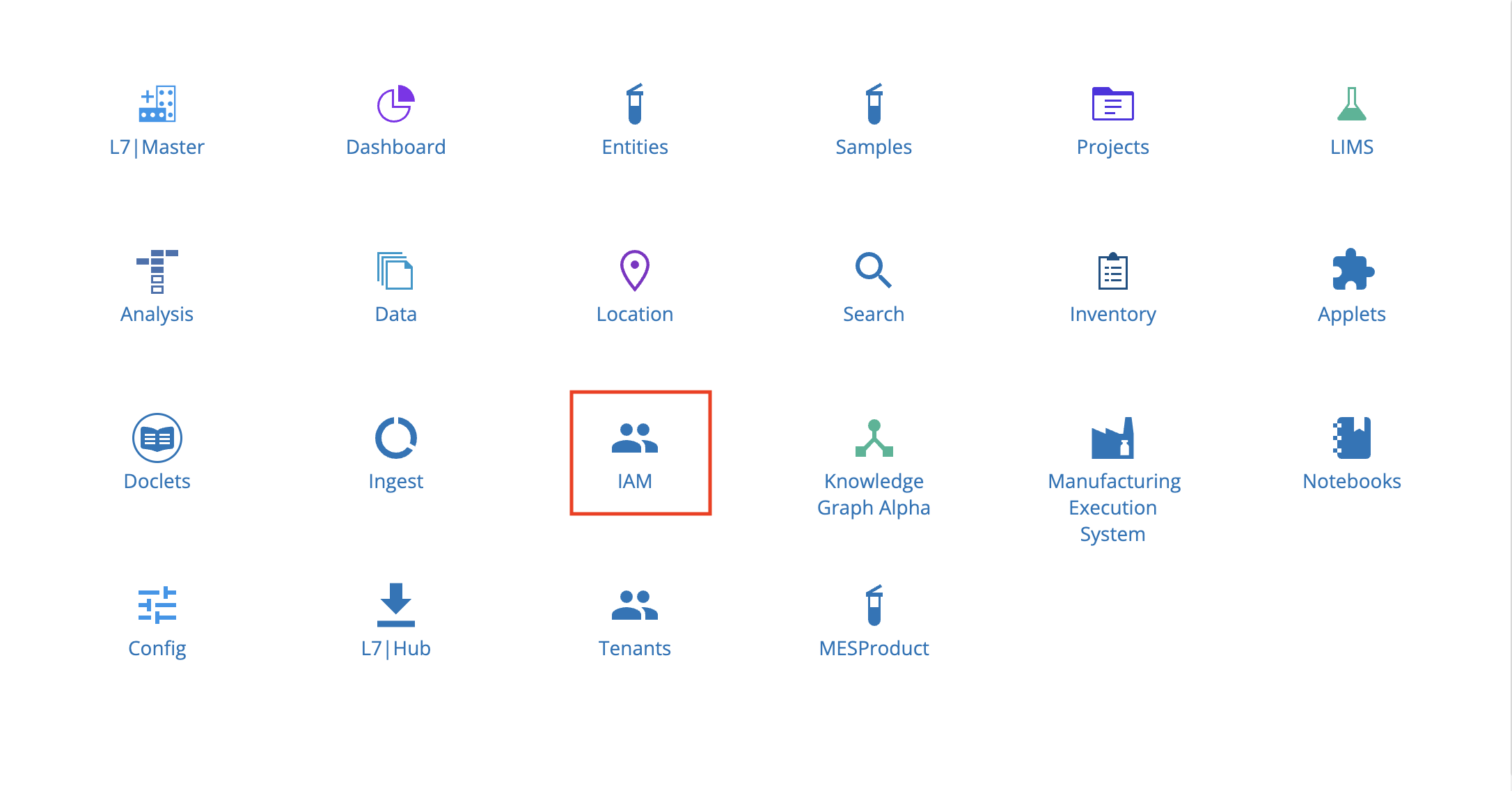
9.7. IAM (Admin) App
From the Home menu, click IAM. Refer to the IAM (Identity & Access Management) for instructions on how to use the IAM app.
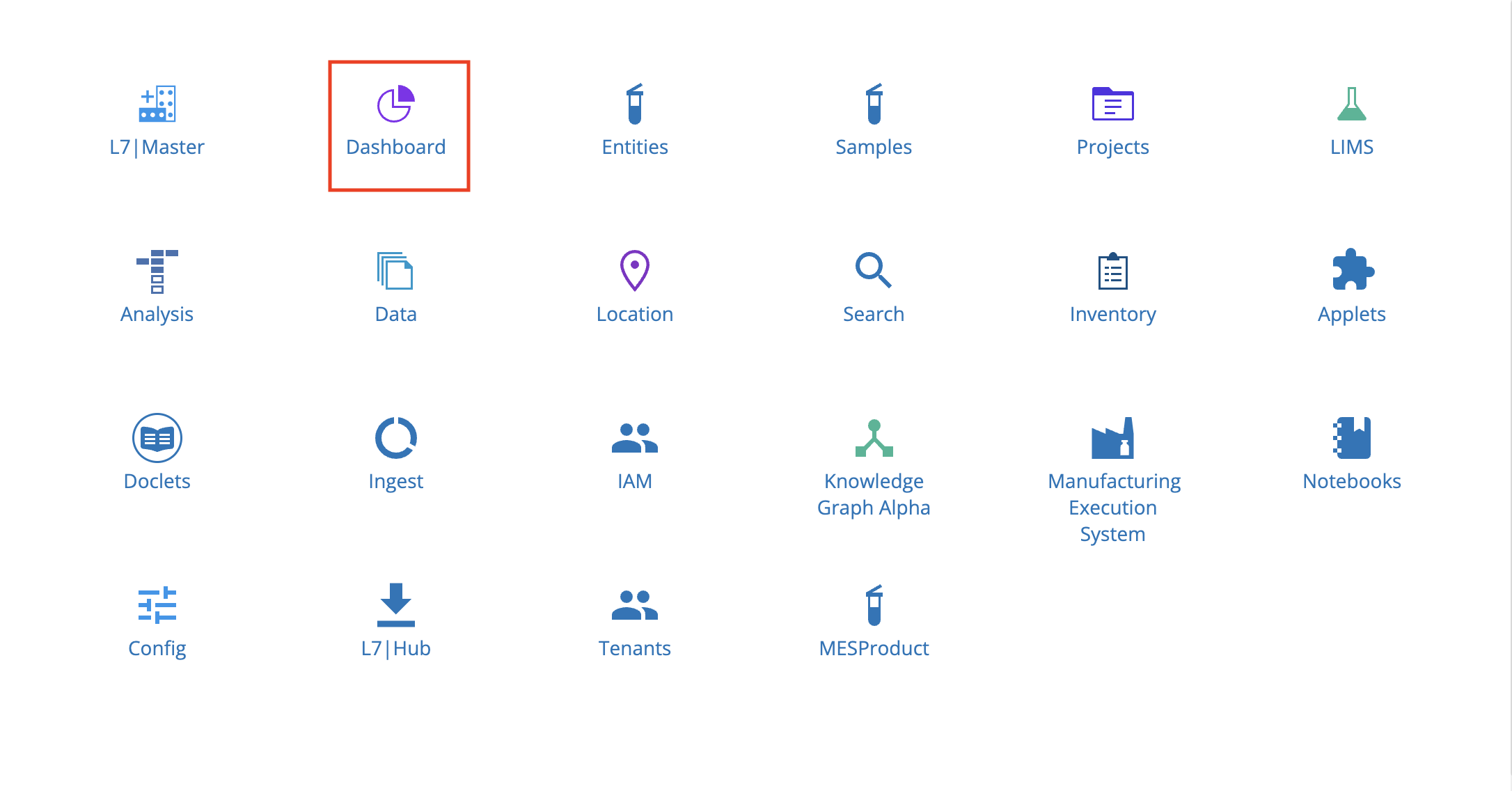
9.8. Dashboard App
From the Home menu, click Dashboard.
The Dashboard app has two tabs: Dashboards and Reports.

9.8.1. Dashboards Tab
The Dashboards tab provides high-level metrics to summarize and display what is happening in L7|ESP.
The Dashboards tab displays the following charts:
Experiment Starts by Project by Week
Items Requiring Reorder
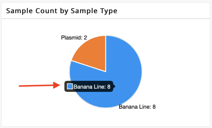
Sample Count by Sample Type
Samples Assigned to Workflows
Sample Movement by Week
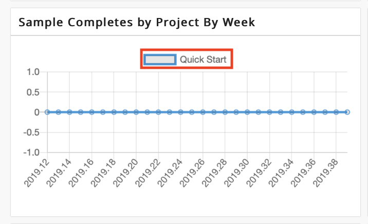
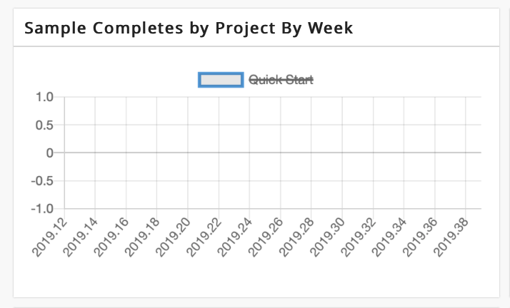
Sample Completes by Project by Week
Sample Fails by Project by Week
Sequenced/Sequenceable
Workflow Turnaround Time (TAT) (Hours)
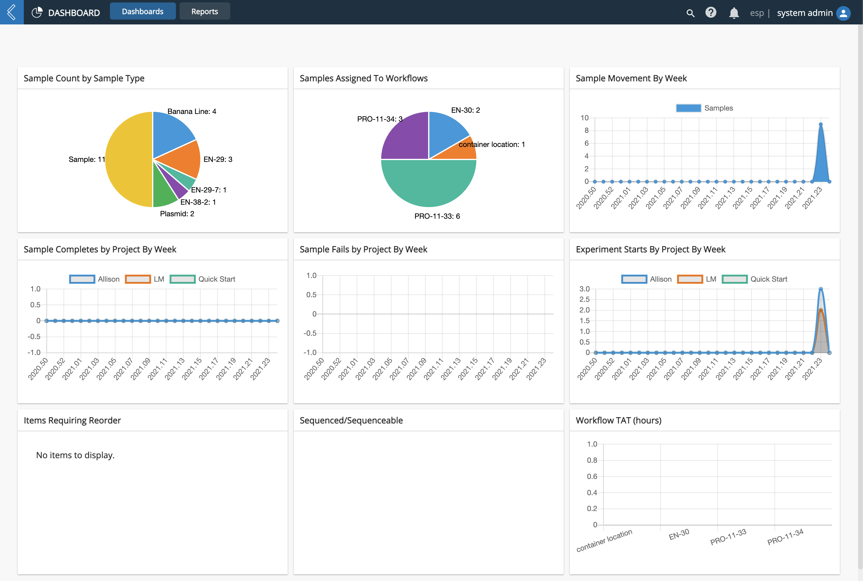
On a pie chart, you can hover your mouse over a section/slice to view the associated details (i.e., name and quantity).
On a line chart, you can click a component in the key to remove it from the line chart, which is helpful when performing comparisons of specific components. Click the component again to add it back to the line chart.
9.8.2. Reports Tab
The Reports tab compliments the metrics displayed on the Dashboards tab. L7|ESP is geared toward entering and automating data - and the Reports tab allows you to view this data in an organized manner. Reports are customized for each customer.
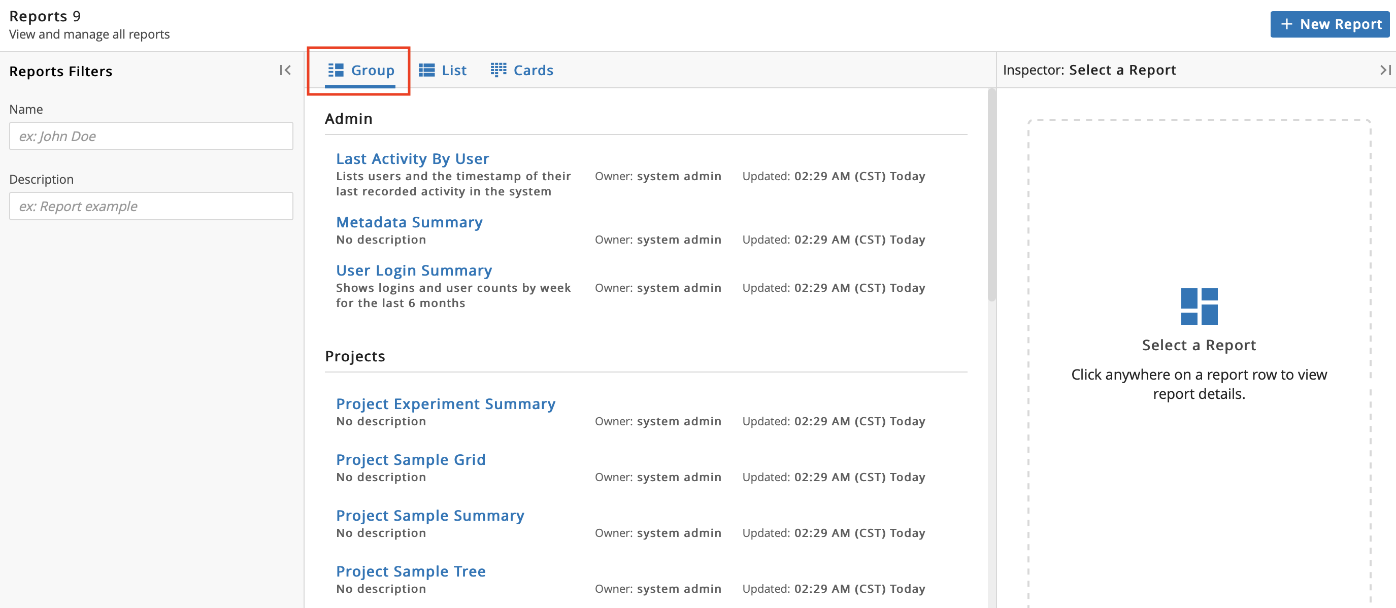
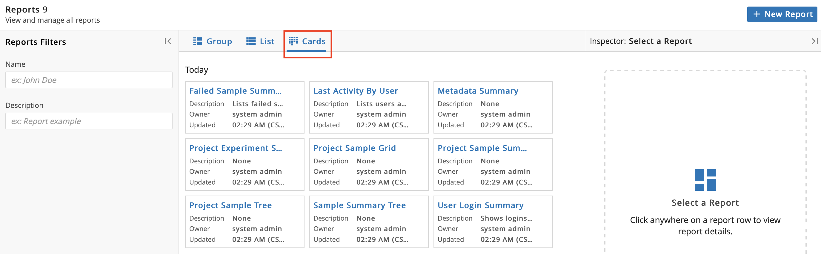
The Reports tab shows the full list of Reports via List view.
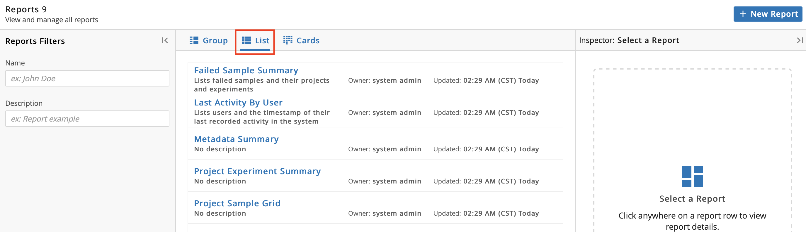
You can click Group to change the display of the Reports.
You can click Cards to change the display of the Reports.
You can click the row of a Report to view associated Report Details in the Inspector panel on the right.
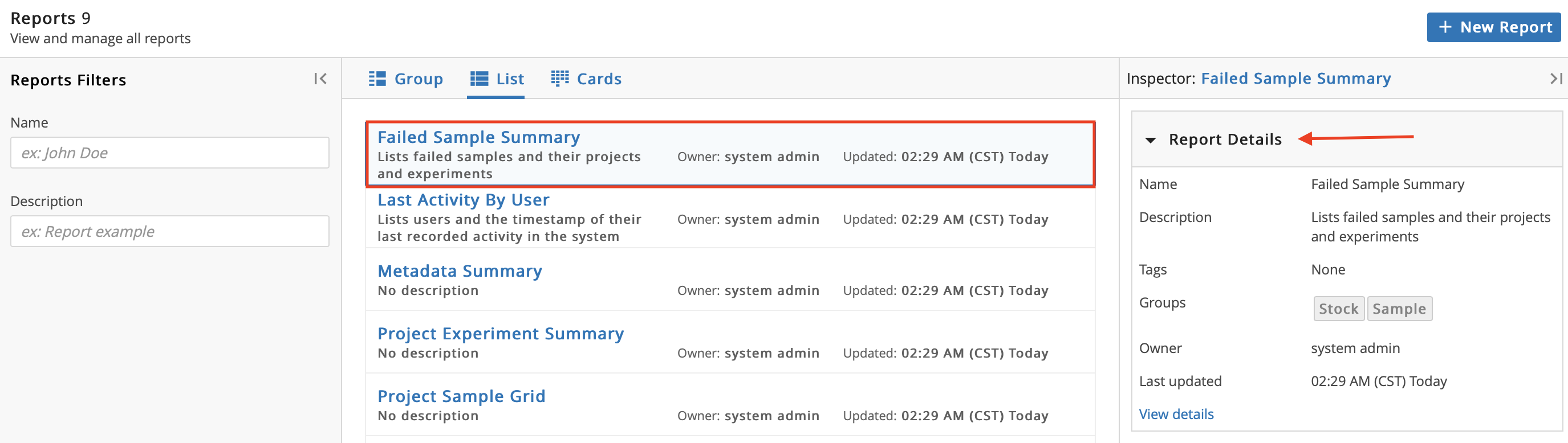
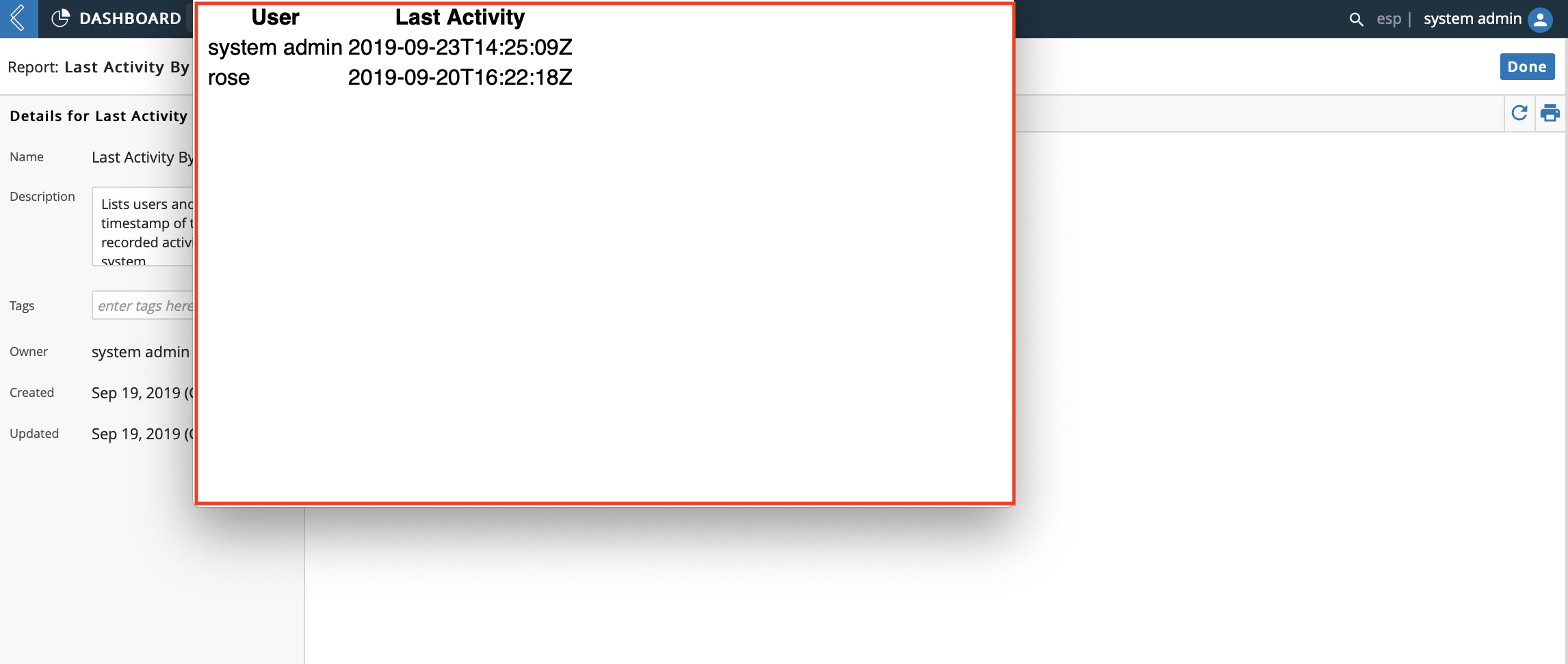
You can click the Name of a Report or click View details under Report Details to access the Report Details page.
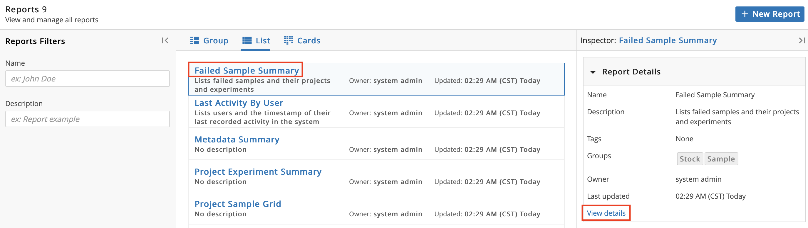
The Report Details page displays information associated with a specific Report. The information in the left Details panel includes: Name, Description, Tag(s), Group(s), Owner, and Last Updated. You can add or edit a Description, Tag(s), and Group(s).
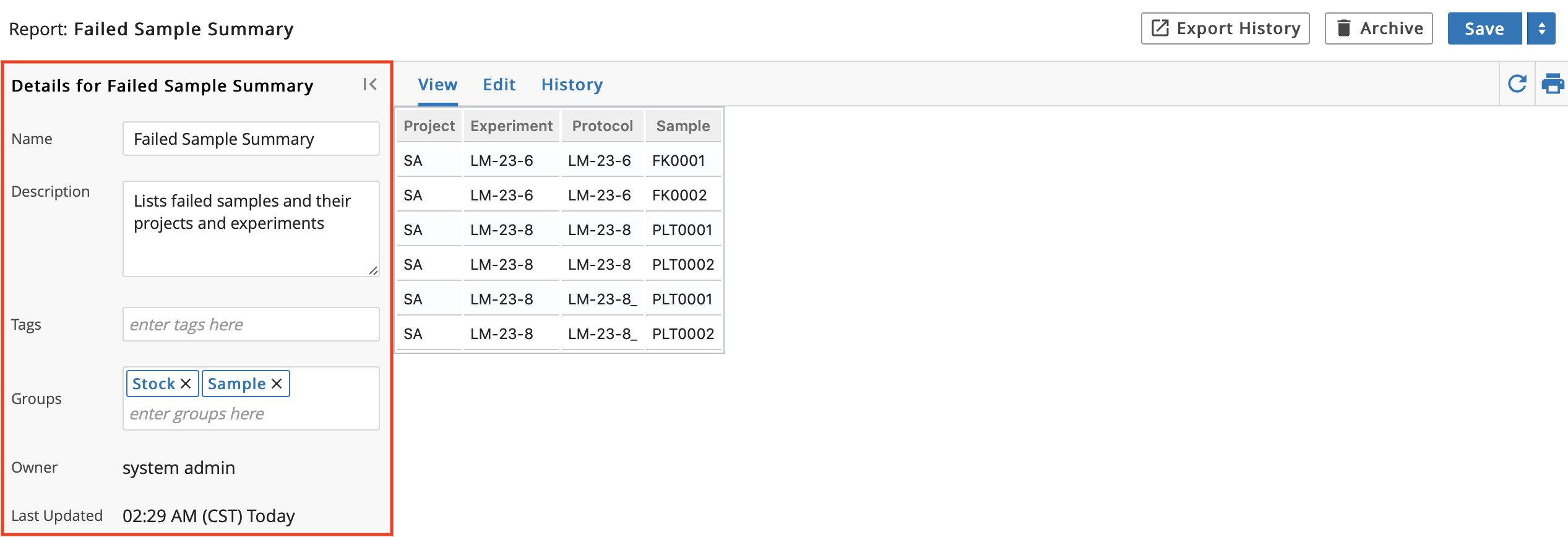
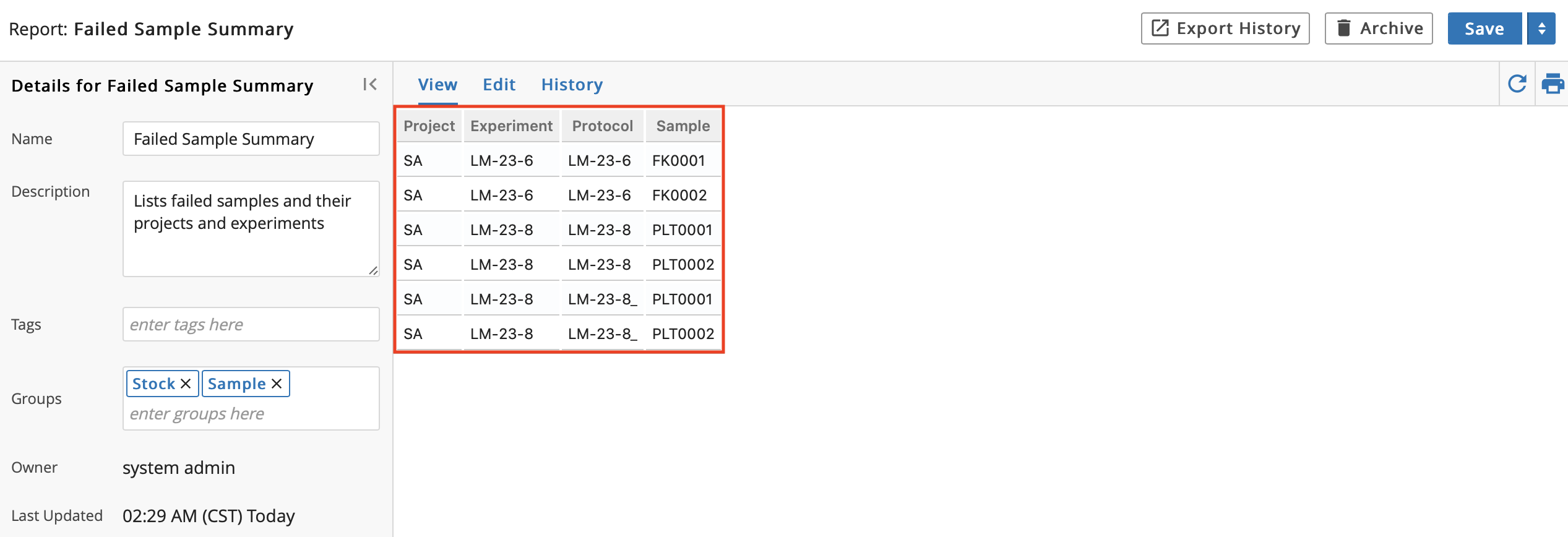
The information in the center is specific to the Report.
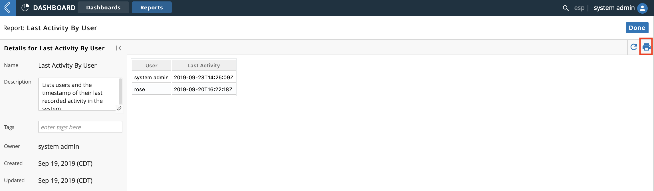
You can click the printer icon to view a print preview and then print the Report.
9.9. Entities App
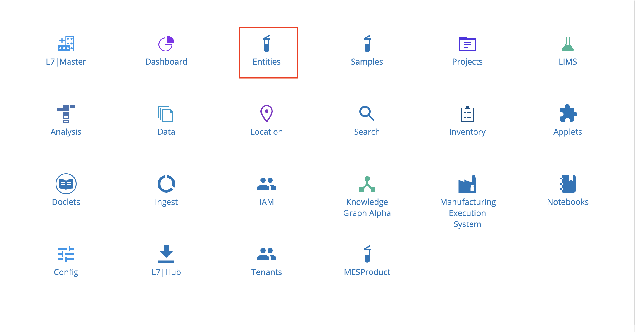
Entities in L7|ESP represent any physical Entities in a lab that are tracked as they progress through various Workflows (e.g., test orders, patients, specimens, etc.)
The Entities app displays a list of all Entities in L7|ESP and allows you to register new Entities and submit Entities to a Workflow.
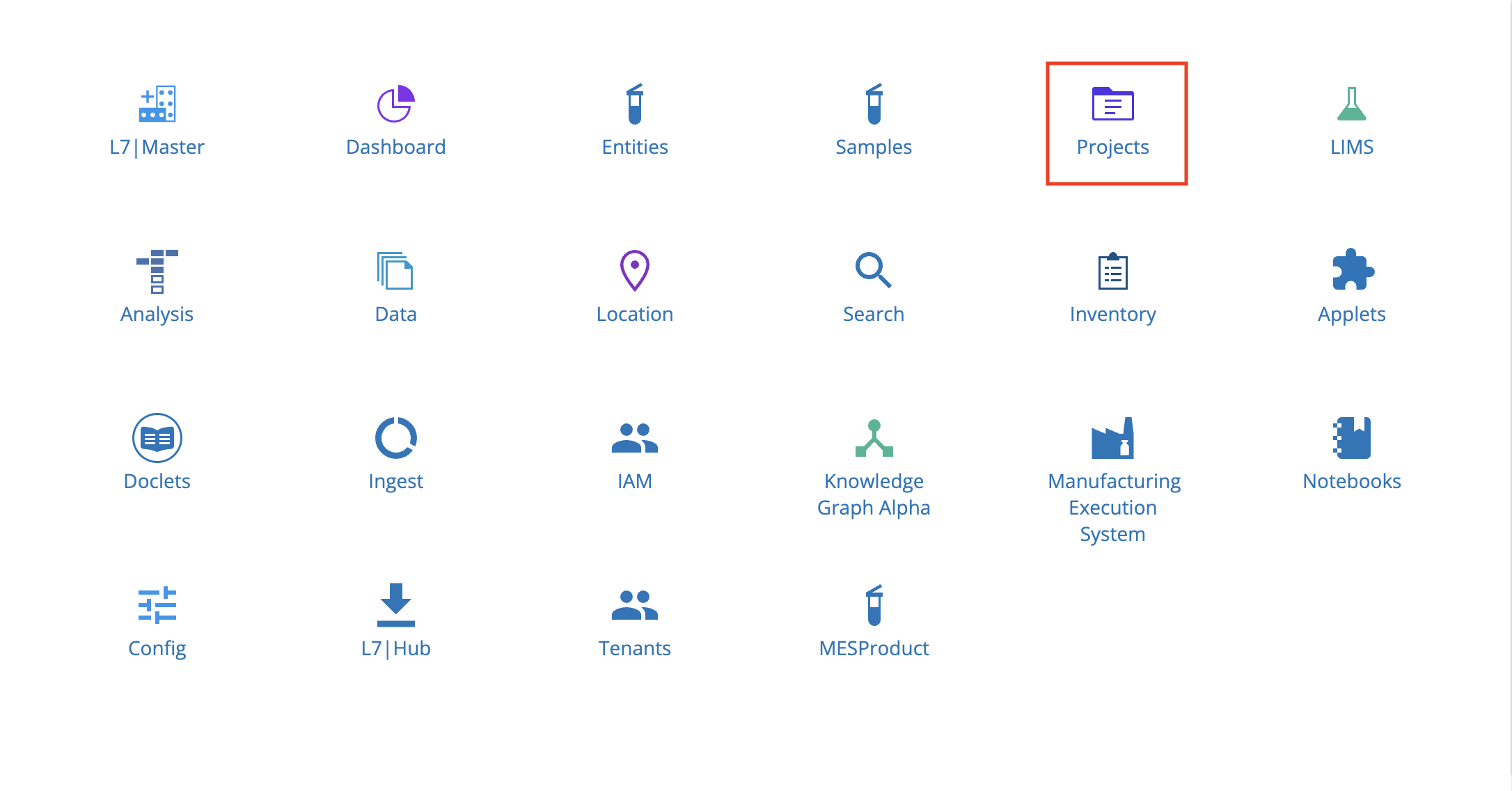
From the Home menu, click Entities.
9.9.1. Create New Entity
From the main page of the Entities app, click + New Entity to register new Entities.
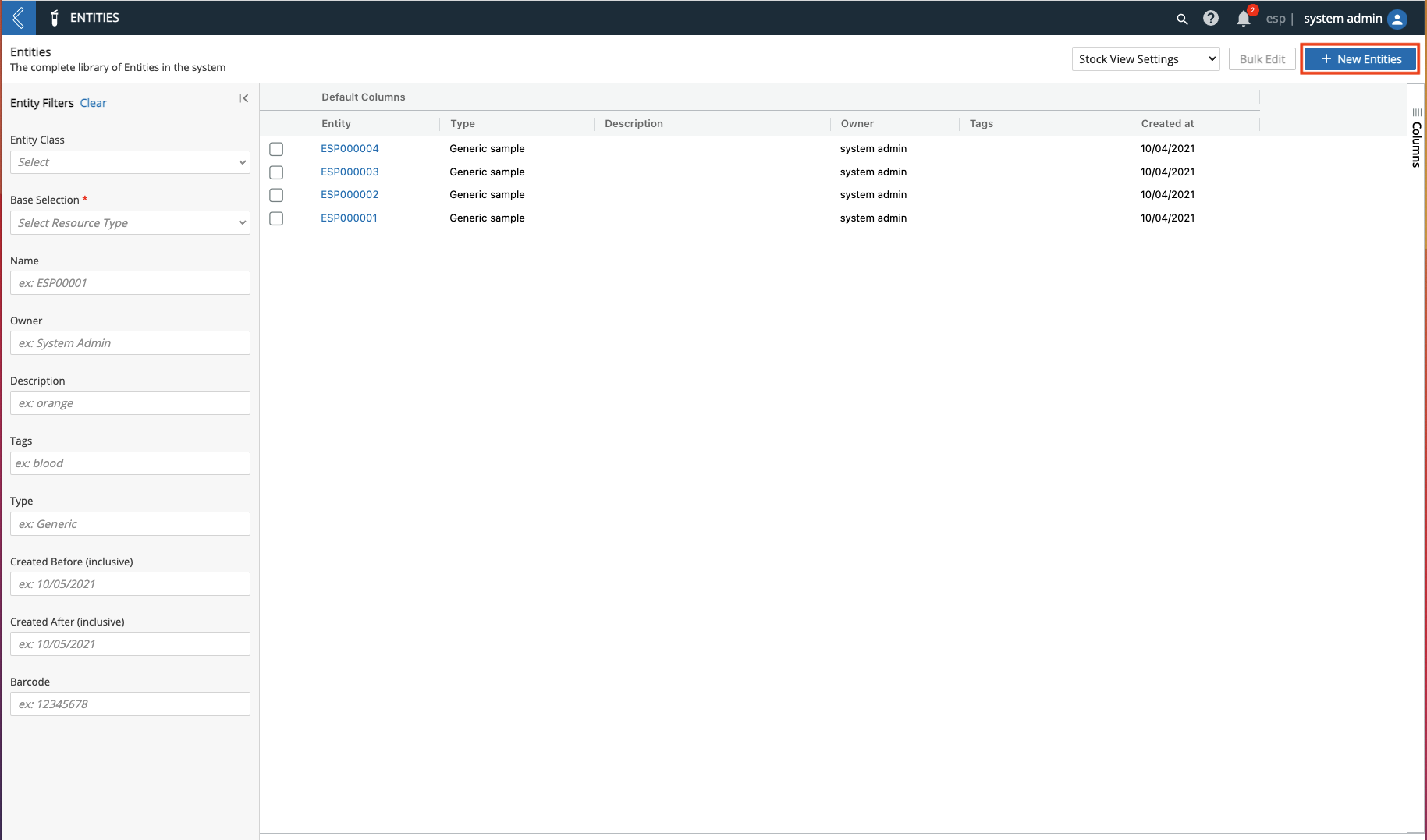
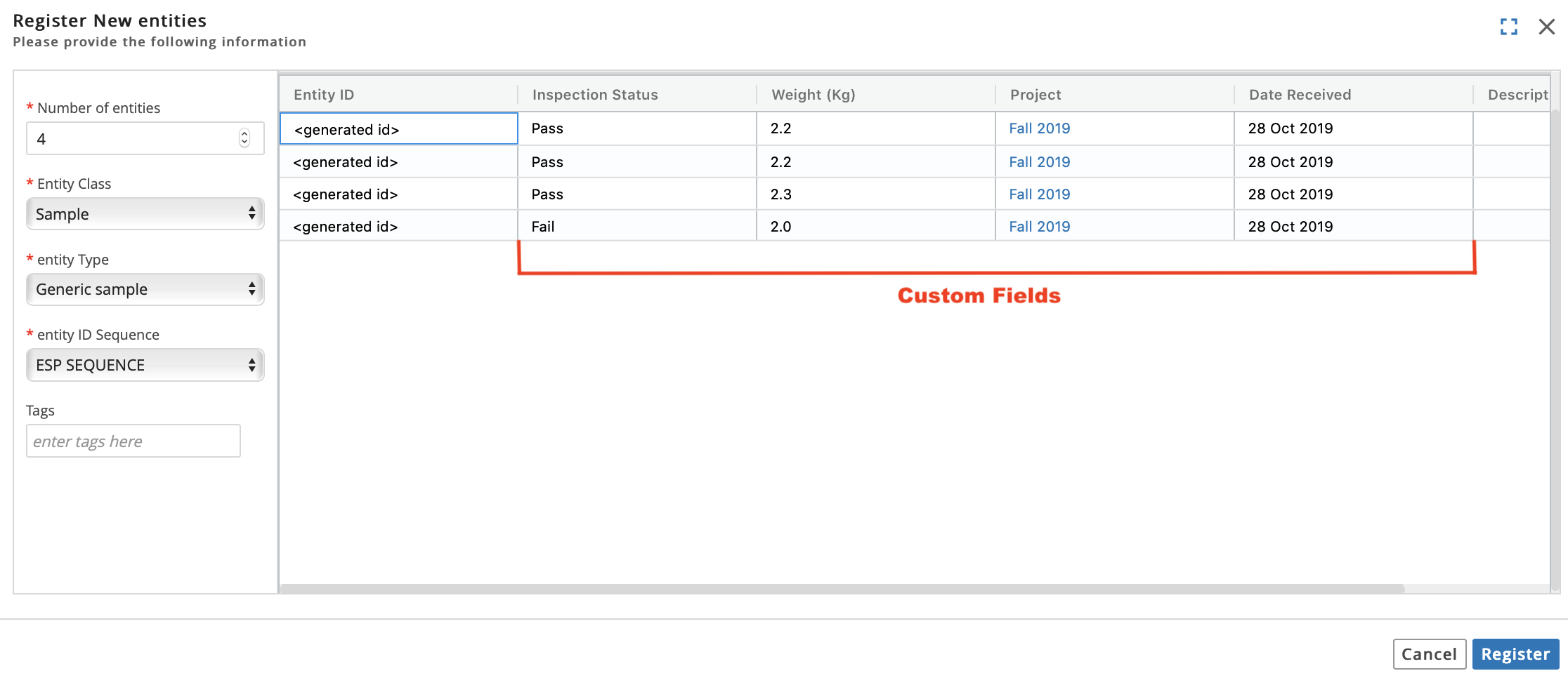
Fill out the Register New Entities dialog:
Enter the Number of Entities to register.
Select an Entity Class.
Select an Entity Type.
Select an Entity ID Sequence.
Optional: Enter Tag(s).
Optional: Depending on the set up of the Entity Type, there may be Custom Field(s) to fill out. Refer to Create New Entity Type for more information regarding Custom Field options.
Click Register.
Hint
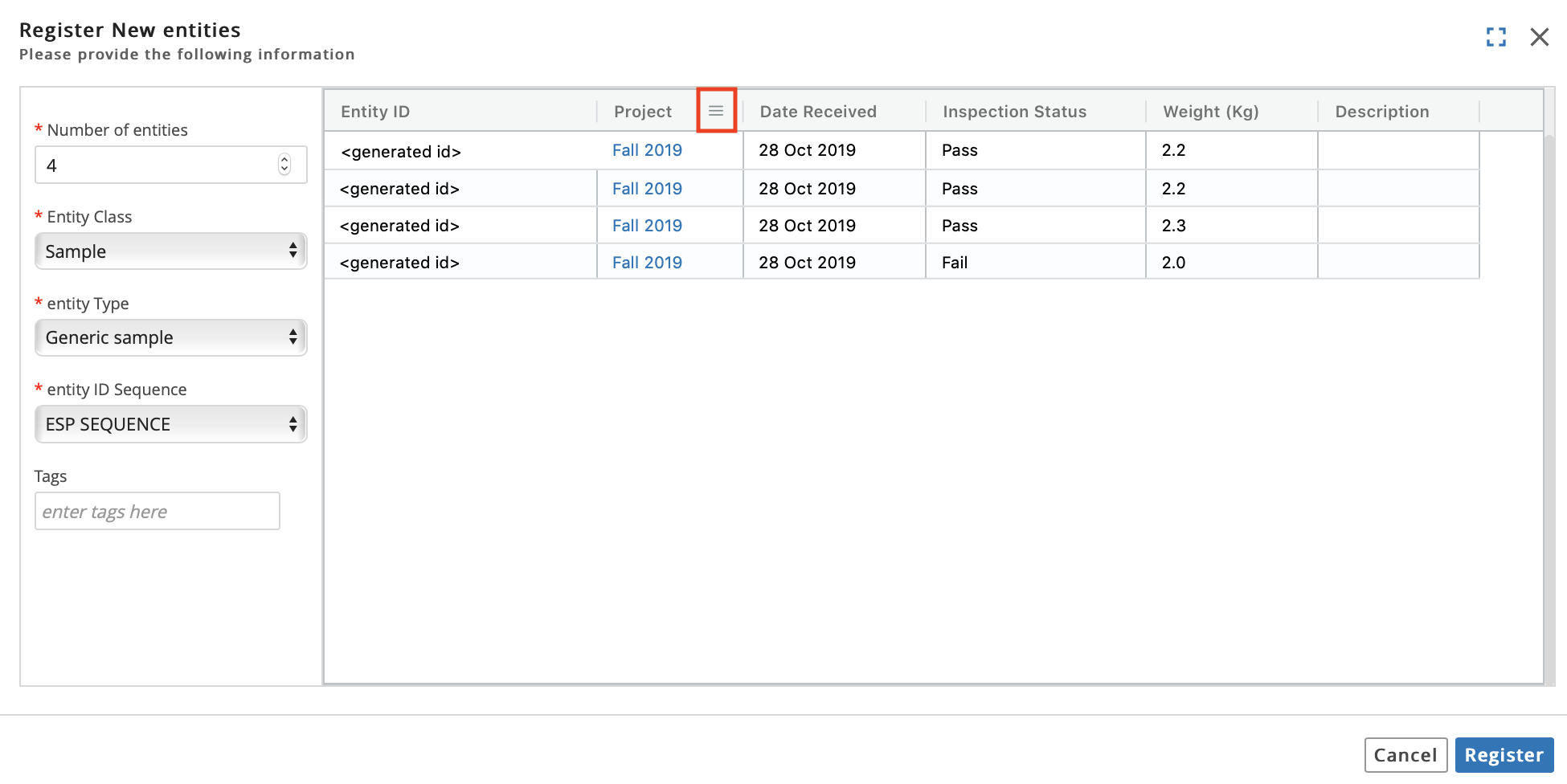
To assist with data entry when filling out the Register New Entities dialog, you can:
Shrink or enlarge a column by dragging the right border next to the column's name.

Rearrange the order of the columns by dragging and dropping a column's name.
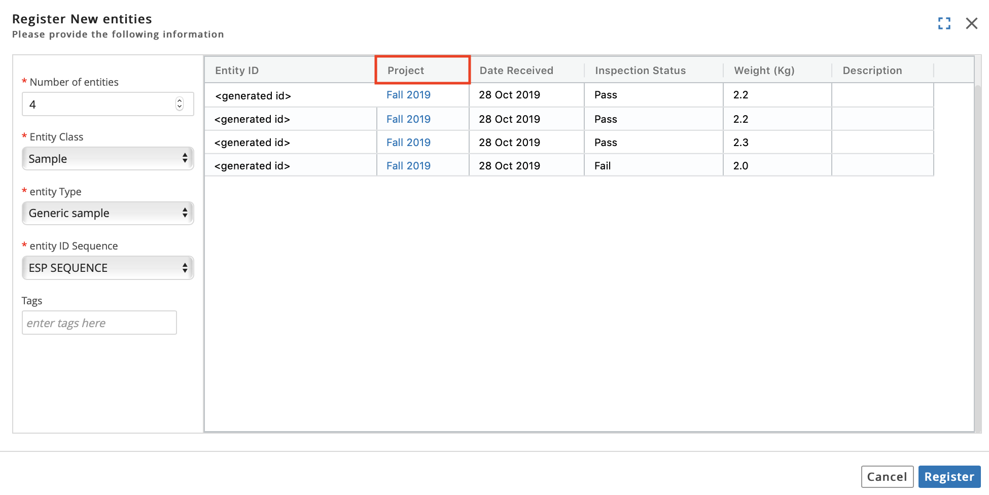
Pin columns, filter columns, and hide columns using the menu to the right of the column's name.
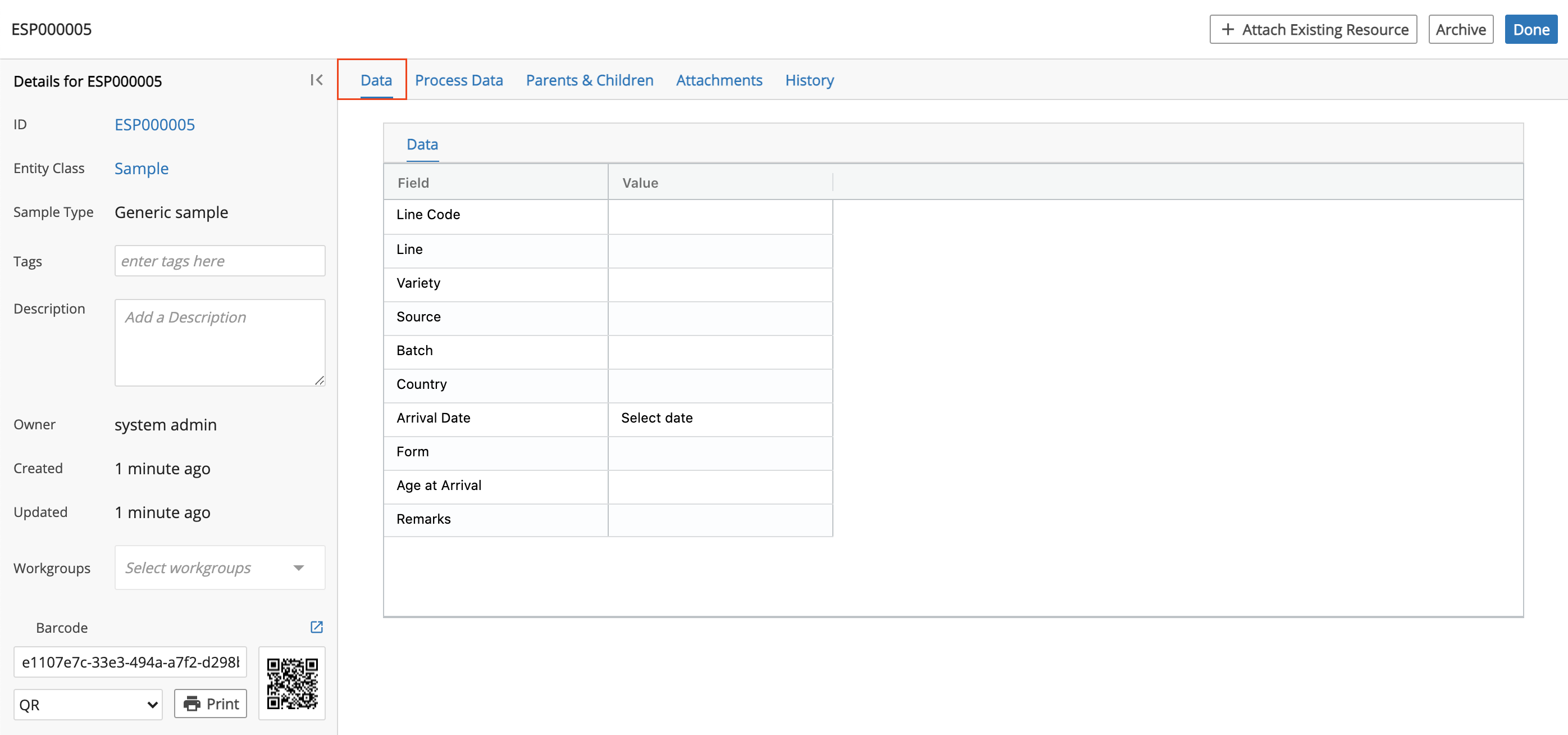
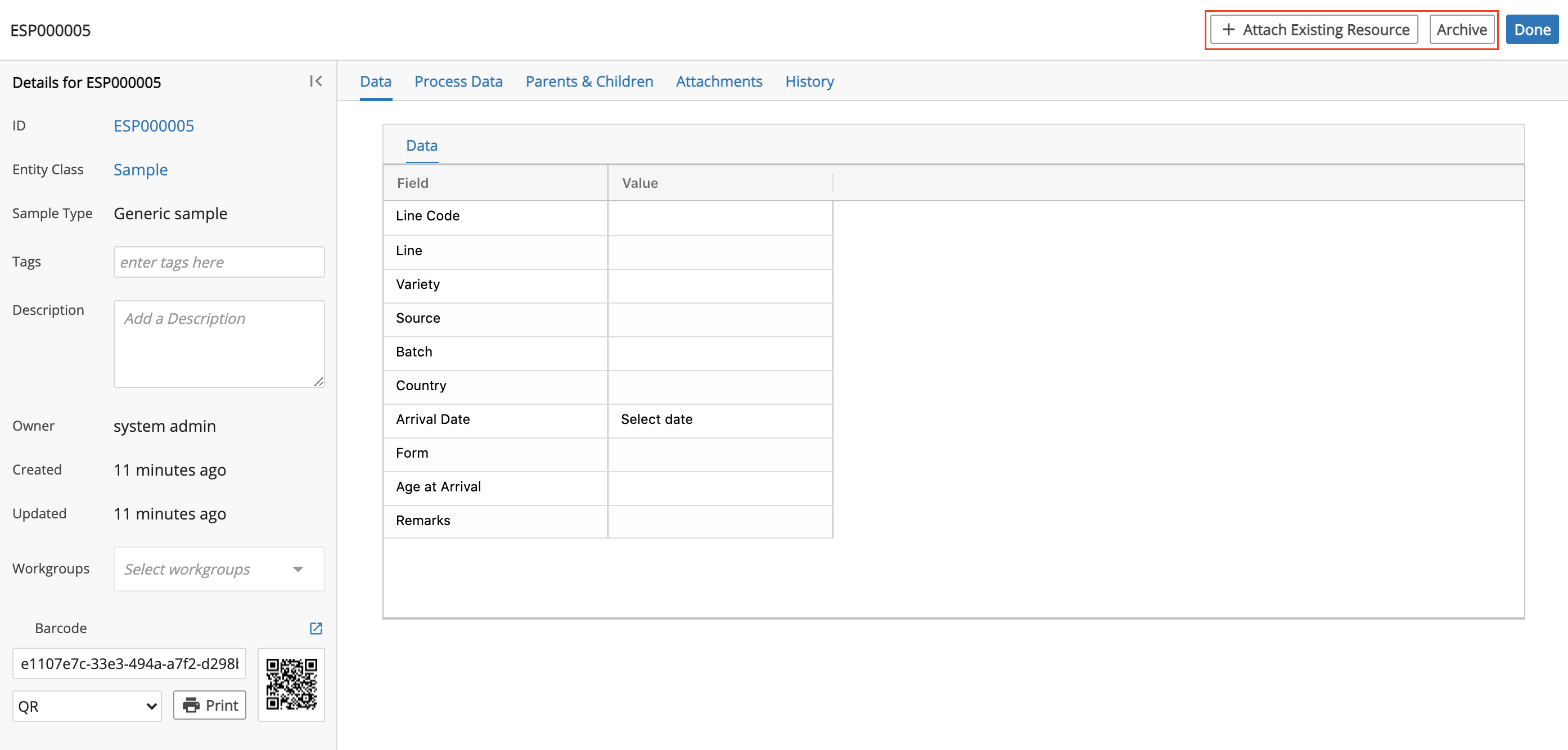
9.9.2. Entity Details Page
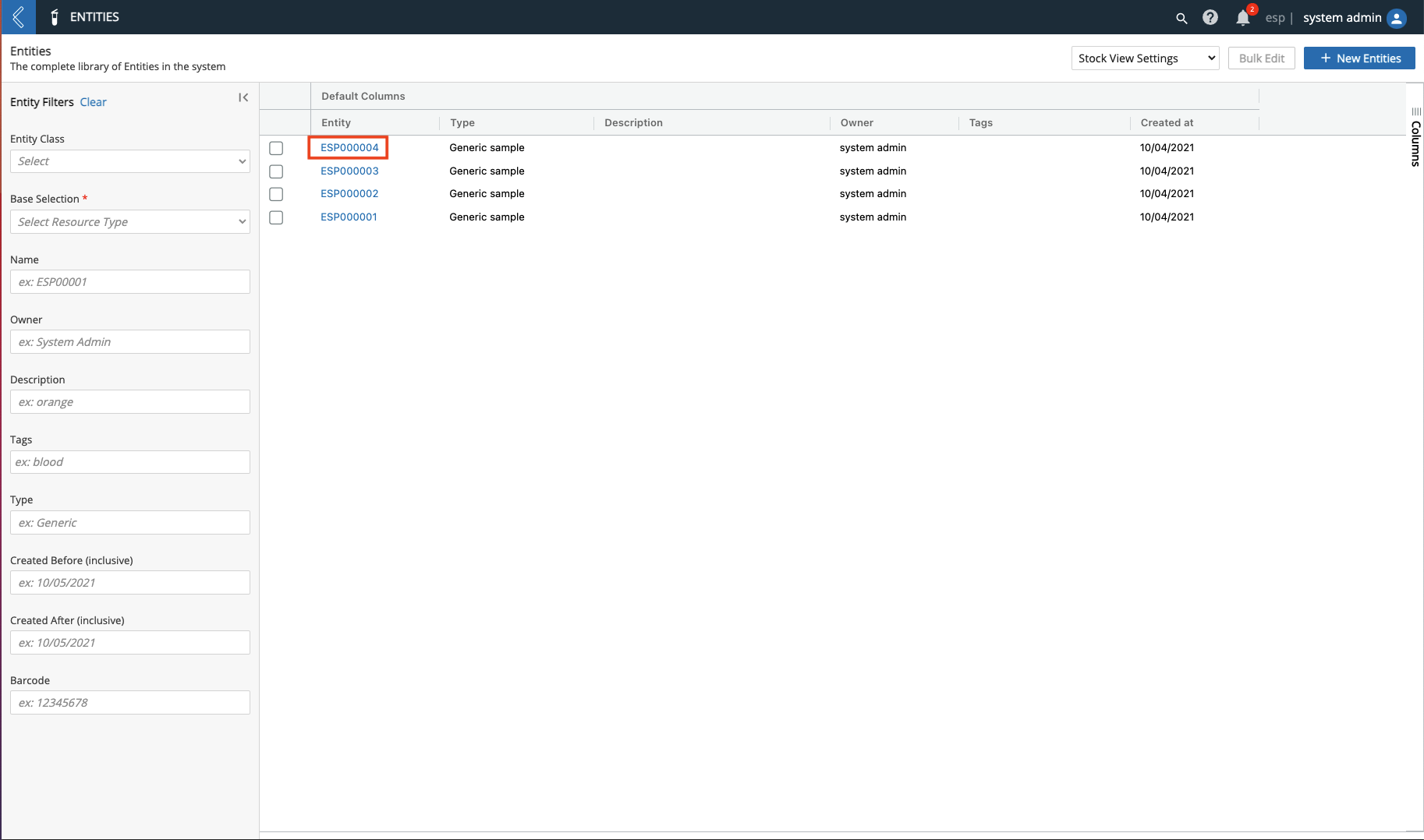
Click the Name of an Entity to access the details page.
The details page includes:
Associated details (i.e., Entity Name (ID), Entity Class, Sample Type, Tag(s), Description, Owner, Created, Updated, Workgroups, and Barcode).

You can print the associated Barcode using the Print button. You can change the display of the Barcode by selecting a display option (i.e., Mini Data Matrix, QR, or 1D) from the drop-down menu and then clicking the check icon.
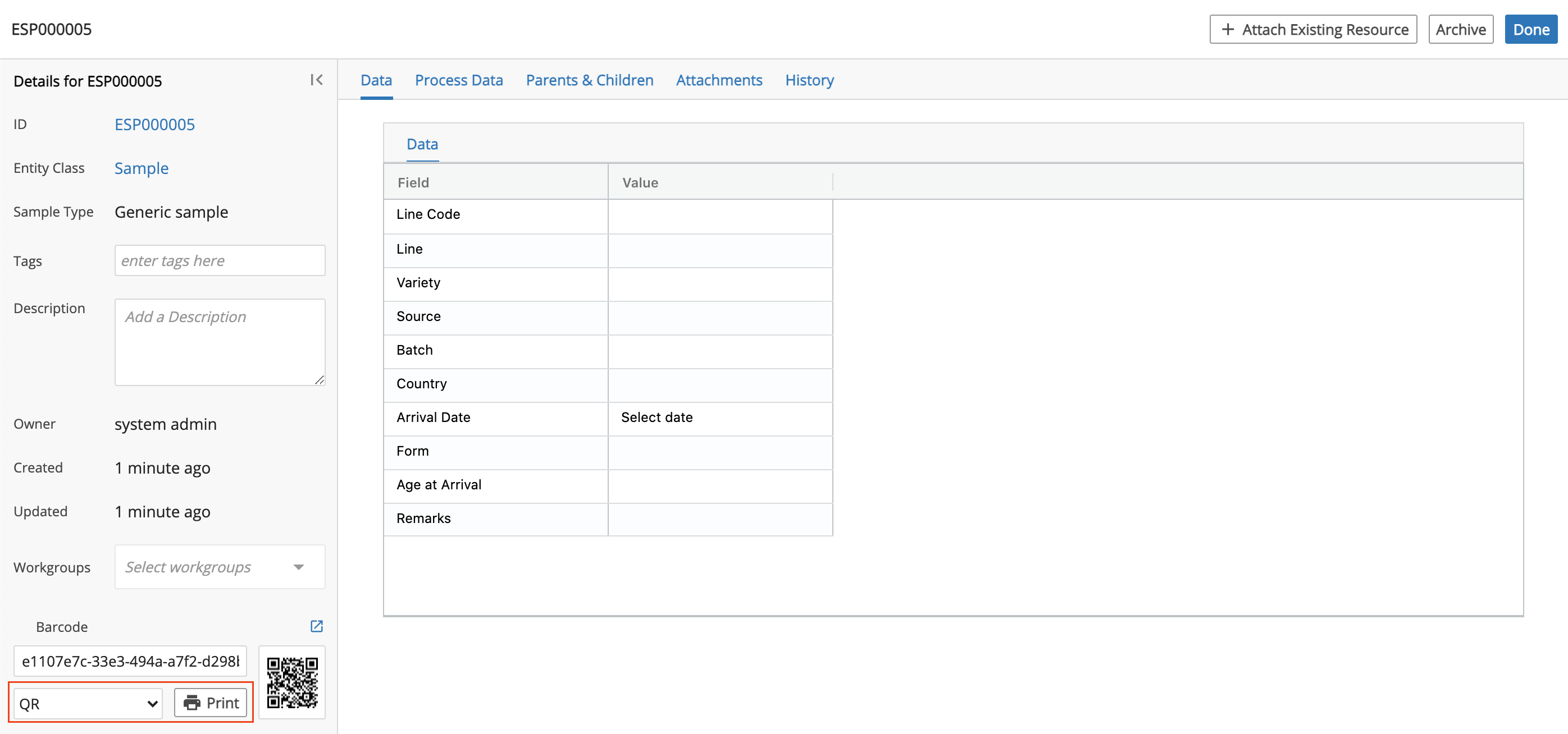
Data tab, which displays the Entity Type's data and metadata. If Var Grouping is set up for the Entity's Entity Type, then the Entity's Custom Field(s) are organized by Var Group.
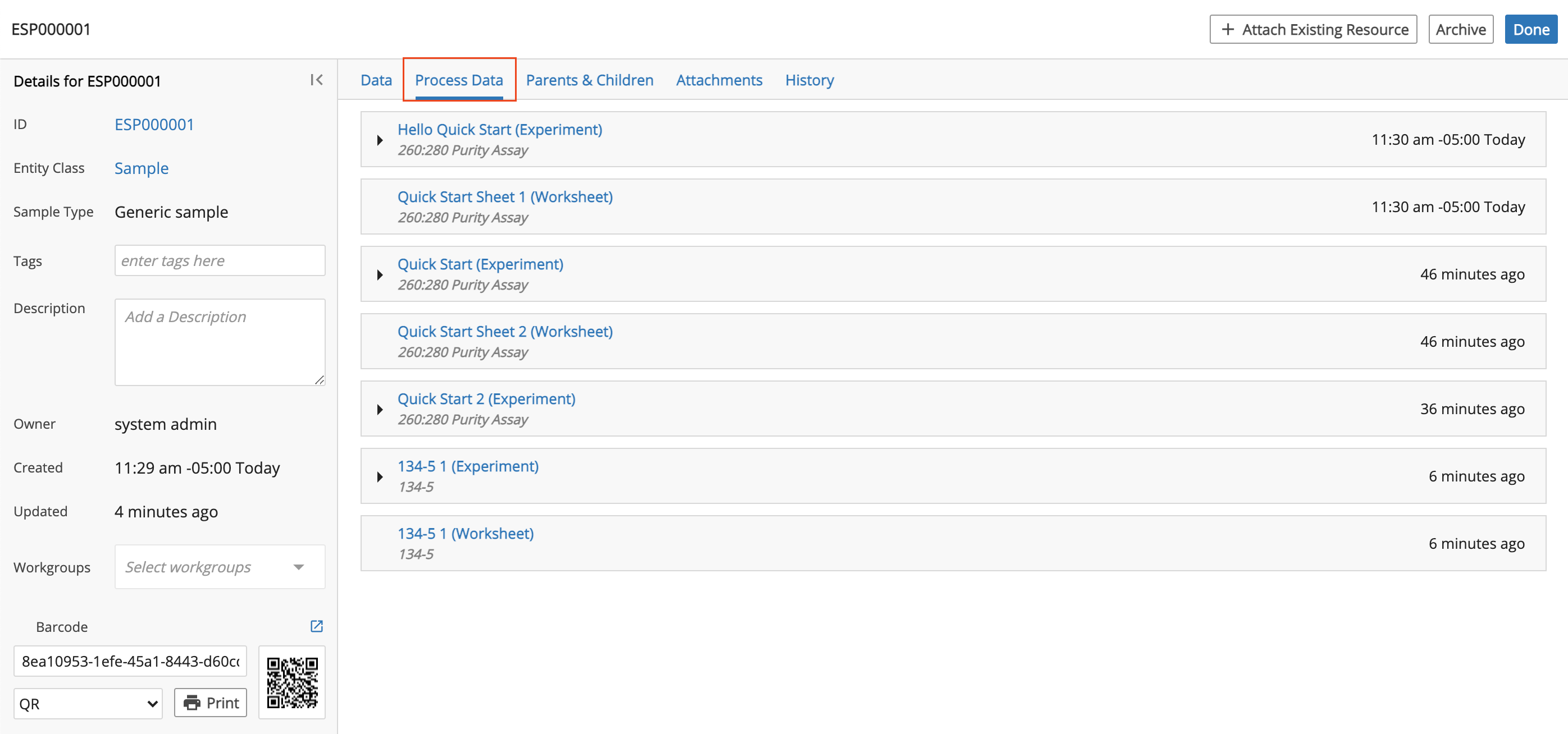
Process Data tab, which displays data collected.
Click the Name of an Experiment to access the Experiment's details page.
Click the row of an Experiment to view the associated Protocols and Worksheets that collected information about the Entity.
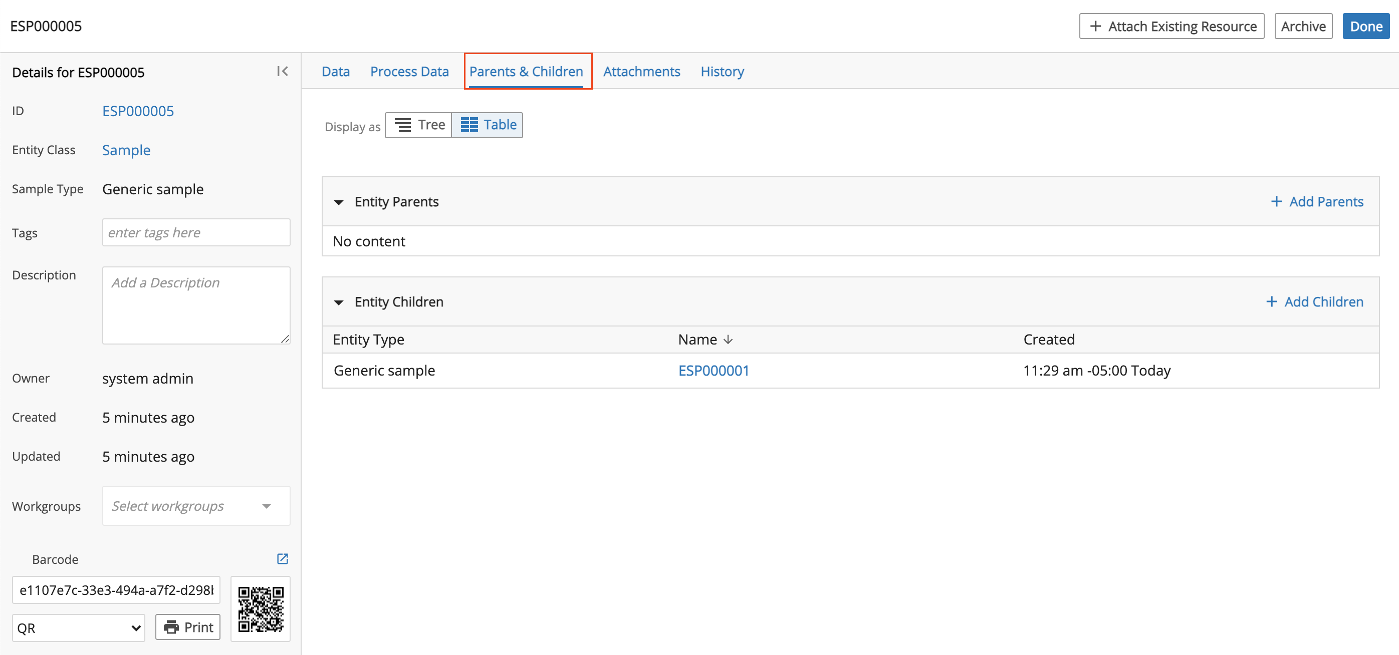
Parents & Children tab, which displays parent and/or child relationships to the Entity and allows you to manage the Entity's lineage.
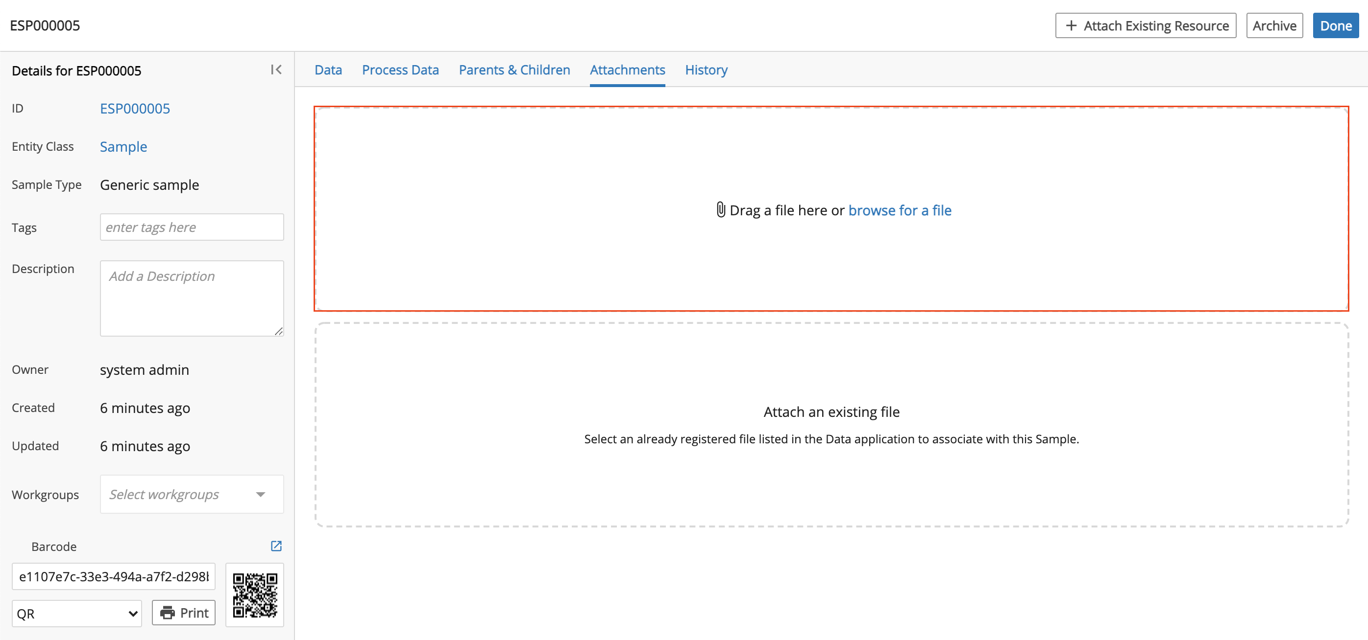
Attachments tab, which displays files associated with the Entity. You can view the files as well as delete the files.
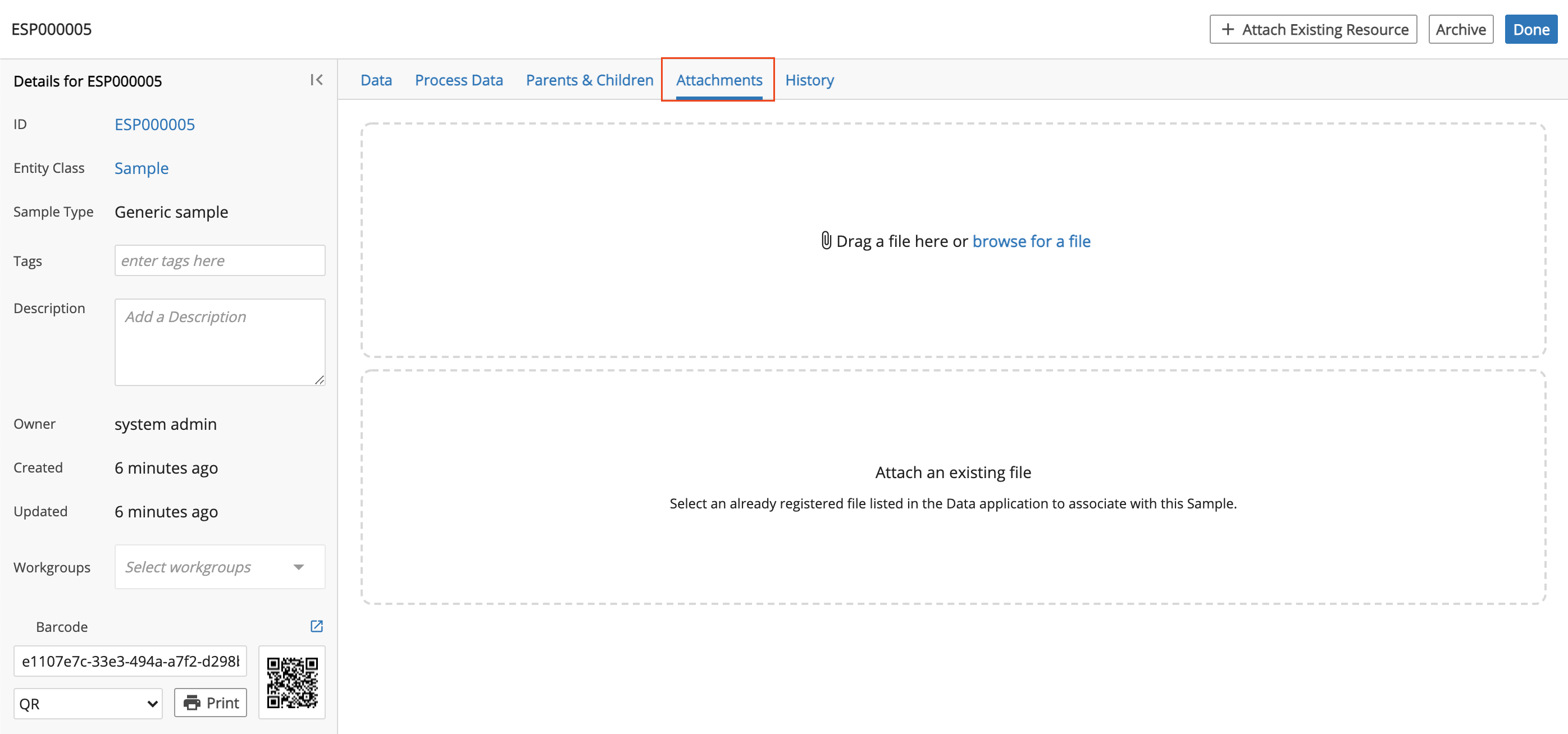
To upload a new file, you can:
Click Browse for a file.
Drag and drop a file.
Click the Drag a file here or browse for a file box to open and search for a file.
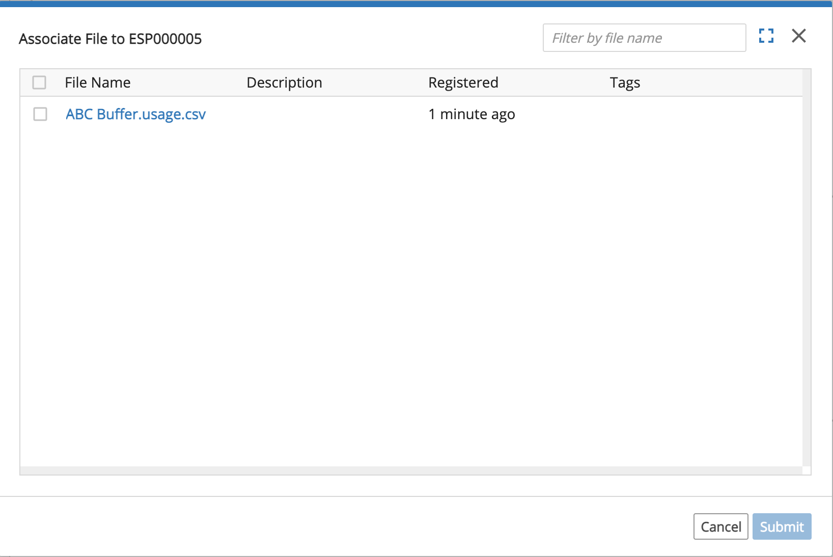
To attach a file already in L7|ESP:
Click the Attach an existing file box.
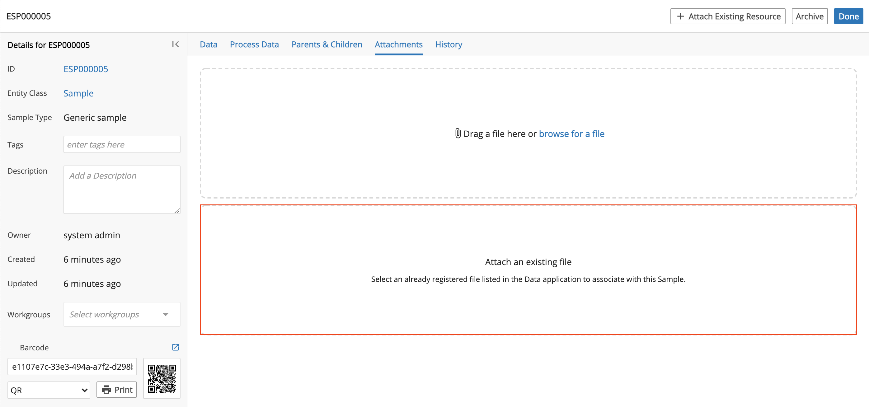
Check the box to the left of the file(s) to attach and then click Submit.
History tab, which displays a detailed account of all updates performed on the Entity.
+ Attach Existing Resource button, which allows you to link an Entity or File. * Archive button, which deletes the Entity from L7|ESP.
9.10. Projects App
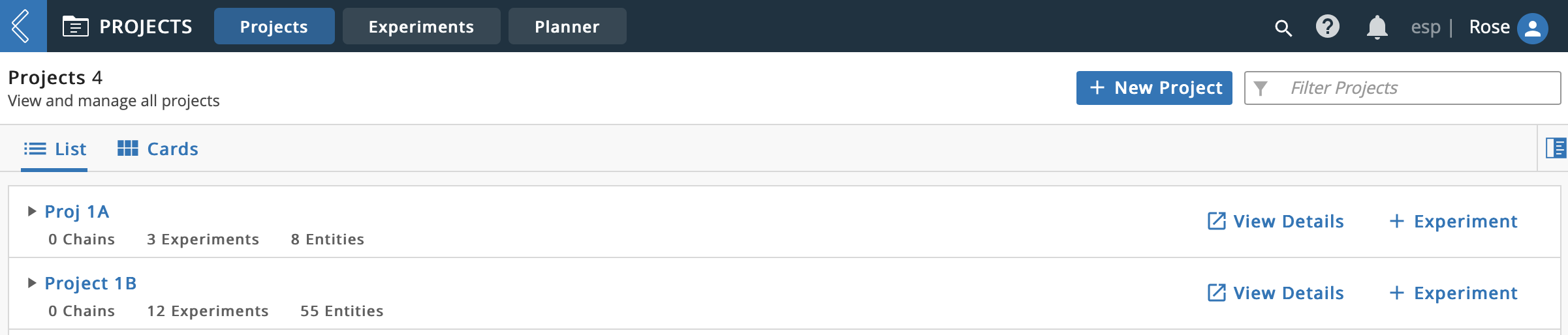
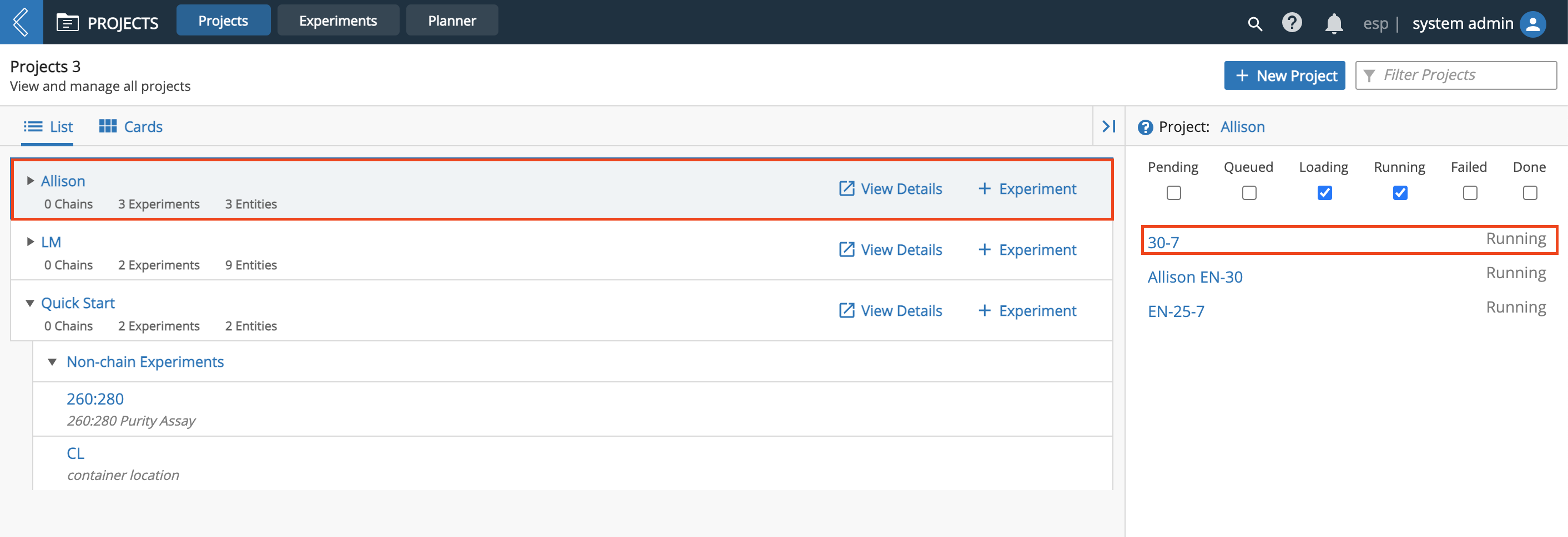
From the Home menu, open the Projects app. This directs you to the Project Library where each row represents a different Project. Click on a Project Name to reveal the Experiments in that Project.
The Projects app has three tabs: the Projects tab displays details of all Projects, the Experiments tab displays details of all Experiments grouped by Project, and the Planner tab is a tool used to view and manage a Workflow Chain plan, focusing on the visualization of Experiment dates and durations along their lifespans.
9.10.1. Create Project
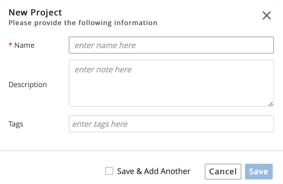
A Project is a collection of one or more Experiments, grouped together for organizational purposes. You must create a Project before creating an Experiment.
Click + New Project.

Enter a Project Name. Optional: Enter a Description and/or Tag(s).
Click Save.
9.10.2. Project Details Page
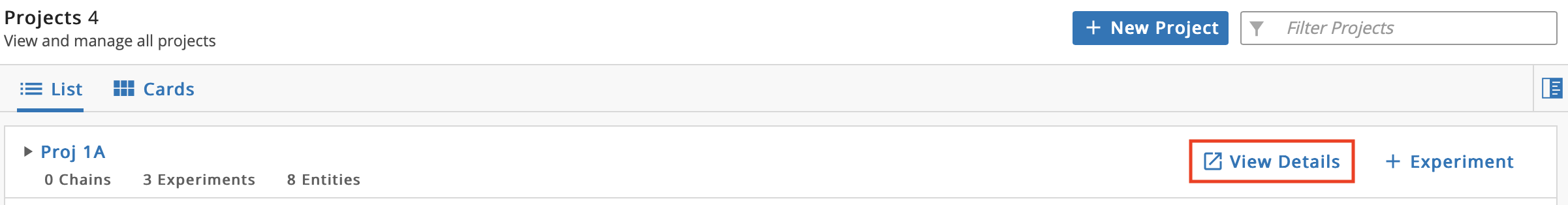
From the Projects tab, click View Details on the row of a Project to access the Project details page. All Experiments in that Project are displayed.
The Project Details page contains:
Details panel associated with the Project (i.e., Project Name, Description, Tag(s), Workgroups, Owner, Created, and Updated).
Chains tab, which displays the associated Workflow Chains. Click any node (circle) of a Workflow Chain to view the related submissions.
Experiments tab, which shows associated Experiment(s) and a visualization of the Protocol(s) that make up the Experiment's Workflow. Click the Name of an Experiment to access that Experiment's details page.
Samples tab, which shows the Entities in the associated Experiments. Click the Name of an Entity to access that Entity's details page, which contains information about the Entity and allows you to manage the Entity's lineage. The inspector on the left allows you to view and edit the Entity's meta-data.
History tab, which displays an audit trail of actions related to the Project (includes action owner and date the action was performed).
Export History button, which downloads an Excel file containing the Project's history in table format.
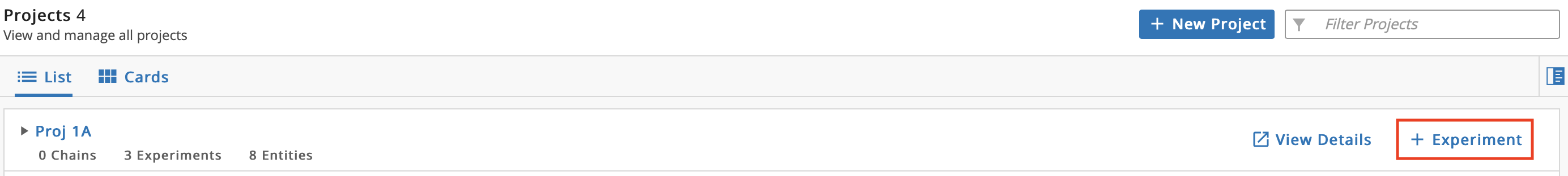
+ Experiment button, which allows you to add an Experiment to the Project by opening the New Experiment module.
9.10.3. Create Experiment
The New Experiment module is the main interface for submitting Entities to Workflows. Creating an Experiment allows you to select a Workflow or Workflow Chain, add Entities to the Experiment, and submit the Experiment to the LIMS app.
Experiments in L7|ESP are execution of a Workflow or Workflow Chain. The Workflow or Workflow Chain determines the data to gather.
Creating a new Experiment can be done with from the Projects or Experiments tabs.
From the Projects tab, on the row of the Project you want to add an Experiment to, click + Experiment.
From the Experiments tab, click + New Experiment. From the New Experiment window, selecting a Project to associate with the Experiment is required.

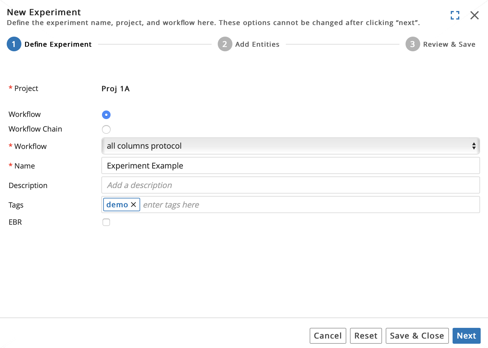
There are 3 steps. Complete 1 Define Experiment in the New Experiment module:
Select Project. If Experiment is created from Projects tab, this will be auto-filled.
Select from Workflow or Workflow Chain. Selecting a Workflow or Workflow Chain restricts the Worksheet to accept only Entities associated with that Workflow or Workflow Chain.
Select the associated Workflow or Workflow Chain. Only the Entity Type(s) defined in the selected Workflow or Workflow Chain will be available.
Enter a Name for the Experiment. Optional: Enter a Description and/or Tag(s).
Click Next.
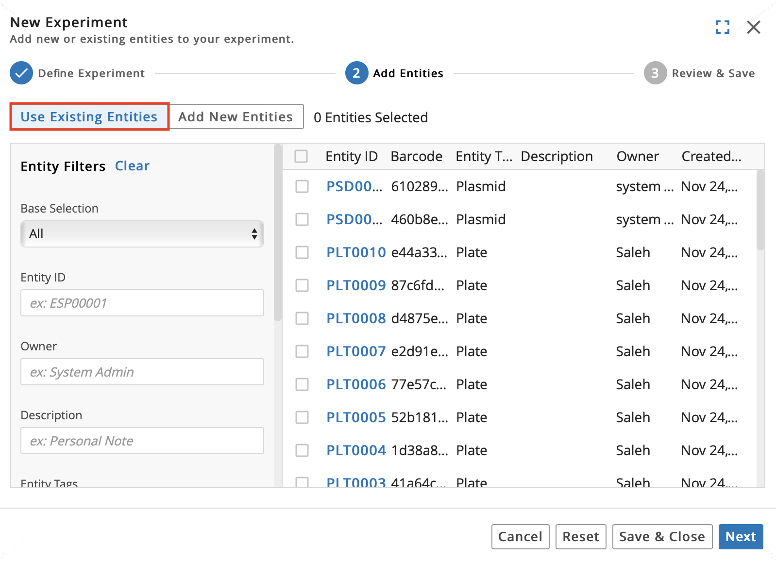
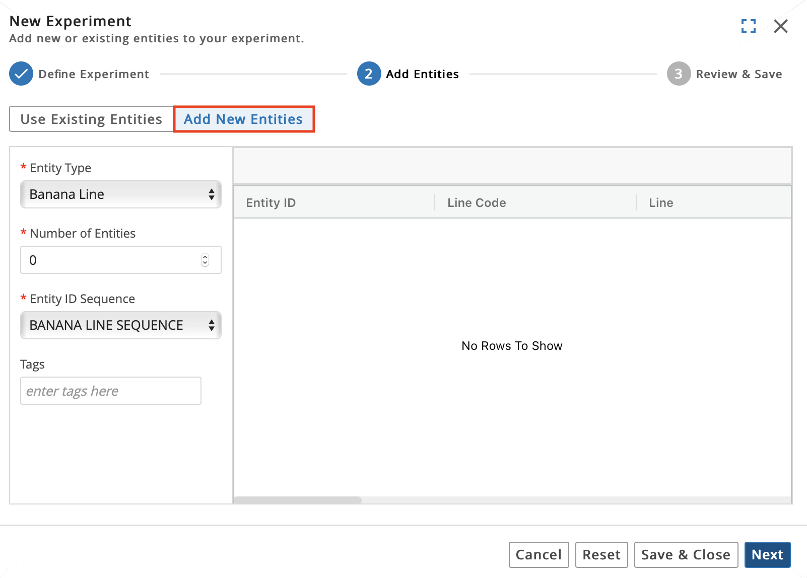
Complete 2 Add Entities in the New Experiment module:
Important
You have two options for adding Entities to the Experiment: you can Use Existing Entities, which pulls Entities that are already registered in the Entities app, or Add New Entities, which registers the Entities in the Entities app.
To Use Existing Entities:
Click the Use Existing Entities tab.
Check the box to the left of the Entities to add. You can use the Entity Filters to search filter and search for specific Entities.
To Add New Entities:
Click the Add New Entities tab.
Enter the Number of Entities to create.
Select an Entity Type. Every Entity in L7|ESP has an associated Entity Type. By default, L7|ESP has a Generic sample Entity Type. However, you can define your own Entity Types as well. Refer to Manage Entity Classes.
Select an Entity ID Sequence. The Entity ID Sequence is used to generate Entity names automatically as Entities are created.
Optional: Enter Tag(s).
Click Next.
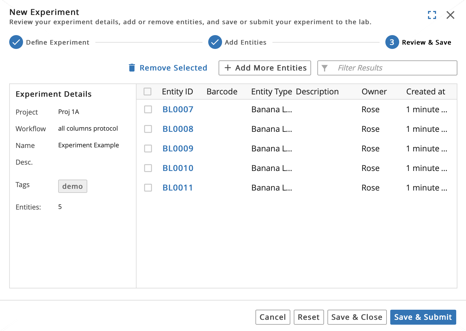
Complete 3 Review & Save in the New Experiment module:
Check the box to the left of the Entities you want to submit to the LIMS app for processing.
Click Save & Submit.
Click Submit Entities.
You have additional options such as:
Remove Selected, which removes selected Entities from the Experiment entirely.
+ Add More Entities, which returns you to 2 Add Entities in the New Experiment module.
Save and Close, which adds the Entities to the Experiment but does not submit the Experiment to the LIMS app for processing.
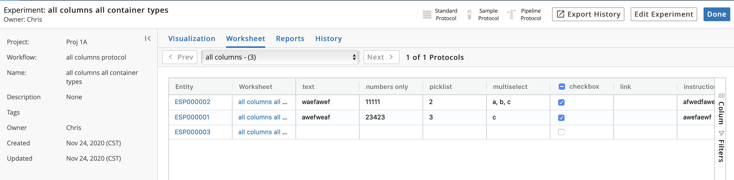
9.10.4. Experiment Details Page
From the Projects tab, click the row of a Project to open the Inspector panel. The Inspector panel lists the Experiment(s) associated with that Project. Click an Experiment Name to access that Experiment's details page.
The Experiment details page includes:
Details of the Experiment in the left panel (i.e., Project Name, Workflow(s), Version, Name, Description, Tag(s), Owner, Created, and Updated).
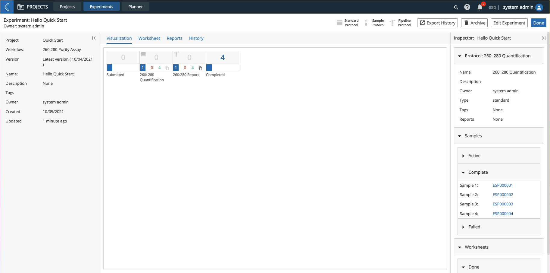
Visualization tab, which displays the Protocol(s) in the Experiment as well as the status of Entities in the Experiment as they move through the Workflow. Each Protocol is represented as one box. Click on a Protocol box to view associated details in the Inspector on the right such as Protocol data and Entities in that Protocol.
Worksheet tab, which displays a read-only view of the associated Worksheet for each Protocol, showing actual data recorded for each Entity in the Experiment. For Pipeline Protocols, the status of the Pipelines are also displayed, along with links to the Run Details page for completed Pipelines. Click Next (if available) to sequentially view the Worksheets (in the order of the Workflow) or select a Protocol from the drop-down menu to view that Protocol's Worksheet.
Reports tab, which displays the Reports generated during the course of the Experiment.
History tab, which displays an audit trail of actions related to the Experiment (includes action owner and date the action was performed).
Export History button, which downloads an Excel file containing the Experiment's history (i.e., all updates performed on the Experiment) in table format.
Edit Experiment button, which allows you to edit an Experiment's Name, Description, and Tag(s). If the Experiment has not been submitted, you can add and remove Entities.
9.10.5. Experiments Tab
Click the Experiments tab.
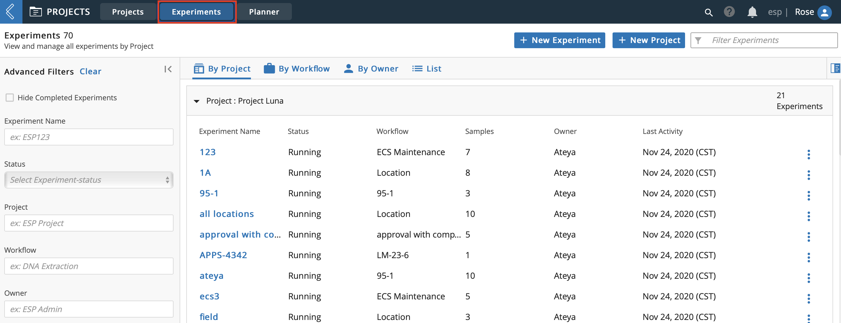
The Experiments tab includes:
Advanced Filters feature so you can locate specific Experiments. You can also check Hide Completed Experiments to further refine your search.
+ New Experiment button, which opens the New Experiment module.
+ New Project button, which opens the New Project dialog.
Additionally, you can use the center panel tabs to change how the Experiments are displayed. You can organize:
By Project.
By Workflow.
By Owner.
By a List
Regardless of how the Experiments are displayed, you can:
Click an Experiment Name to access the Experiment's details page.
Click the vertical ellipses on the row of an Experiment and then click Edit to access the Edit Experiment module.
Click the row of an Experiment to view associated details and Entities in the Inspector on the right. Clicking an Entity name opens the Entities details page.
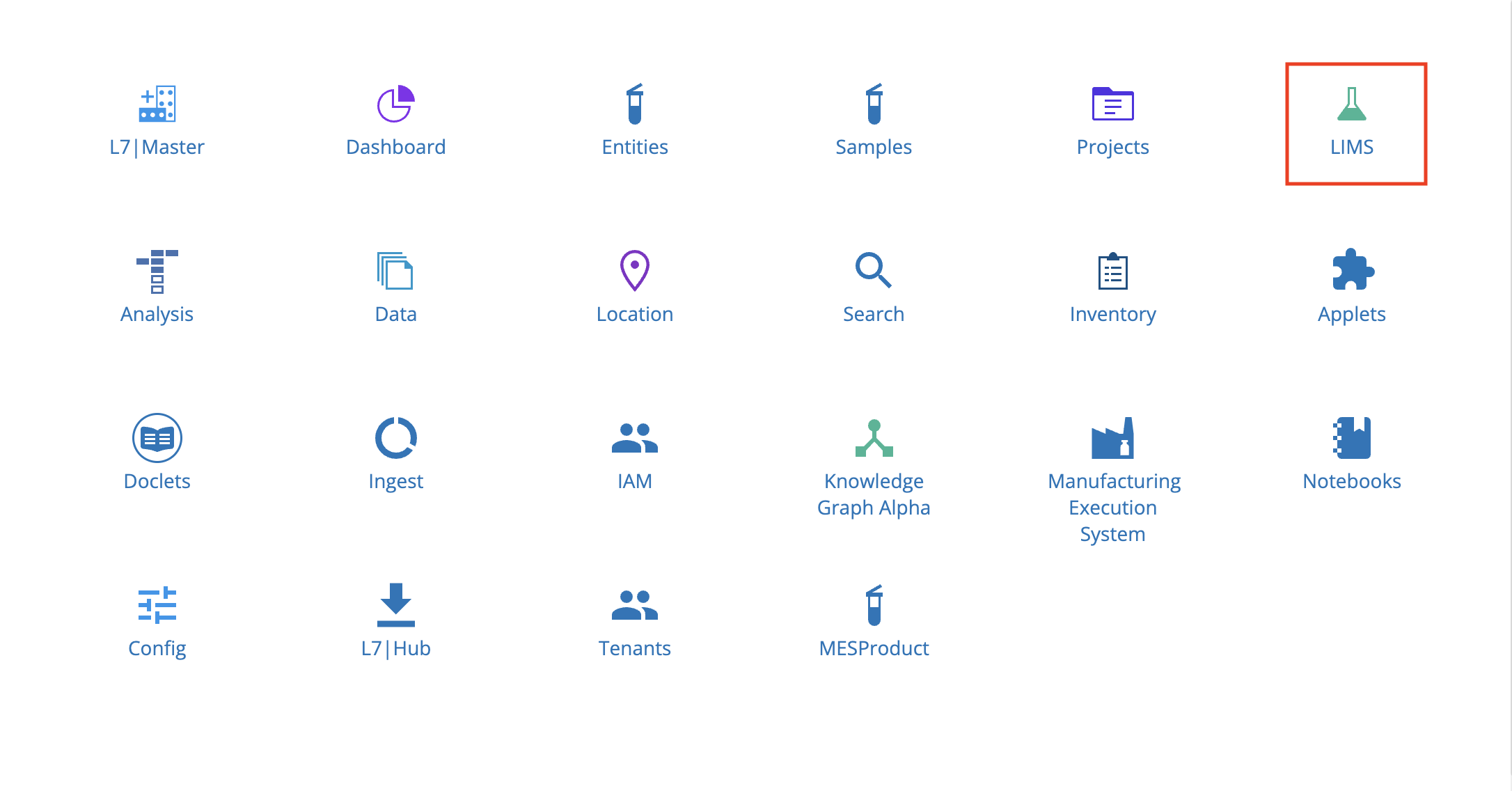
9.11. LIMS App
The LIMS app allows you to accept Entities and direct them through a Workflow and Workflow Chains. You can also view Experiments and Entities waiting to be processed, as well as create and fill out Worksheets.
The overall laboratory process flow in L7|ESP is separated by the types of actions that typically occur together. Experiment initiation and Entity creation/submission are handled primarily through the Experiments app. Entity processing (e.g., actually performing the experiment, recording information in LIMS, and launching Pipelines) is handled in the LIMS app. This division of labor reflects the fact that a scientist requesting an Experiment is not always the one performing the work. By separating submission and monitoring from data entry and Entity processing, L7|ESP allows scientists to keep track of their Experiments without interfering with the personnel performing the work.
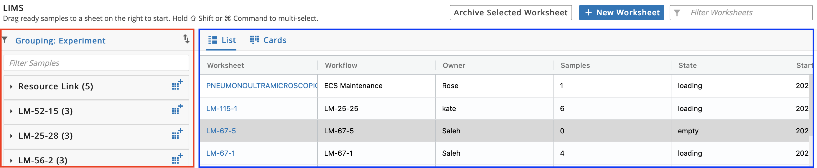
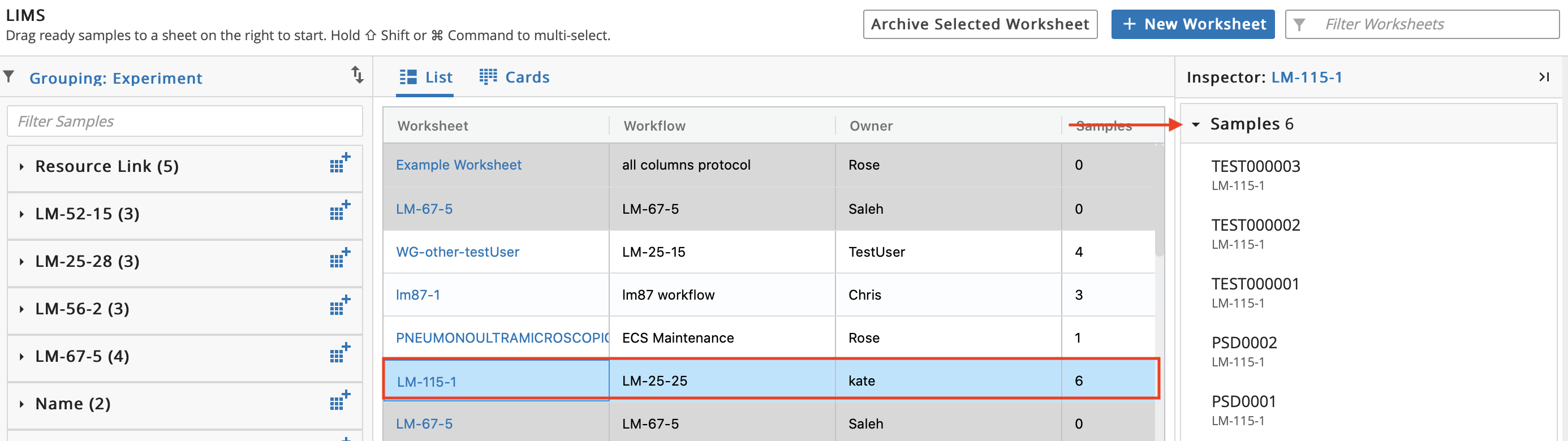
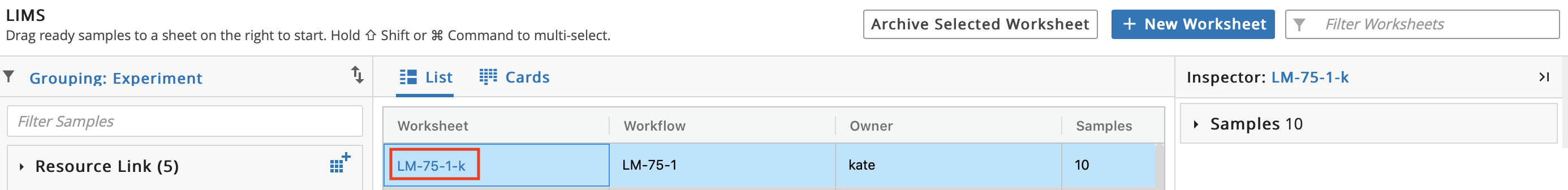
The LIMS page is divided into two sections: the left section (boxed in red) contains Experiments and the right section contains Worksheets (boxed in blue).
9.11.1. Create Worksheet
Entities to process together are grouped into a Worksheet. Worksheets are displayed as spreadsheets, with each Entity corresponding to a row, and each type of Entity data as a column. A Worksheet is used for data entry when processing Entities.
Because separate Experiments may rely on the same underlying Workflow, or because there may be more Entities in one Experiment than can fit on a given plate or chip, you can choose the Entities to include in a Worksheet. A subset of one Experiment's Entities can be assigned to a Worksheet, or Entities from multiple Experiments can be merged into one Worksheet.
There are two options to create a new Worksheet (filling out a Worksheet is how data is entered into L7|ESP). There is one Worksheet for each Protocol (the Protocol defines the Worksheet). Worksheets have Excel-like functionality.
Option 1: Click + New Worksheet.
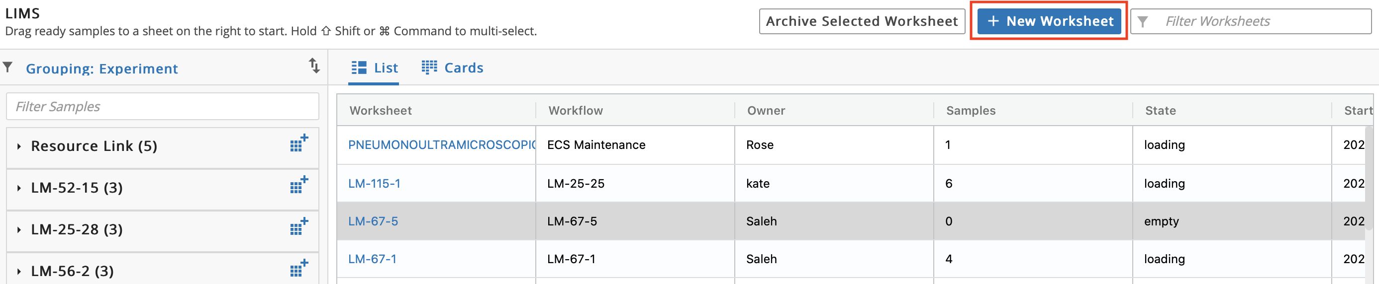
Enter a Name for the Worksheet.
Select a Workflow. Selecting a Workflow restricts the Worksheet to accept only Entities associated with that Workflow.
Click Add Worksheet.
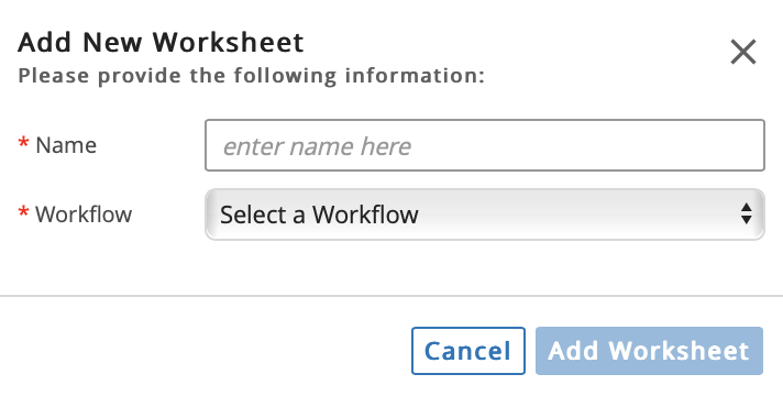
Observe that the new Worksheet is grayed out. This means that the Worksheet has no Entities.
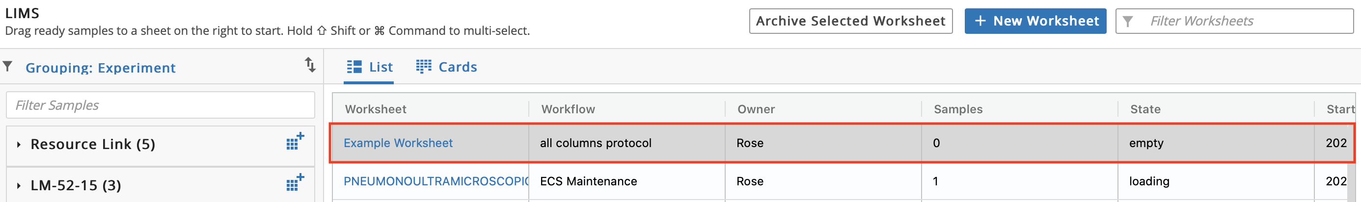
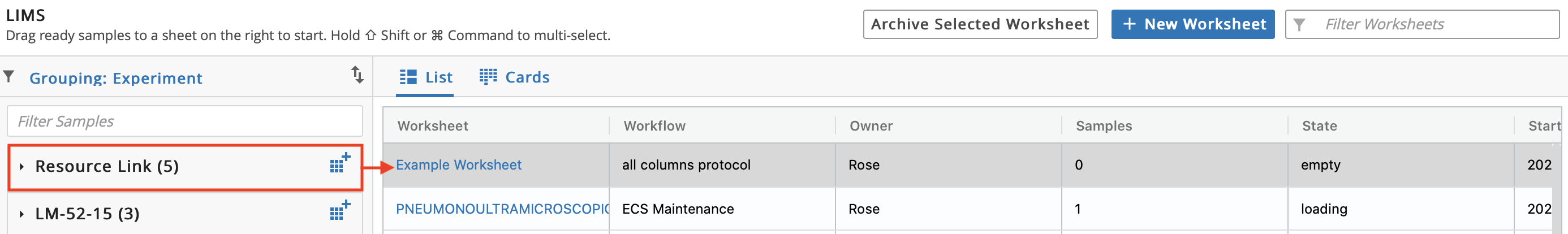
Option 2: From the left panel, click the icon next to the Experiment Name to create a new Worksheet, which automatically adds all Entities from that Experiment to the new Worksheet.
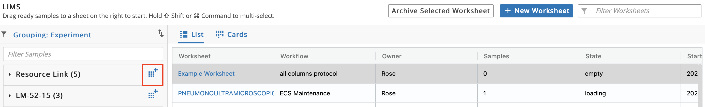
Observe that the Name and Workflow fields are already populated. Optional: Update the prepopulated Name.

9.11.2. Add Entities to Worksheet
There are two options to add Entities to a Worksheet.
Important
To add Entities, the Experiment and Worksheet must have the same Workflow. Additionally, you can only add Entities from Experiments that have been submitted.
Option 1: To add all Entities from an Experiment to a Worksheet, drag a queued Experiment from the left panel and drop on the Worksheet. Observe that the Experiment box disappears from the Experiments on the right. The right panel displays what is in progress.
Option 2: To individually add Entities from an Experiment to a Worksheet, click the arrow on a queued Experiment (left panel) to view the associated Entities. Drag and drop an Entity onto a Worksheet. Repeat as desired.
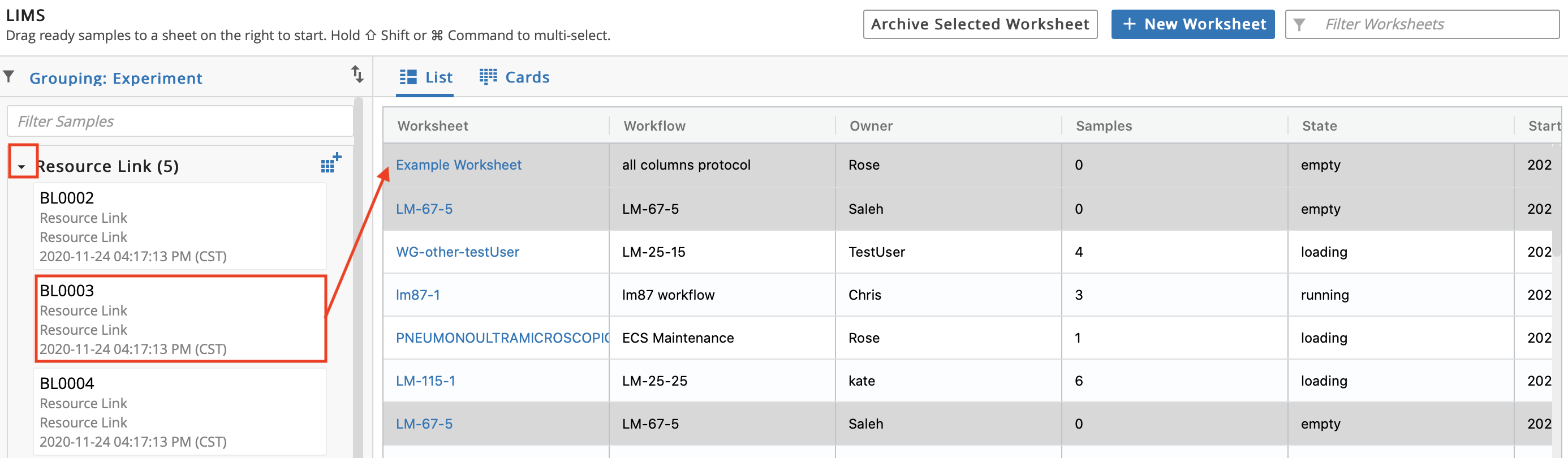
Click the row of a Worksheet to view the Entities that were added. (You can remove an Entity by hovering over it in the Inspector and clicking the x).
9.11.3. Data Entry/Process Entities
Click the Name of the Worksheet to begin performing data entry.
To perform data entry, fill out the columns in the Worksheet (columns are determined by the Protocol). To improve data entry, you can click the Transpose icon. When an Entity has progressed through the current Protocol, check the Complete button to advance it to the next Protocol.
For a Pipeline Protocol, click Start Pipeline for each Entity. Click Run in the Run Pipeline verification dialog. Note: A Worksheet must be filled out before the associated Pipeline can be ran.
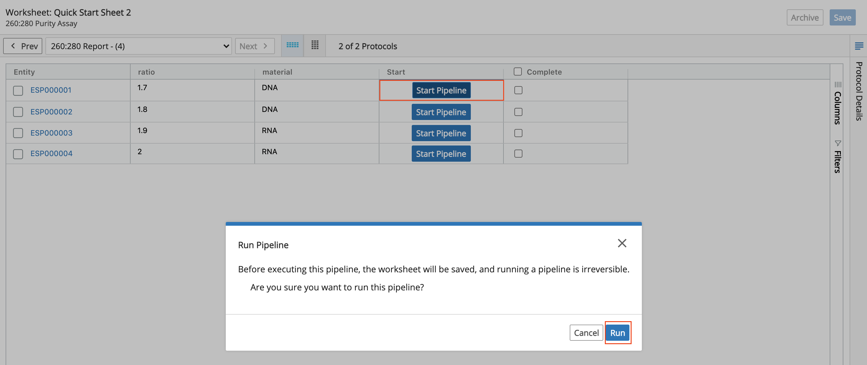
Entities can run simultaneously so click Start Pipeline and then Run in the Run Pipeline verification dialog for each of the remaining Entities. All Complete checkboxes will be checked and the Start column will say Done once the Entities are finished running.
To monitor Entities as they move through an Experiment, navigate to the Projects app. Click View Details on the the applicable Project row.
Note
Always click Save on a regular basis when filling out Worksheets. L7|ESP stores the history of all Worksheet data, but clicking Save is necessary to ensure data goes into the system. Saving also has the side effect of updating any values that may depend on the values in the edited cells. For example, Data Linked cells and Protocols that use grouping will update their values on Save.
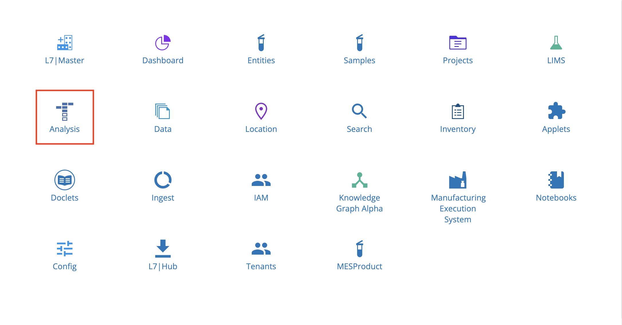
9.12. Analysis App
From the Home menu, click Analysis.
The Analysis app is used to:
Monitor Pipelines via the Monitor tab.
View and manage all Pipelines via the Pipelines tab.
Create Pipelines via the Pipelines tab.
View and manage all Tasks via the Tasks tab.
Create Tasks via the Tasks tab.
For more information on the Analysis app, including how to create Pipelines and Tasks, refer to L7|Master Guide.
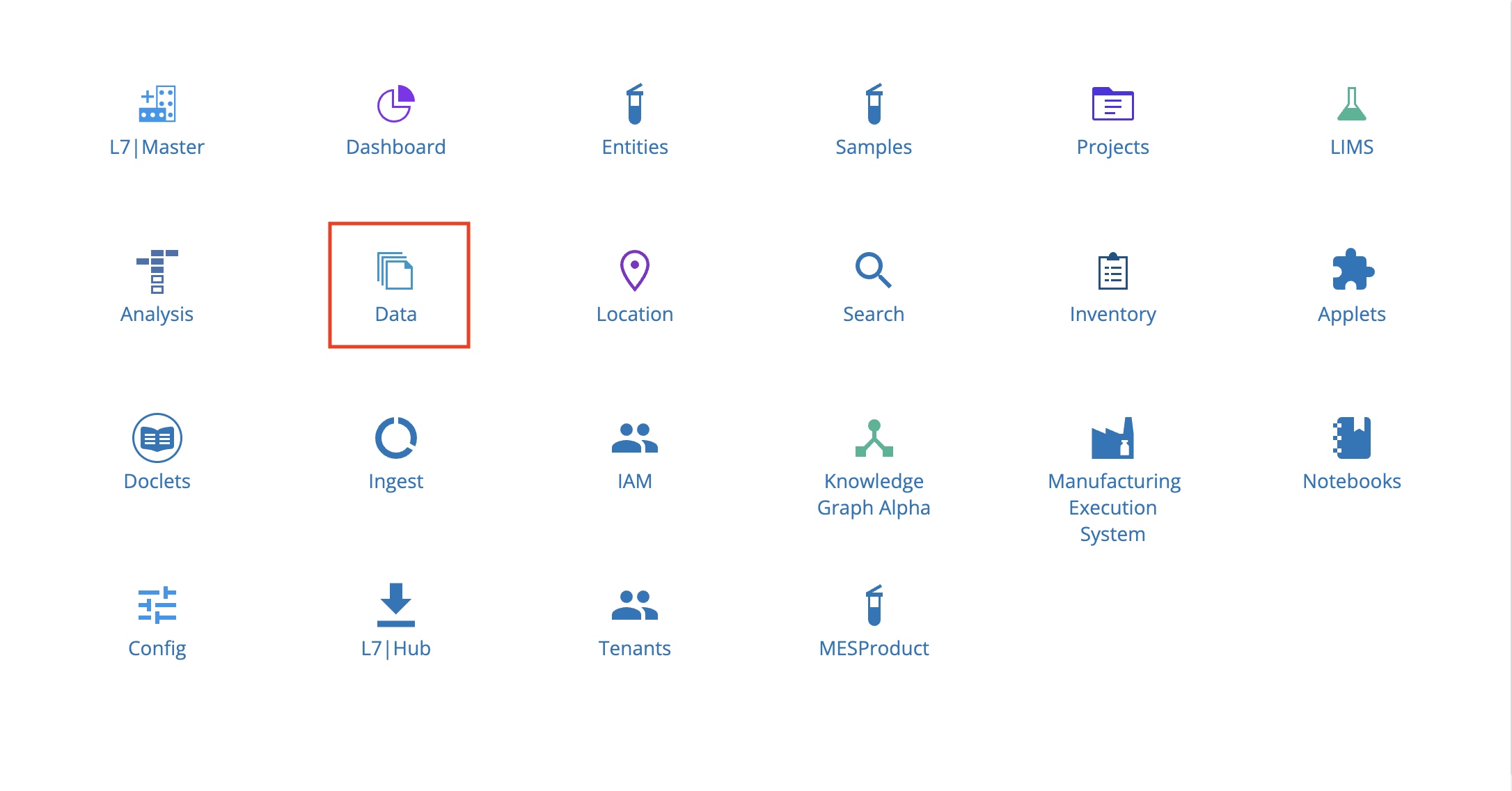
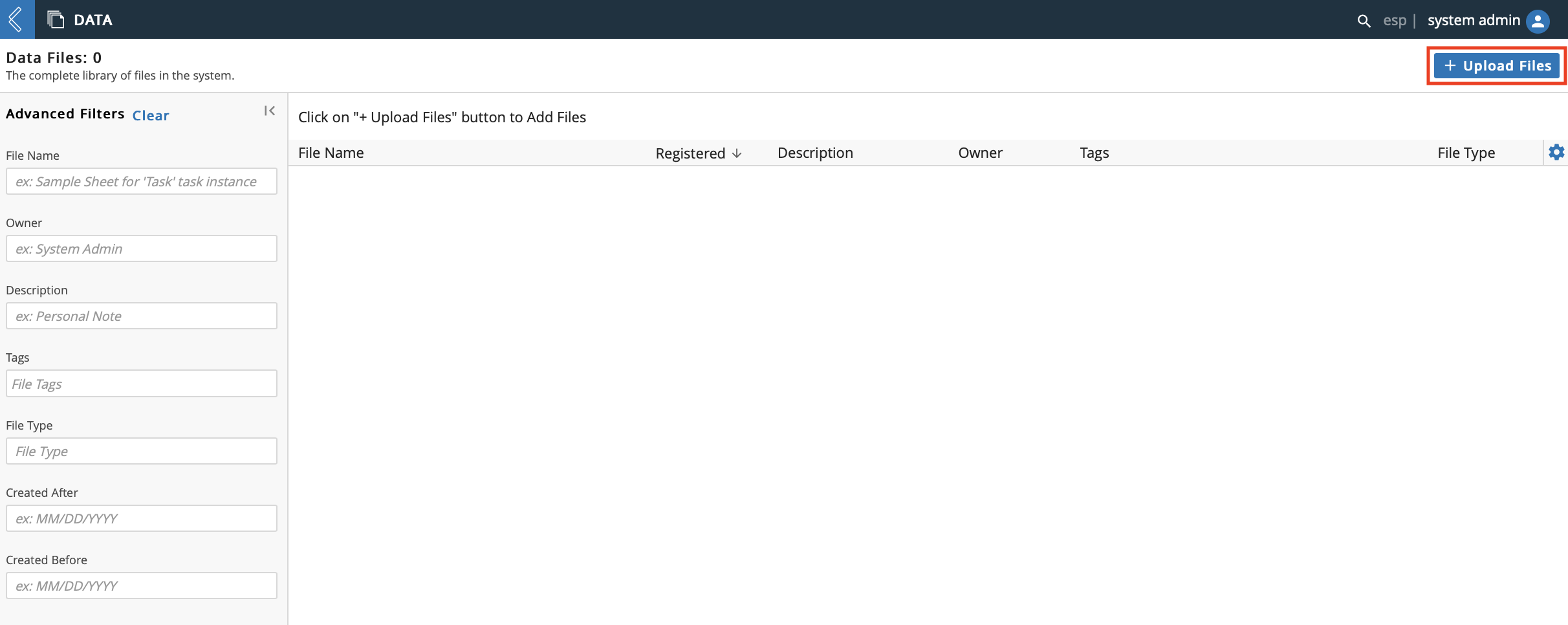
9.13. Data App
From the Home menu, click Data.
The Data app gives you complete access to all files in L7|ESP. Each file is made into three copies: job script (code), standard out, and standard error.
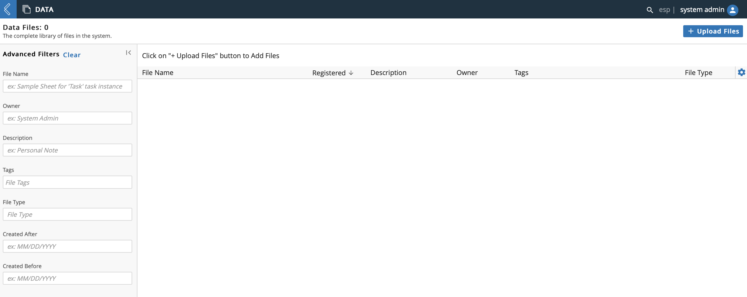
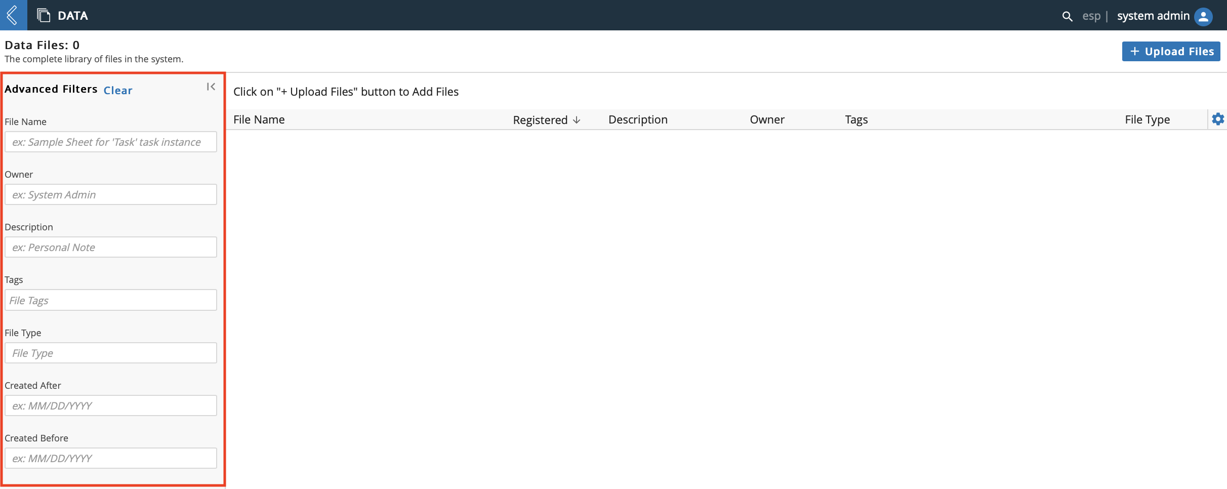
All files are searchable using the Advanced Filters feature. Filter results by File Name, Owner, Description, Tags, File Type, Created After, and Created Before.
9.13.1. Upload File
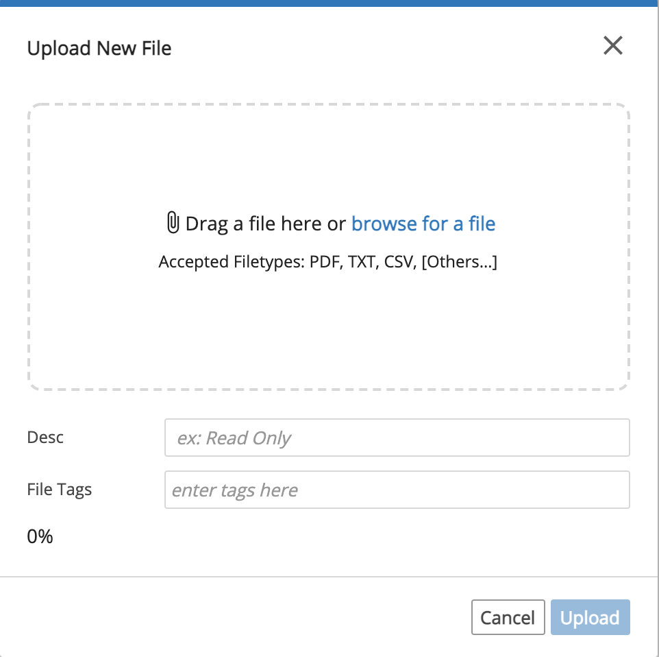
You can upload files directly to the Data app for retention by clicking + Upload Files. Most file types are supported such as PDF, TXT, CSV, etc.
In the Upload New File dialog, drag and drop a file or browse through your computer to select a file. Optional: Add a Description and/or File Tag(s). Click Upload.
9.13.2. File Details Page
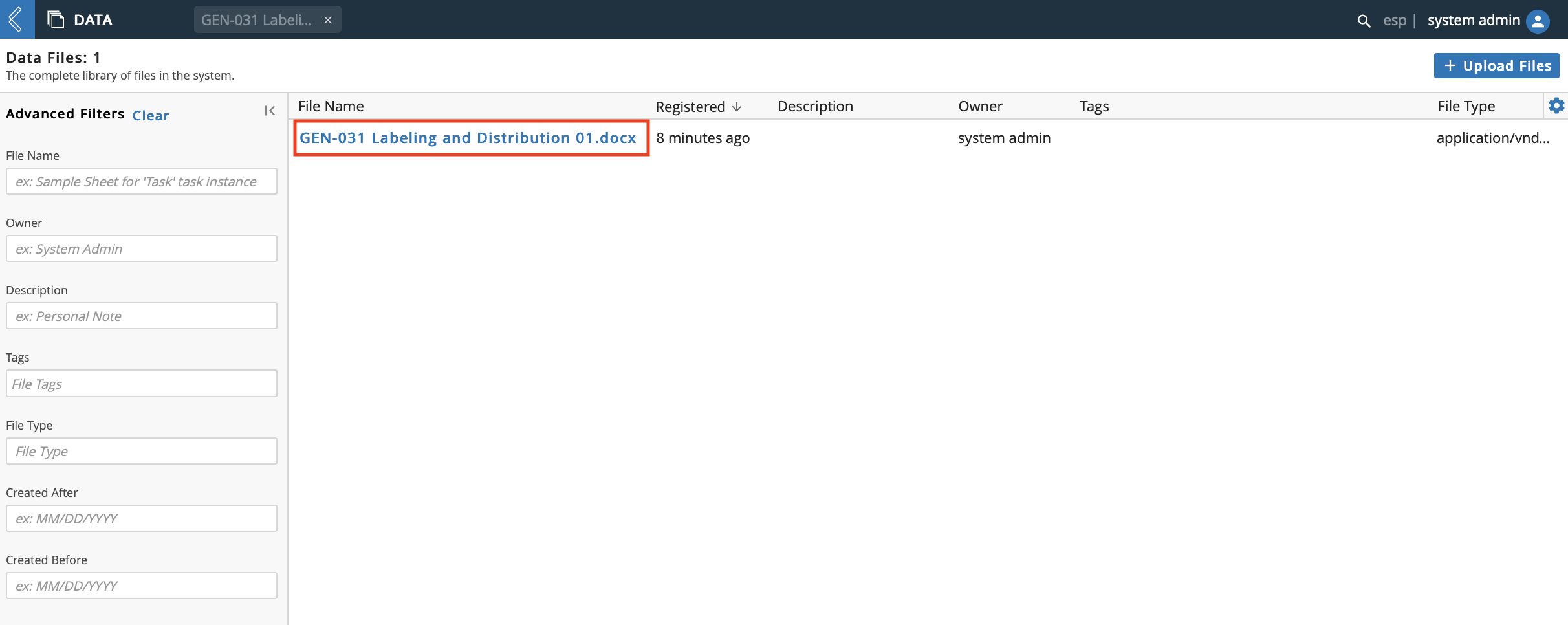
Click on a file name to view the file details.
The left panel displays details of the file, specifically: File Name, File Size, Owner, Tags, Description, and Registered time/date. The Tags and Description fields are editable.
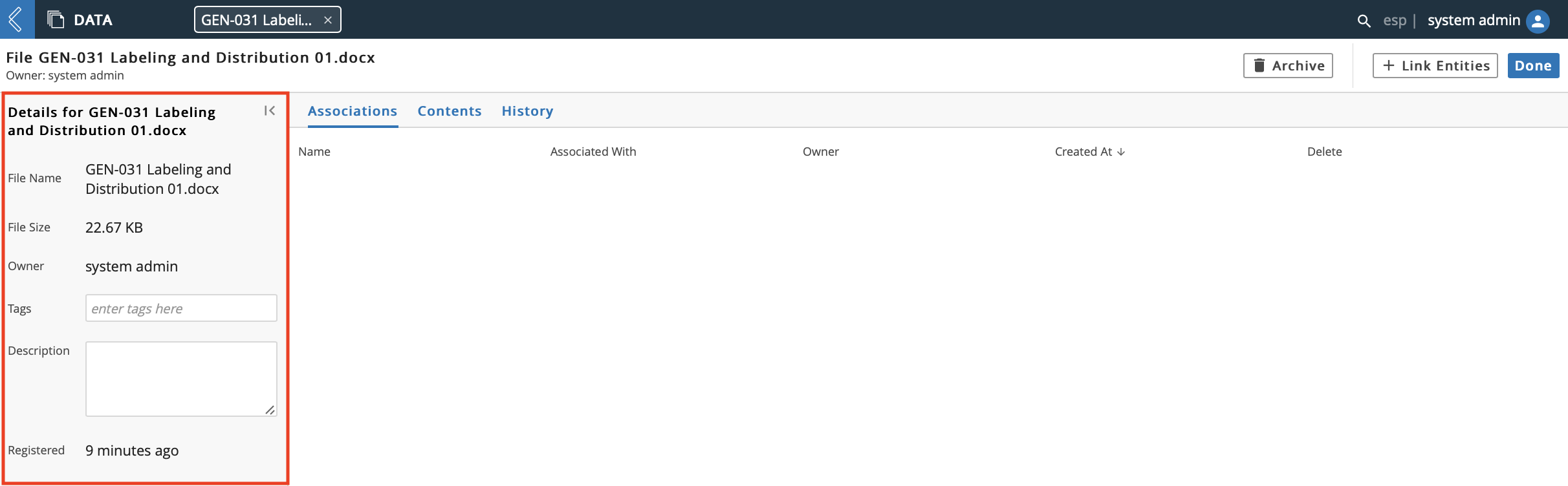
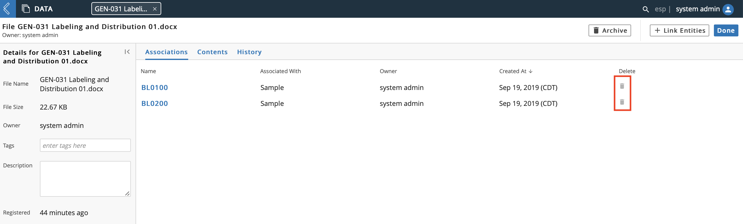
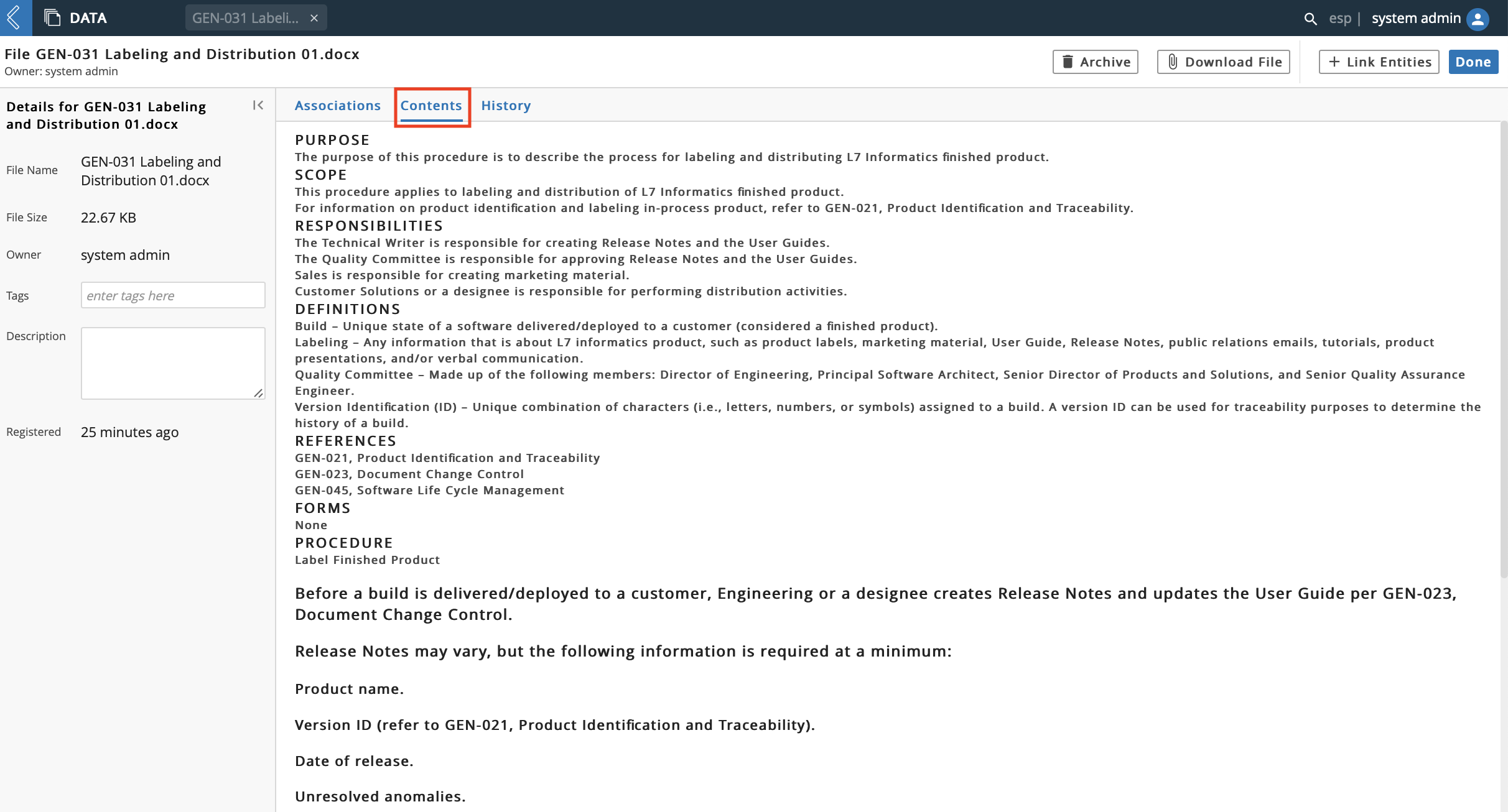
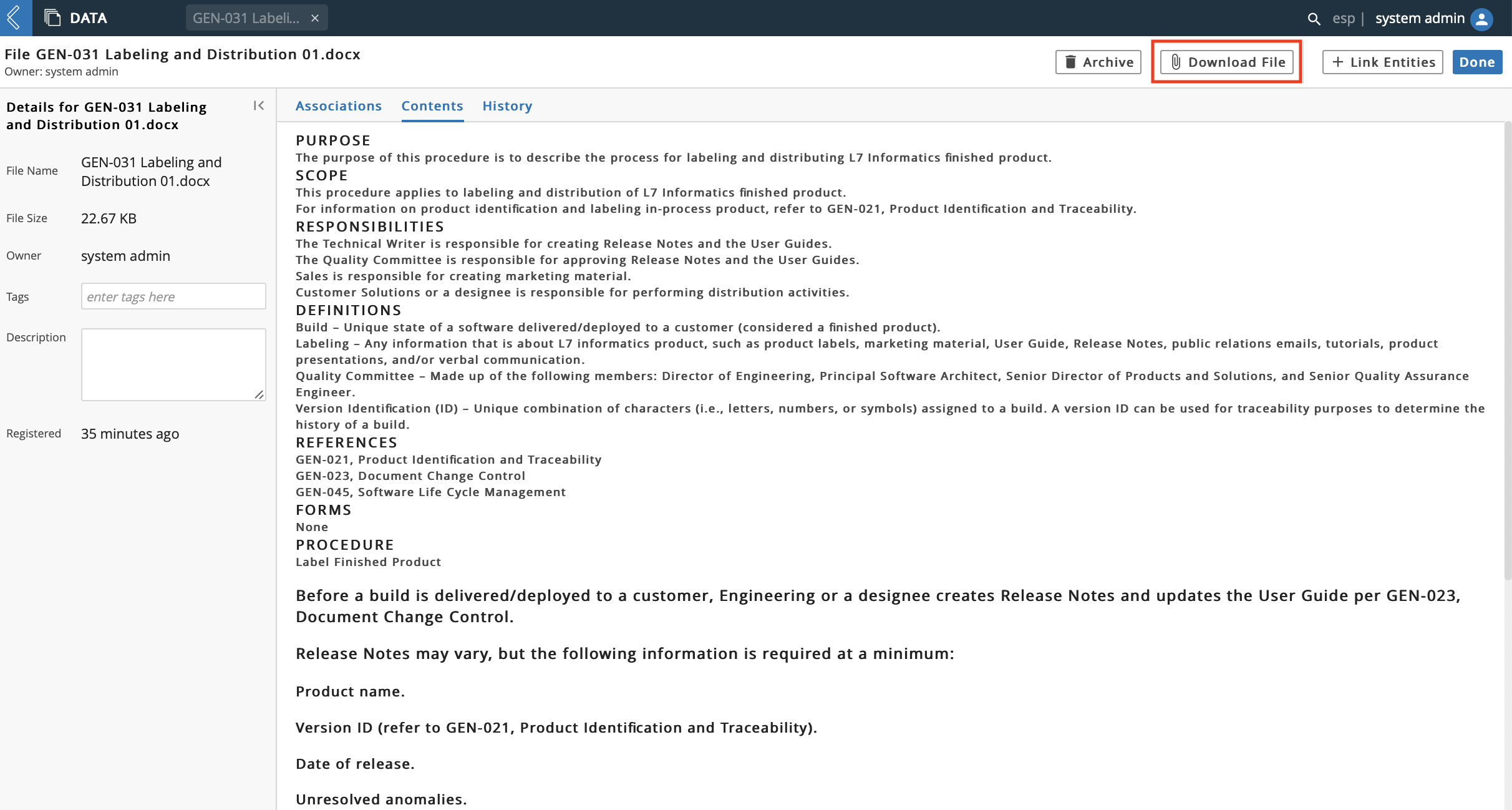
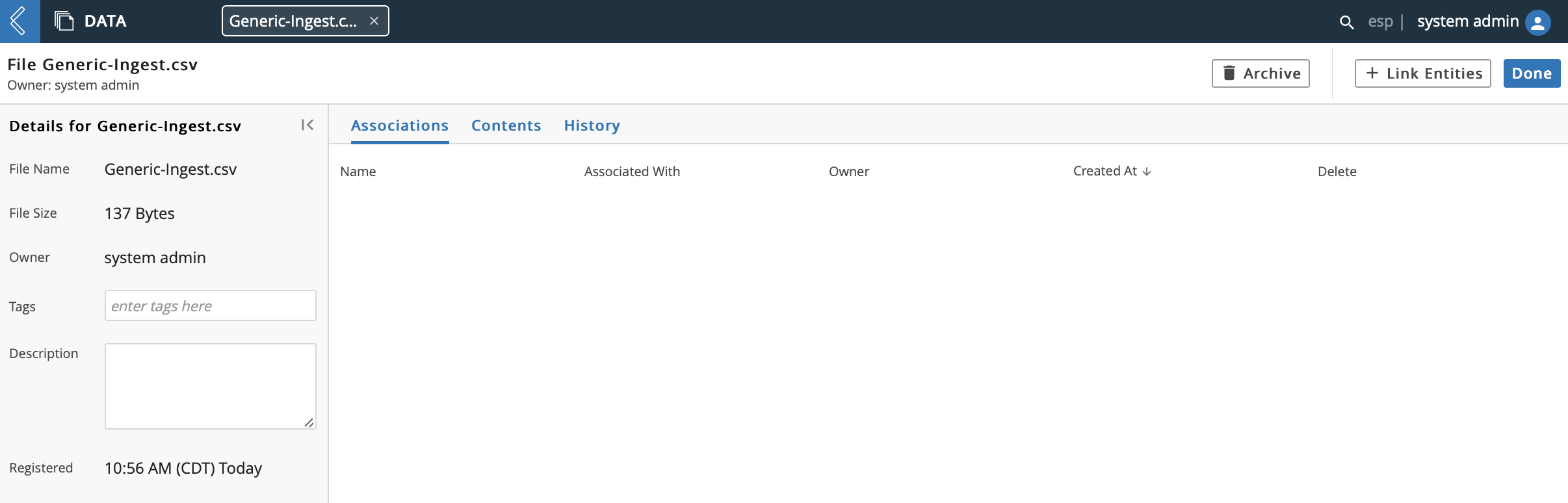
The center panel has tabs for Associations, Contents, and History.
The Associations tab displays associated Resources.
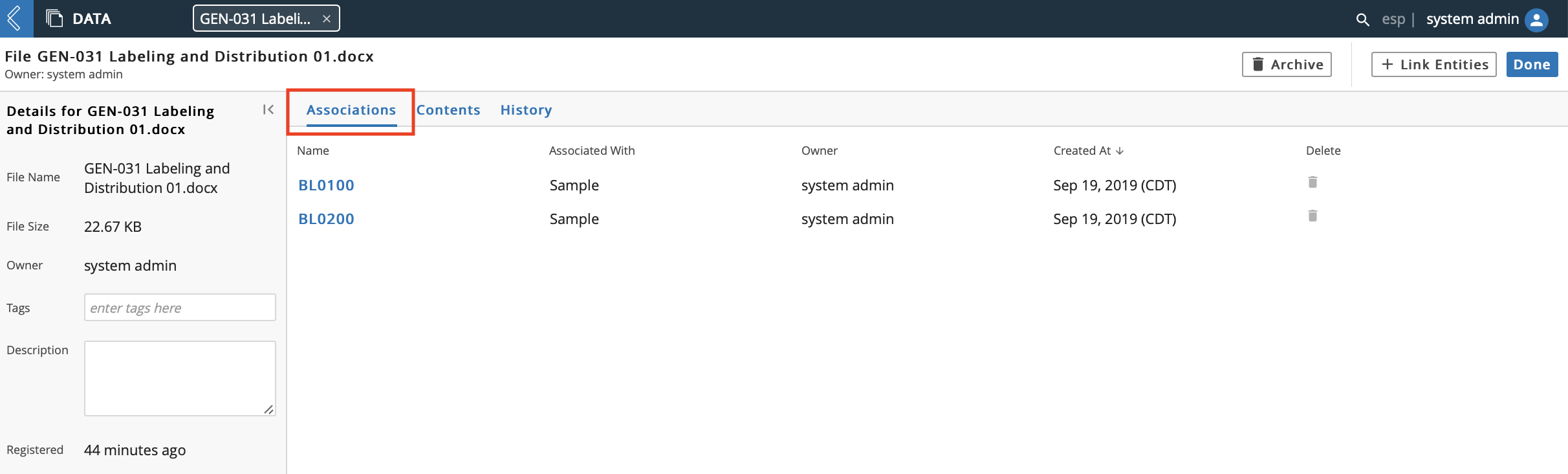
From the Associations tab, you are able to Delete associated Resources.
The Contents tab displays the file's contents in a text format.
From the Contents tab you can Download File, which downloads the file in its original format.
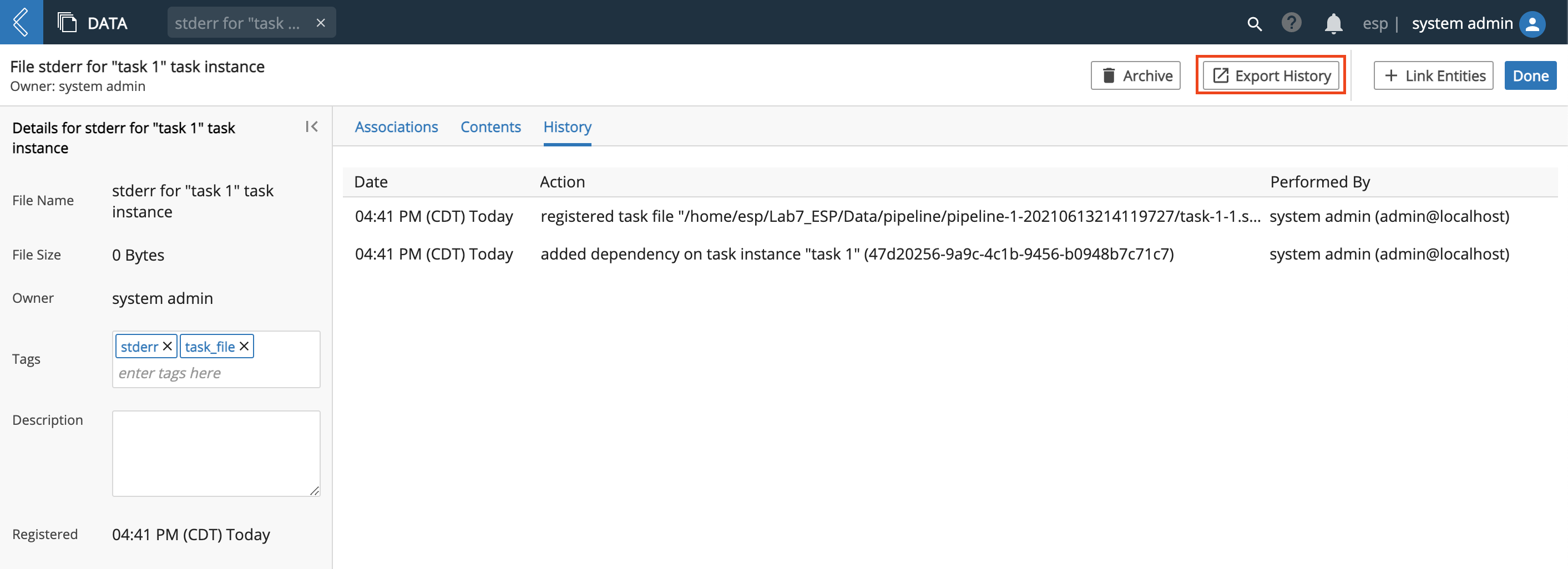
The History tab displays recent actions performed on the file, including the Date an action was performed, the specific Action performed, and the Performed By performing the action.
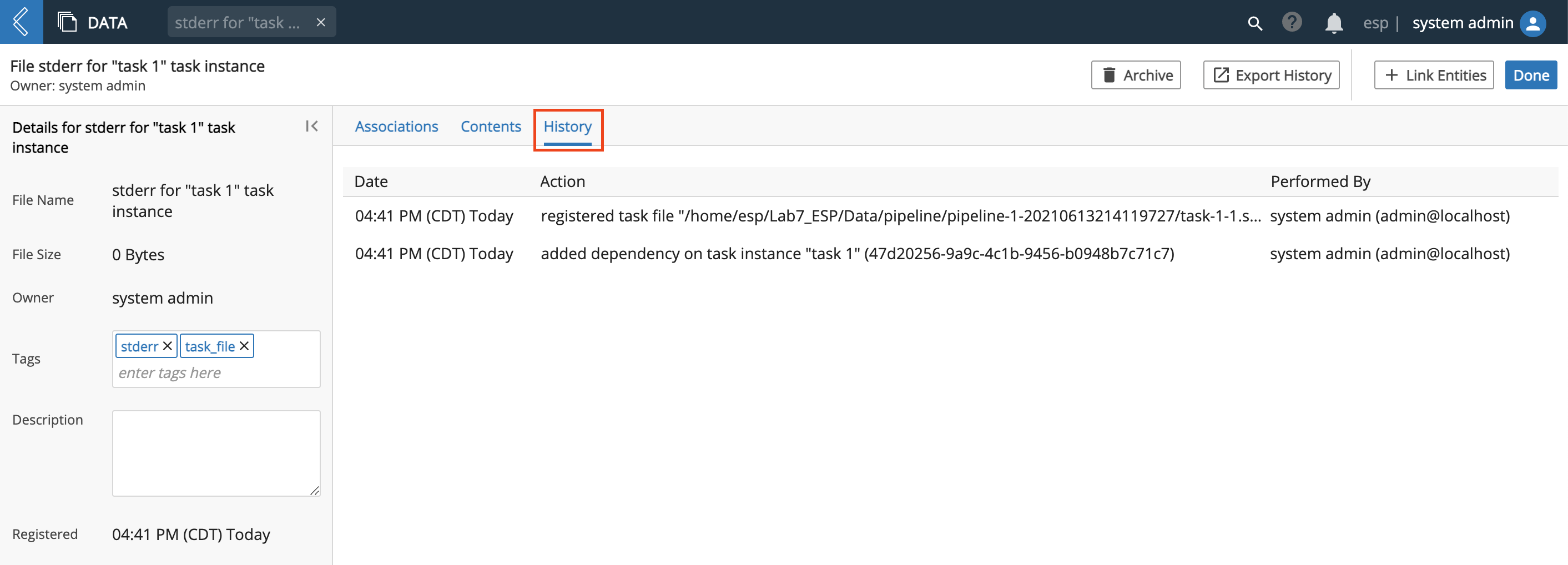
From the History tab you can Export History, which downloads and then opens an Excel file containing the file's history in table format.
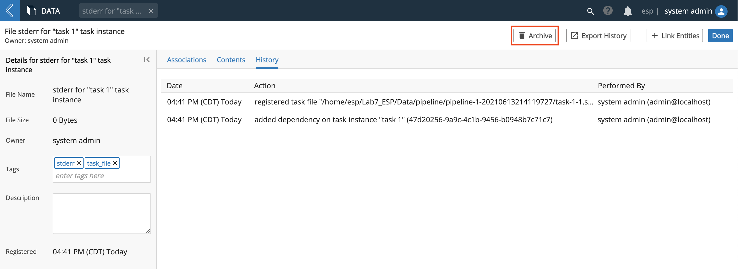
From the Associations, Contents, and History tabs you can Archive the file, which permanently removes it from L7|ESP.
Additionally, from all tabs, you can Link Entities.
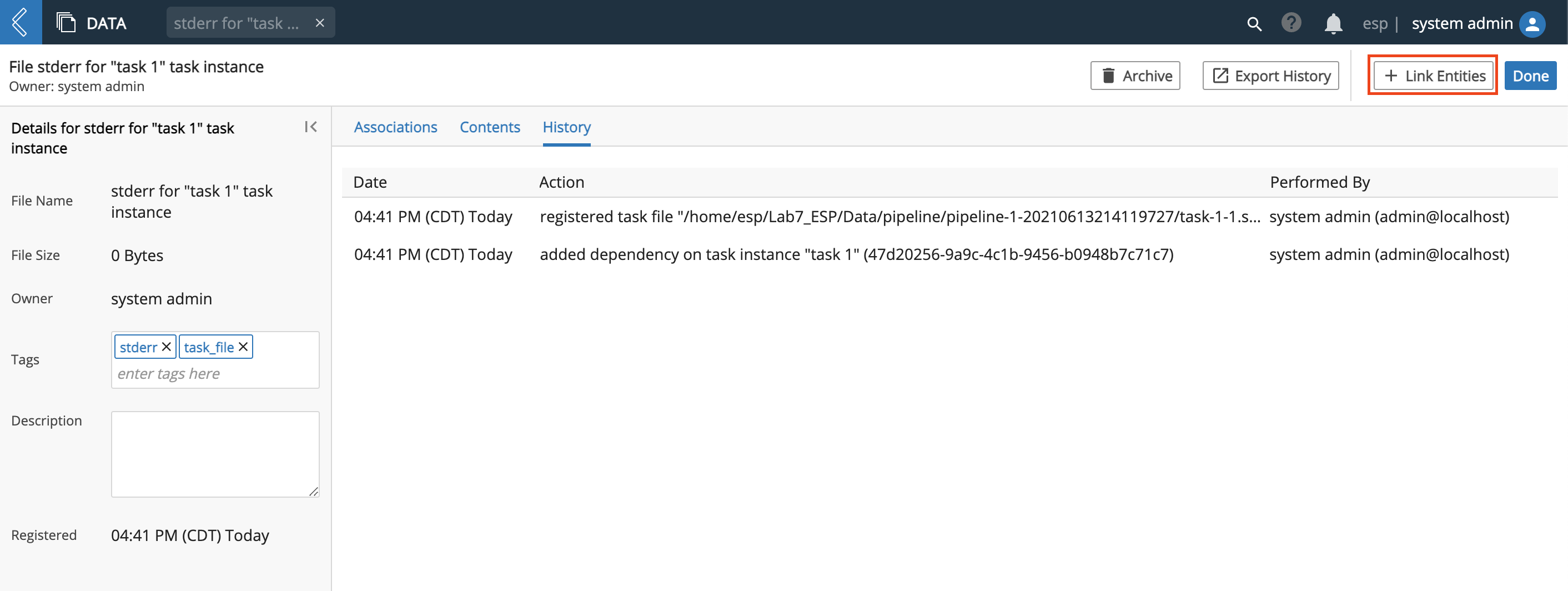
To link an existing entity, click + Link Entities. Use the Resource Filters panel to filter/search for the Entity.
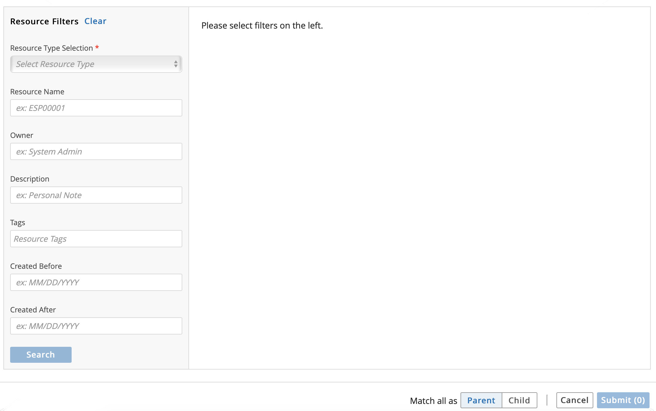
Once you have found the Entity to link, check the box to the left and then click Submit.
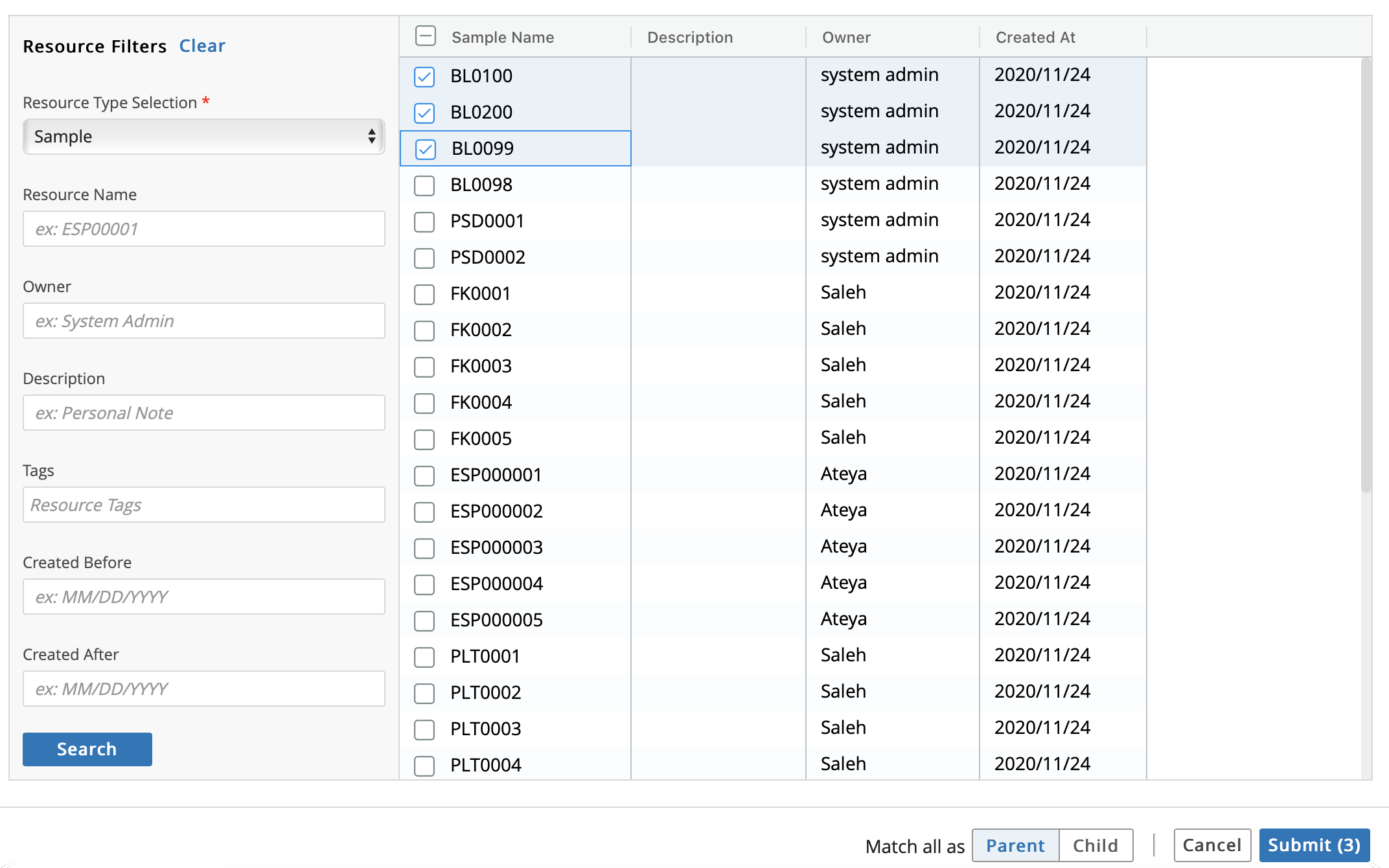
The linked Entities will now appear in the Associations tab.
Important
What's the difference between a Resource and an Entity? A Resource is everything in L7|ESP, such as: Files, Containers, Workflows, Entities, Inventory Items, etc. An Entity is a subset of what is contained/encapsulated within a specific Resource that can be moved through a Workflow such as a human tissue sample, a livestock sample, human patient, etc.
The Data app stores the path to a Registered File, along with any tags and meta-data associated with it. You can use an API to access the Data app to develop tools to maintain Registered Files. For example, you can create an auto-archive utility that walks the Data app, identifies old files, archives old files, and updates old files' records in the Data app. This utility allows you to use the Data app as a Provenance Engine for the data, as well as the Entities.
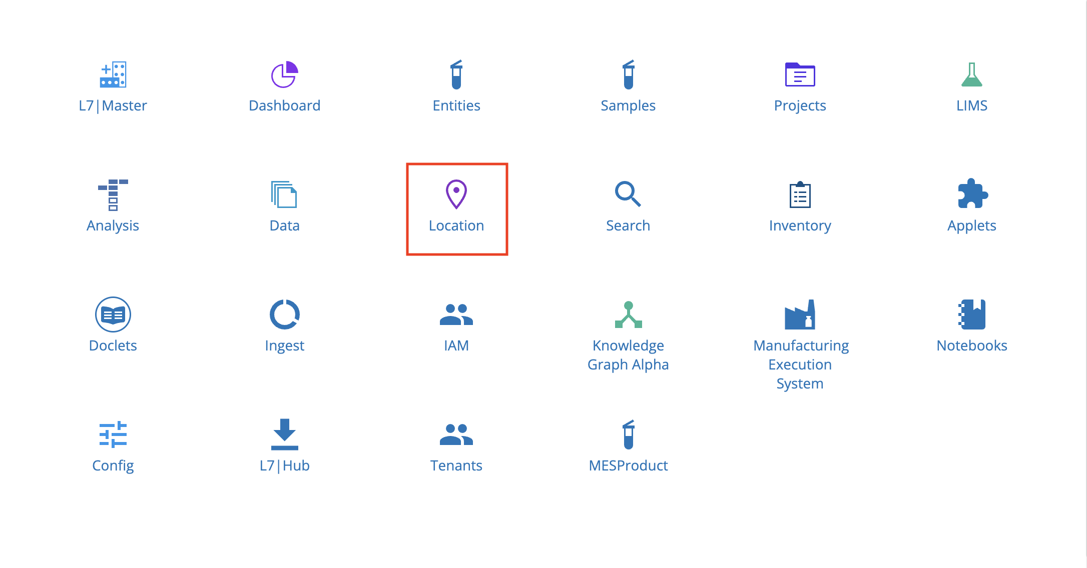
9.14. Location App
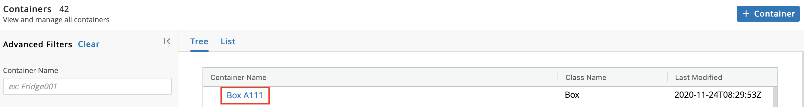
From the Home menu, click Location. In L7|ESP, a Location is any physical location (e.g., wells plates, racks, freezers, room in a lab, etc.).
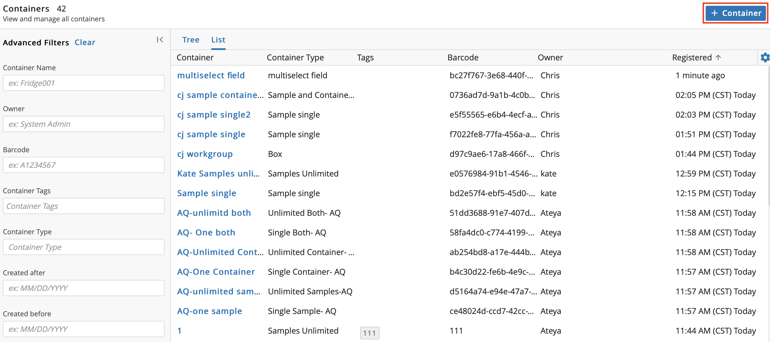
There are 2 tabs with different views: Tree and List. From either tab, click a Container to see the representation of the physical location based on the Container Type.
9.14.1. Create New Container
Click + Container to add a new Container.
In the Add New Container dialog, enter a Name and select a container Type. Optional: Enter a Barcode, Tag(s), and/or a Description. Click Save.
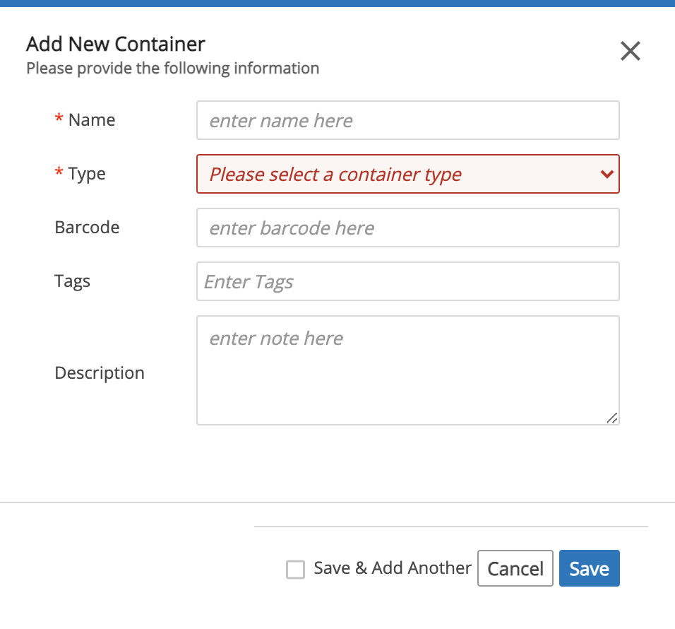
Note
To create a Container Type, refer to Manage Container Types.
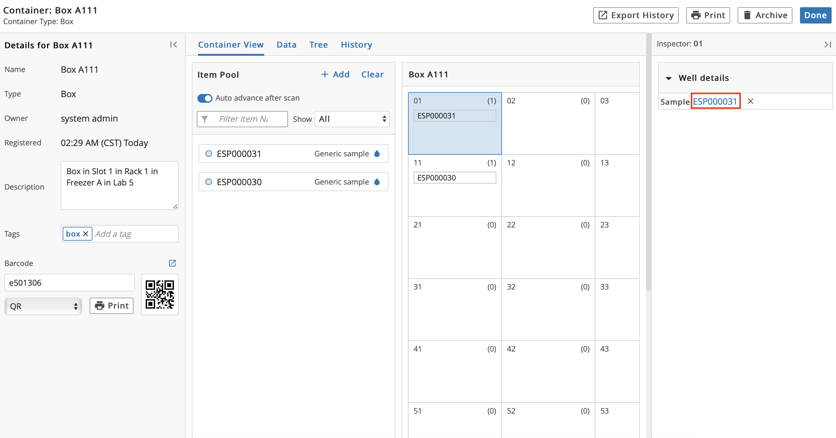
9.14.2. Container Details Page
Click the Name of a Container to view associated details.
From the container details page, you can:
Add/Edit Description and/or Tag(s).
Export History of the Container, which downloads an Excel file containing the item's usage history in table format.
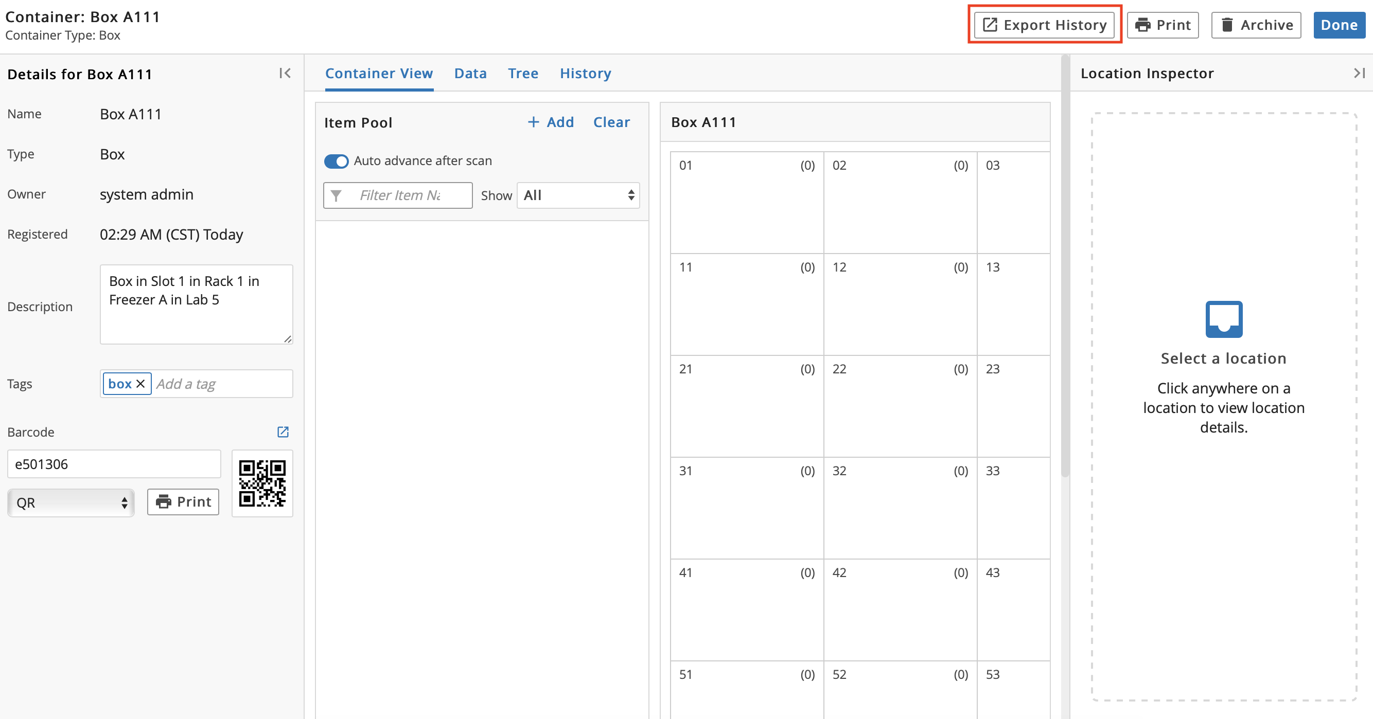
+ Add Item(s).
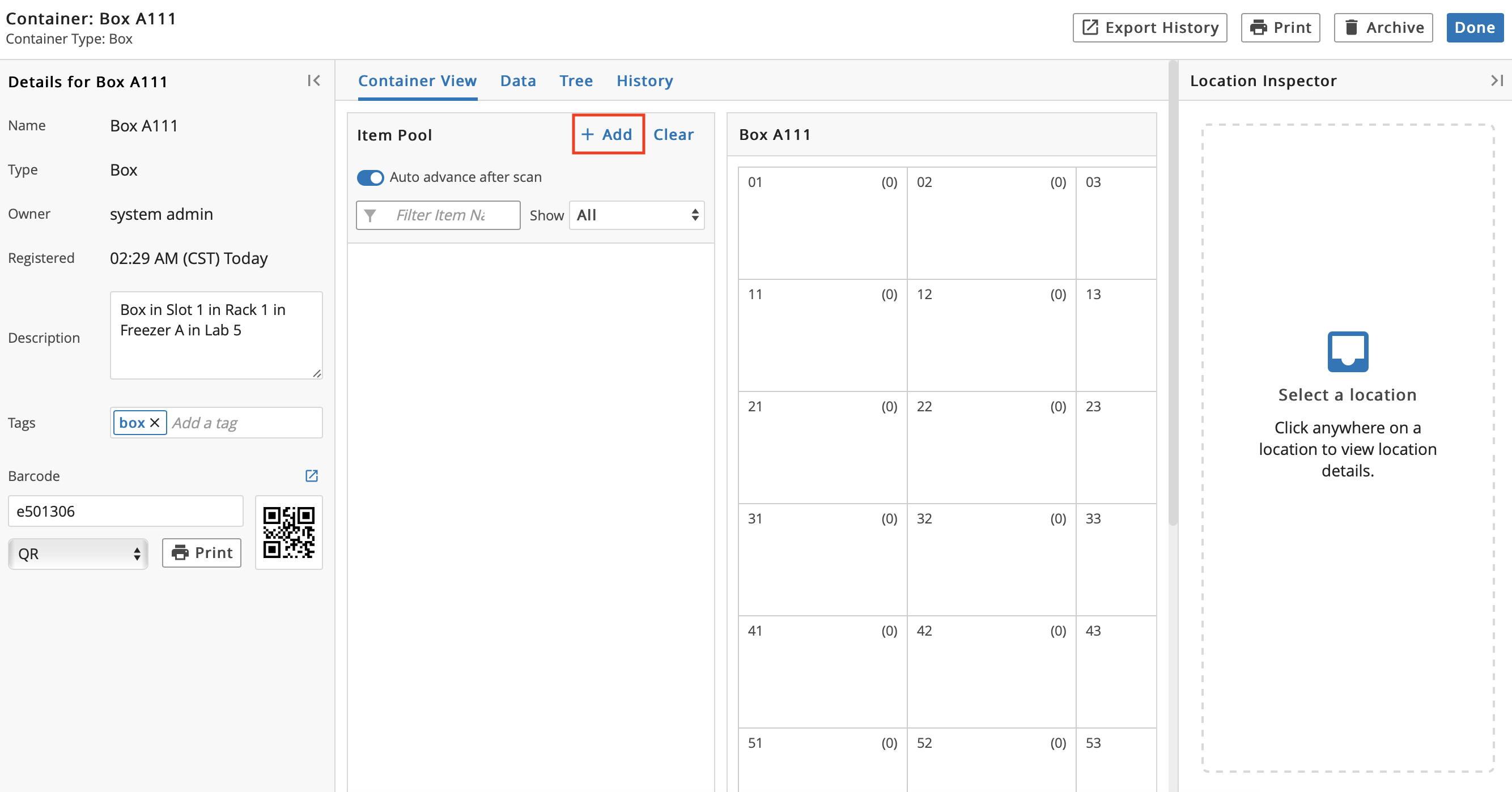
In the Select Items dialog, check the box to the left of the Item(s) to add to the Container. Click Select.
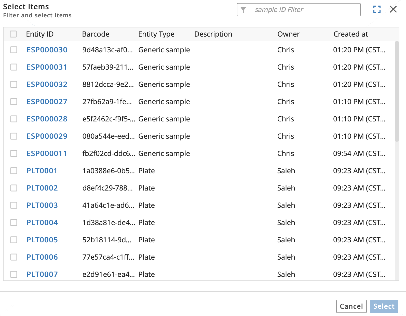
Hint
Click Clear to remove the selected Item(s).
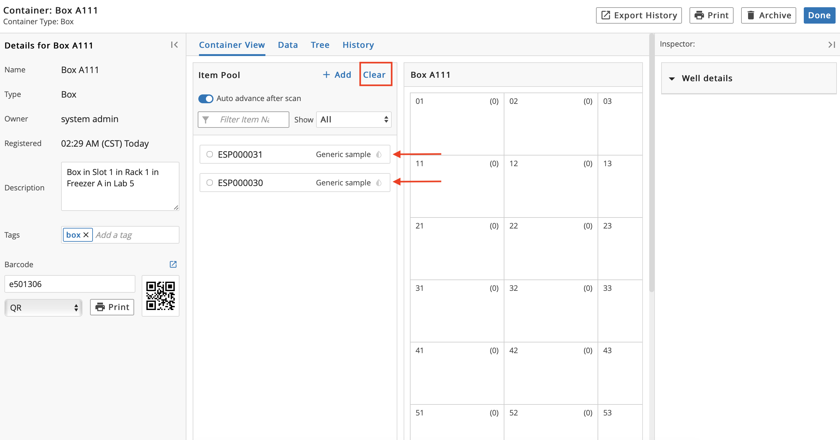
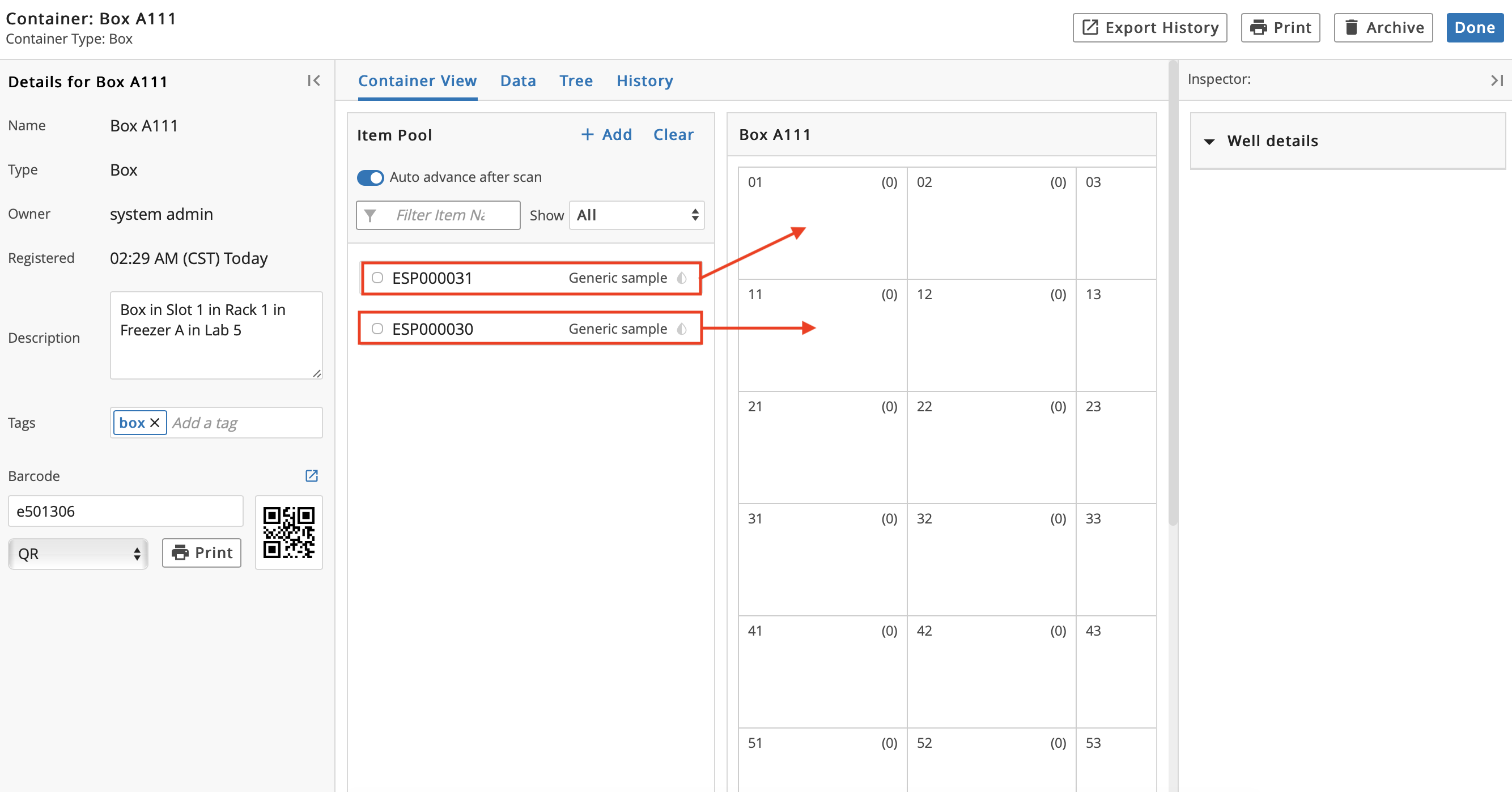
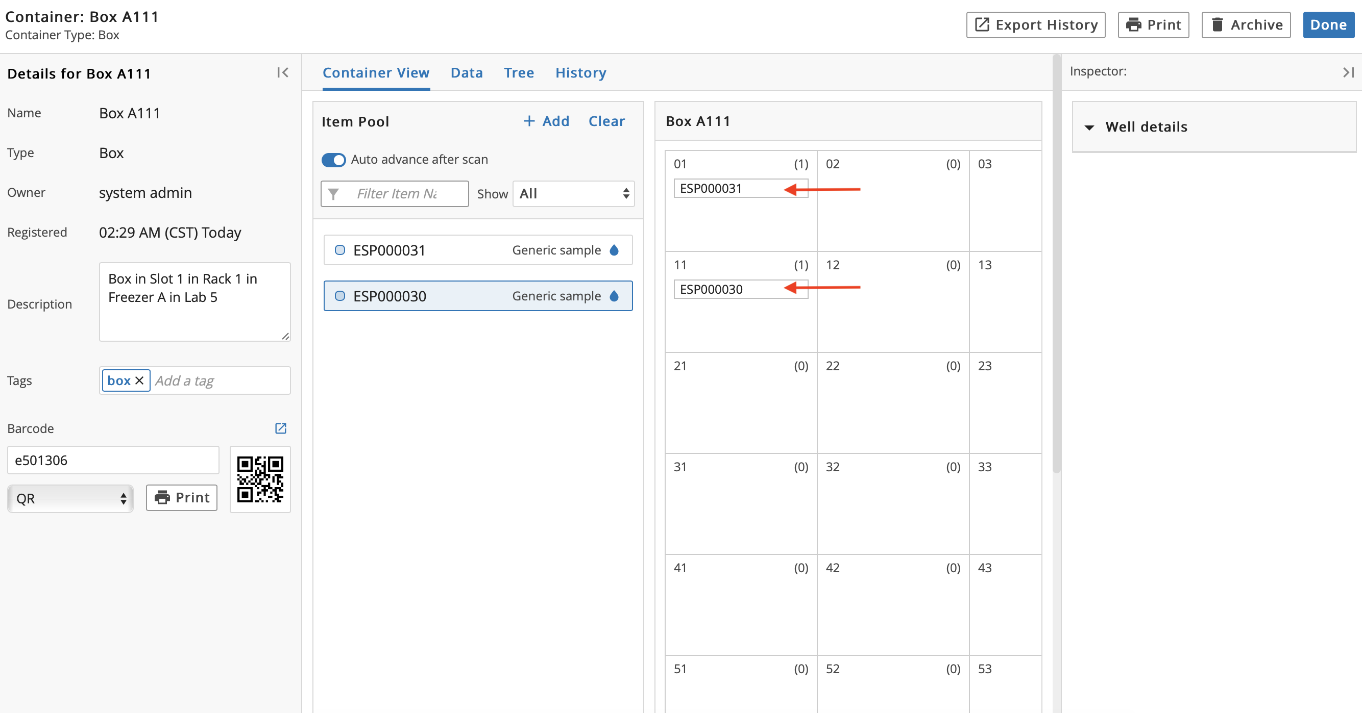
The Items are listed under Item Pool. Individually drag and drop the Item(s) into the desired Locations. Alternatively, to drag and drop multiple items at one time: Press the Shift key, and then press the + key, and then select the Items.
Note
Container Type determines the Container's capacity and allowable Items.
If available, select Allow Multiple, which allows you to place an Entity in multiple Locations.
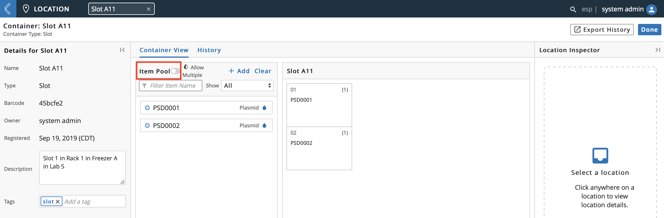
Note: A blue drop indicates that an Item cannot be placed in multiple Locations. A half white/half blue drop indicates that the Item can be placed in multiple Locations.
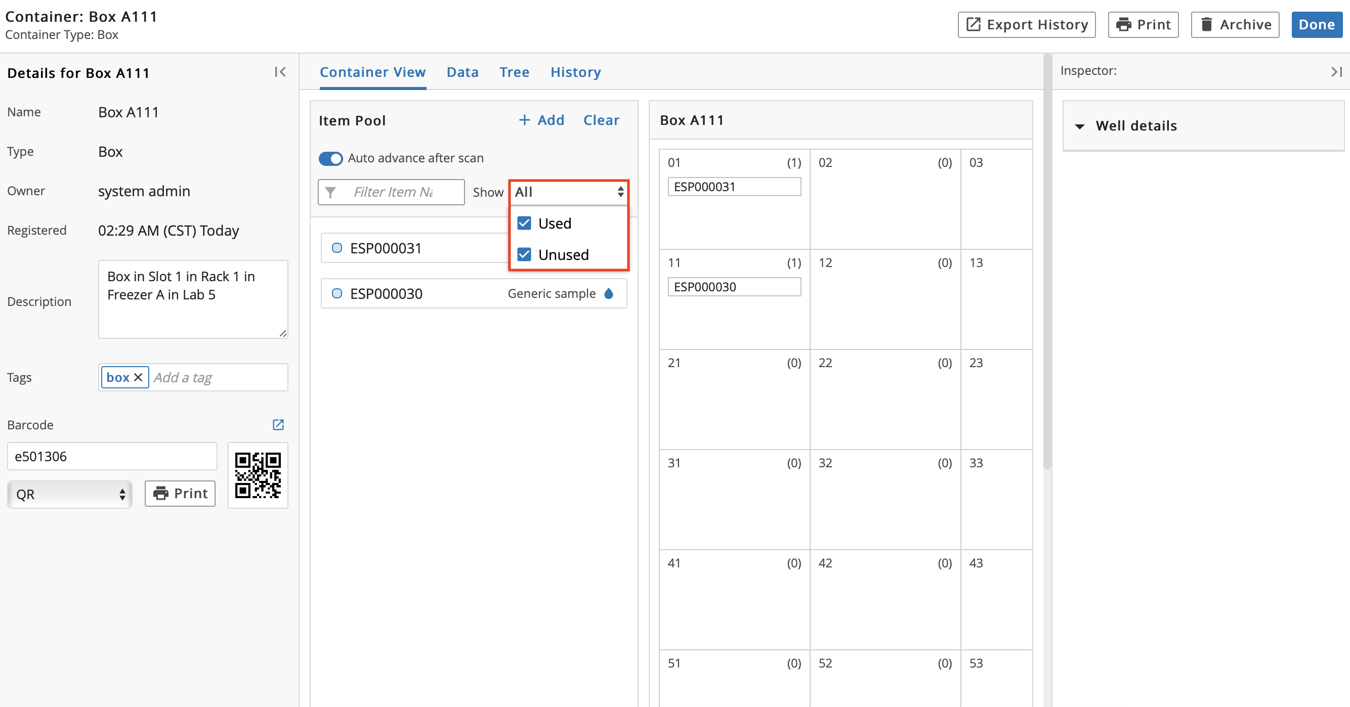
Filter Items in the Item Pool by All, Used, and Unused.
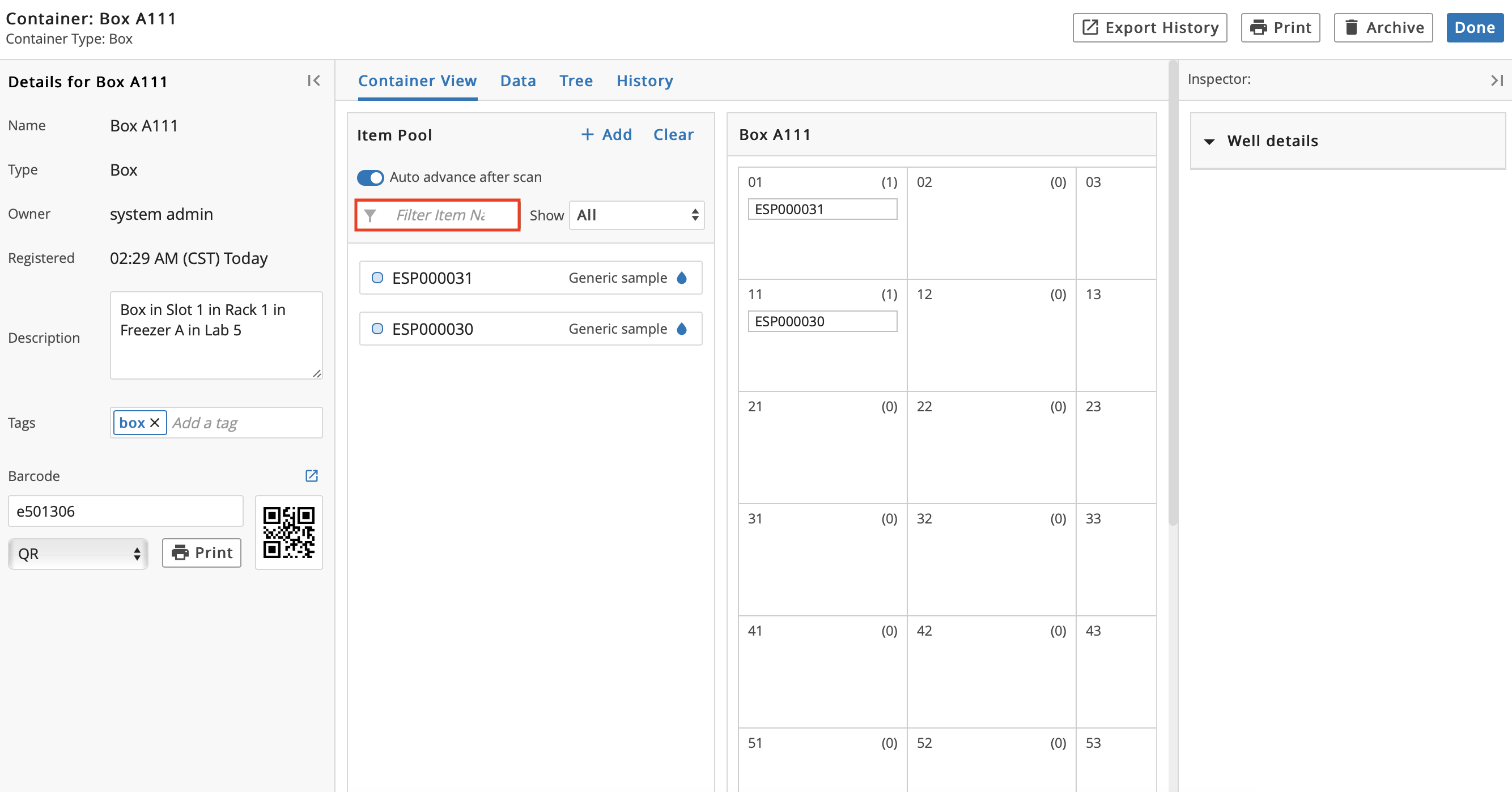
Filter Items in the Item Pool using the Filter Item Name filter.
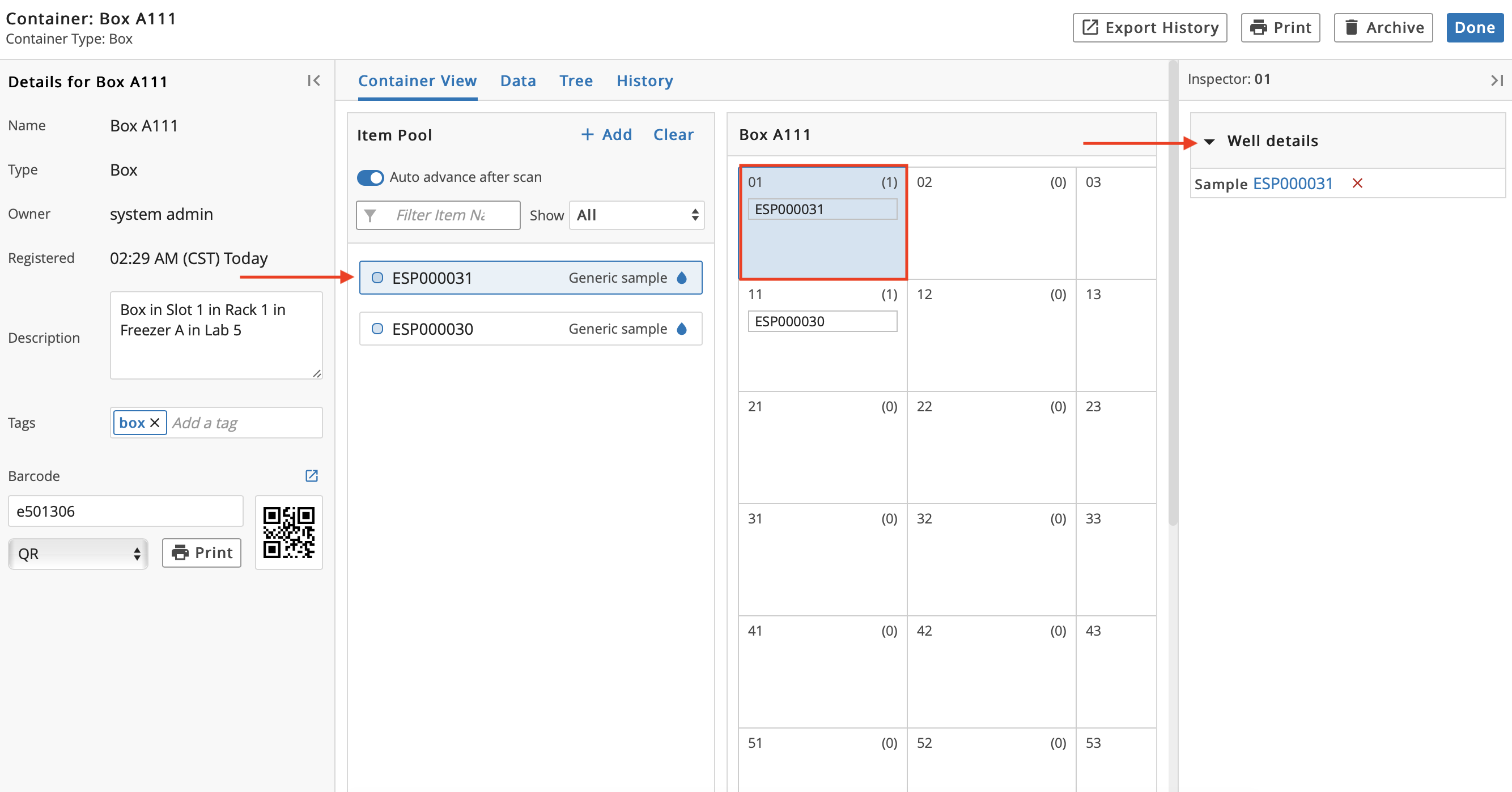
Select a Location. This will highlight the Location in blue and the Item currently in that Location will turn blue in the Item Pool. Additionally, the Inspector on the right will update.
Click the Name of an Item to be taken to that Item's details page.
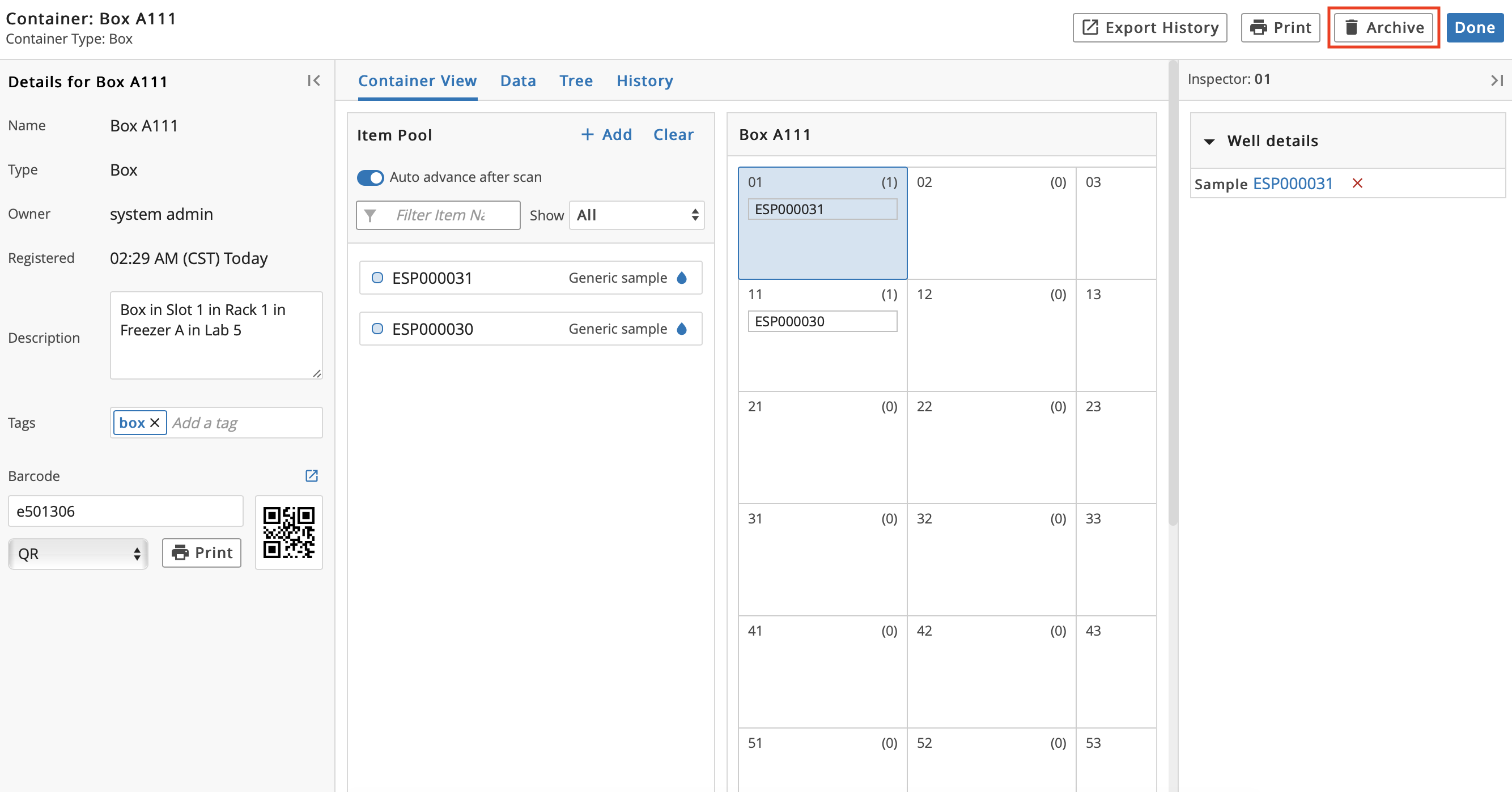
Archive the Container by clicking Archive. Note that a Container cannot be archived if there are Items in the Container.
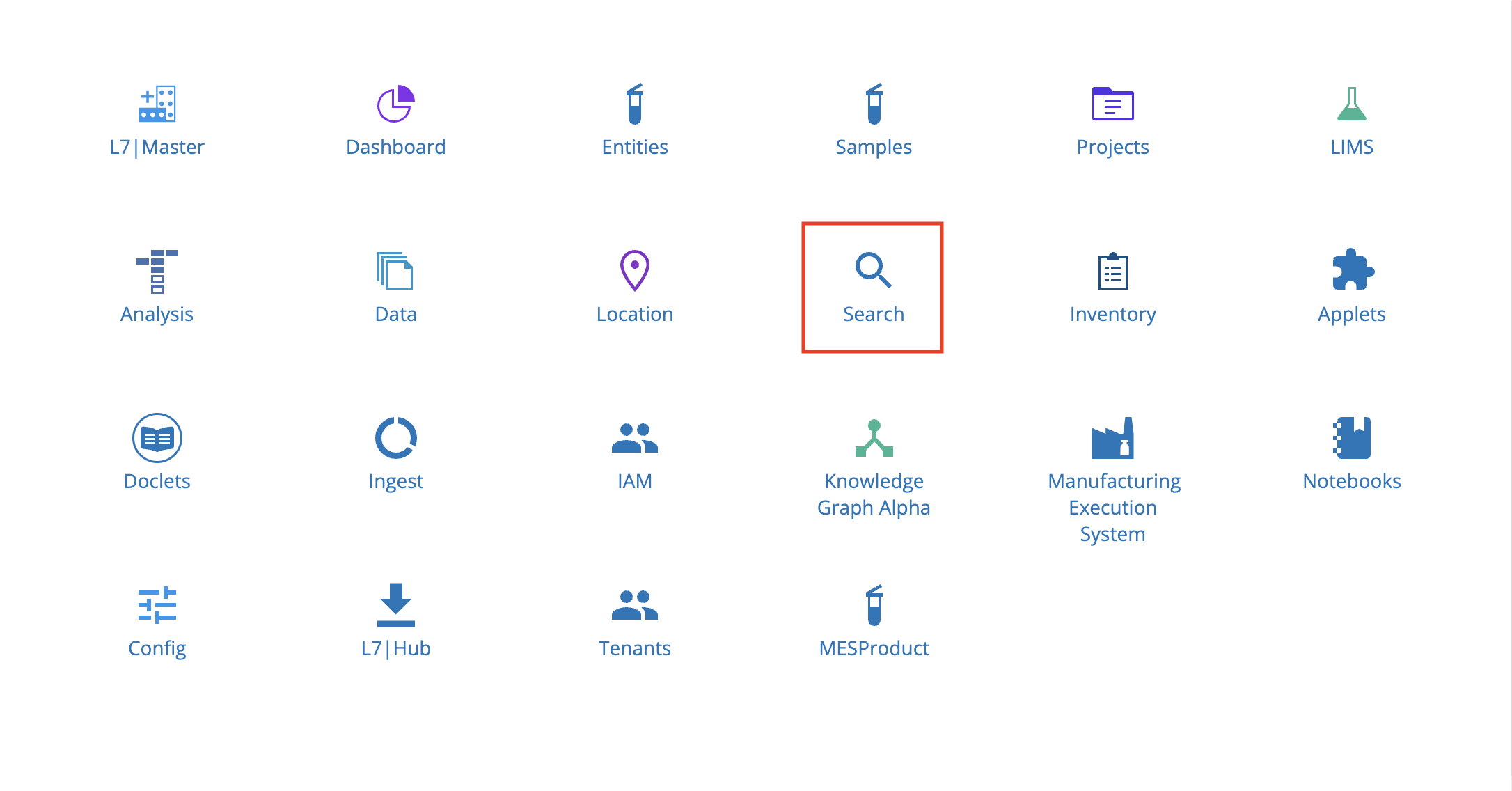
9.15. Search App
From the Home menu, click Search.
The Search app has a global search engine and displays Search History and your Recent Activity.
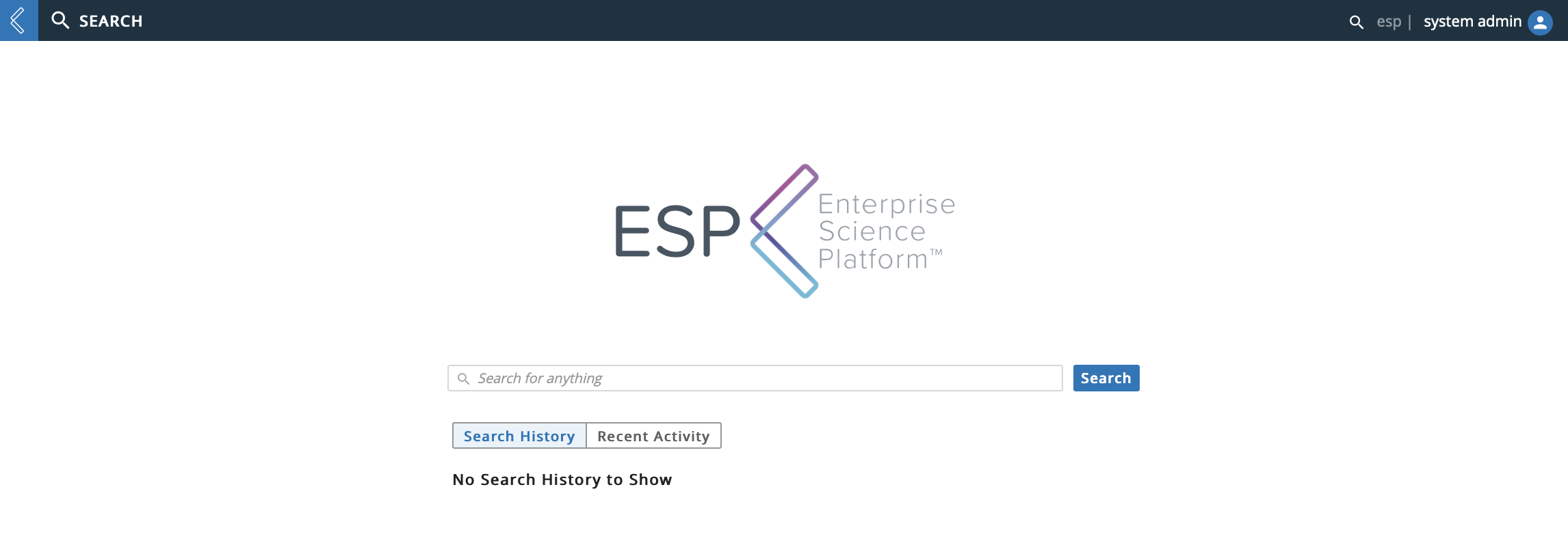
You can enter an item to search for in the Search for anything field and click Search.
Corresponding results appear under the All Results tab. Additional tabs are created as appropriate to the searched term (e.g., Samples).
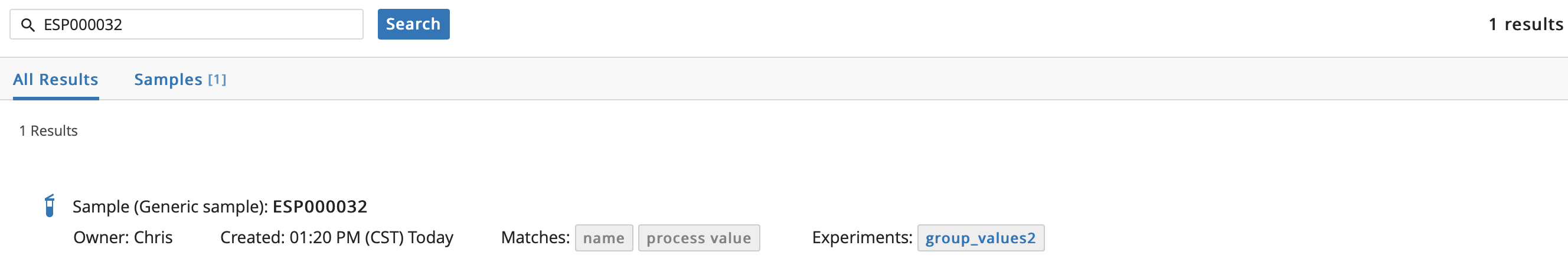
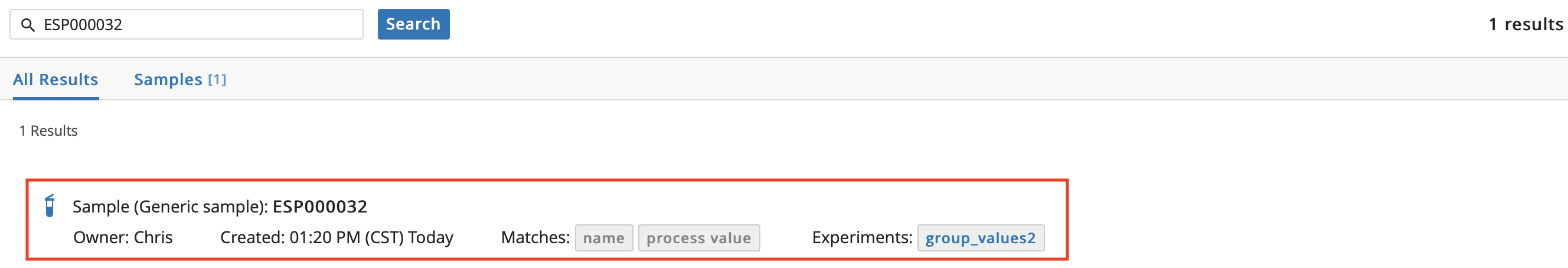
You can click the row of a result to to be taken to the associated details page.
9.16. Inventory App
The Inventory app is used to manage usage and inventory of physical Items in your lab and provides facilities for barcoding Items.
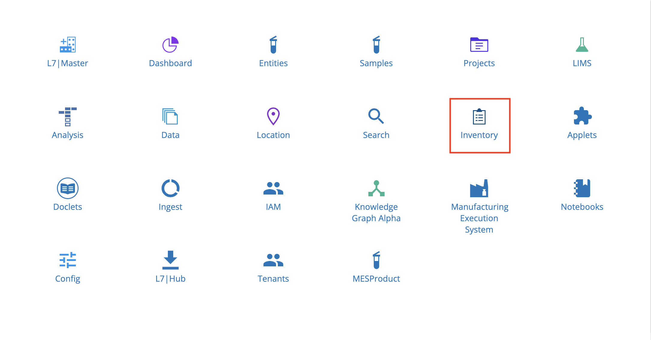
From the Home menu, click Inventory.
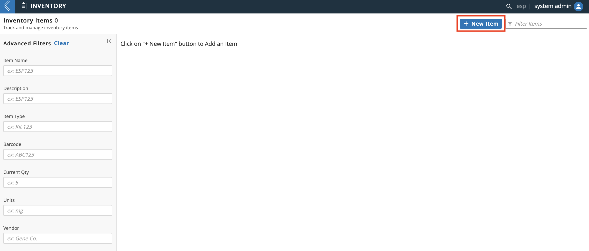
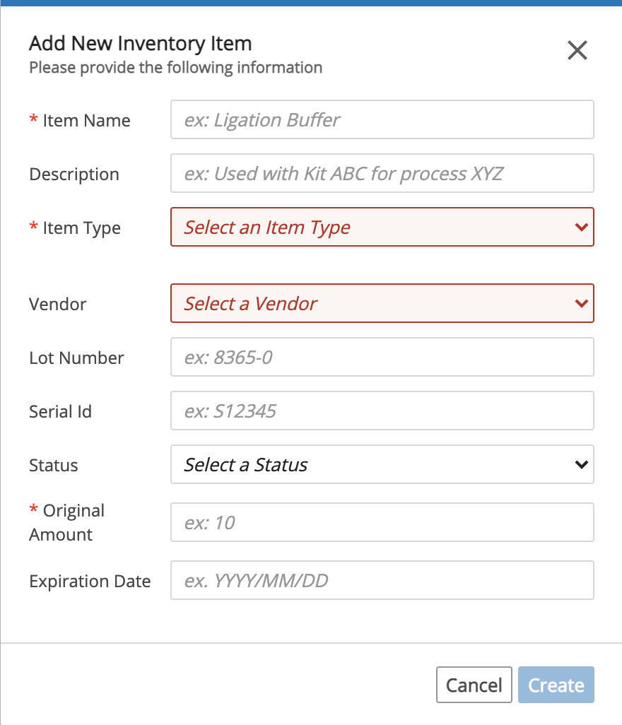
9.16.1. Create New Item
To add a new Item, click + New Item.
In the Add New Inventory Item dialog:
Enter an Item Name.
Optional: Enter a Description.
Select an Item Type. To create a new Item Type, refer to L7|Master Guide.
Optional: Select the Vendor to reorder from.
Optional: Enter the Lot Number of the Item.
Optional: Enter the Serial ID of the Item.
Optional: Enter the Status of the Item.
Enter the quantity available in the Original Amount field.
Optional: Enter an Expiration Date.
Click Create.
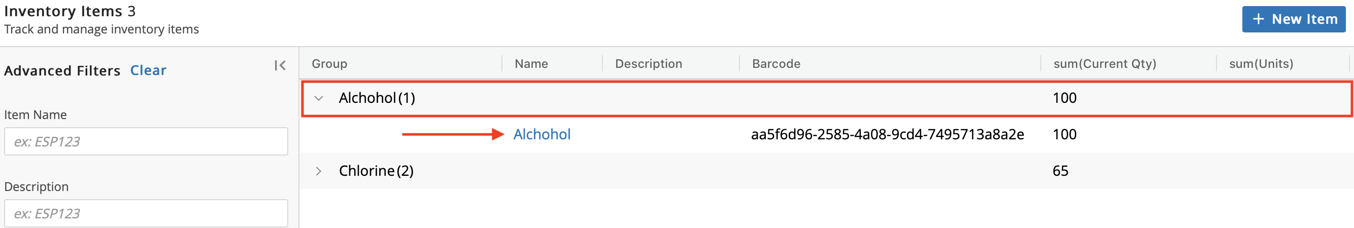
Items are grouped by Item Type. Therefore, the new Item you created will appear under the Item Type you selected in the previous step. To view your new Item, click the row with the applicable Item Type. Note that a Barcode is automatically assigned to the new Item.
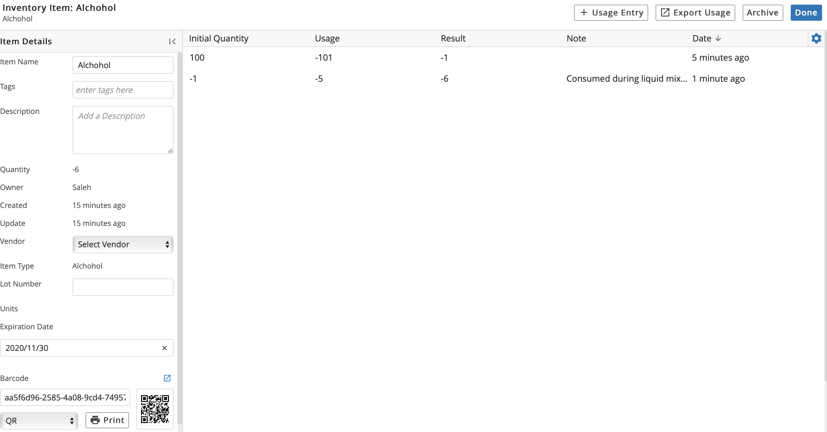
9.16.2. Item Details Page
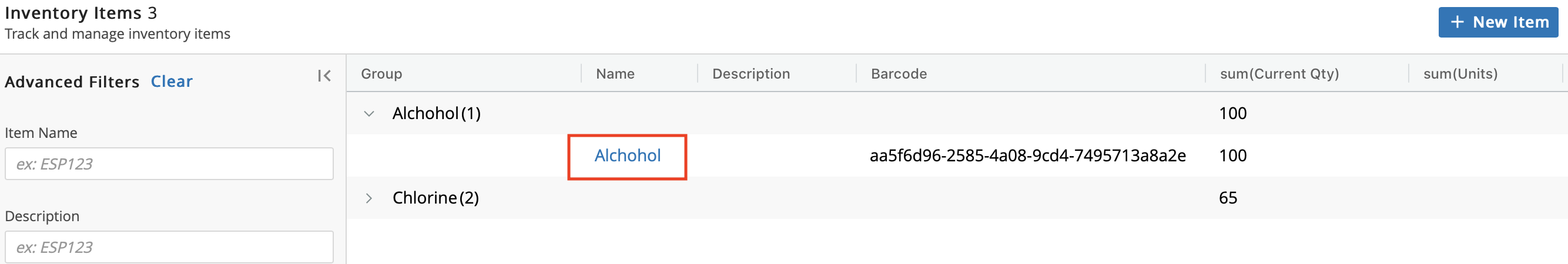
Click the Name of an Item to go to the details page.
From the details page you can:
View details associated with the Item as well as add/edit the following: Item Name, Tag(s), Description, Vendor, Lot Number, and Expiration Date.
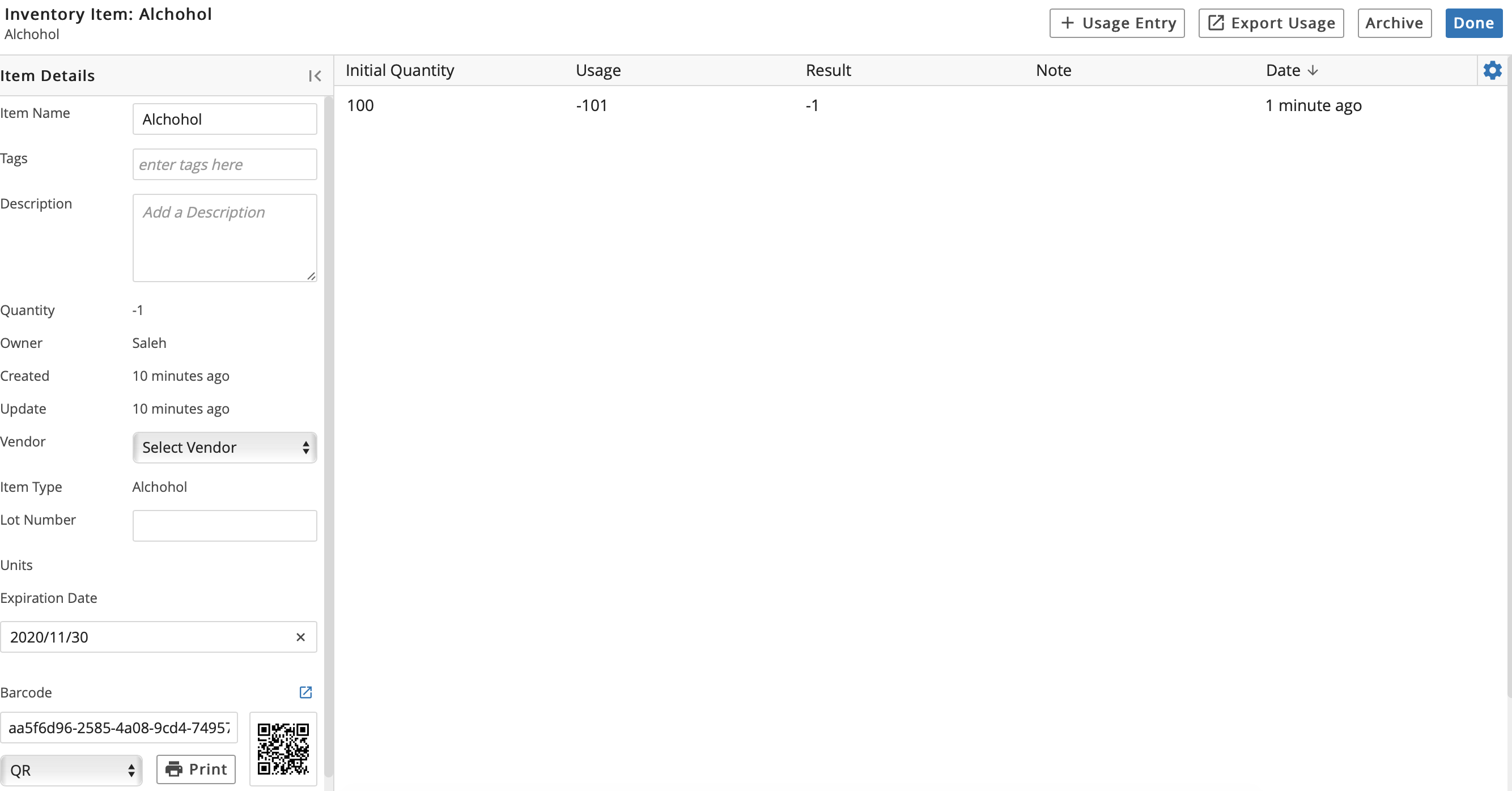
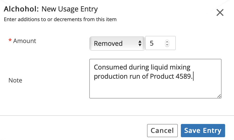
Click + Usage Entry to manage usage.
Enter the Amount Added, Removed, or Transferred from the Inventory. Optional: Add a Note. Click Save Entry. Confirm the entry.
Observe how the details page has changed:
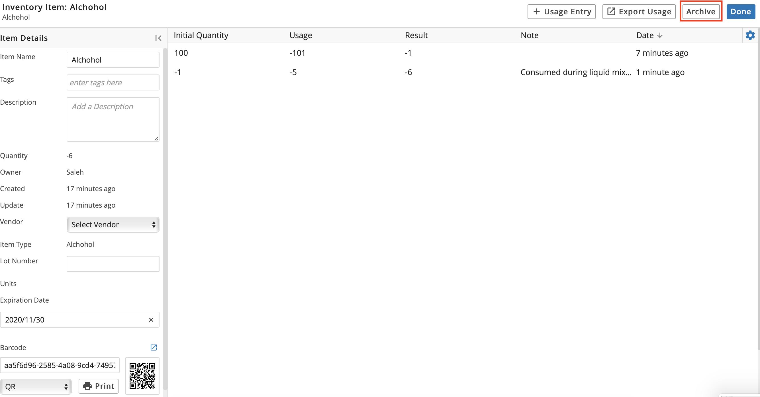
Archive the Item.
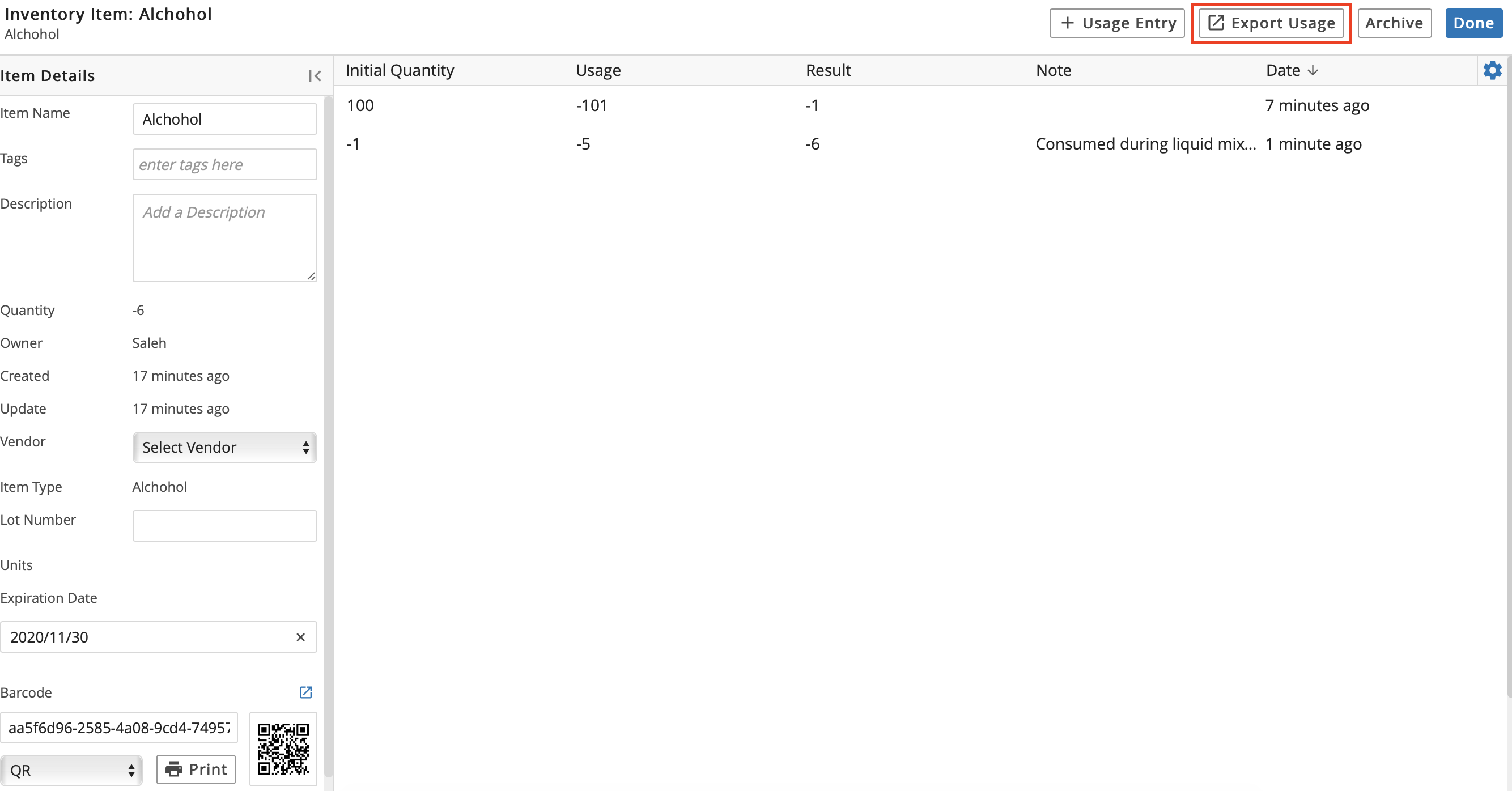
Export Usage, which downloads an Excel file containing the Item's usage history in table format.
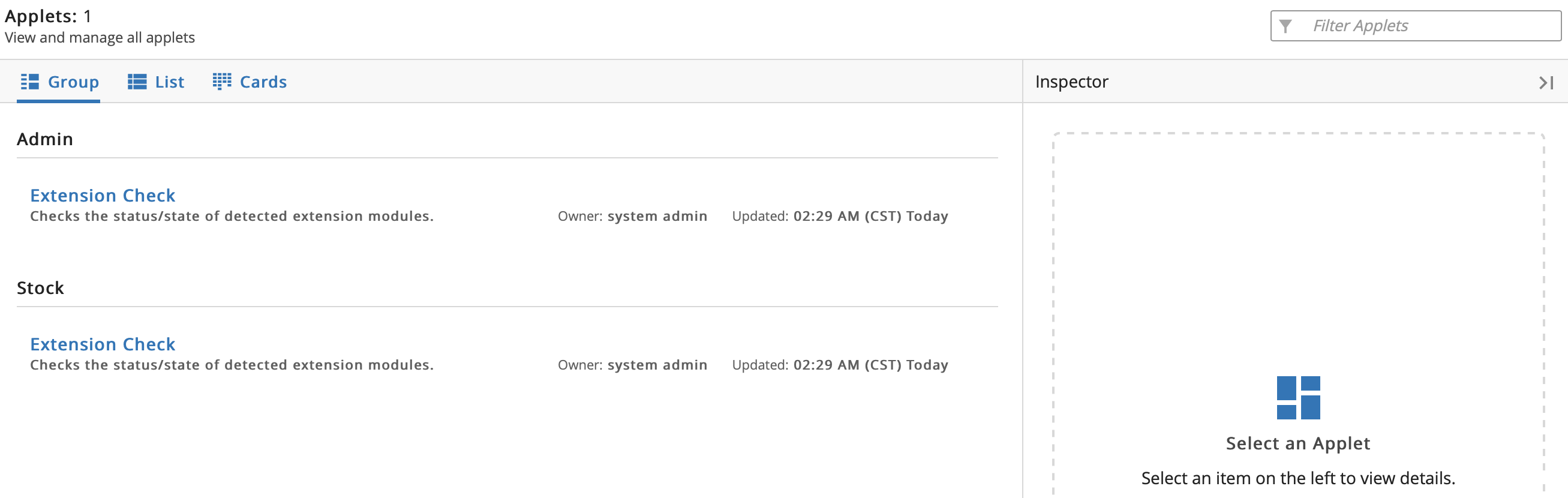
9.17. Applets App
From the Home menu, click Applets. The Applets app is used to view any custom Applets that have been designed for your L7|ESP.
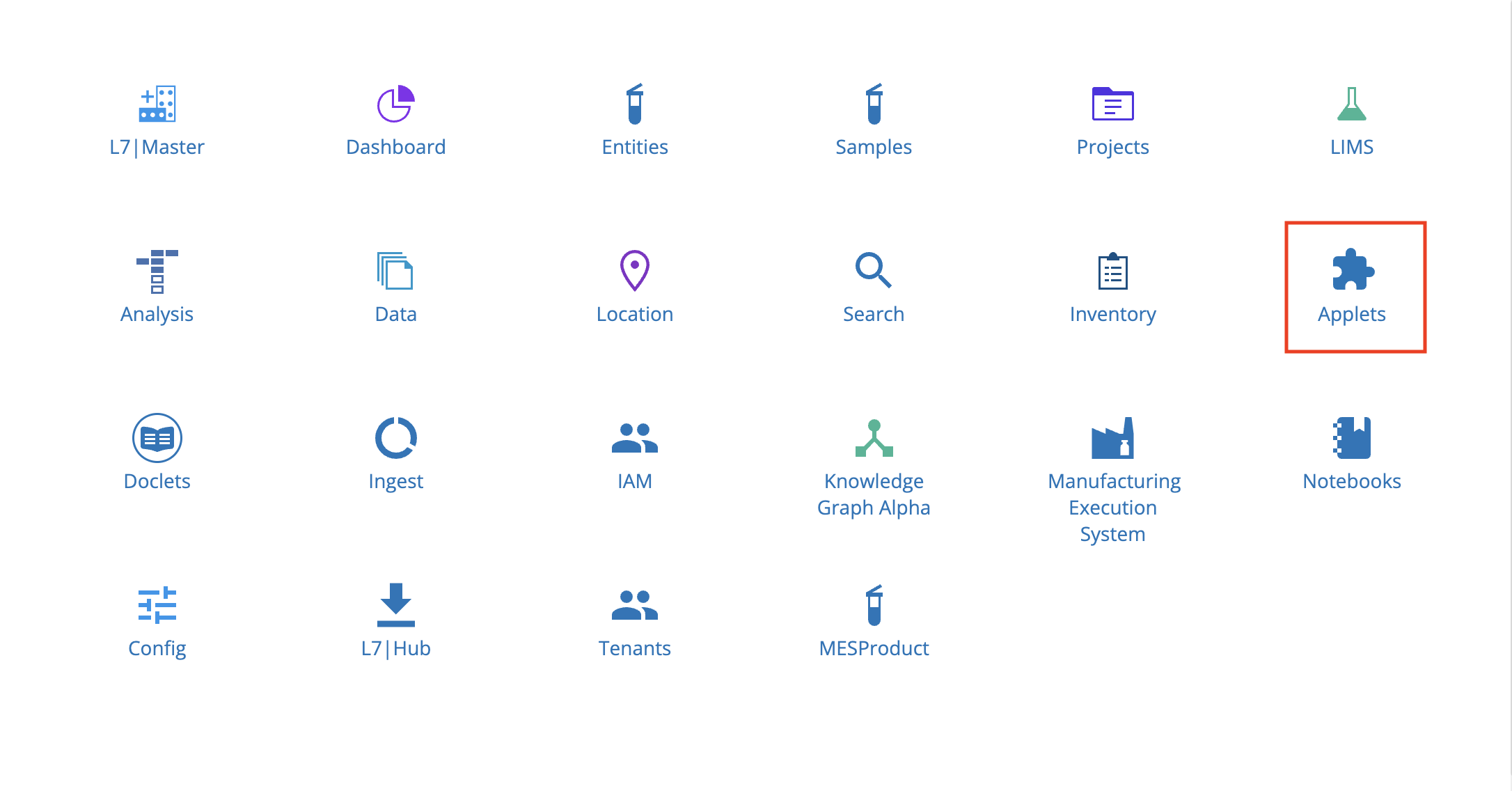
The Applets app is similar to the Reports tab in the Dashboard app; however, whereas Reports can only be viewed, Applets are functional.
Refer to L7|Master Guide for instructions on how to create a new Applet or update an existing Applet.
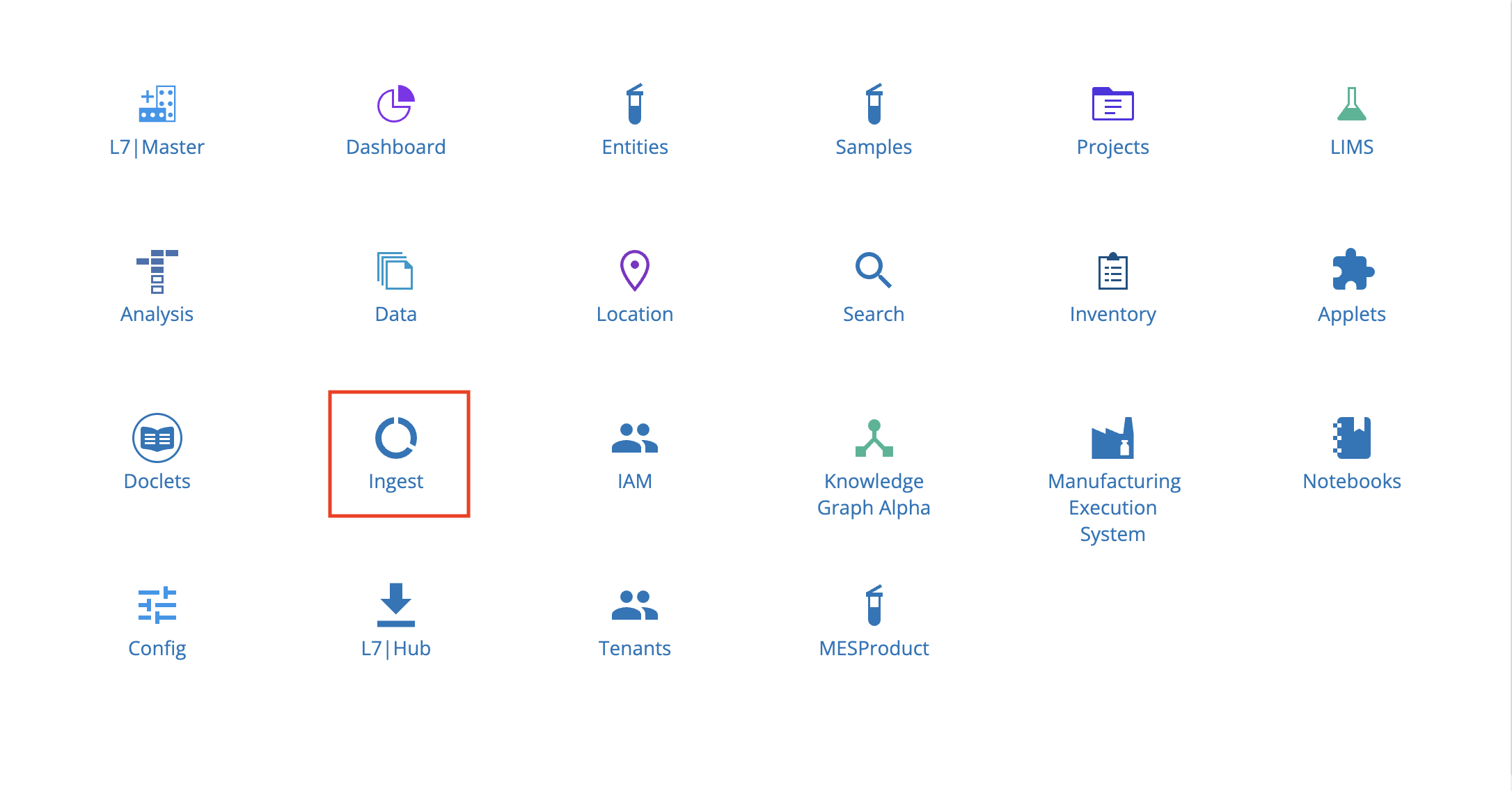
9.18. Ingest App
The Ingest app offers a simple solution for importing Entities into L7|ESP in bulk and annotating the Entities with metadata, which helps users with existing datasets adopt L7|ESP. Allowable formats to ingest include: TXT, TSV, CSV, XLSX, and JSON (JSON data must be structured in a format suitable for parsing into a tabular file).
From the Home menu, click Ingest.
9.18.1. Ingests Tab
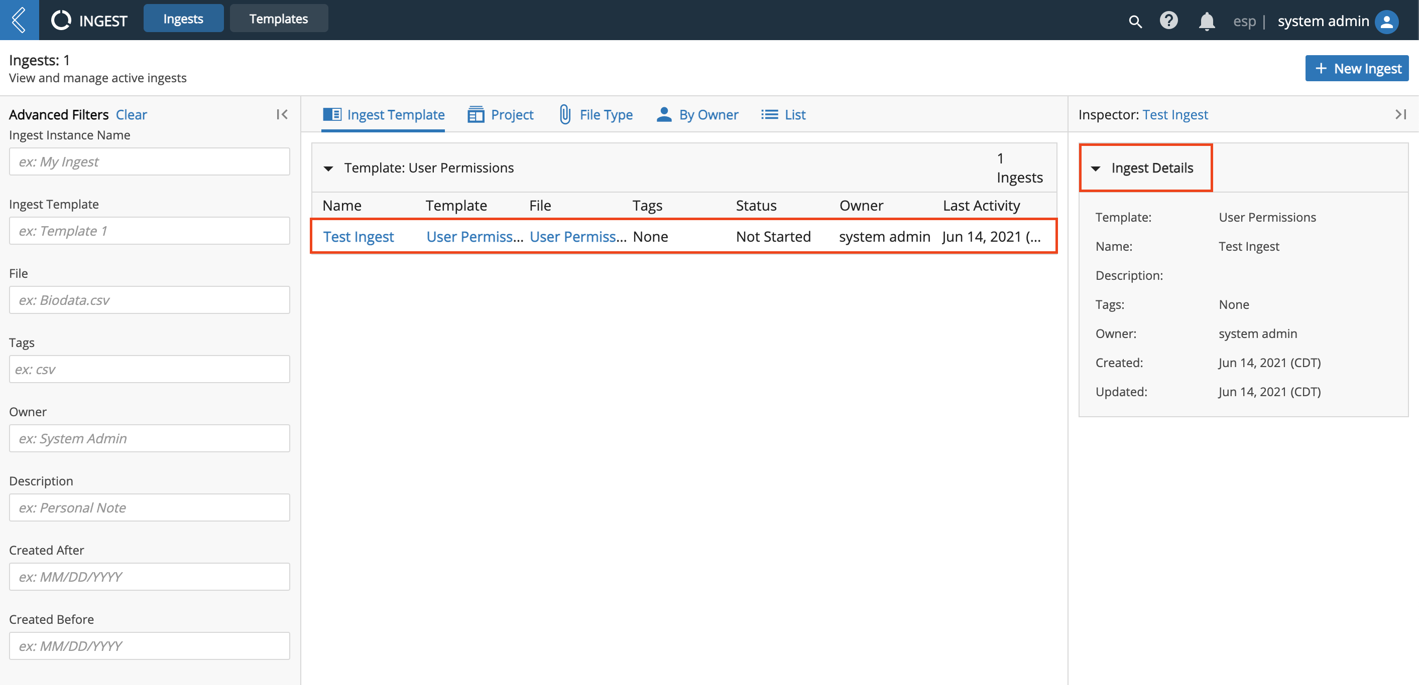
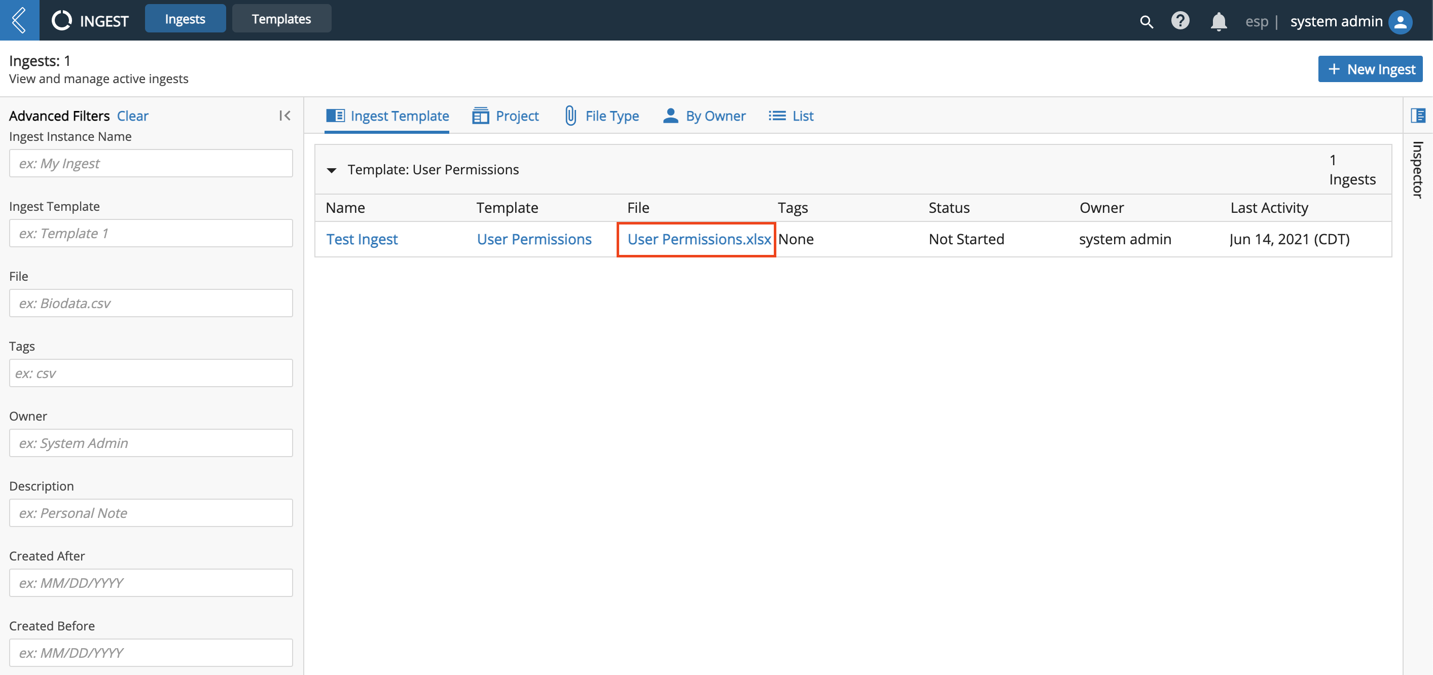
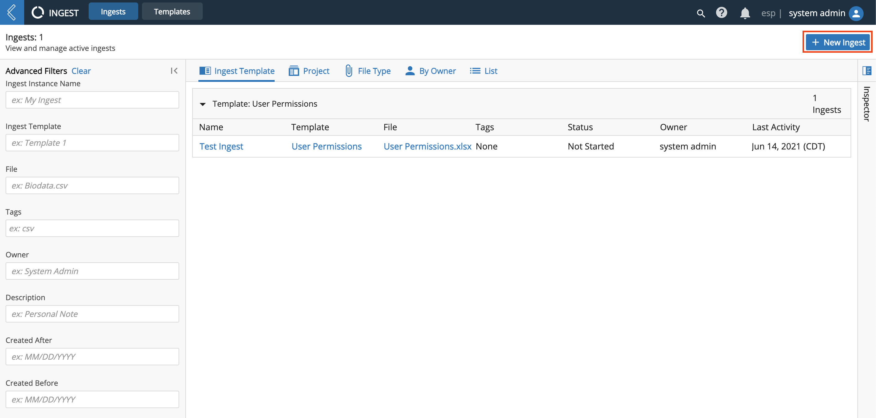
The Ingest app has two tabs: Ingests and Templates. The Ingests tab displays a list of all active Ingests, which can be viewed by Ingest Template, Project, File Type, By Owner, or in a List.
From the Ingests tab, you can view details about active Ingests, such as number of Entities processed, Ingest state, associated Definition, and who submitted the Ingest for processing (i.e., Owner).
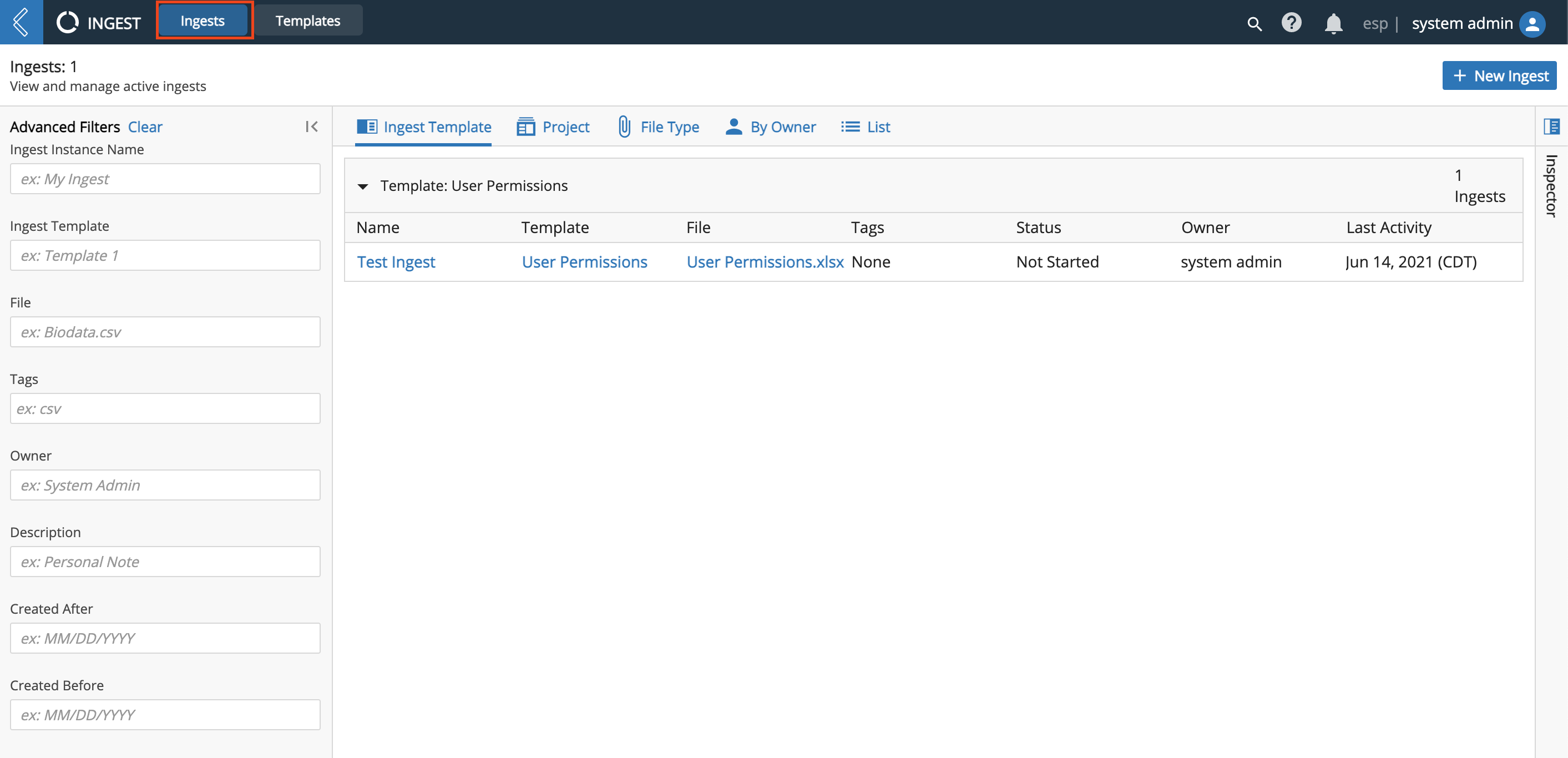
Click the row of an Ingest to view associated details in the Inspector on the right.
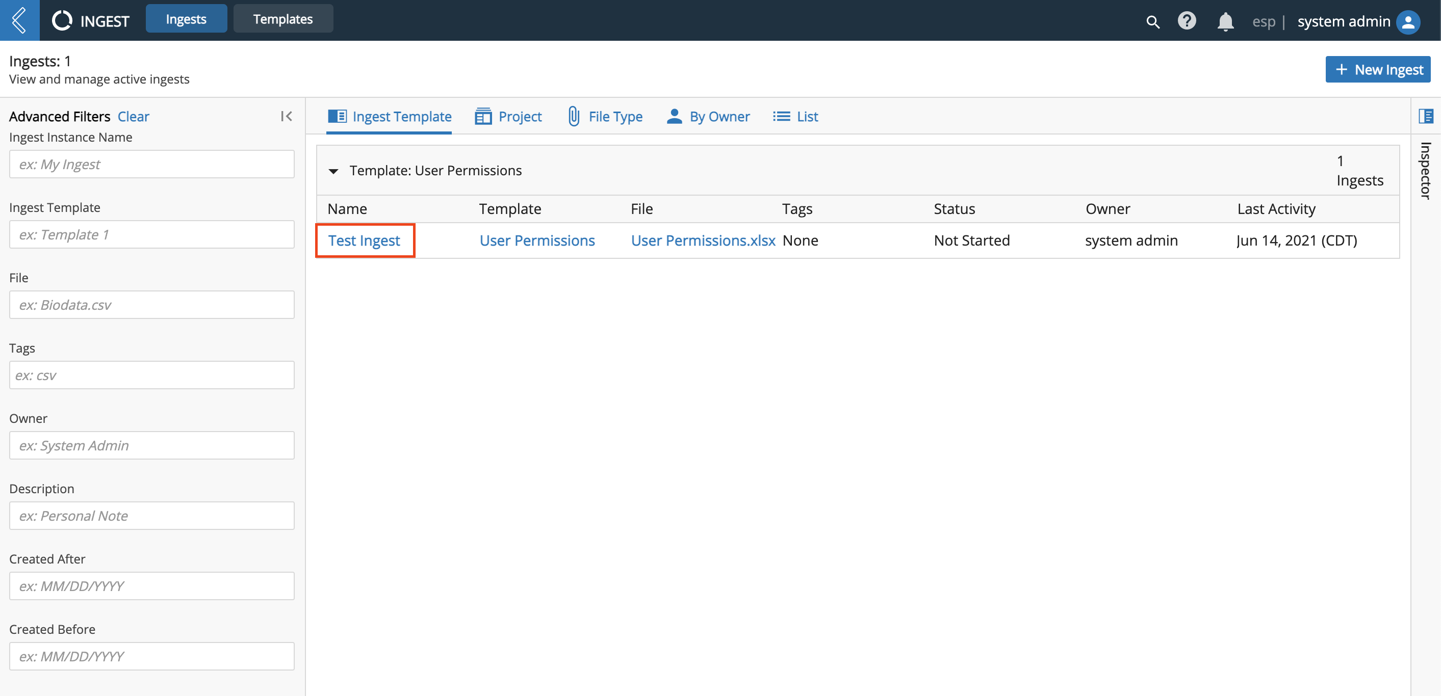
Click the Name of an Ingest to access the Ingest's details page.
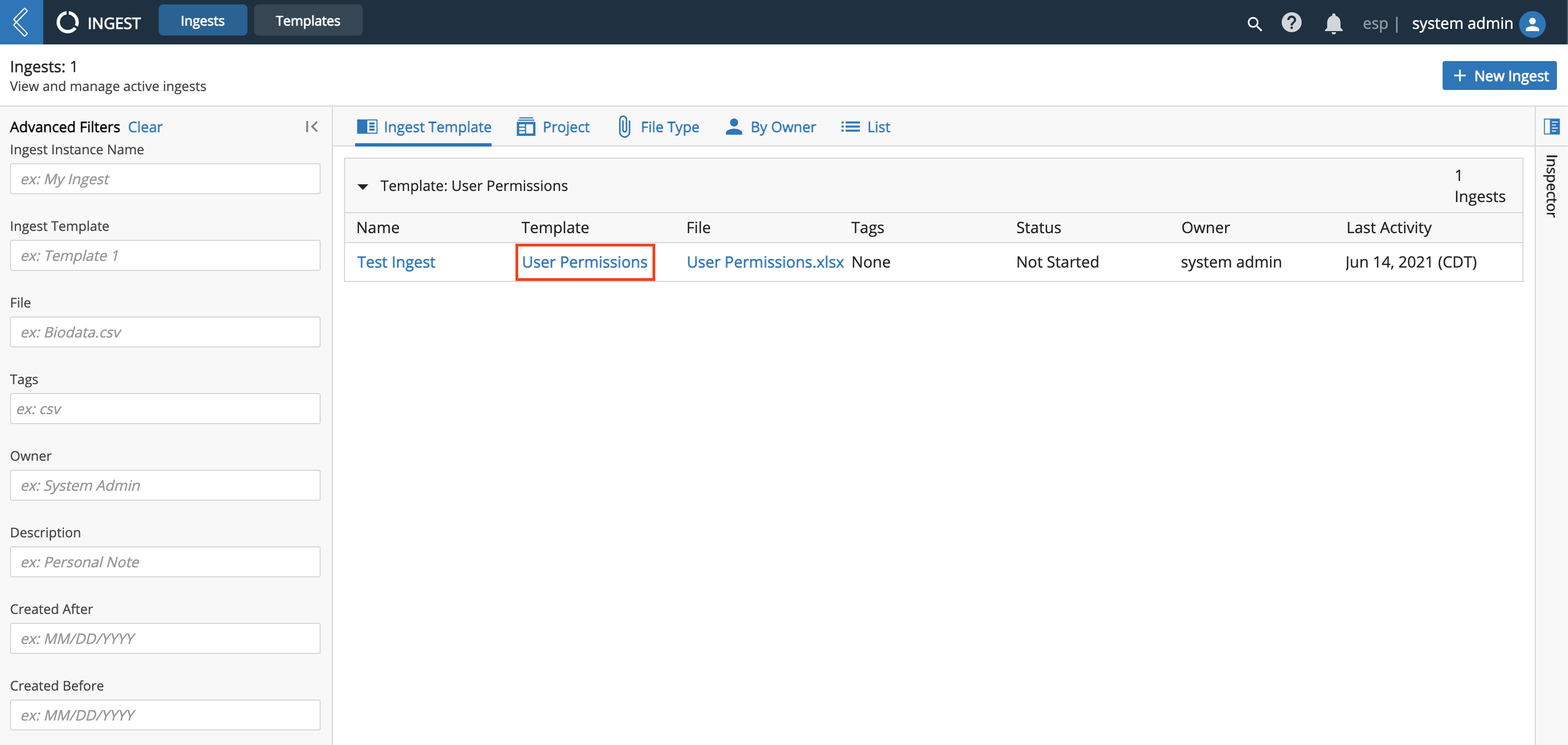
Click the Template of an Ingest to access the Template's details page (in the Templates tab). From this page you can update the parameters on how to Ingest files under that Template.
Click the File name of an Ingest to access the file's details page (in the Data app). From this page you can add a Description and/or Tag(s), Archive the file, Link Entities, view the file's contents, and download the file.

9.18.2. Templates Tab
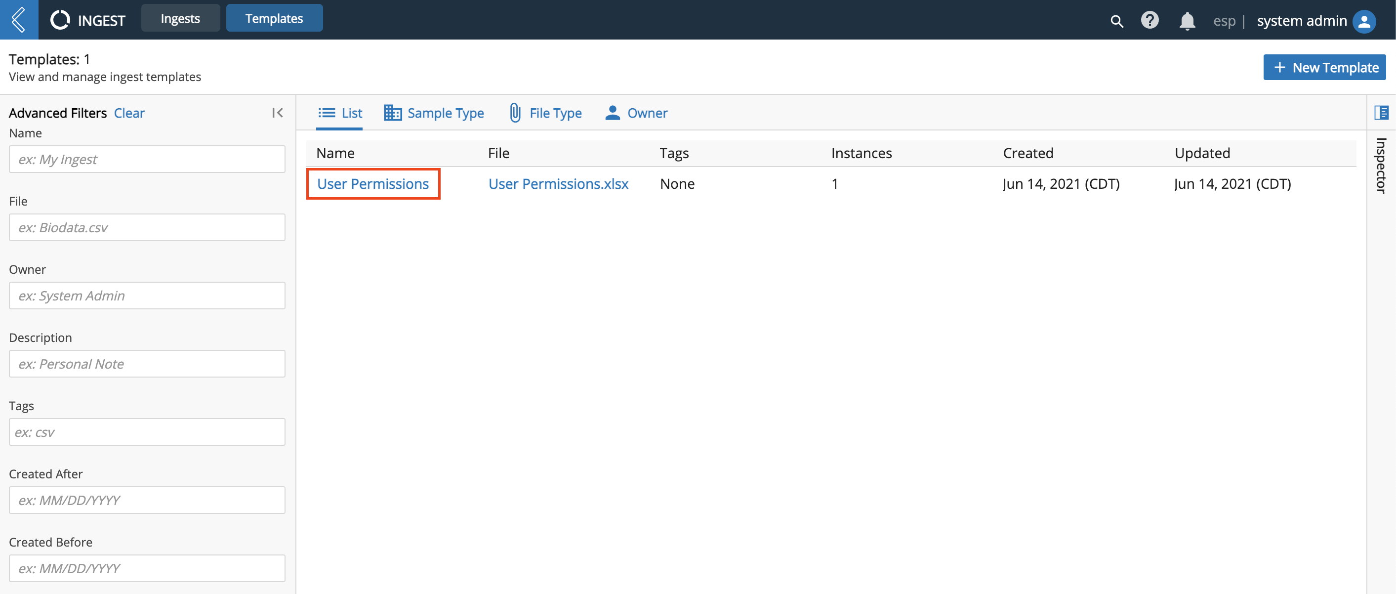
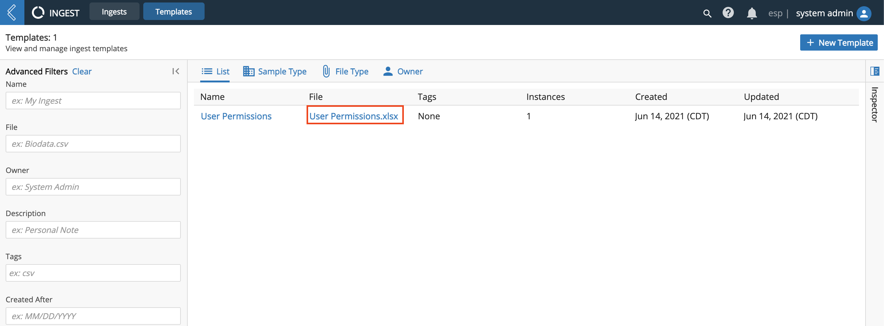
The Ingest app has two tabs: Ingests and Definitions. The Templates tab displays a list of all active Definitions, which can be viewed in a List, by Sample Type, by File Type, or by Owner.
From the Templates tab, you can view details about active Templates, such as number of files processed for each Template.
Click the row of a Template to view associated details in the Inspector on the right.
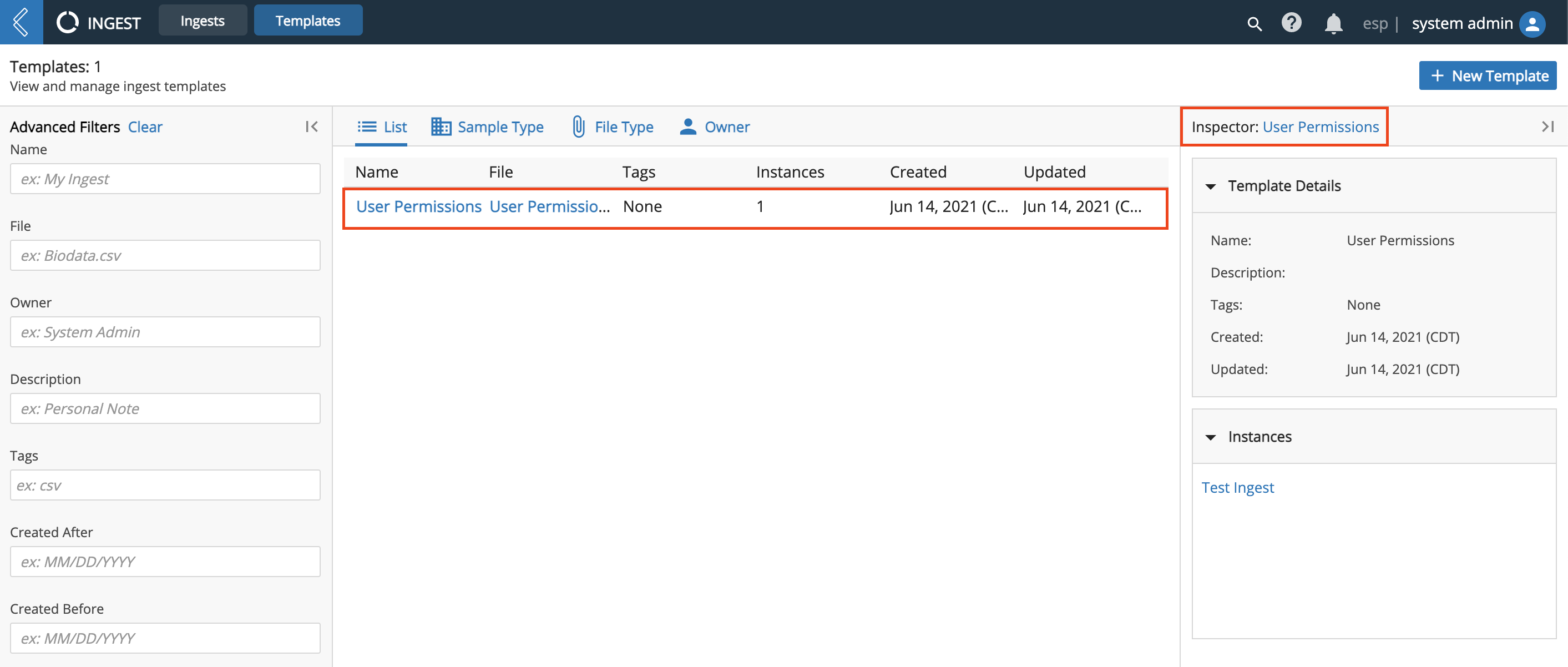
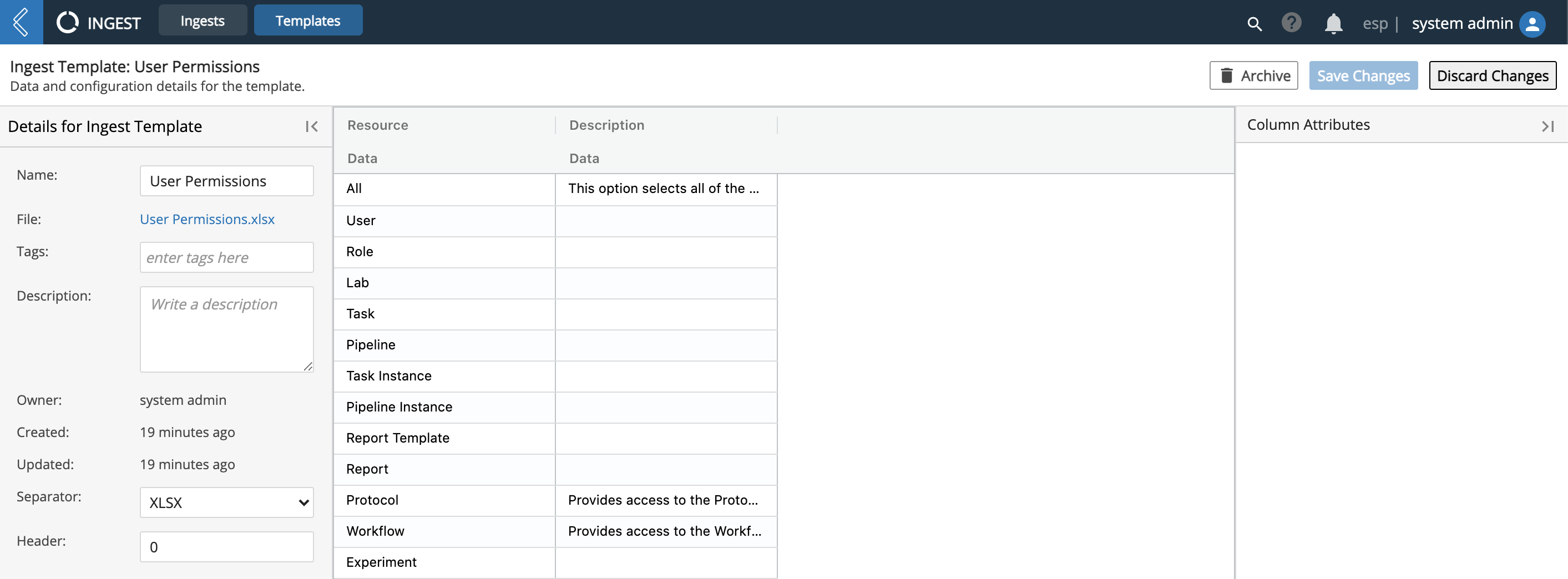
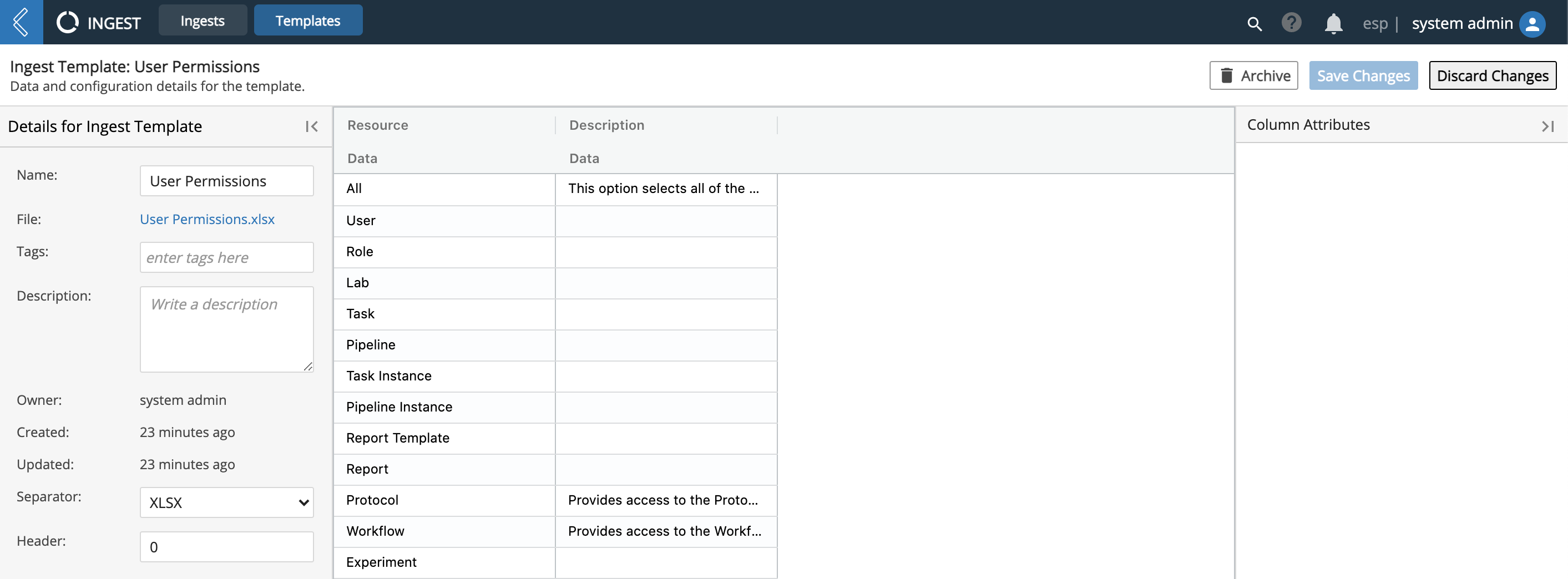
Click the Name of a Template to access the Template's details page (in the Templates tab). From this page you can update the parameters on how to Ingest files under that Template.
Click the File name of a Template to access the file's details page (in the Data app). From this page you can add a Description and/or Tag(s), Archive the file, Link Entities, view the file's contents, and download the file.
9.18.3. Create New Ingest
From the Ingests tab, click + New Ingest.
Drag and drop a file to Ingest, browse and select a file, or select a file previously uploaded to L7|ESP.
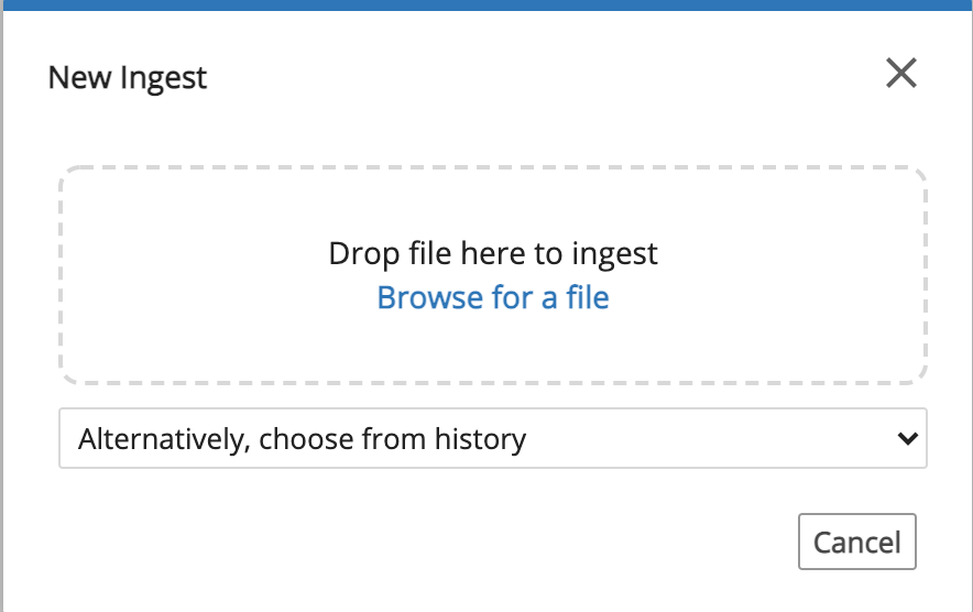
Observe that a preview of the uploaded file is displayed.
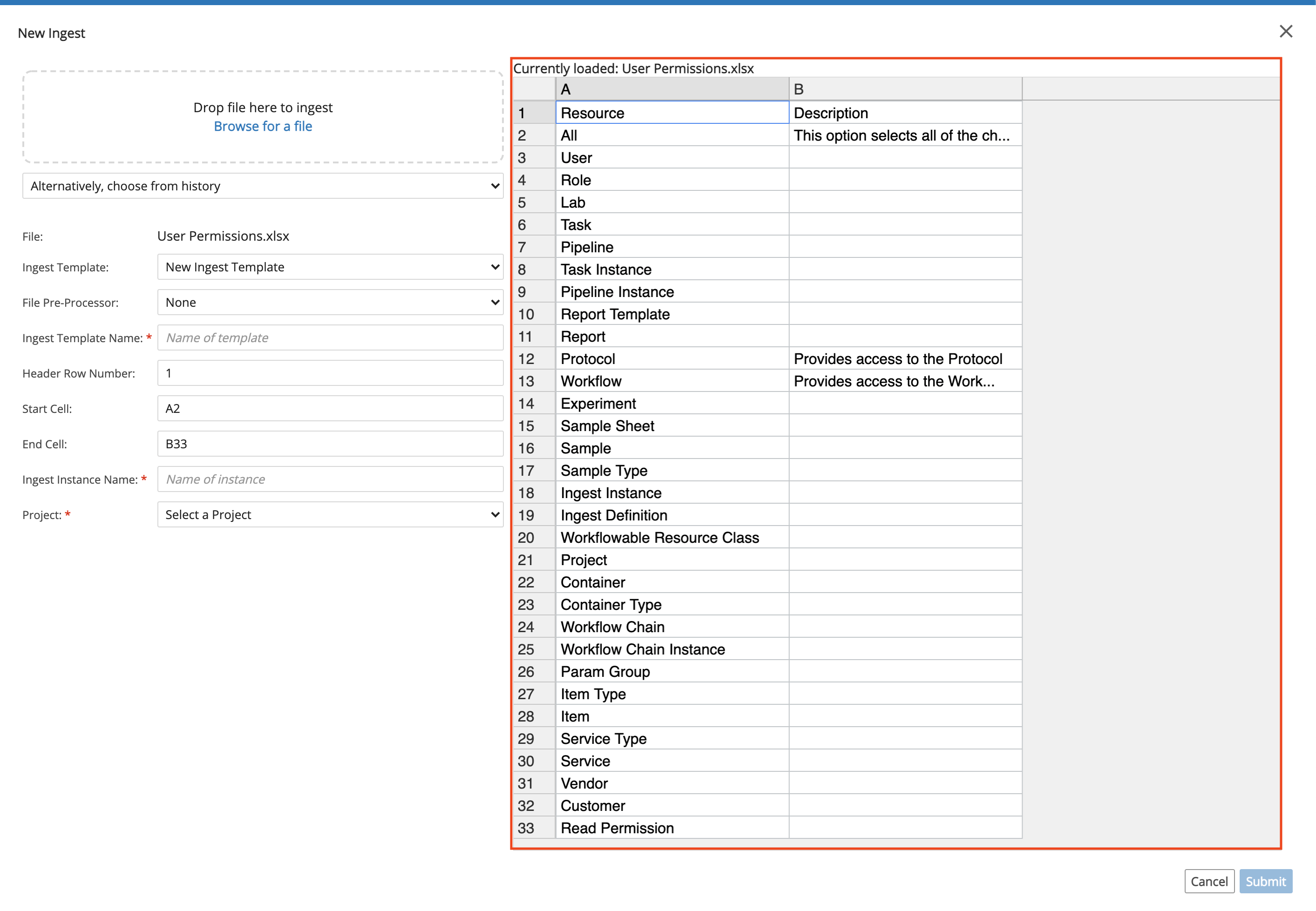
In the Ingest Template field, select New Ingest Template or select an existing Template. The Ingest Template field is used to establish parameters for Ingesting a file.
If you selected an existing Template, then the fields are automatically populated; however, you can make changes and rename the Template. If you selected New Ingest Template, then:
Verify the File Type.
Enter a Name for the Ingest Template.
Enter the Header Row Number, Start Cell and End Cell, which are parsing parameters so L7|ESP can properly read and pull the file's data.
Enter an Ingest Instance Name.
Select a Project.
Click Submit.
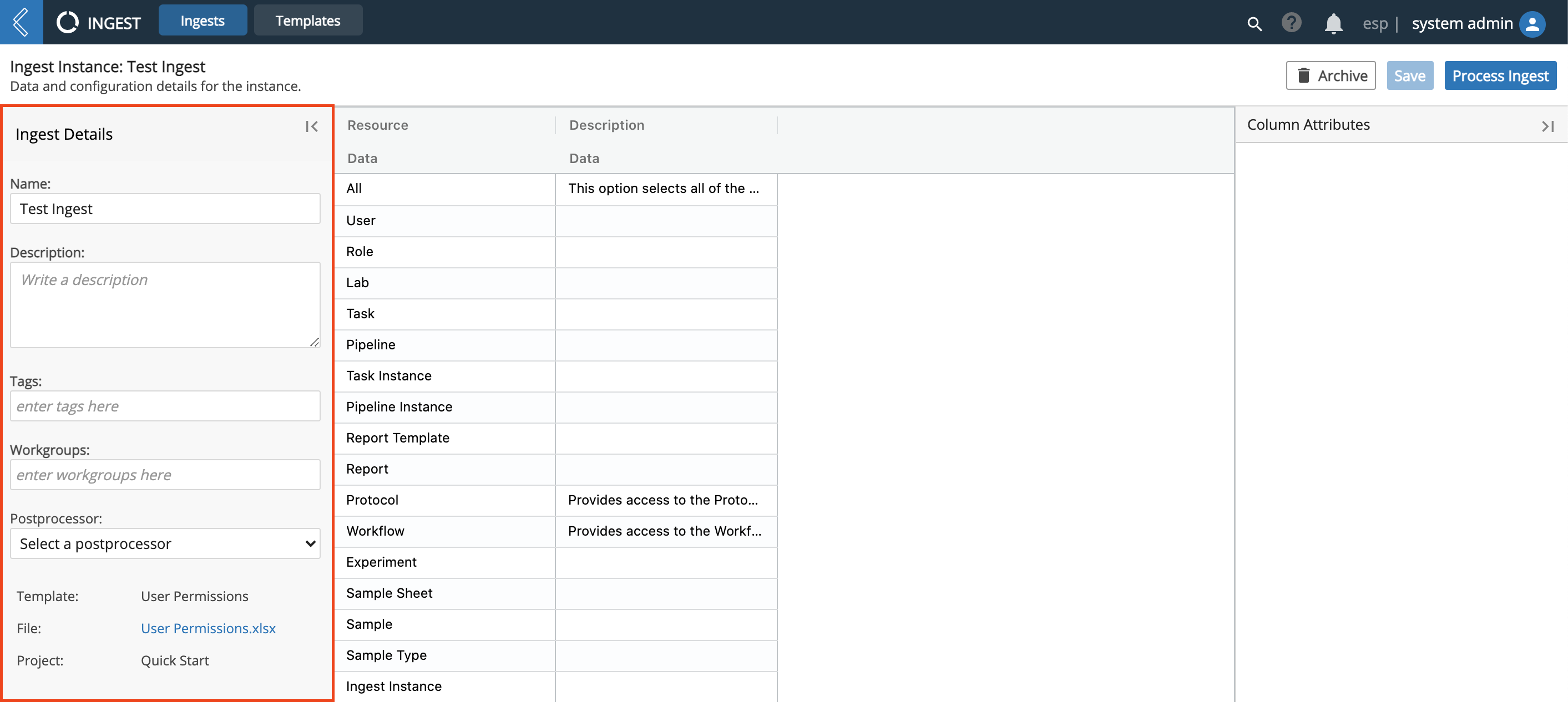
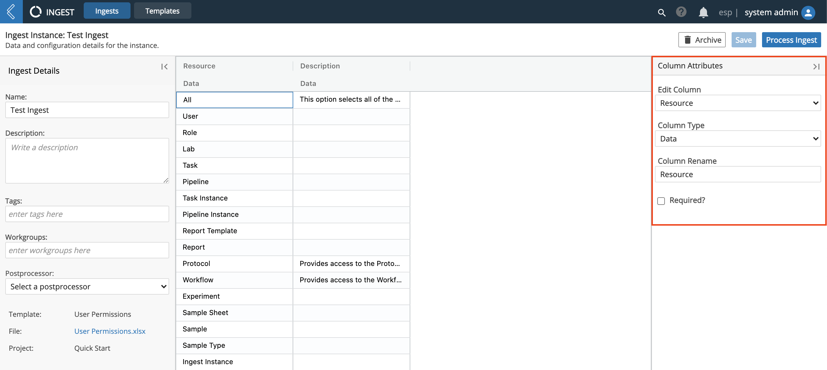
Before submitting for processing, review the associated information:
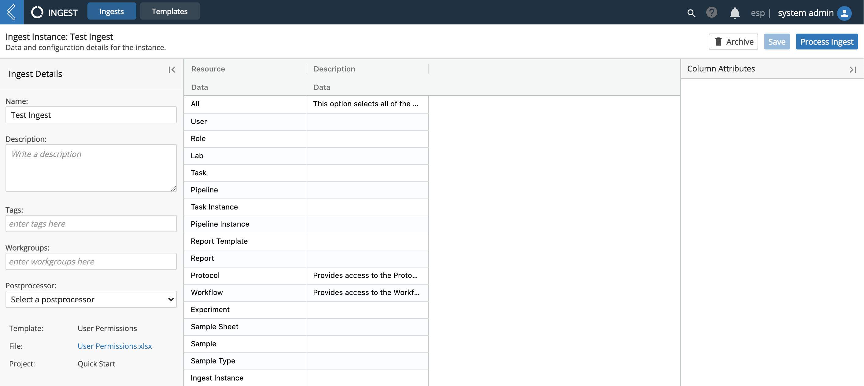
From the left panel you can update the Name and enter a Description and/or Tag(s). There is also a link to open the original file.
In the right panel is the associated Column Attributes.
In the center panel is L7|ESP's rendering of the file for you to preview.
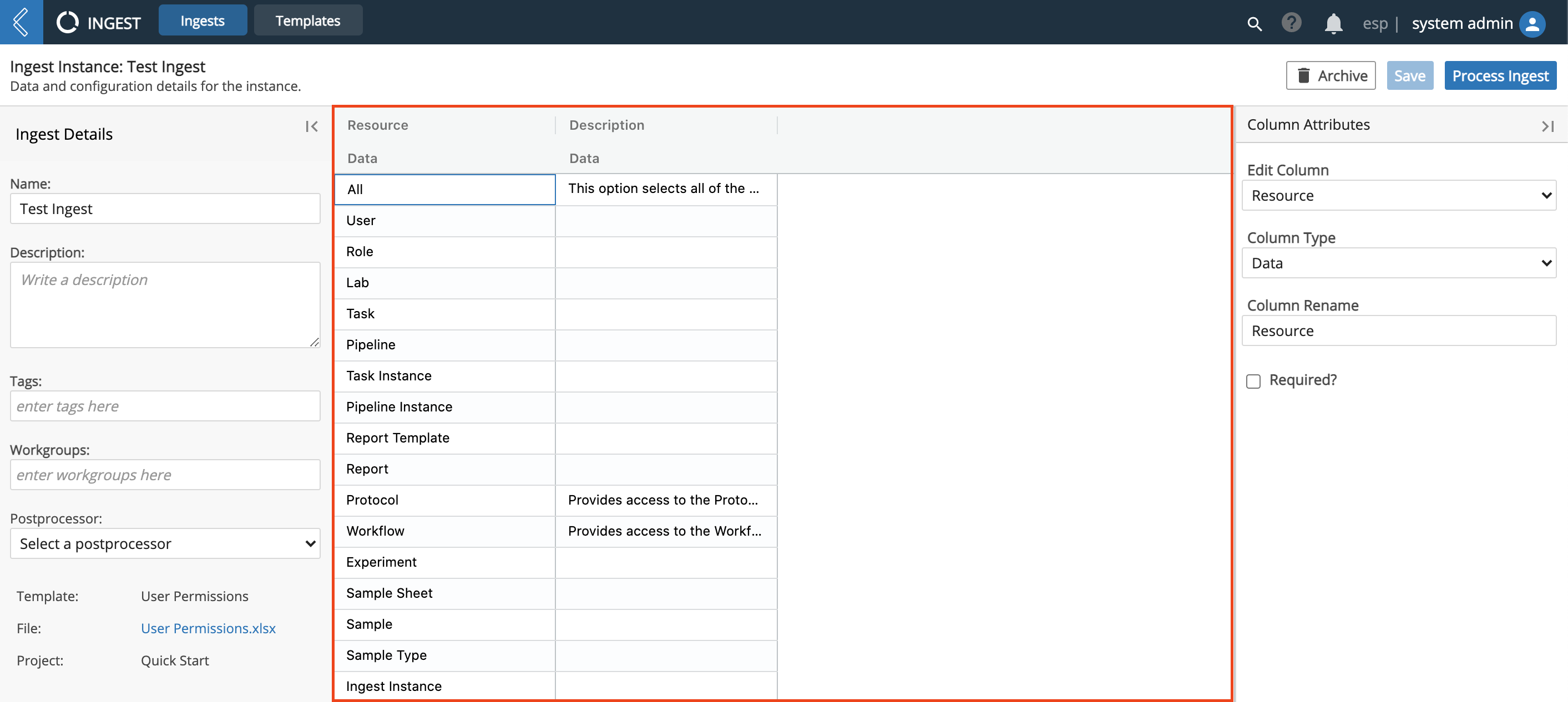
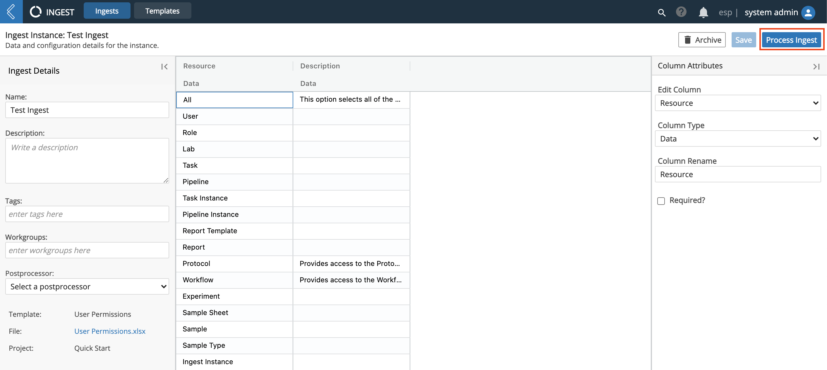
Click Process Ingest.
9.19. I18N
The Translations app allows administrators to import and export system and content translations. The app consists of the "Export" and "Import" panels.
9.19.1. Export Panel
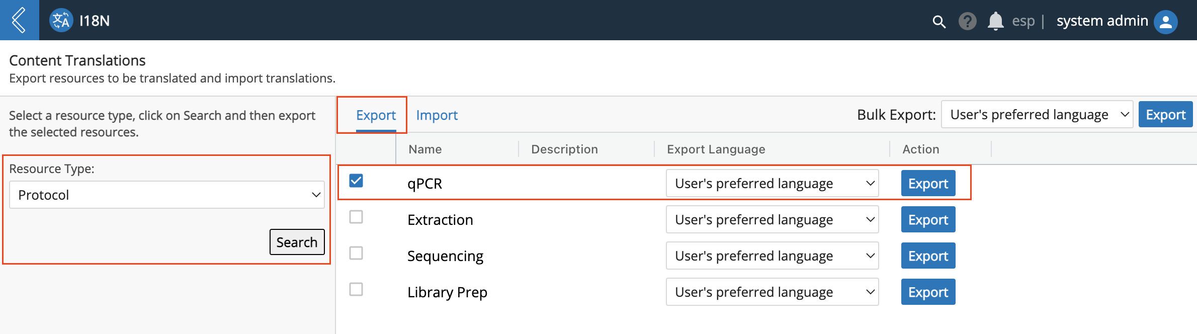
A user may:
Search for objects of a particular type
Export a translation file for a single object by choosing the appropriate language in the field adjacent the object then clicking "Export" for that row.
Export a translation file for many objects at once by selecting all of the objects to export, selecting the language to export next to "Bulk Export", and clicking the adjacent "Export" button.
When an object is exported, L7|ESP selects the appropriate rows from the i18n table and exports them in JSON file format:
{
  "fileInfo": {
    "fixed_id": "Quick Example",
    "cls": 512,
    "language": {
      "name": "English (US)",
      "code": "en_US"
    }
  },
  "name": {
    "value": "Quick Example",
    "type": "string"
  },
  "metadata": {
    "export_type": "single"
  }
}
The keys are as follows:
fileInfo: contains metadata about the exported file object, an object with keys:
fixed_id: the ID of the exported object. Used to match imported bundles to existing objects.
cls: The L7|ESP class id of the object. This is an internal-use field and should not be modified.
language: Information on the translation language with keys:
name: The display name of the language
code: The locale code for the language
metadata: metadata about the export with keys:
export_type: "single" - used during import to determine how to parse the file.
All remaining entries in the JSON object correspond to translated properties, where the key is the
property name and the value is a dictionary with keys value (the translated string) and type
(the translated property type).
When a bulk export is performed, the file format is nearly identical:
{
  "Quick Example": {
    "fileInfo": {
      "fixed_id": "Quick Example",
      "cls": 512,
      "language": {
        "name": "English (US)",
        "code": "en_US"
      }
    },
    "name": {
      "value": "Quick Example",
      "type": "string"
    }
  },
  "metadata": {
    "export_type": "bulk"
  }
}
The Bulk Export format takes the single-object export format and wraps it in an
outer object with key equal to the single object name. The metadata key
remains an outer-most object key, but the value of export_type changes to bulk.
9.19.2. Import Panel
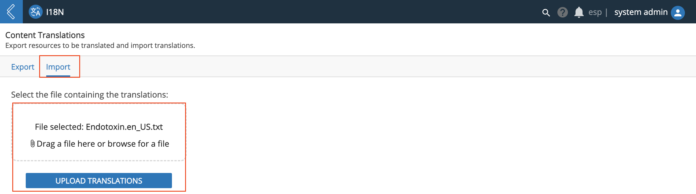
A user may:
Drag and drop a translation file bundle onto the drop target
Click the drop target to open a file browser to select a translation file bundle
Upload the translation bundle
When the file is imported, the JSON contents are extracted and imported into the database, associated with the appropriate object. For versioned objects, the imported keys are associated with the newest version of the file.
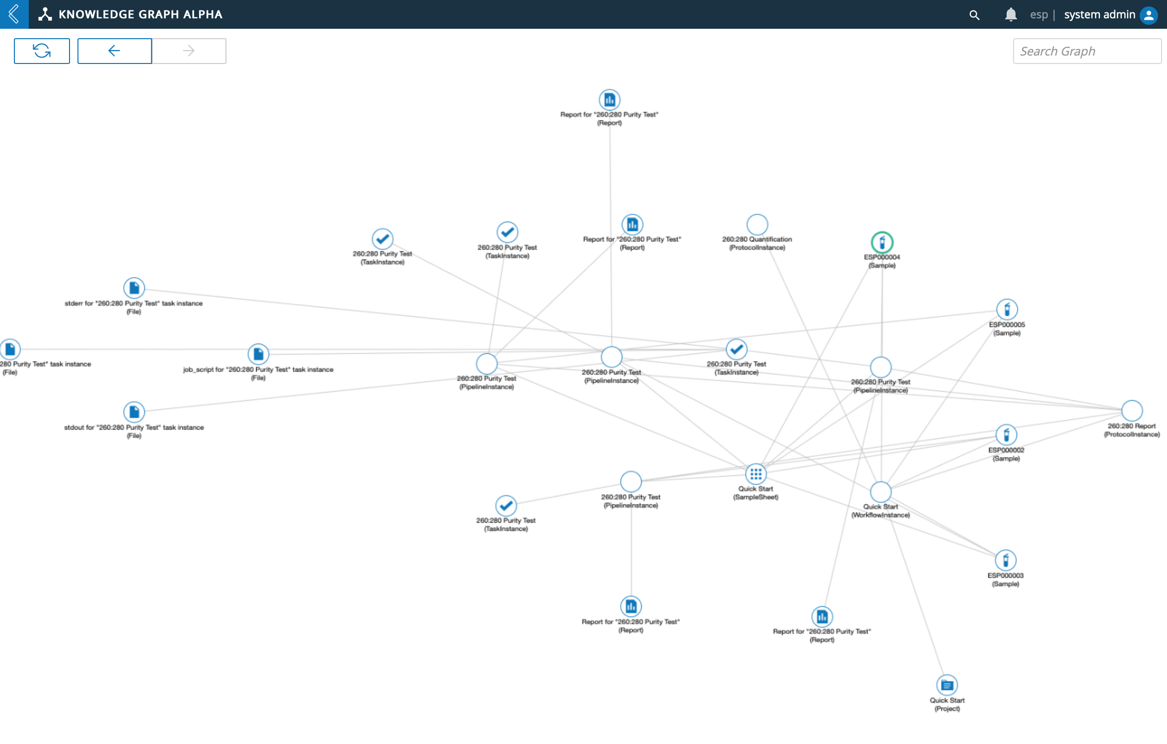
9.20. Knowledge Graph
Note: The Knowledge Graph is currently in an Alpha phase. Further improvements to the Knowledge Graph are coming soon.
The Knowledge Graph aggregates your L7|ESP Entities into a visual form. The displayed Knowledge Graph:
Gathers L7|ESP's data automatically.
Displays numerous connections in an easy-to-view manner.
Can be used to discover important relationships between groups of Entities.
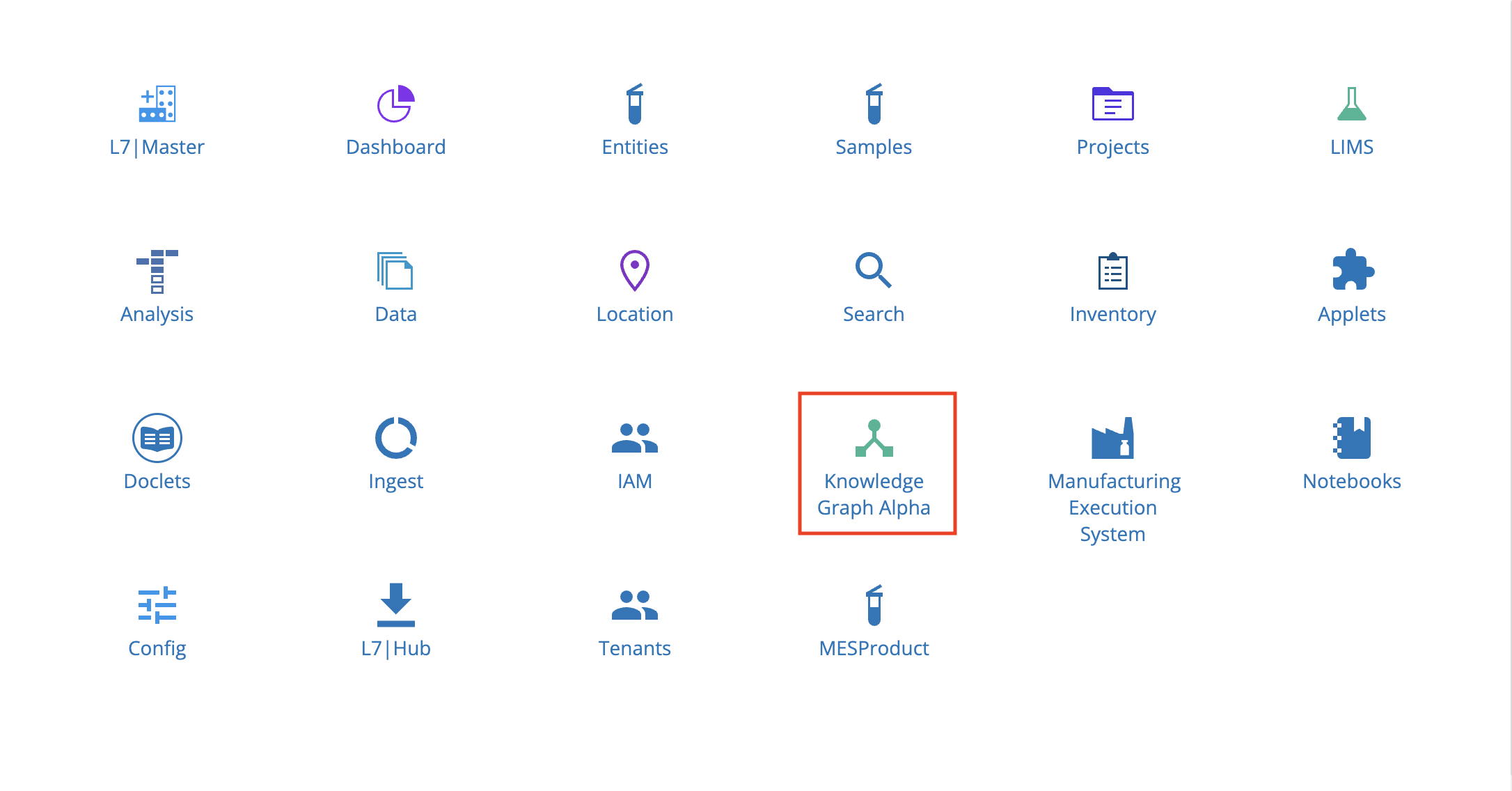
Click an Entity in the Knowledge Graph.
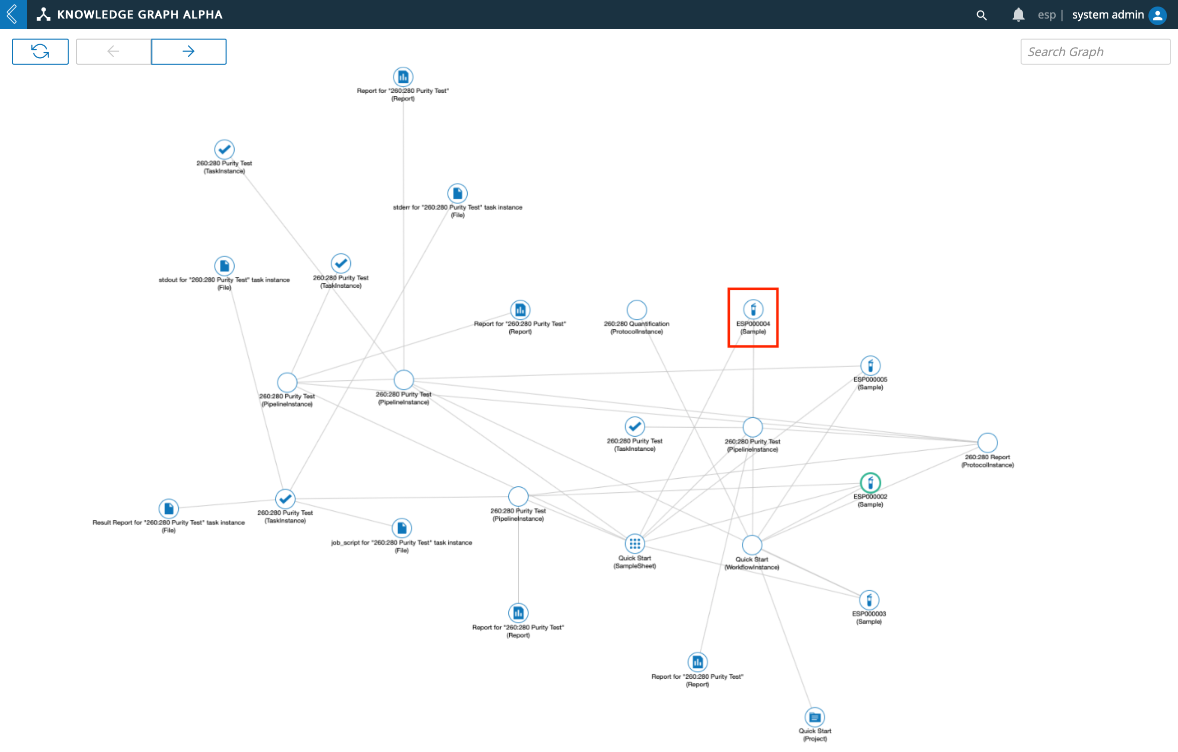
The Knowledge Graph will rearrange and display connections associated with the Entity clicked.
9.21. Manufacturing Execution System
The Manufacturing Execution System app facilitates batch execution using the ESP workflow engine. The MES user is able to enter date during process executions, review and correct data after the fact, manage samples and bill of materials for batches, and gather signatures for batch records.
From the Home menu, click Manufacturing Execution System.
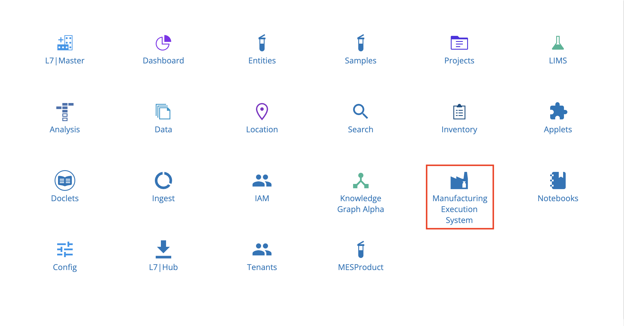
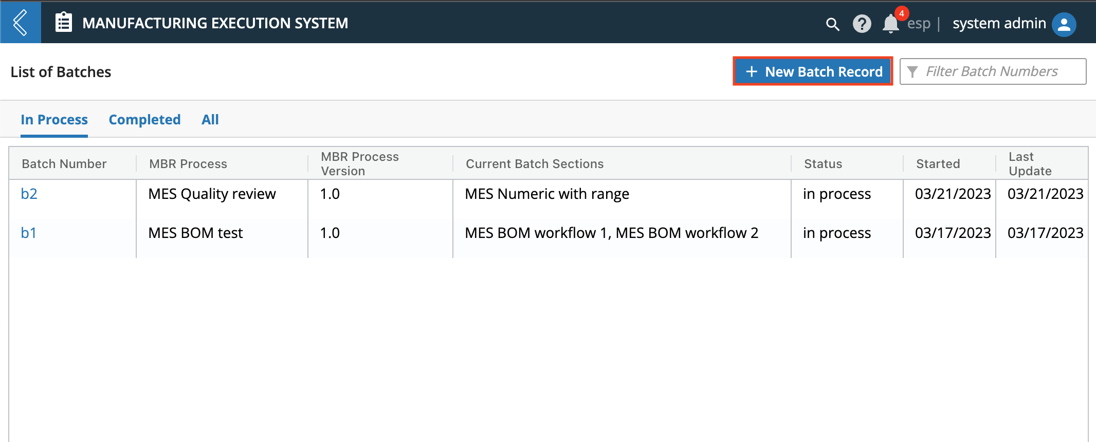
In the Manufacturing Execution System app, there will be a page showing the List of Batches, that can be filtered using In Process, Completed, and All.
9.21.1. Create New Batch Record
From the Manufacturing Execution System page, click + New Batch Record.
Enter a Batch Name and select Product from the drop down selections.
Process will be auto-populated with Product. Select Version.
Optional: Select Specification Plan and Sample Plan.
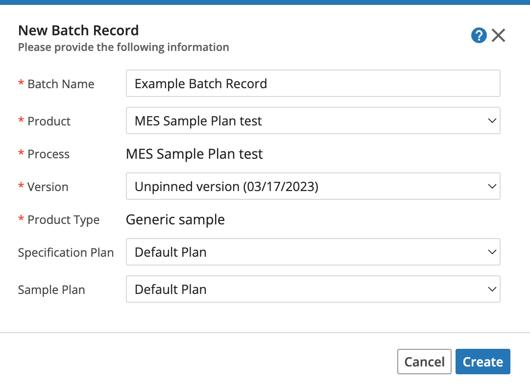
Once the new Batch Record is created, it can be selected under the List of Batches to navigate to the batch record's page.
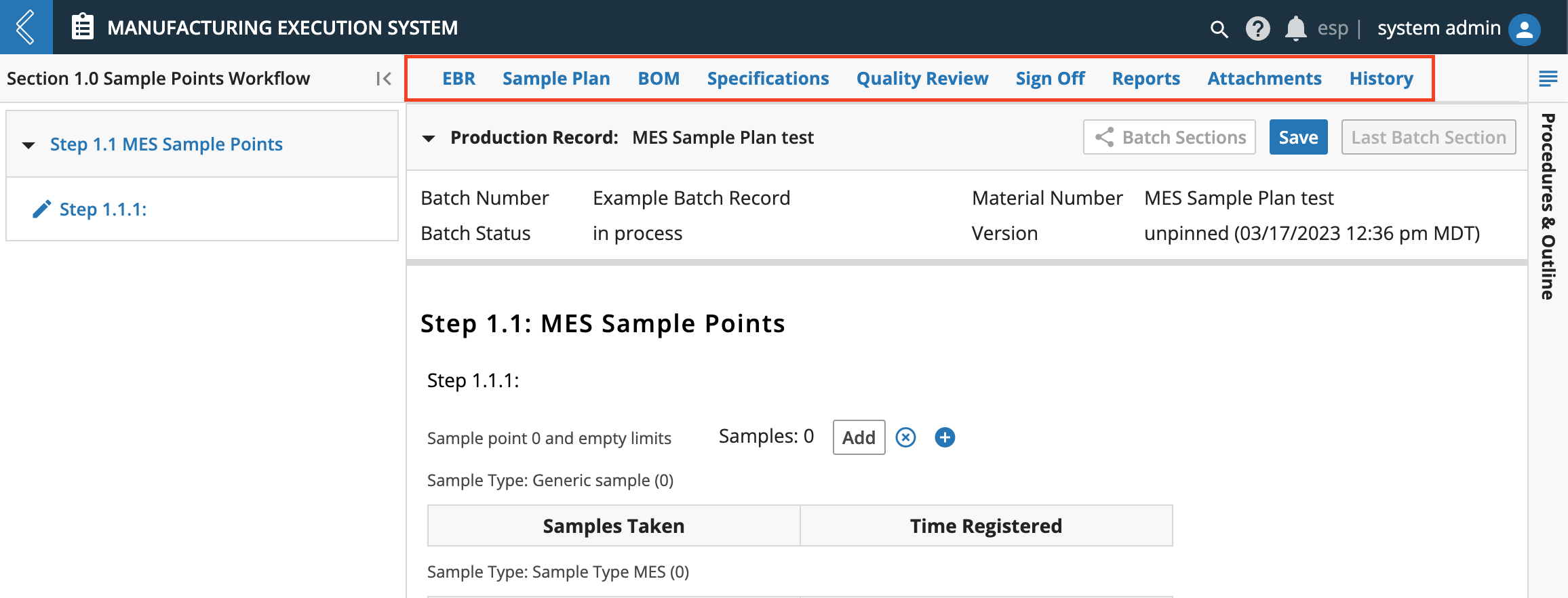
- The Batch Record details page includes:
Electronic Batch Record (EBR)
Sample Plan
Bill of Materials (BOM)
Specifications
Quality Review
Sign Off
Reports
Attachments
History
9.21.2. Electronic Batch Record
The ERB Tab is used to enter data gathered during batch execution. It will display fields for one step at a time. All steps within a section are listed on the left panel.
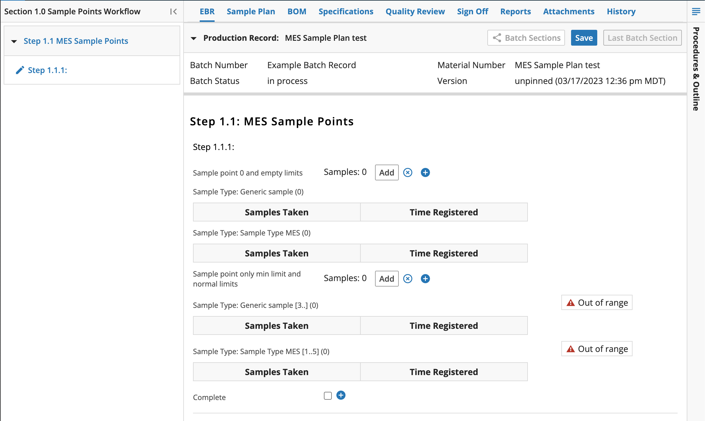
Data can be edited, entered, new items added (Using the Add button), or marked as N/A (Using the "X" N/A Toggle button).
Comments can be added to Data sets by clicking the + button, which will bring up the Add Comment window. Entering a Deviation is also possible from this window.
When a step is complete, ERB will automatically move to the next step, until reaching the last, which will display the Last Batch Section button to the right of Save.
9.21.3. Sample Plan
The Sample Plan tab displays information about the Samples within the manufacturing process. It also enables the permitted users to print sample labels and reconcile unused sample labels.
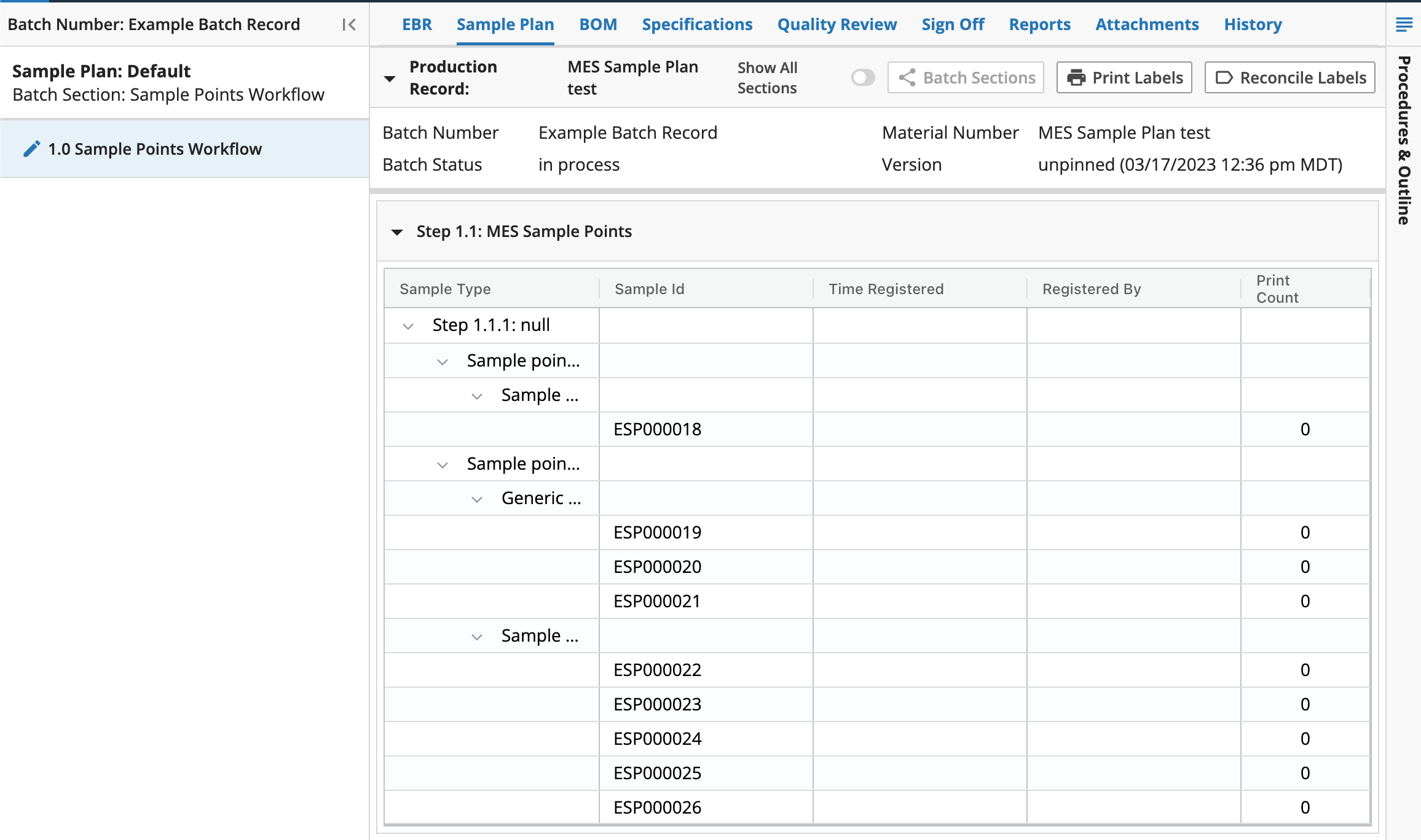
The main panel of the Sample Plan tab displays information about the samples used or planned within the batch.
Sample labels can be printed from this page by selecting the Print Labels button in the upper right hand corner of the main display. Labels can be printed as all samples in the Batch, all samples within the Batch Section, and specific sample points.
The permitted user is also able to Reconcile labels by selecting the Reconcile Labels button in the upper right corner of the main display. Within the Reconcile Labels window, the amount of Labels destroyed is defaulted using the Print Count and Used Count, but the amount may be modified as needed.
9.21.4. Bill of Materials
The Bill of Materials (BOM) tab displays information about the raw materials and other items consumed/used during the manufacturing process.
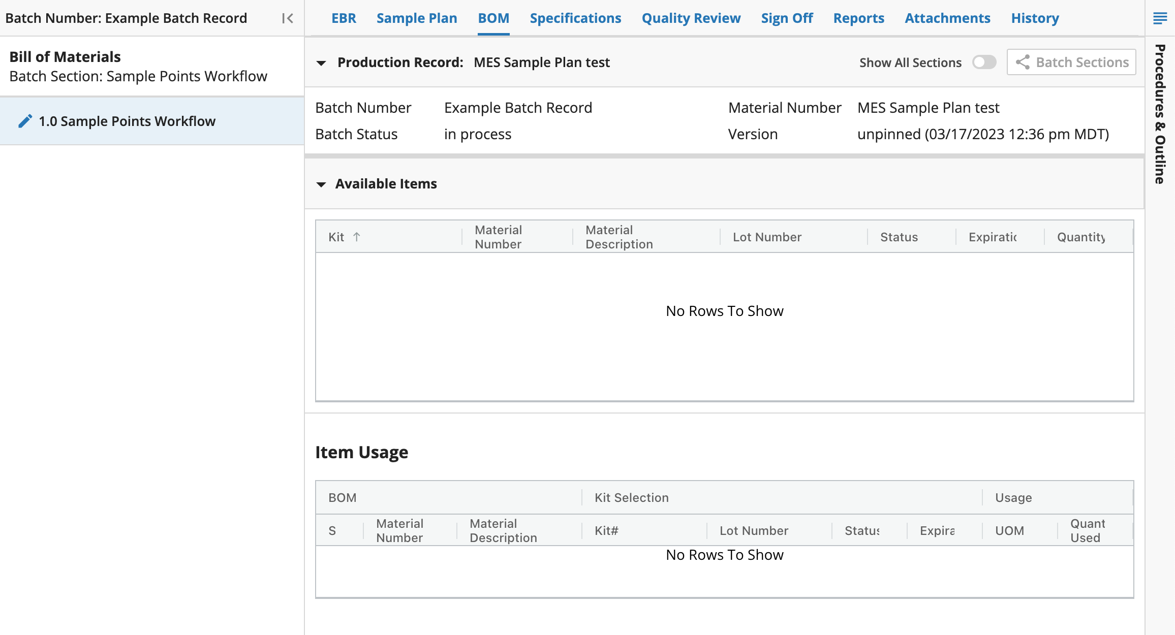
Available Items associated with the batch or batch execution is shown in the main display of the BOM tab.
Information about Kits is displayed, which is modeled in ESP Containers, and is intended for use within a particular batch that is specified during batch creation or execution.
The Item Usage table includes information about the items listed as used during the manufacturing process. If more than one lot of an item is used, each lot is displayed as its own row. In this table is also the items that are planned for the batch, if the process has not reached those consumables yet.
9.21.5. Specifications
The Specifications tab provides an overview of the numeric specification fields that are captures during the manufacturing process. The information shown is for viewing purposes only.
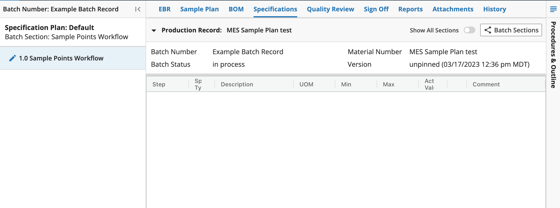
The Batch Sections button at the top of the main display shows an overview of all sections within the batch recipe.
The main display shows information about the specifications used or planned within this batch.
9.21.6. Quality Review
The Quality Review tab in MES is used to review and correct data gathered during batch execution. Users with the correct permissions can mark data as reviewed, request changes, and make changes to the data in this tab.
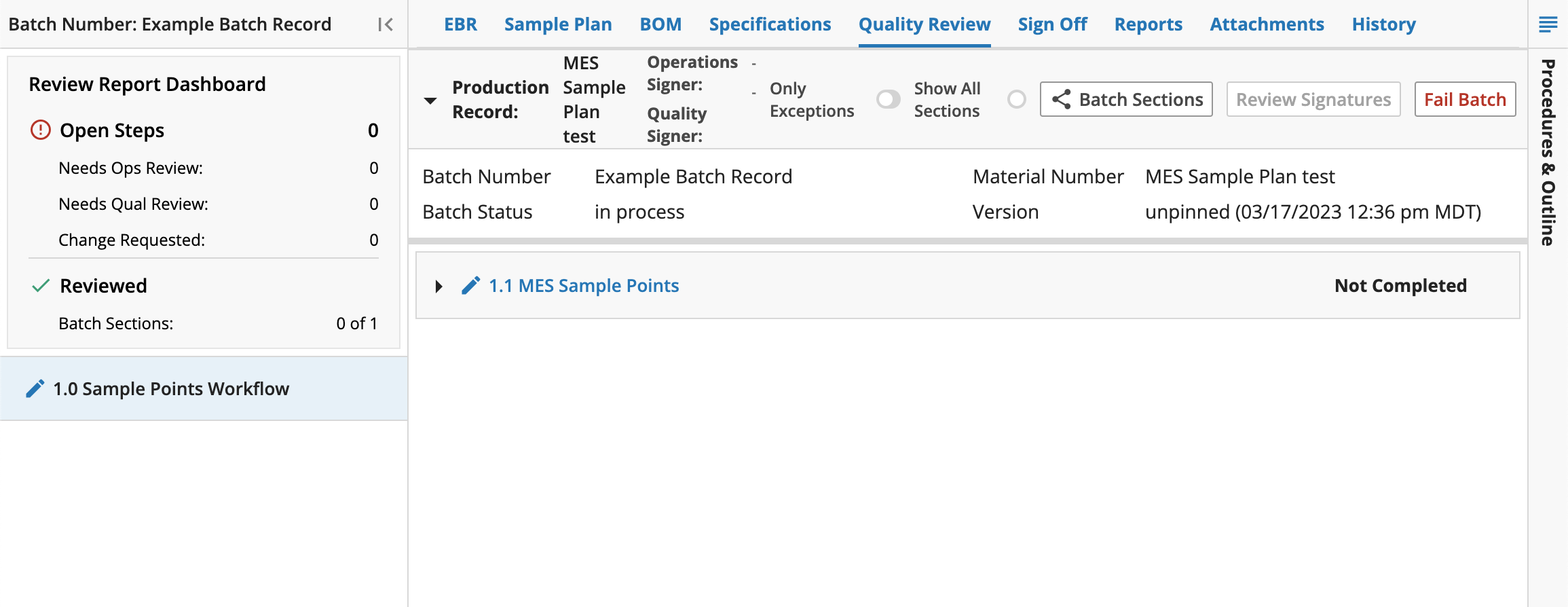
The main display shows information of each step in the batch. Each step and sub-step can be selected to view it in the Reviewer Portal
When a step is completed in ERB, MES automatically reviews the entered data to identify any exceptions that require review. Included exceptions are: Procedural, Incomplete, Unsigned, and Out of Range.
Each step in a batch is assigned a status: Needs Ops Review, Needs Qual Review, Changes Requested, Reviewed or Systems Reviewed. - To complete the review process, Quality Review requires one signature from an operations reviewer and one from a quality reviewer after all steps have been marked as reviewed/system reviewed. - At any time during Batch execution, before completion, the batch can be marked as Failed using the Fail Batch button in the upper right corner of the main display. Once Failed, the batch is locked and no data may be entered.
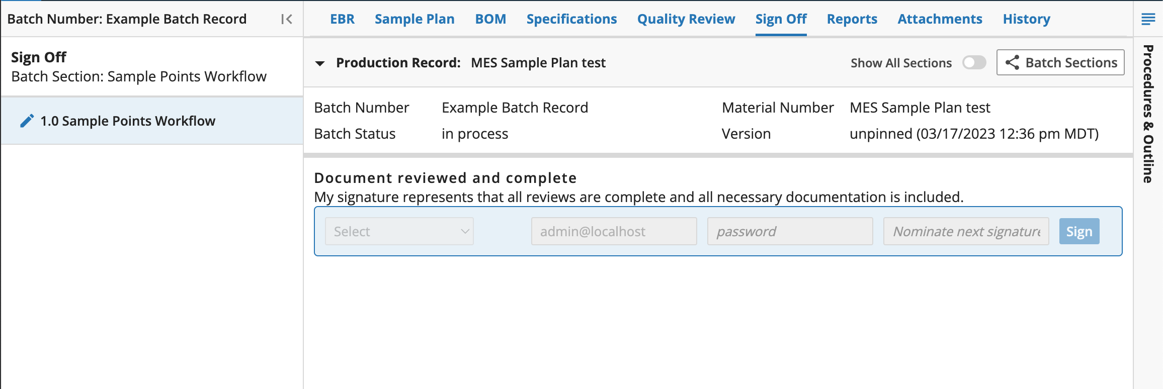
9.21.7. Sign Off
The Sign Off tab provides a mechanism for a final review sign off on a batch before it is completed in MES. Signatures in this tab can only be captured after completion of required Quality signatures within the Quality Review tab. The signatures required are governed by the signature flow associated with the Batch recipe.
9.21.8. Reports
The Reports tab allows the user to generate both out-of-box and custom reports for the Batch.
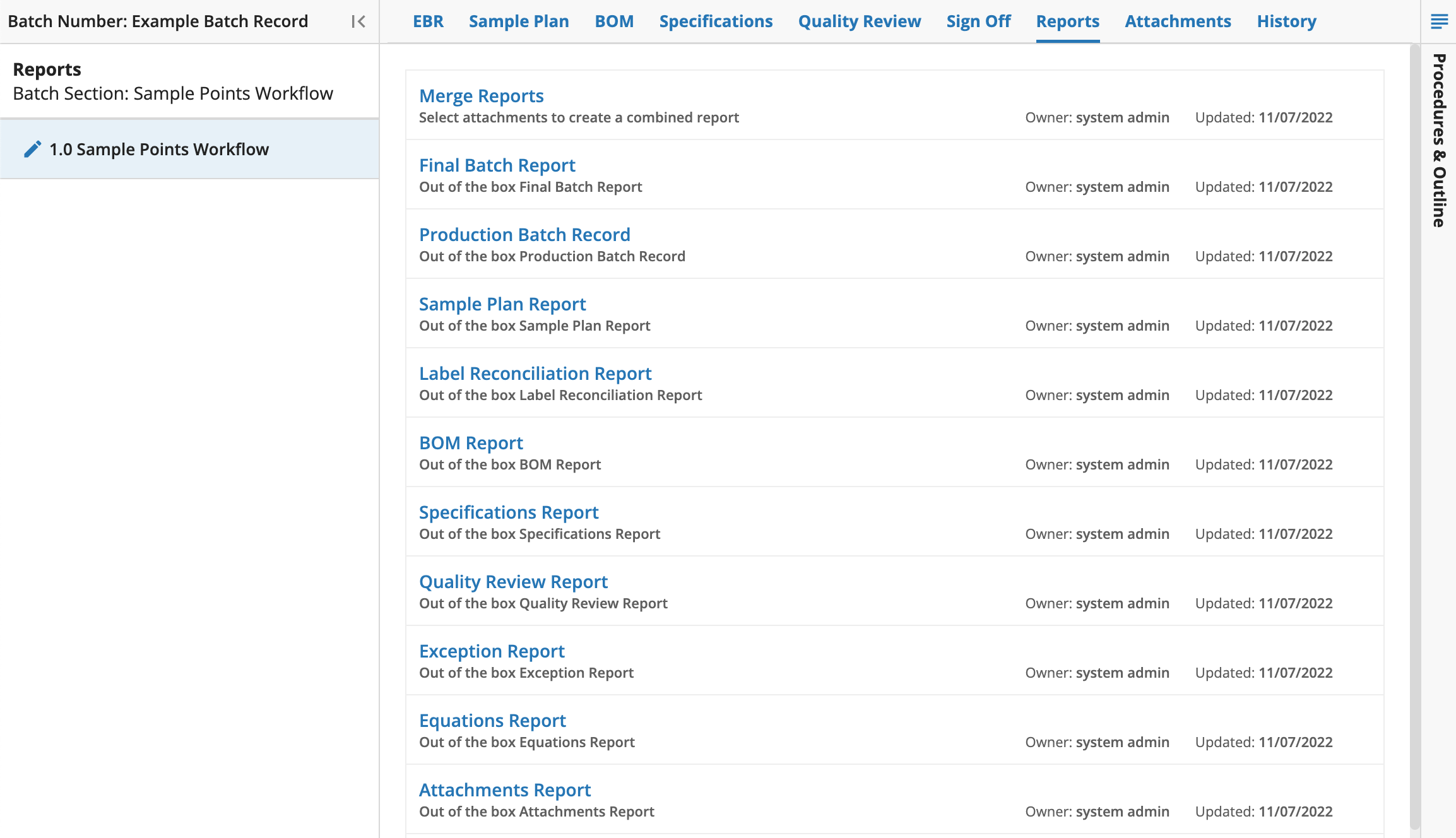
Reports can be generated by clicking a report name, which will generate the requested report and display it in the main display. Out-of-box reports that can be generated are as follows: - Final Batch Report: Includes combined reports of information gathered during the batch processing: Signatures, EBR, Sample Plan Report, Label Reconciliation Report, BOM Report, Specifications Report, Equations Report, Quality Review Report, **and **Exception Report. - Production Batch Record: Includes a record of all fields captured during batch processing. The combined Record includes Signatures, EBR, Sample Plan Report, Label Reconciliation Report, BOM Report, Specifications Report, Equations Report, and Lookup Report. - Sample Plan Report: Lists all sample IDs that were reserved or registered for use in the batch. - Label Reconciliation Report: Lists all sample IDs that were reserved or registered for us in the batch, with the print counts of labels and acknowledgement of destruction. - BOM Report: Lists all materials planned or consumed in the batch. - Specifications Report: Lists all specifications for the batch. - Equations Report: Lists all equations used during batch processing. - Quality Review Report: Lists all field values that were changed within the Editor Portal. - Exception Report: Lists all fields with deviation comments or out of range exceptions that exist after the step has been marked as Reviewed. - Lookup Report: Lists all pick-list or lookup fields in the batch. - Master Batch Record: A similar build to the Production Batch Record, but without the context of the batch. The batch name is not included in this report.
Reports can be merged using Merge Reports, which allows the user to merge individual PDF files from the Attachments tab into one PDF file. This can be done by selecting the Merge Reports link, then selecting Merge PDFs.
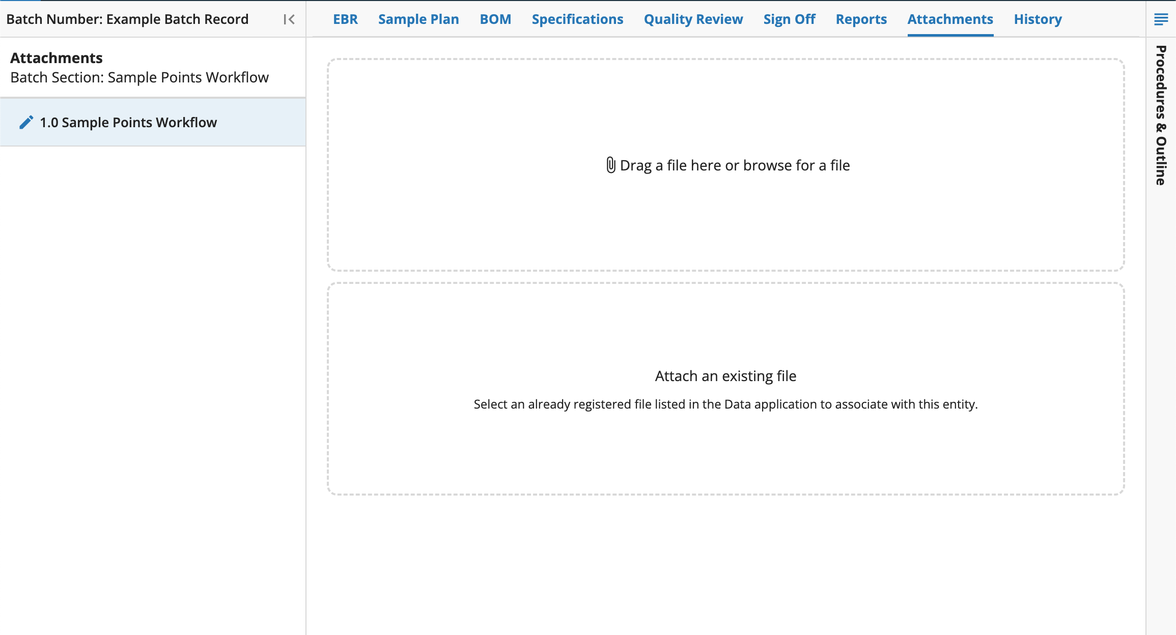
9.21.9. Attachments
The Attachments tab lists the files that have been attached to the batch. Files can be attached to a batch by dragging and dropping, browsing for the file, or using the Attachments button in EBR. Any PDF files may be merged with other reports using the Merge Reports link on the Reports tab.
9.21.10. History
The History tab provides a history of all activity performed against the Batch, including users, date, and time.
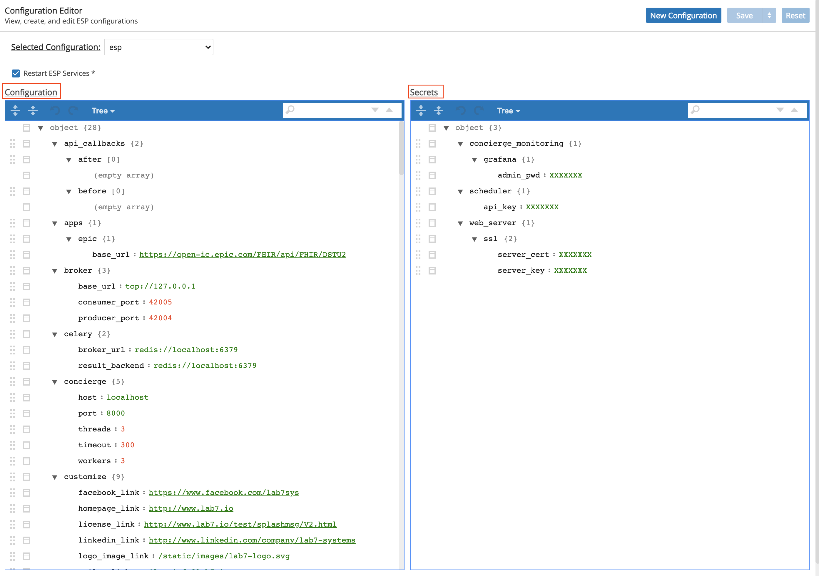
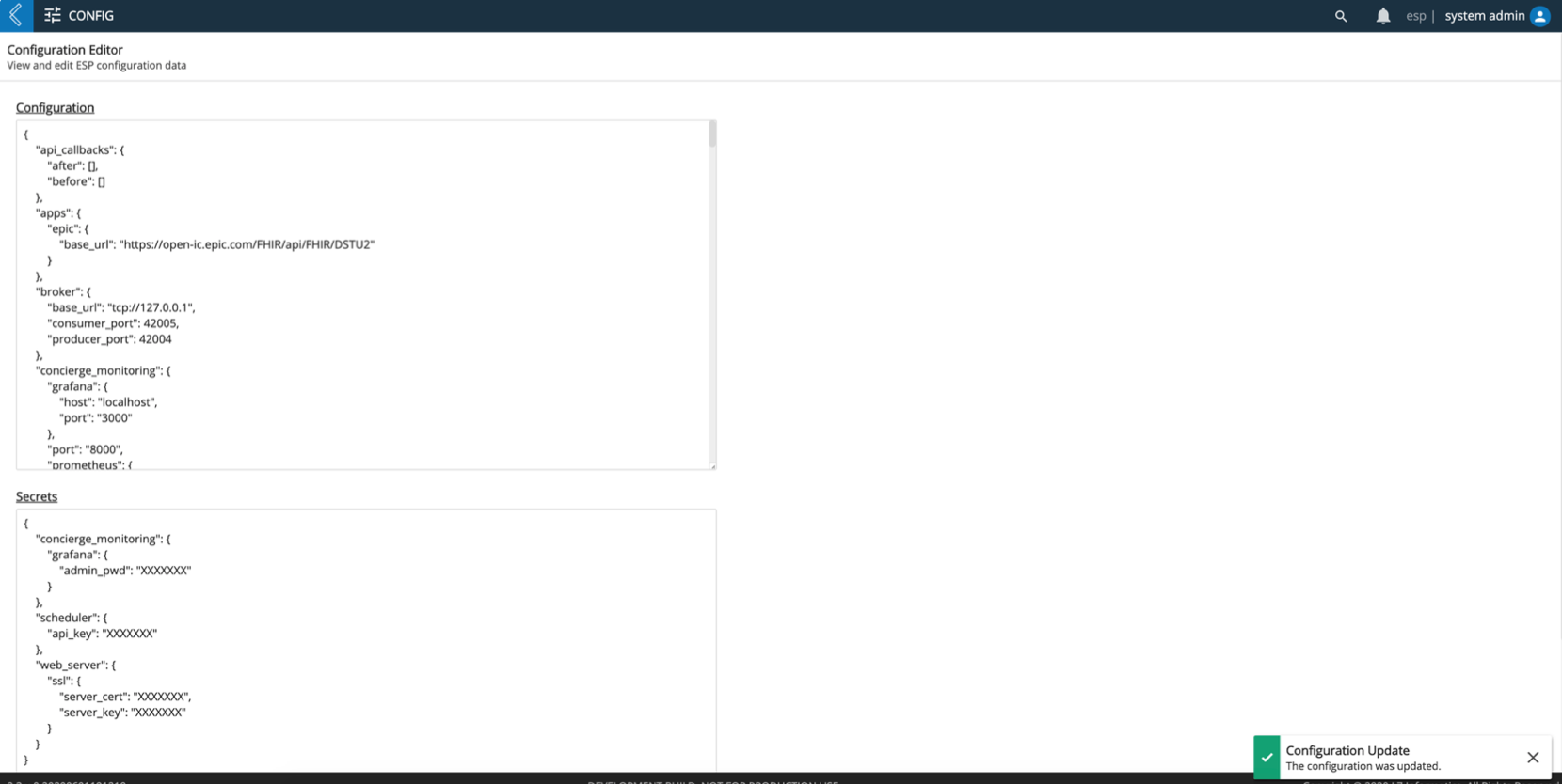
9.22. Configuration App
The Configuration app allows users to easily update L7|ESP configuration data.
The Configuration app has the following functions:
Displays current configuration.
Displays secrets.
Allows changes to the configuration.
Allows changes to the secrets.
Applies changes with restarting L7|ESP services.
Applies changes without L7|ESP services.
Resets if a user wants to discard any changes made.
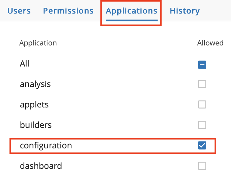
To access the Config app, the user must have proper permission. Refer to the L7|Master Guide for instructions on how to assign permissions. In addition to assigning the user permission to access the Config app, an entry inside the license for “__configuration__” will need to be added and a new license file generated. This will allow Roles within L7|ESP to have access to the Config app.
The Config app has two large text areas: Configuration and Secrets. These text areas are initially filled in with the configuration and secrets retrieved from the database. Use these text areas to modify data.
If data has not been modified, then the Save and Reset buttons are disabled.
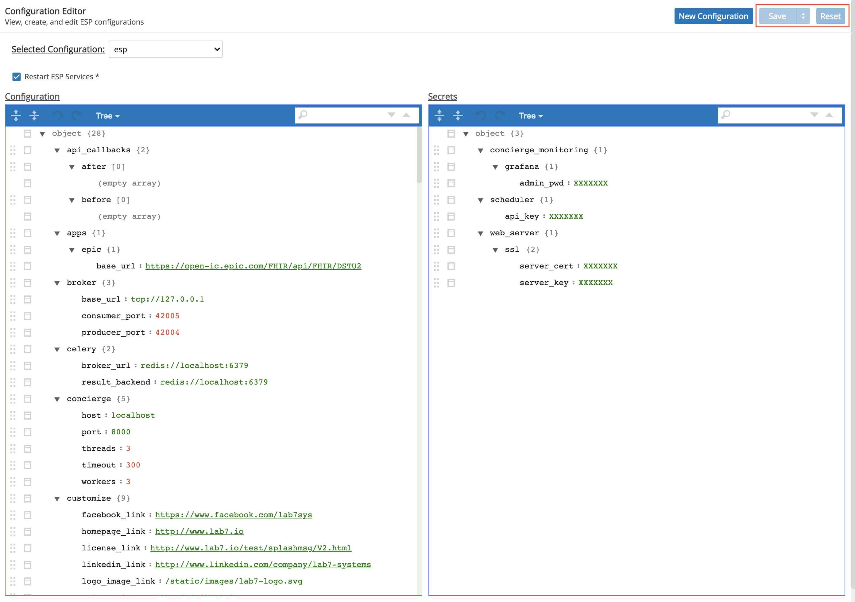
Once data has been modified, the Save and Reset buttons are enabled.
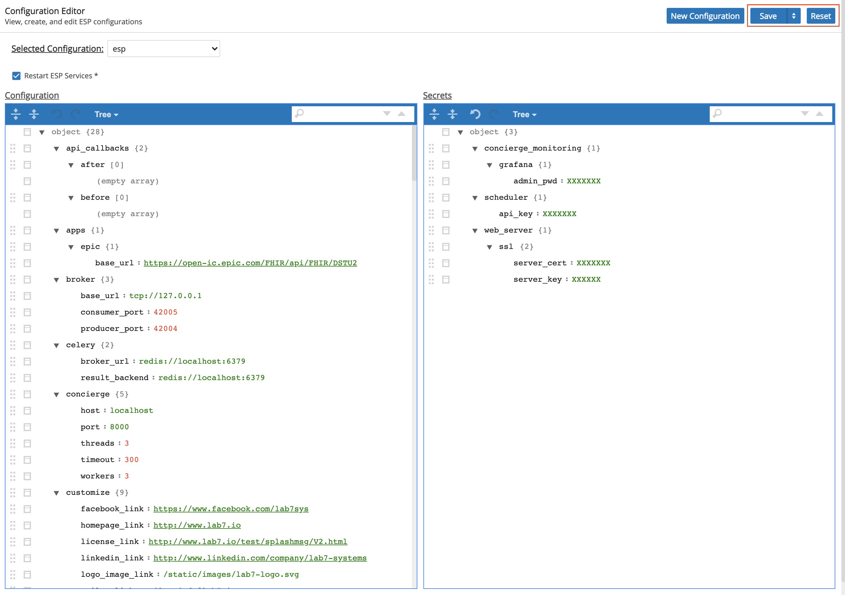
Once the data is modified and submitted, the entire GUI is disabled.
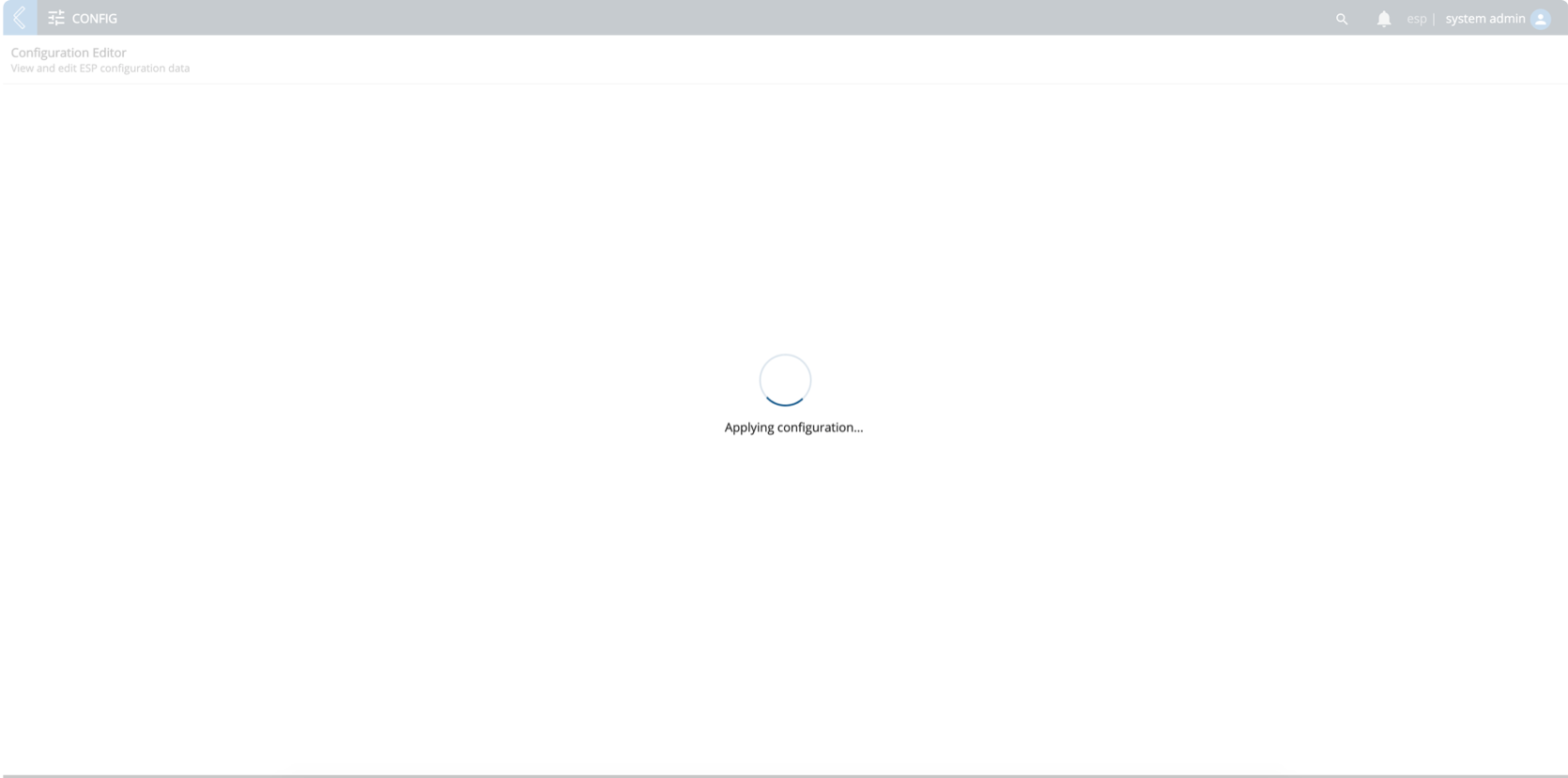
The user cannot use the GUI until a response from the server occurs.
9.23. L7|HUB
The L7|HUB app of ESP is where you can see the content that has been installed or is available for install in your L7|ESP instance. In the application, "content" refers to data models that have already been formatted for an L7|ESP instance. Content comes in many forms, such as Sample Types, Applets, Workflow Chains, and even Bundles containing multiple content items. Once content has been installed in the L7|HUB app, it will be automatically applied to your L7|ESP instance.
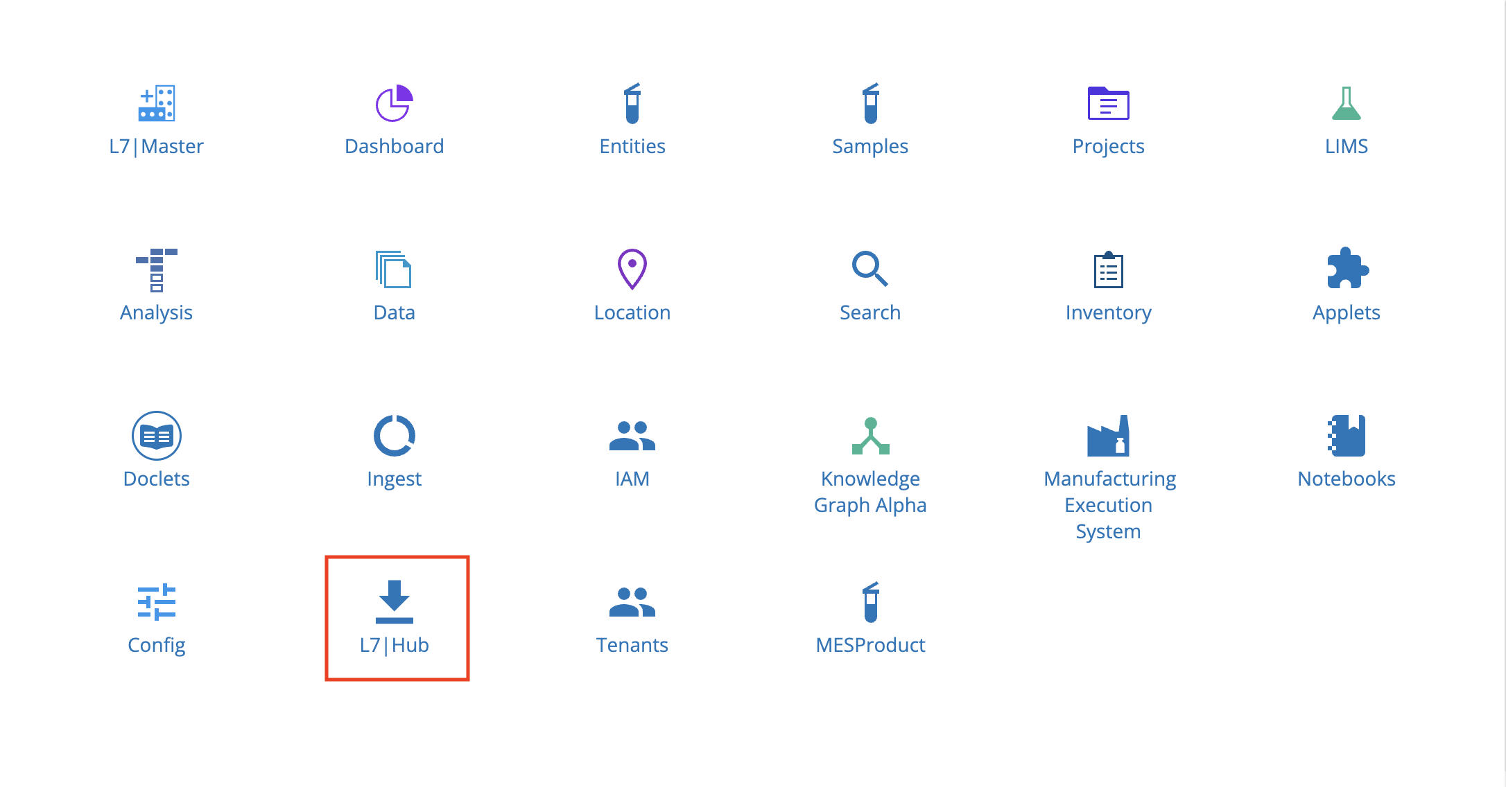
From the Home menu, click L7|HUB.
There are two tabs in the L7|HUB app: Hub and Collections.
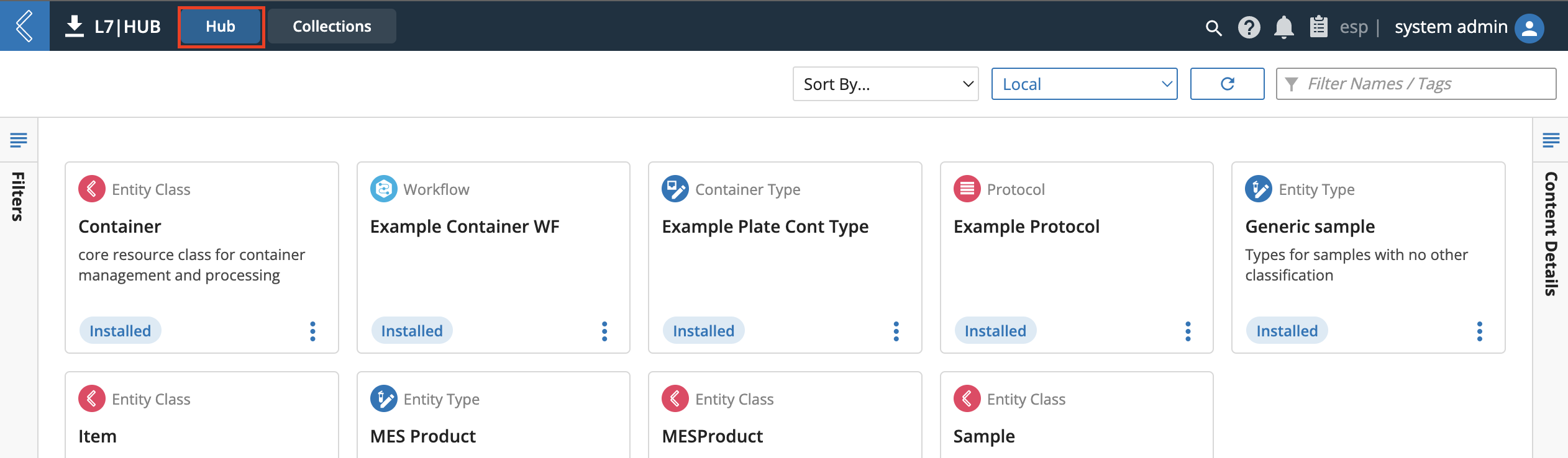
The L7|HUB app - Hub tab displays the content store used for viewing content currently on the instance and—following proper instance configuration and permissions—finding external content from other instances to install to the current instance.
9.23.1. HUB Library
SDS-HUB-1
Clicking the L7|HUB app icon opens the Hub tab L7|HUB library.
The library contains available, or already installed, content on the local instance.
To sort through content in the library, the "Sort By..." dropdown shows 4 options for sorting.
Newest First
Oldest First
A-Z
Z-A
In addition, users can filter by content Type(s), Status, or Tags by expanding the Filters pane at the left edge of the screen.
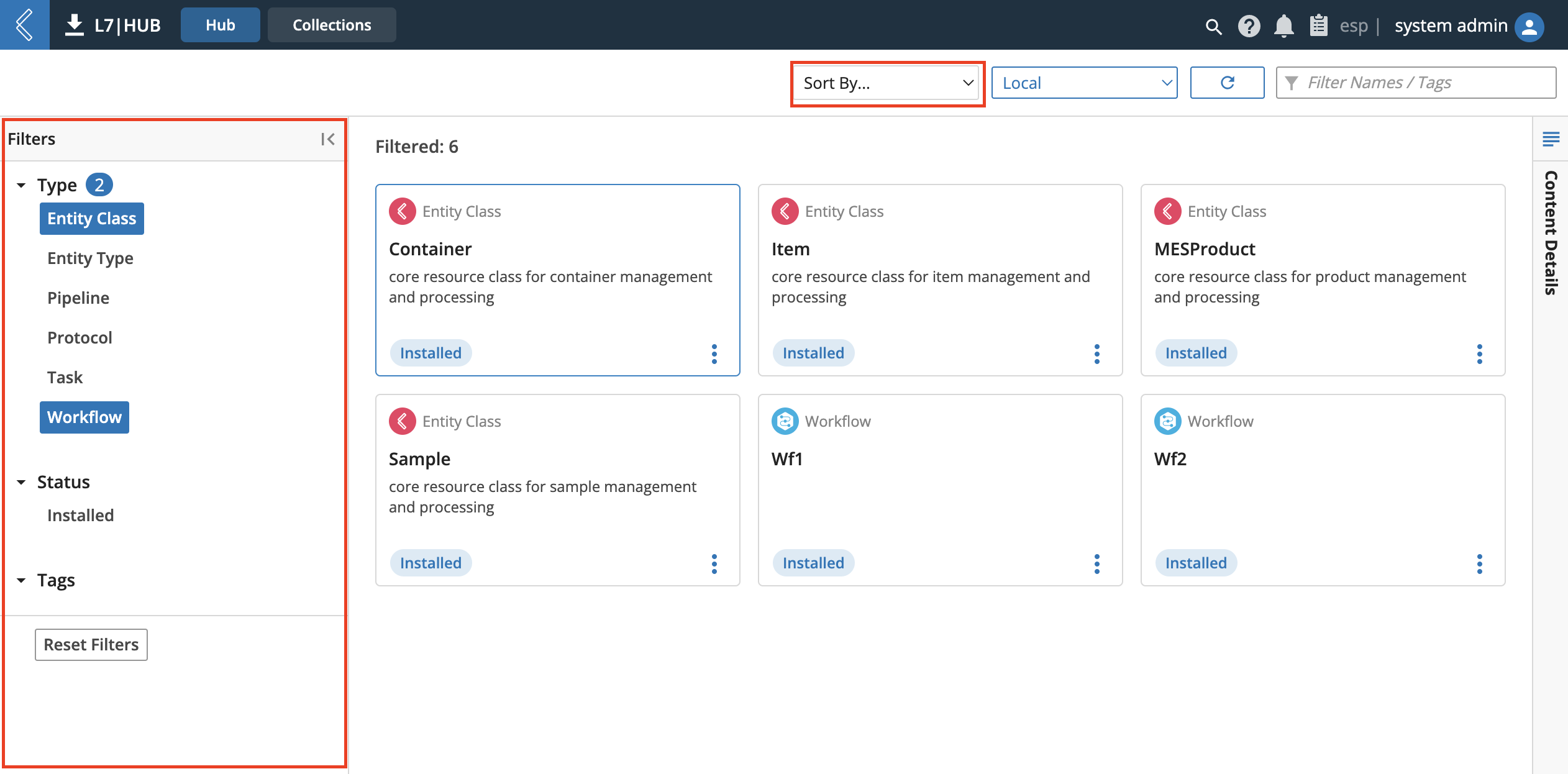
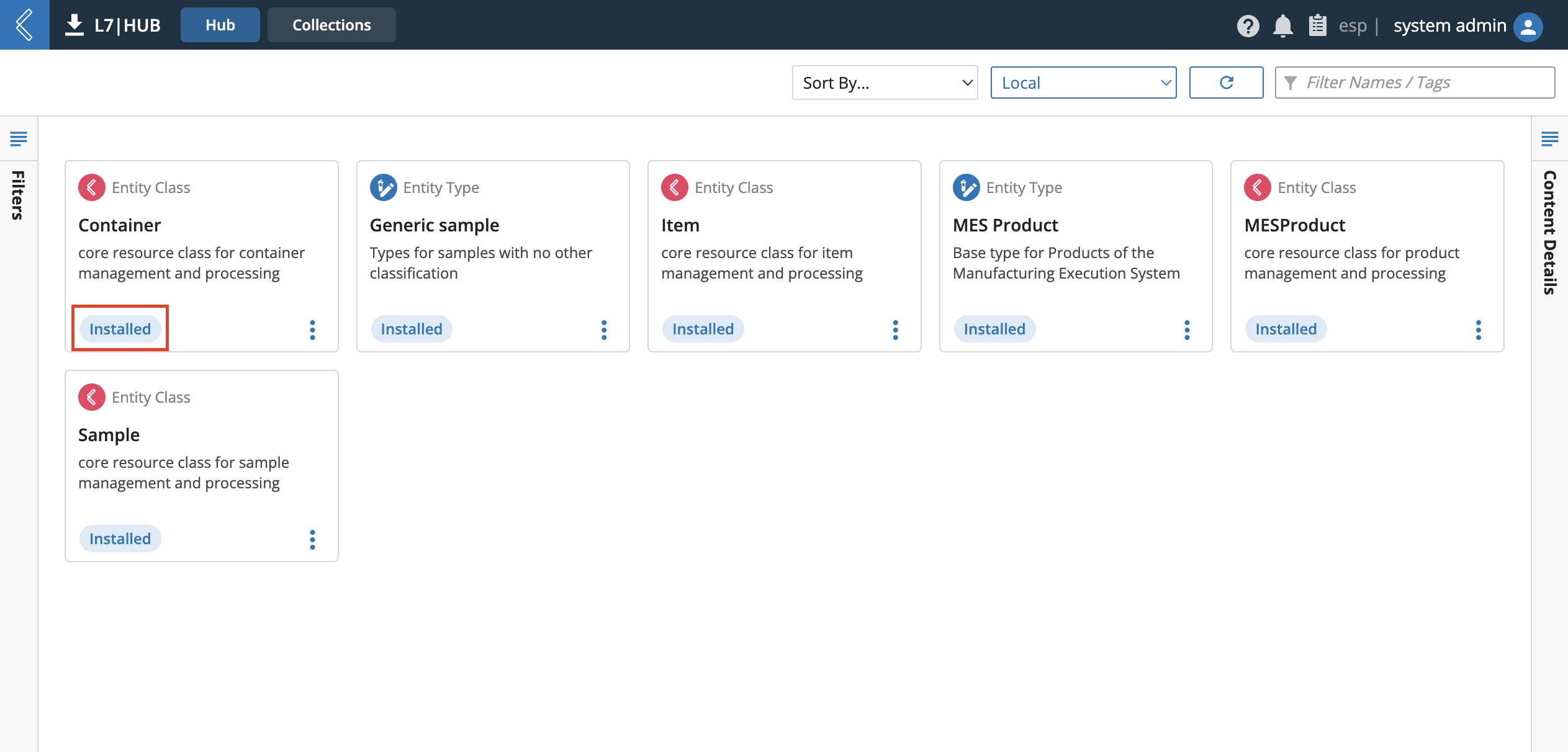
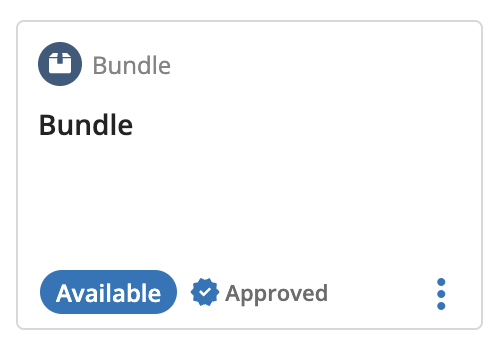
Installed content will have "Installed" text in the bottom-left corner.
If content has not been installed yet, the text will be "Available".
If content has been archived in the instance, the text will be an orange "Archived".
If content has a matching uuid but has been modified from the remote content being viewed, the text will be a red "Modified".
Clicking the vertical-triple dots on any item cards opens the Action Menu dropdown. The options offered in the Action Menu vary based on the Hub location being viewed and the Type and Status of the current content selection.
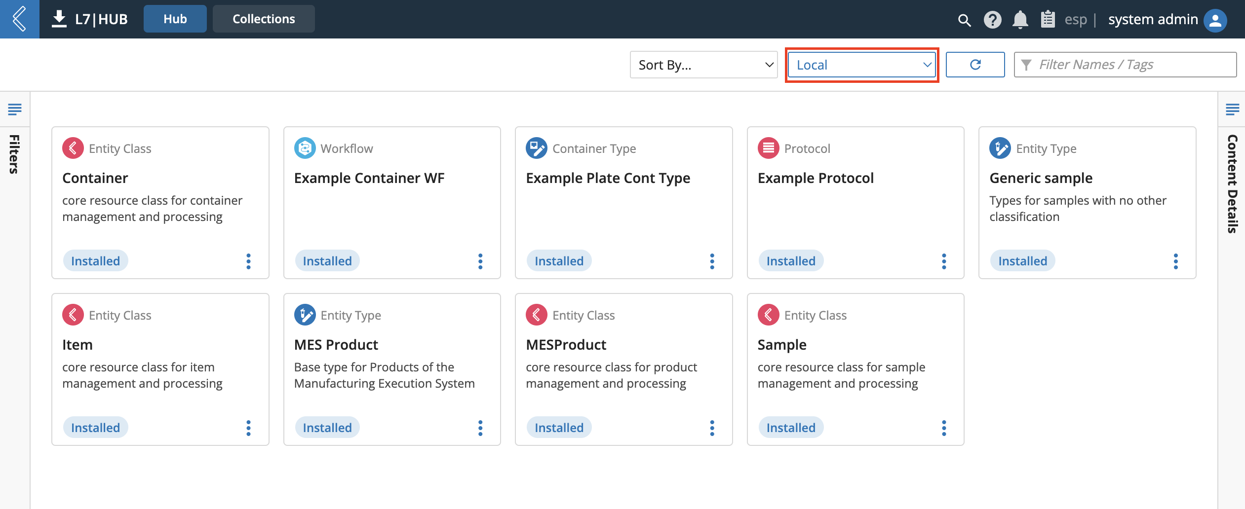
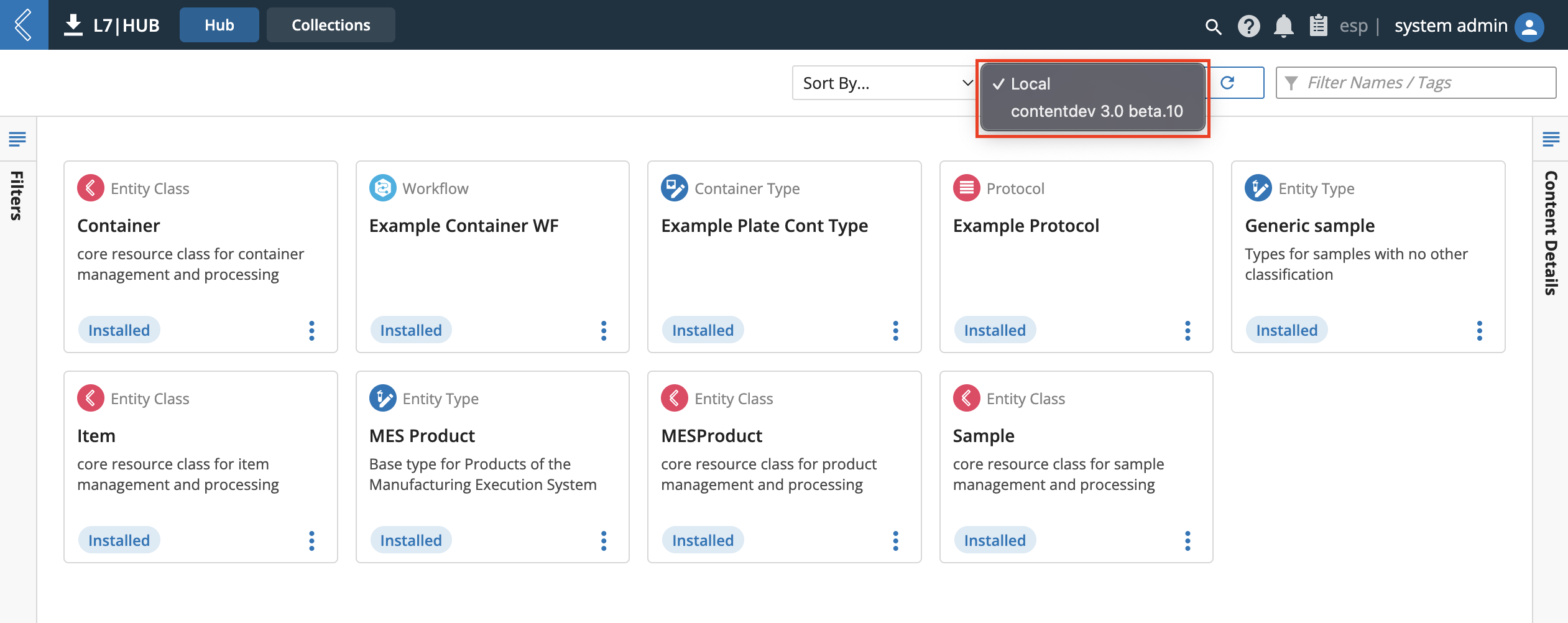
Additional content on other L7|ESP instances can be accessed by selecting the instance from the drop down located to the left of the L7|HUB icon and text at the top of the display.
If the L7|HUB library has been filtered down to show select options, clicking the refresh icon to the left of the filter content box to refresh the library.
In addition to the content categories panel, content in the library can be searched for by name by entering text into the filter content box using in-fix partial matching.
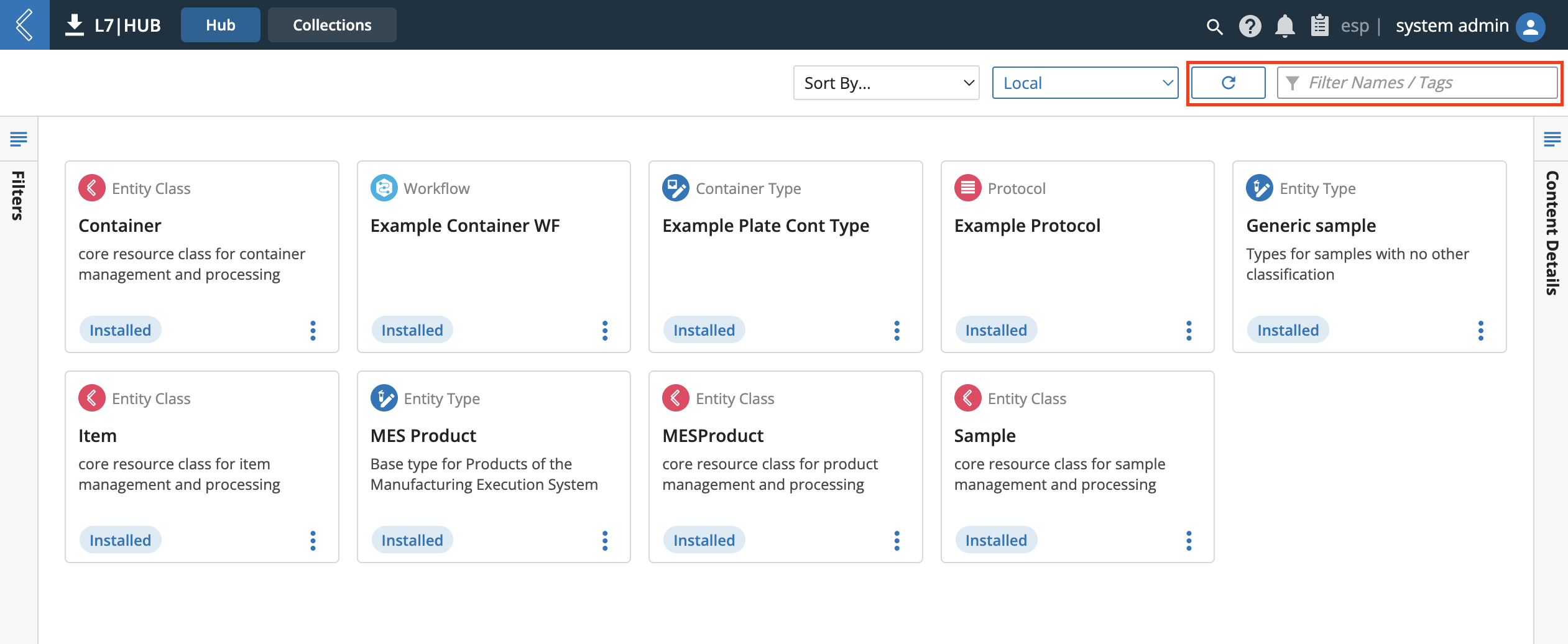
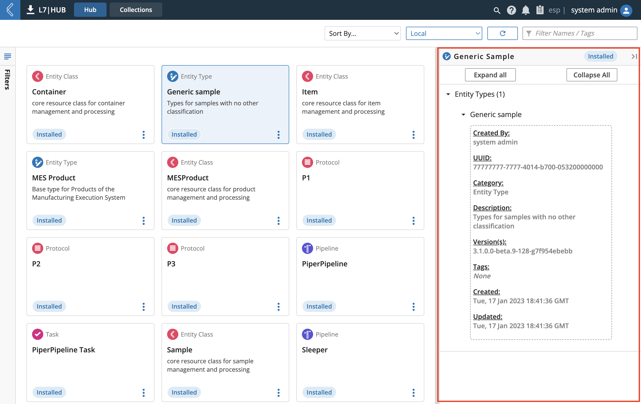
To view details of the content selected, expand the Content Details Inspector at the right edge of the L7|HUB Library.
To select multiple content items, Cmd+Click, or Ctrl+Click, unselected content to add to the selection.
9.23.2. Installing Available Content
SDS-HUB-2
To install "Available" content from a remote Hub, click the Add to Cart option from an Action Menu. This will queue the content for installation by adding it to the Hub cart.
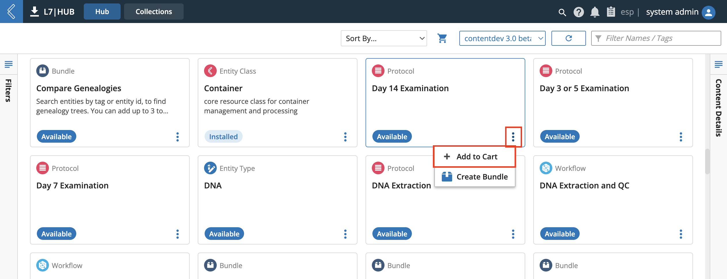
The quantity of content items currently in the cart is tracked by the red number beside the shopping cart icon at the top of the page. Clicking this icon will open the Cart modal, which displays a summarized list of all items currently in the cart. Clicking the trash can icon beside a content item will remove that content from the cart.
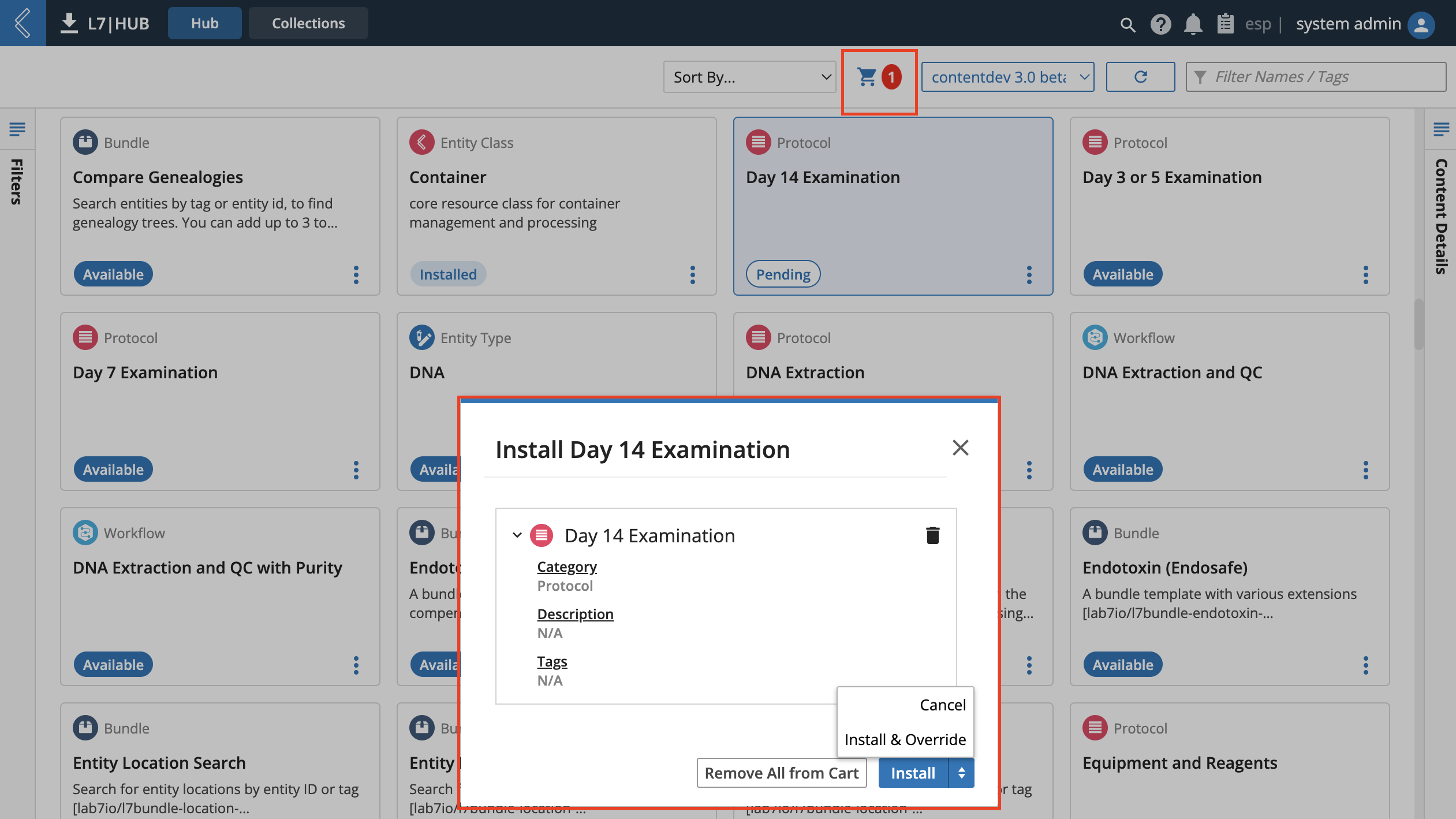
Next to the blue install button is a drop down arrow presenting an option to “Install and Override” the content. This option will attempt to force install all content of the cart, which would ignore many system checks that might otherwise prevent the installation from executing. The user must confirm override (as applicable) in order to do so.
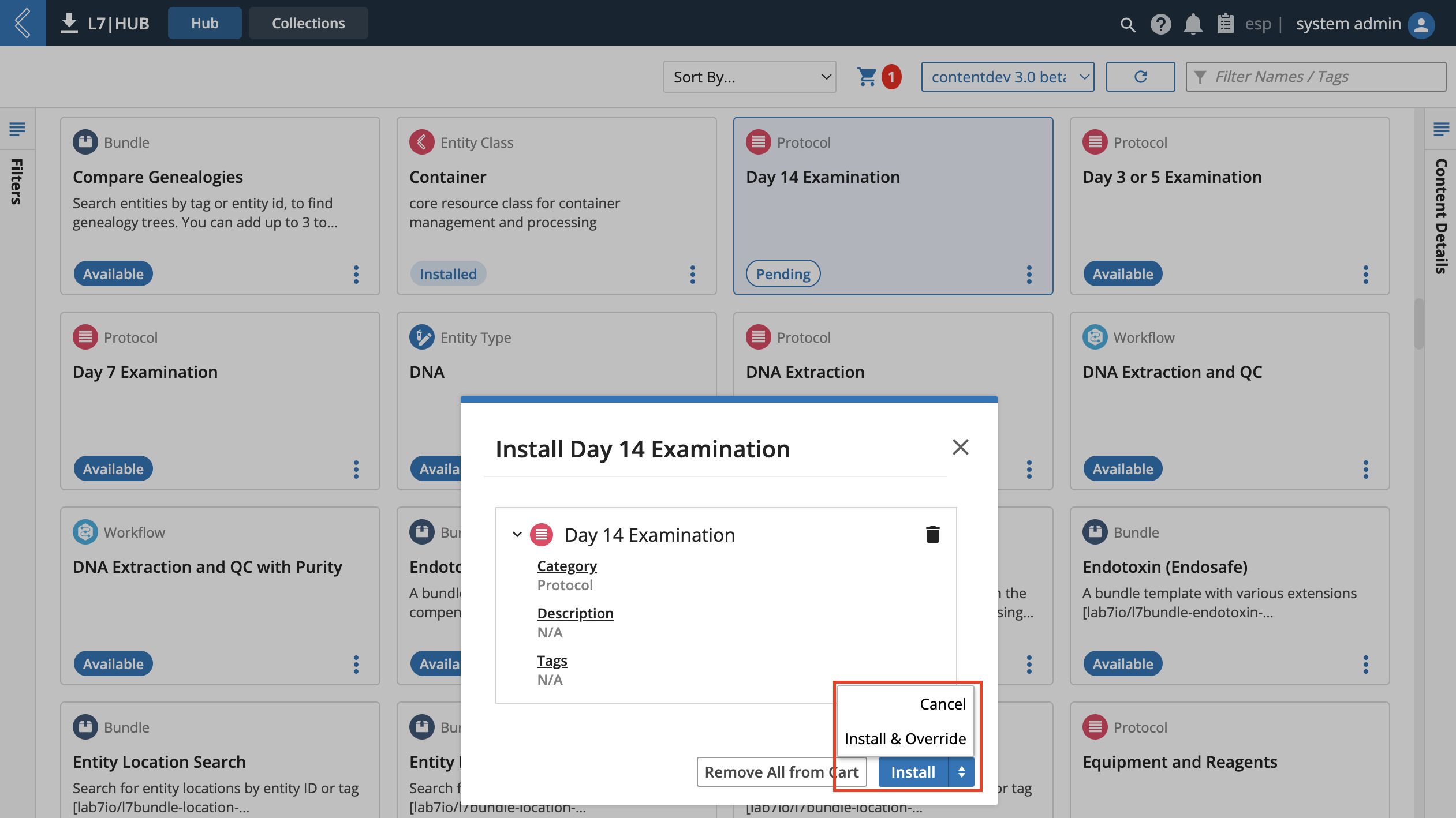
Note
The install and override option is important in updating Bundle versions. For instance, if a user creates a Bundle and installs it before later creating another Bundle using the same Bundled contents, using the override is necessary to update the Bundle content versions in order to have an accurate installation.
After installing content, the cart is emptied and all relevant content cards display a status of "Installed".
9.23.3. Content Bundles
SDS-HUB-3
An L7|HUB Bundle is a combination of content items that, for whatever purpose, a user has determined should be grouped together. Installing a Bundle to an instance will install all content within the Bundle. A Bundle can be saved to an instance to be accessed by others. The files of a Bundle can also be downloaded by choosing a Direct Download option at the third step of Bundle creation.
SDS-HUB-2
A Bundle is a zip file with a
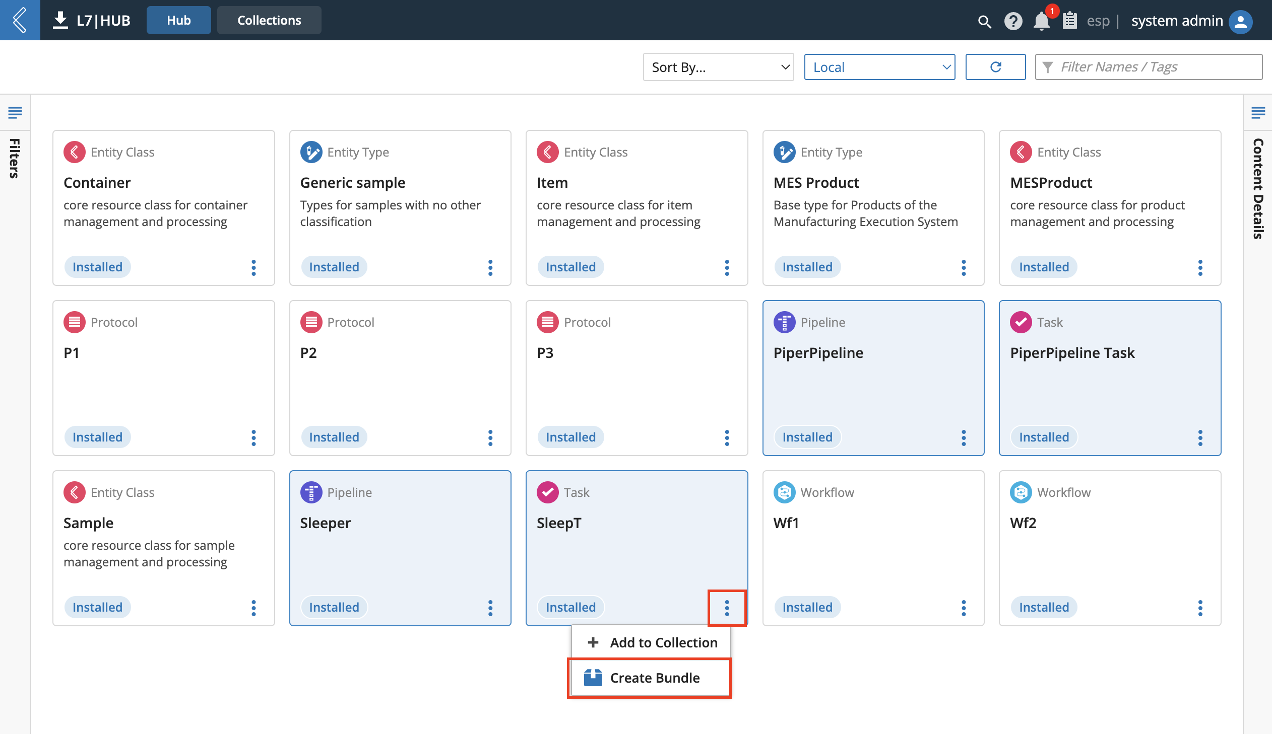
manifest.jsonfile that declares what is in the Bundle, as well as aresourcesfolder with the actual Bundle contents.To create a L7|HUB Bundle, the current selection must exclude other Bundles. Then click the vertical-triple dots item Action Menu on any item cards of the selection and click the Create Bundle option from the opened menu.
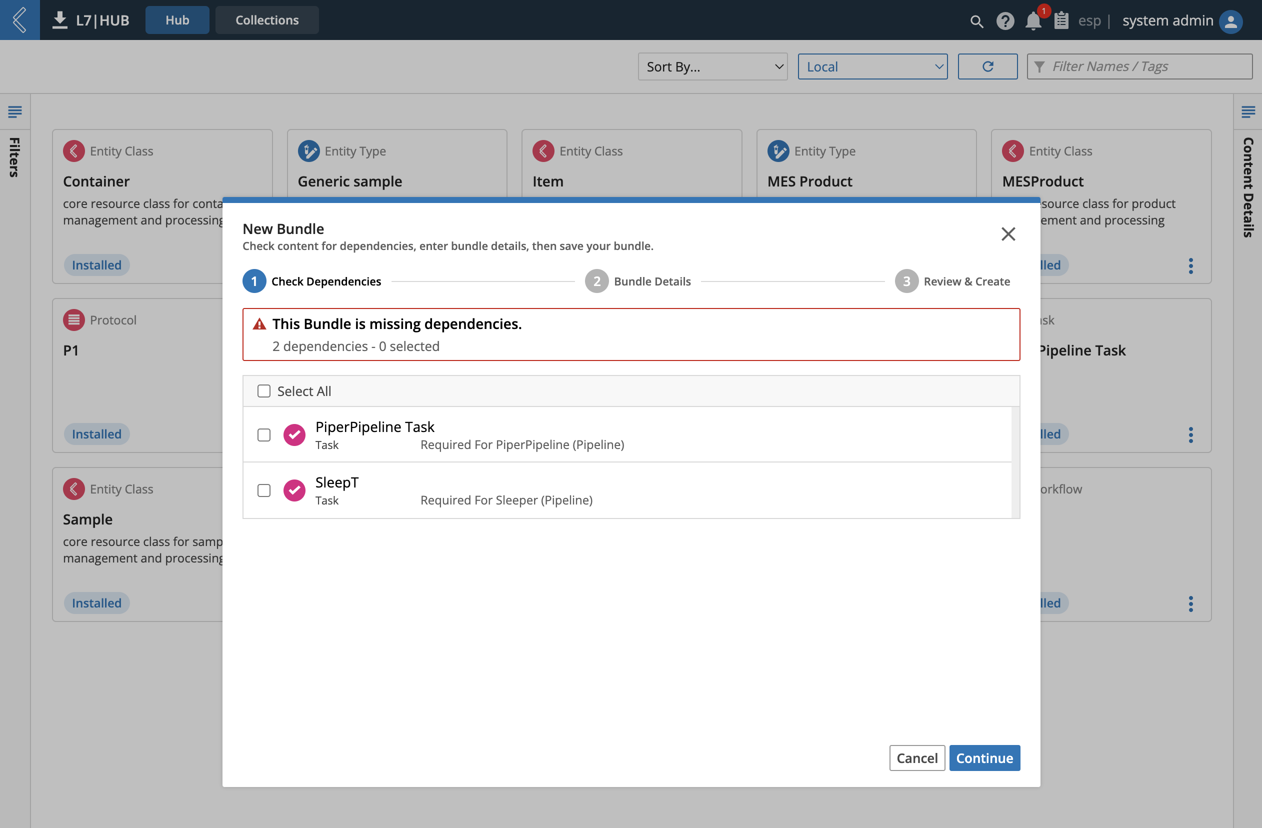
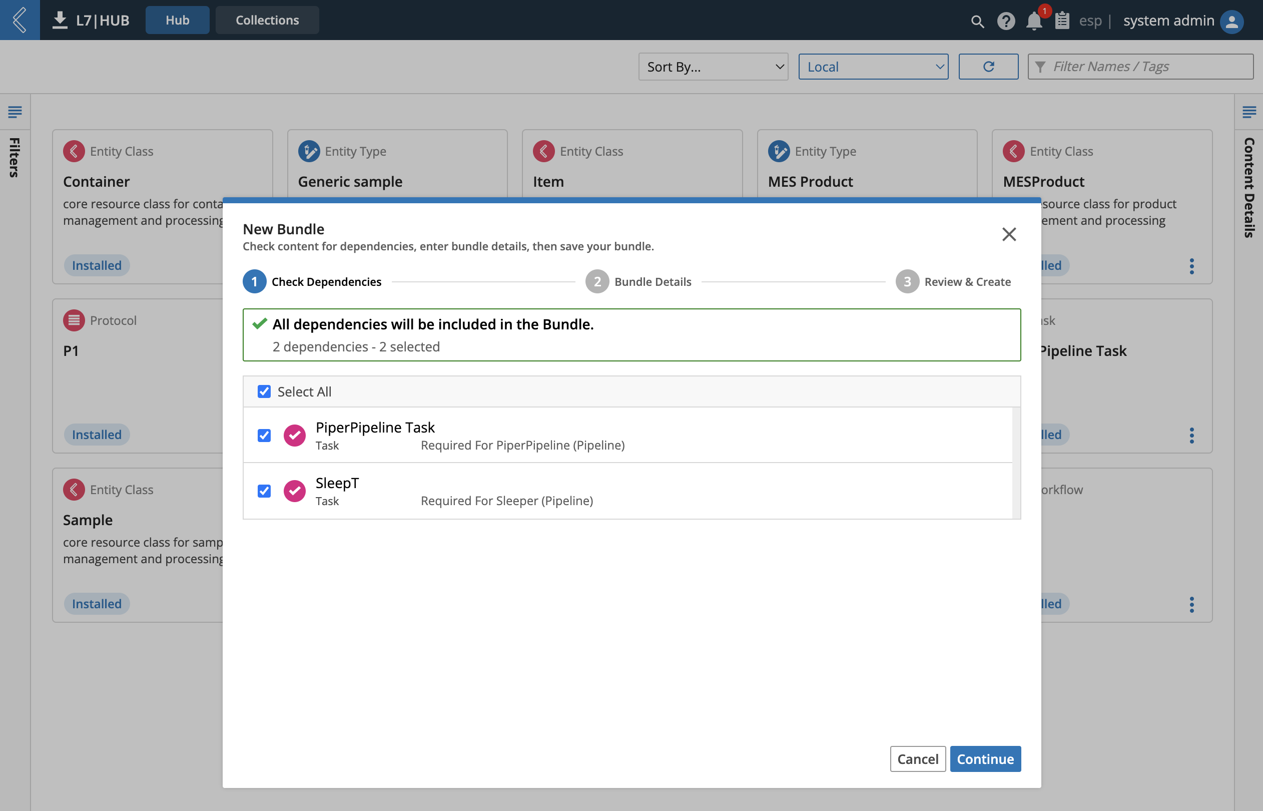
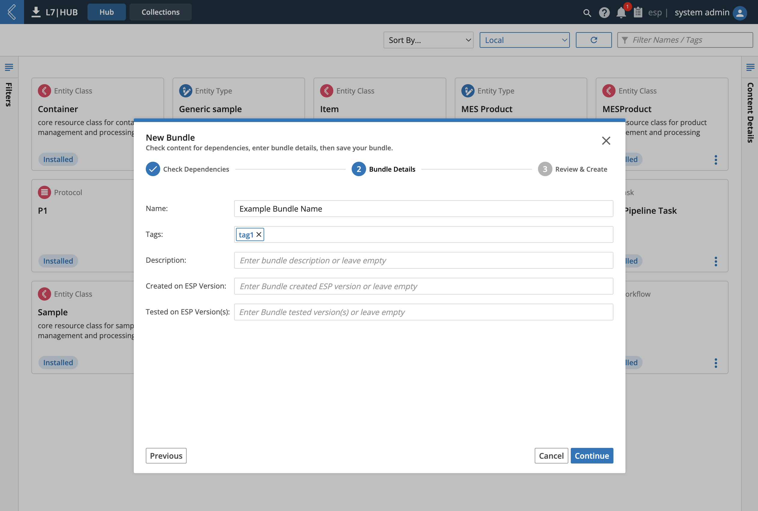
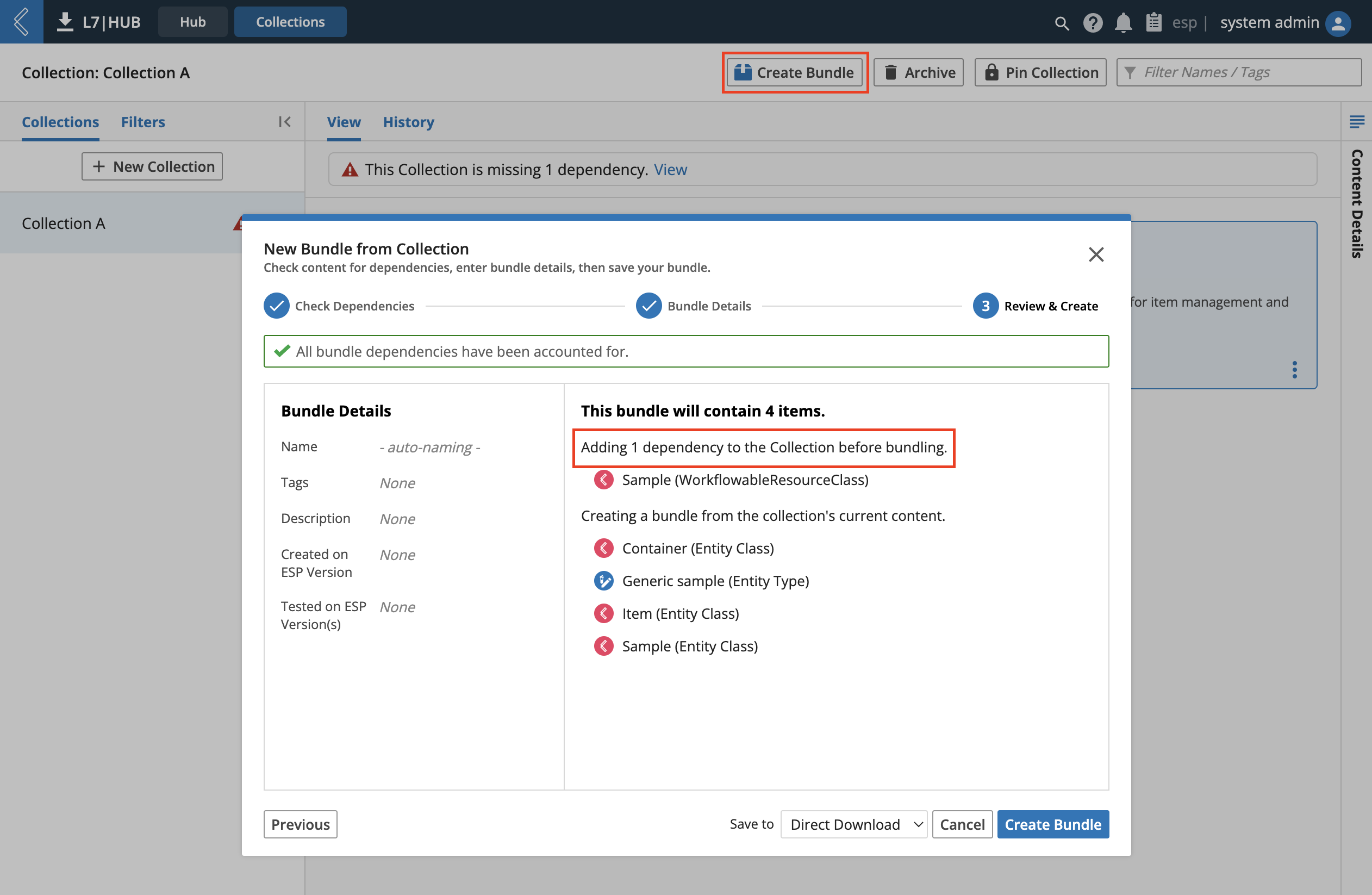
After clicking Create Bundle a New Bundle modal opens. The top of the modal displays which step of the three-step process the user is currently at. The first step is to Check Dependencies. Any content that the current selection of content usually depends on is listed at this step. By clicking the checkbox of content, the dependency will be included in the final bundle at the end of step 3. Click the blue Continue at the bottom-right of the modal to continue.
The second step of the New Bundle modal is to clarify the Bundle Details. Clicking the blue Continue at the bottom-right will progress bundle creation to the third step. Bundle Details include 5 fields:
Bundle name (required)
Tags
Description
Created on ESP Version
Tested on ESP Version(s)
The third step of Bundle creation is to Review & Create the Bundle. On this step, the quantity of missing dependencies are recapped at the top, the Bundle details are recapped at the left, and a snapshot of anticipated Bundle contents are previewed at the right. The content snapshot will clarify which files are to be included in—as well as dependencies to be excluded from—the Bundle.
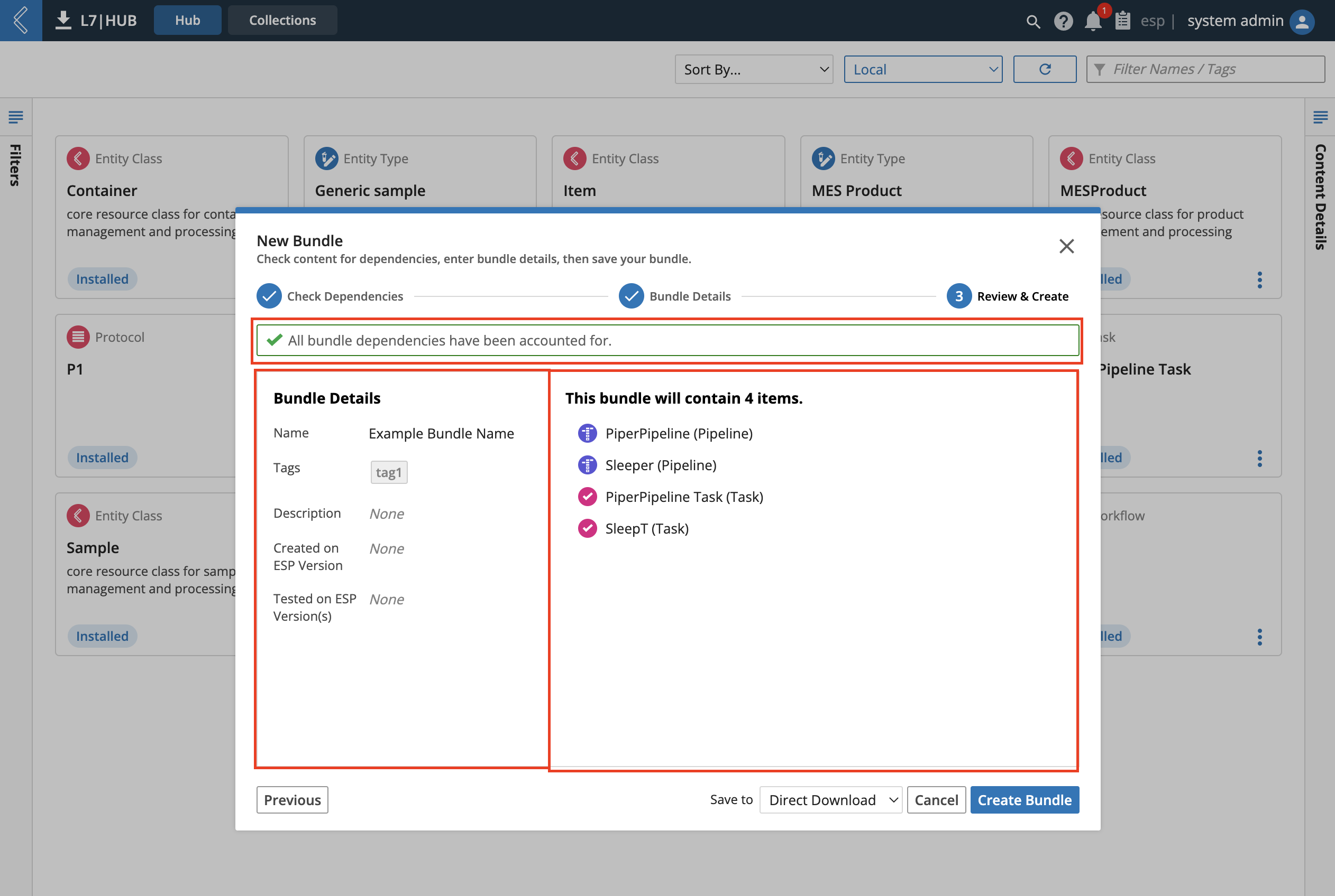
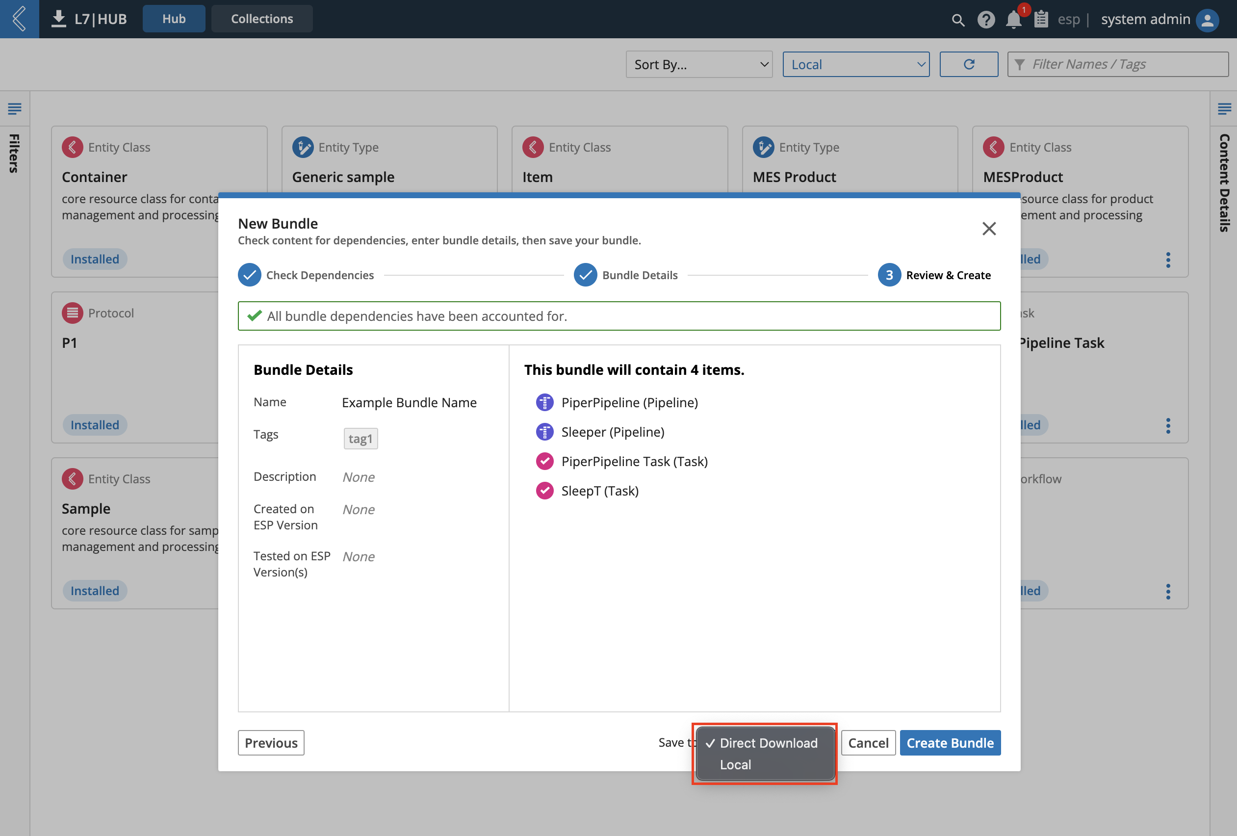
The Bundle can be saved locally, as a direct download, or under any remote store listed in the users L7|HUB configuration (customized configuration that is not out-of-box). After clicking “Create Bundle”, a direct download results in a zip file (JSON files of Content) being created and downloadable via the user’s web browser. Saving locally presents the Bundle in the L7|HUB, where it becomes available (bundled) content to install. Saving to a remote L7|ESP instance saves the Bundle to that remote instance, where it becomes available (bundled) content to install. The arrow dropdown at the right-side of the blue Create Bundle button allows Bundle creation to proceed to the optional fourth step of the Bundle creation process.
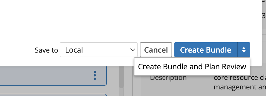
For Bundles that are not being Direct Downloaded, the optional fourth step of Bundle creation is to assign the Bundle a Review Plan. Review Plans follow a Signature Flow as created in the L7|Master app. Here, 4 fields can be determined prior to the final Save using the blue Save button at the bottom-right corner of the modal.
Name (required)
Signature Flow (required)
Description
Due Date
See the next section for more on Bundle Review Plans outside of initial Bundle creation.
9.23.4. Bundle Review Plans
Bundles can earn an “Approved” label after going through a Bundle Review Plan, indicating to others that the Bundle went through a Signature Flow verification.
A Review Plan can be assigned to a Bundle either as the optional fourth step of the New Bundle Modal or using the “Plan Bundle Review” option of a Bundle card’s content action menu. Details of an ongoing—pending—Review Plan can be seen by selecting the Bundle card, viewing it in the right-hand Inspector pane, and clicking the Review Details tab there. In addition, in the same location, a Review Plan can be edited or deleted by using the blue pencil icon next to the blue Selected Flow name.
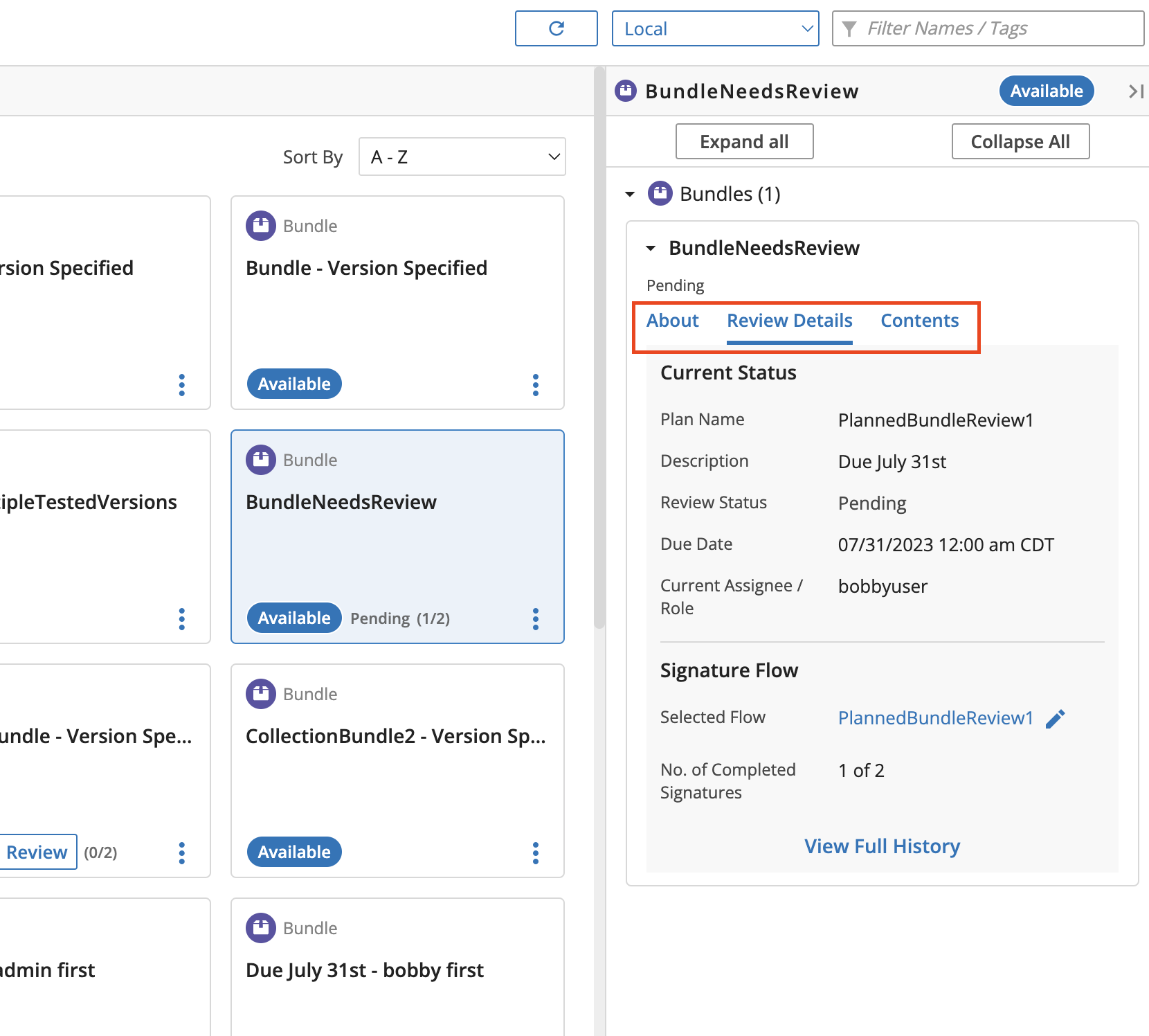
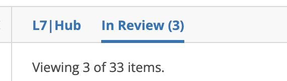
In order to more easily see Bundles which have Pending Review Plans, users can use the “In Review” tab view at the top of the content section. While in this view, the Sorting options are changed to better fit Bundle Review Plans.
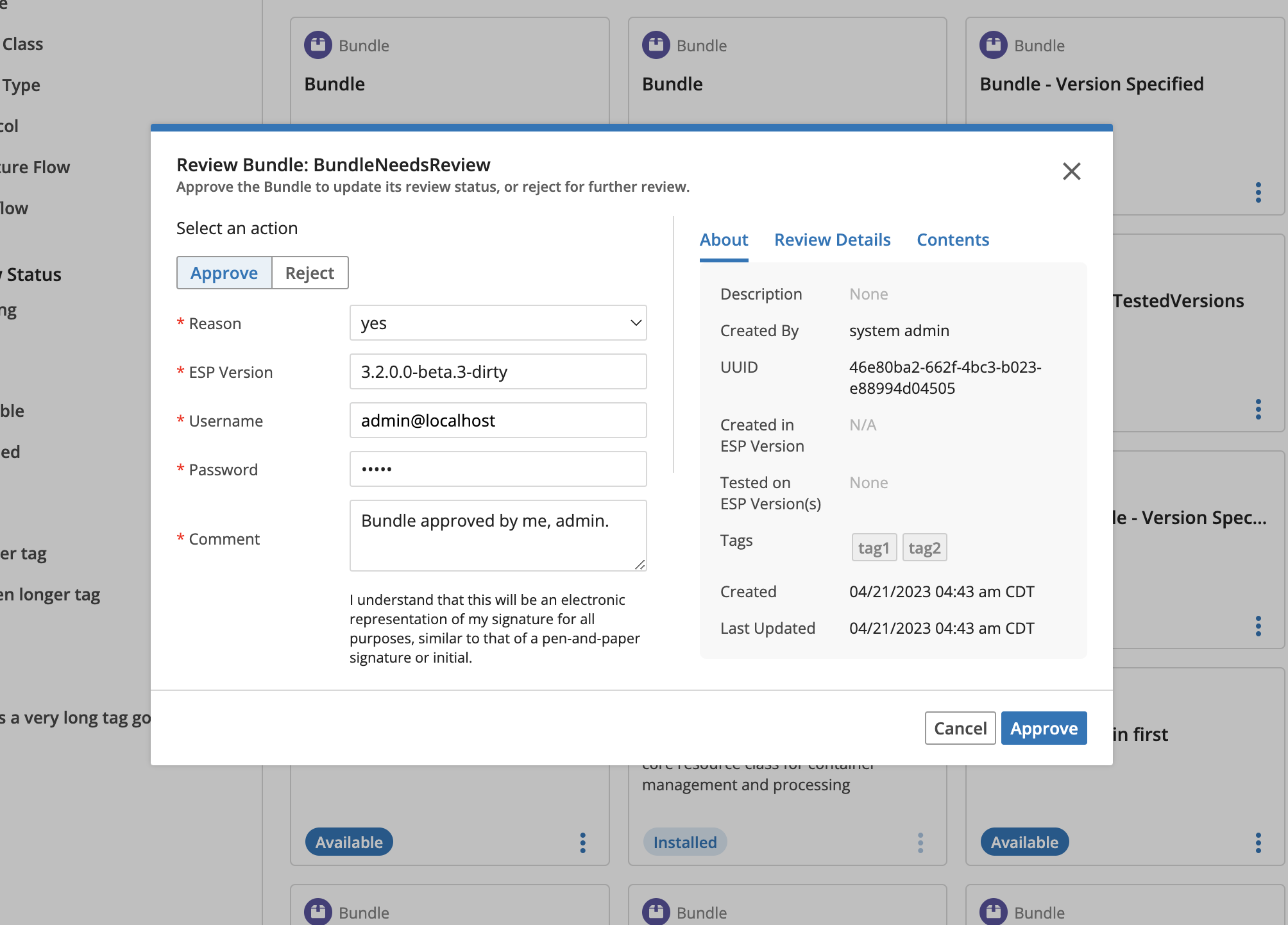
Regardless of the viewing tab, if it is the user's turn to review a Bundle—as per the Signature Flow—they’ll see the “Review” button displayed on the card of the Bundle. This opens the “Review Plan” modal, where the user can take their turn to “Accept” or “Reject” the Bundle.
A Bundle with an “Approved” Review Status can have its approval Retracted using the red Retract button in the Inspector pane to the right while the Bundle is selected, or by the card’s content action menu. The Bundle will subsequently show up as Rejected, although a new Review Plan can be started immediately.
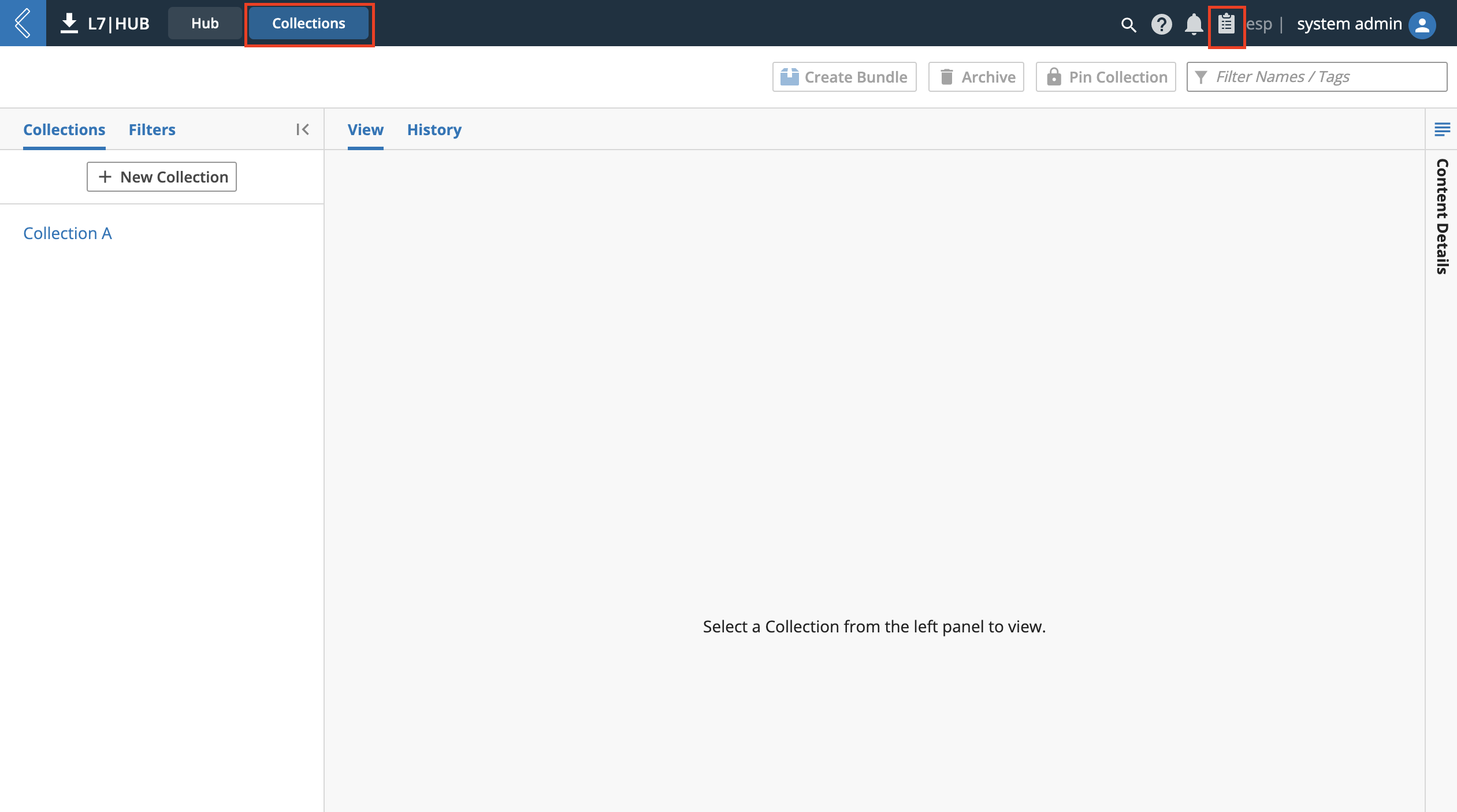
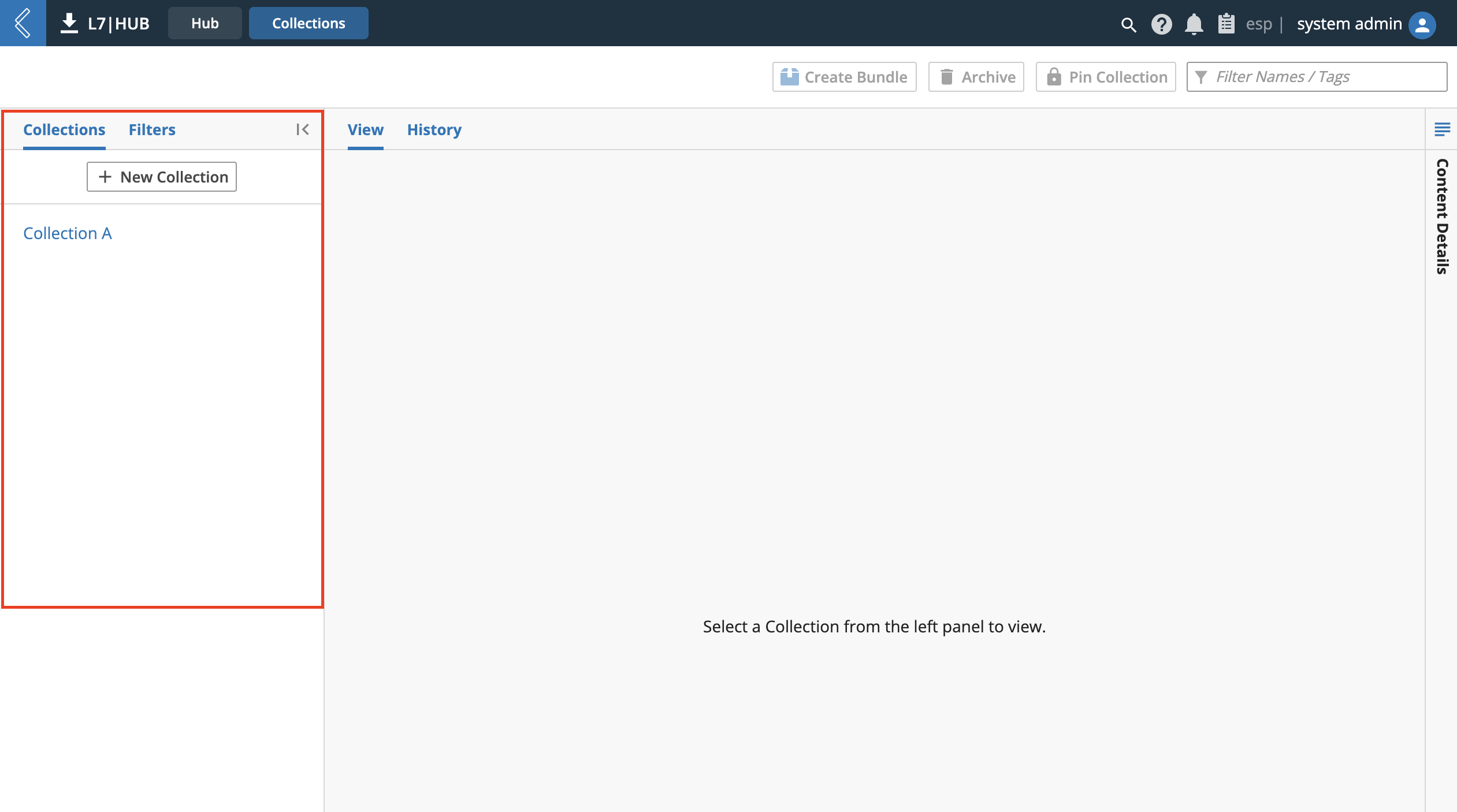
9.23.5. Collections
The L7|HUB app - Collections tab is used to manage collections of content. Collections are impermanent groupings of content that can be used to organize content and more easily create Bundles. The Collections tab can be visited either by the typical tab navigation at the top-left of L7|ESP or by clicking the clipboard icon at the top-right corner of the same navigation bar. When displayed, the clipboard icon can be used to quickly navigate to collections from outside of the L7|HUB app.
Note
Collections are for local, installed content only and cannot be used to manage remote content.
Collections Library
SDS-HUB-4
There are two methods of creating a new collection:
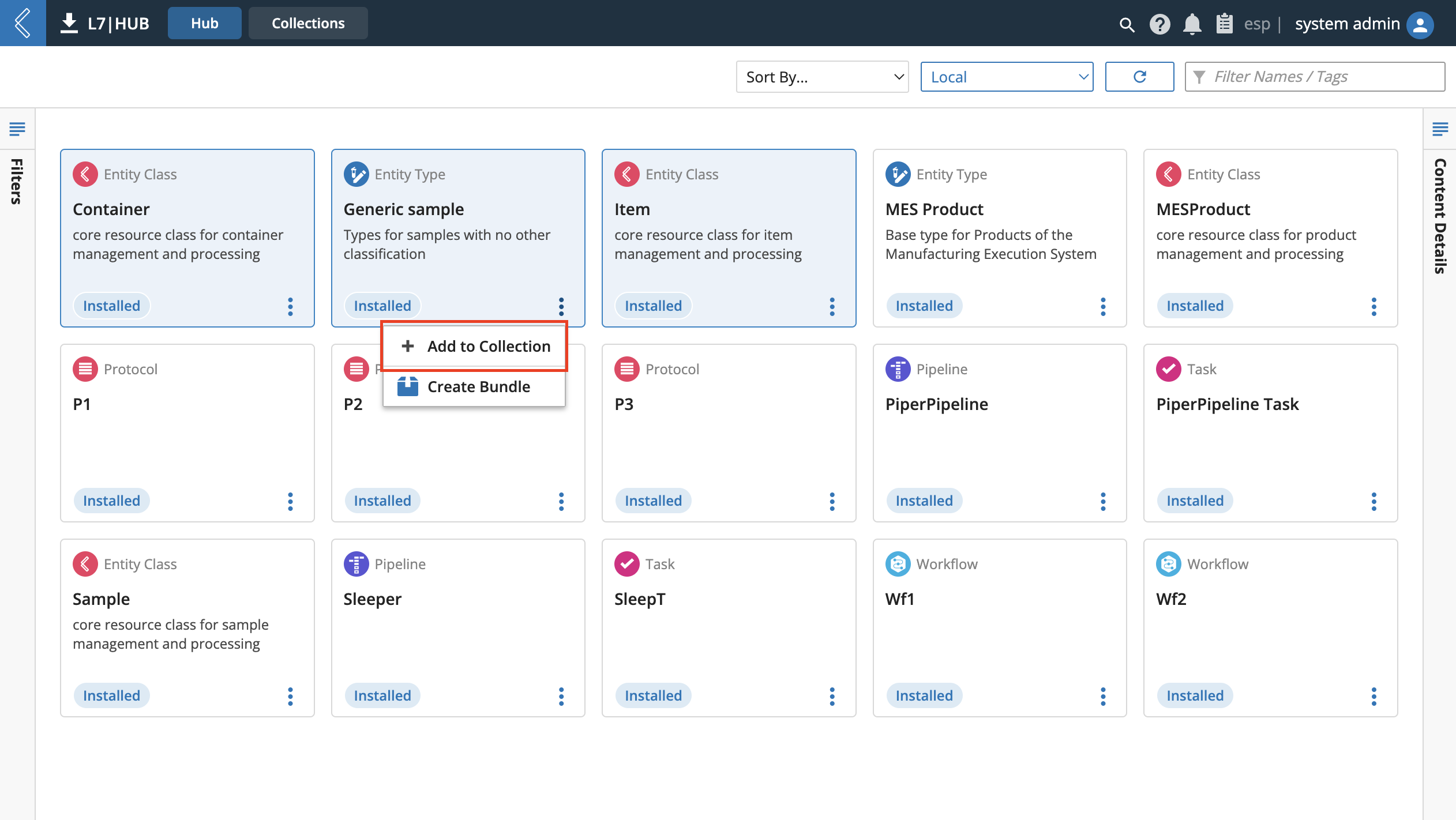
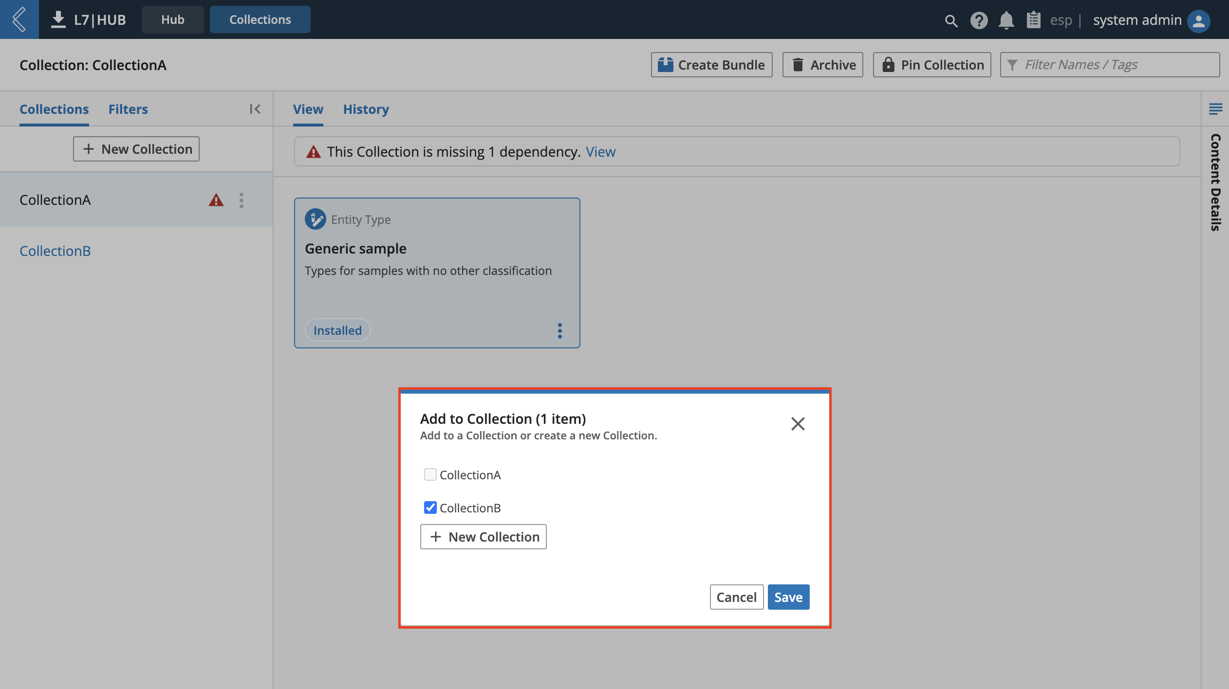
In either the Hub or Collections tab of the L7|HUB app, use the Add to Collection option from the Action Menu of an "Installed" content card to open an Add to Collection modal.
In the L7|HUB app - Collections tab, click the white New Collection button at the top of the left-hand Collection list pane.
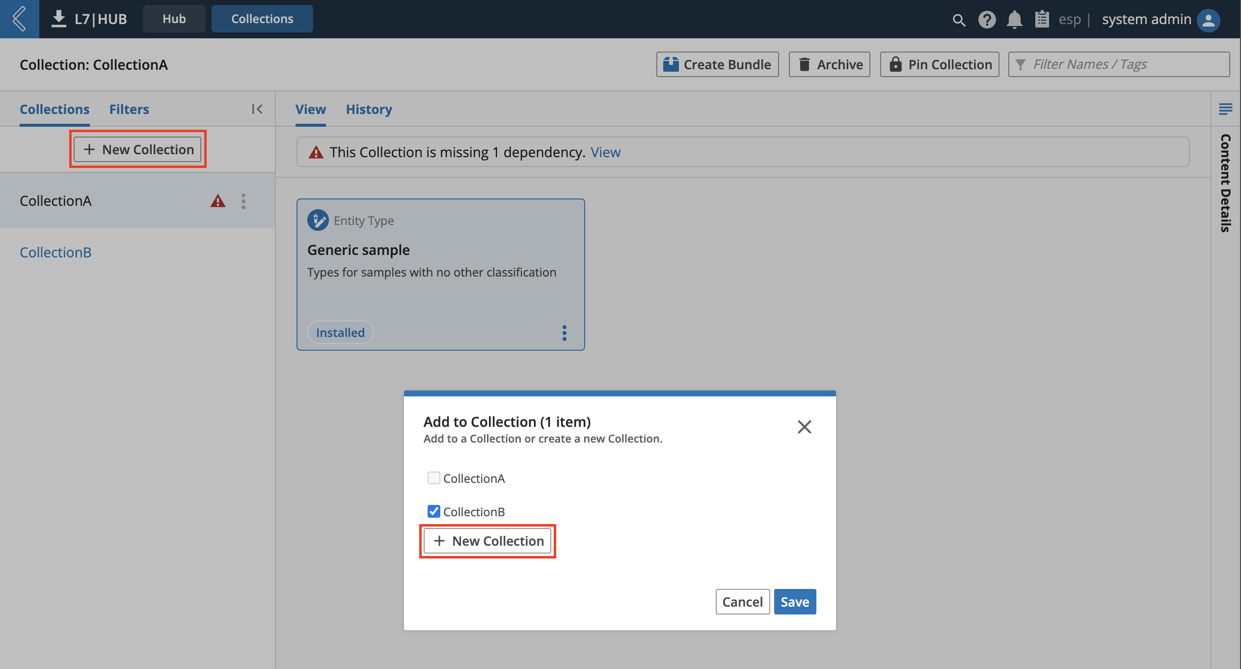
Adding content to a collection can be done in either the Hub or Collections tab of the L7|HUB app by using the Add to Collection option from the Action Menu of an "Installed" content card to open an Add to Collection modal. All currently selected content will be added to all checked collections from this list upon clicking the blue Save.
To first begin viewing and managing a collection, choose a collection from the left-hand collections list.
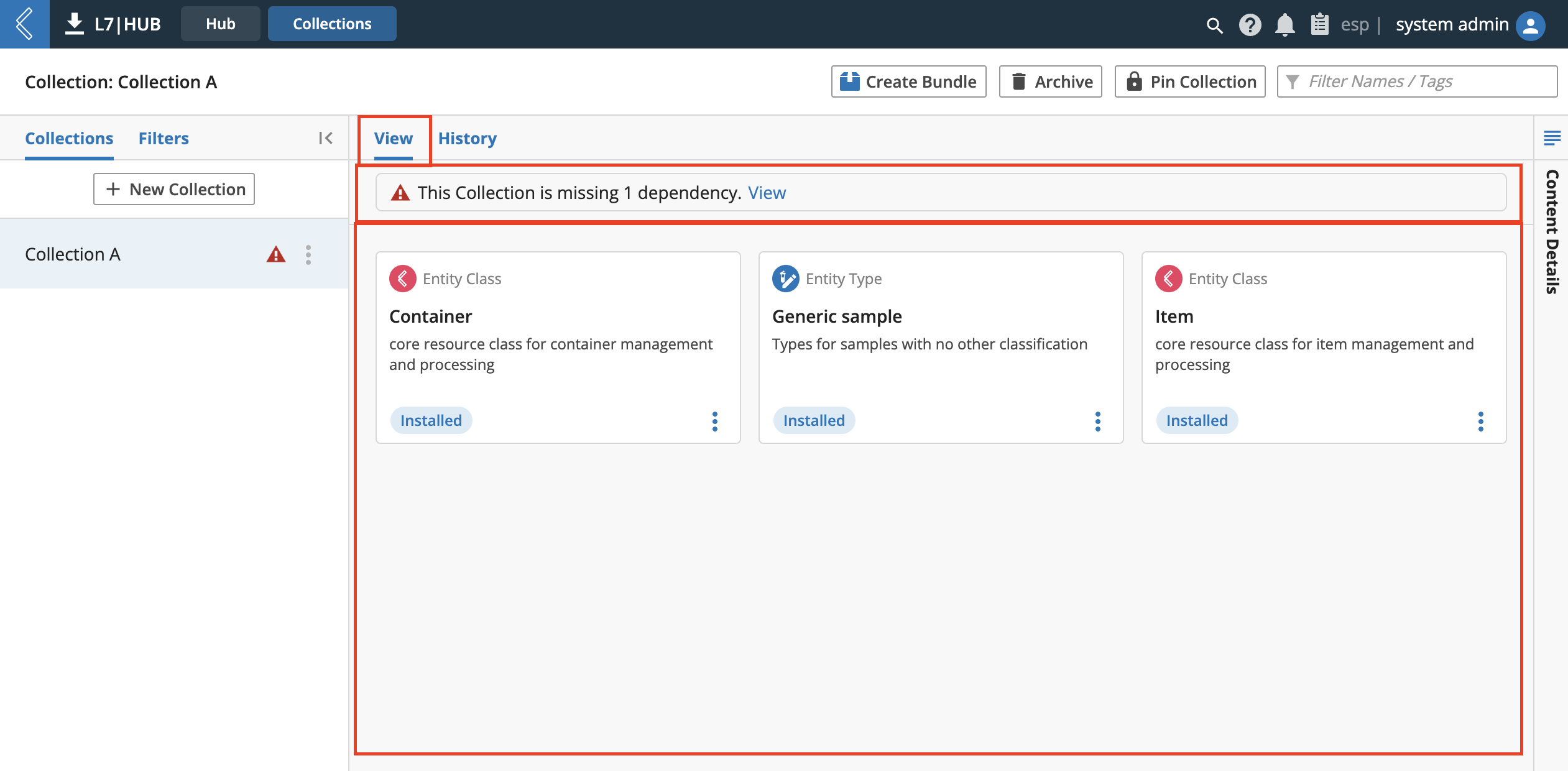
There are two views when looking at collection details. View displays the content of a current collection as the content cards would appear in the Hub tab. Important notifications about the collection as a whole, such as missing dependencies, will appear above the content.
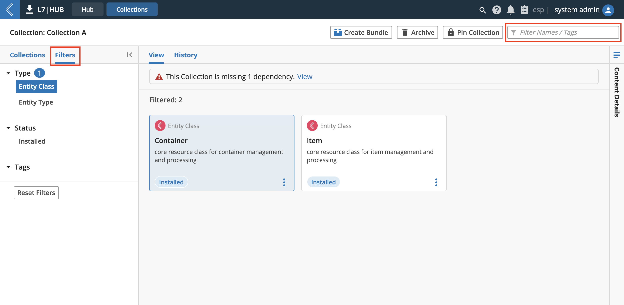
To sort through the content of a collection, users can filter either by:
the Filter text field at the top-right of the page or
by using the Filters tab of the left-hand details pane, which replaces the displayed list of collections with categorical filters of Type(s), Status, and Tags.
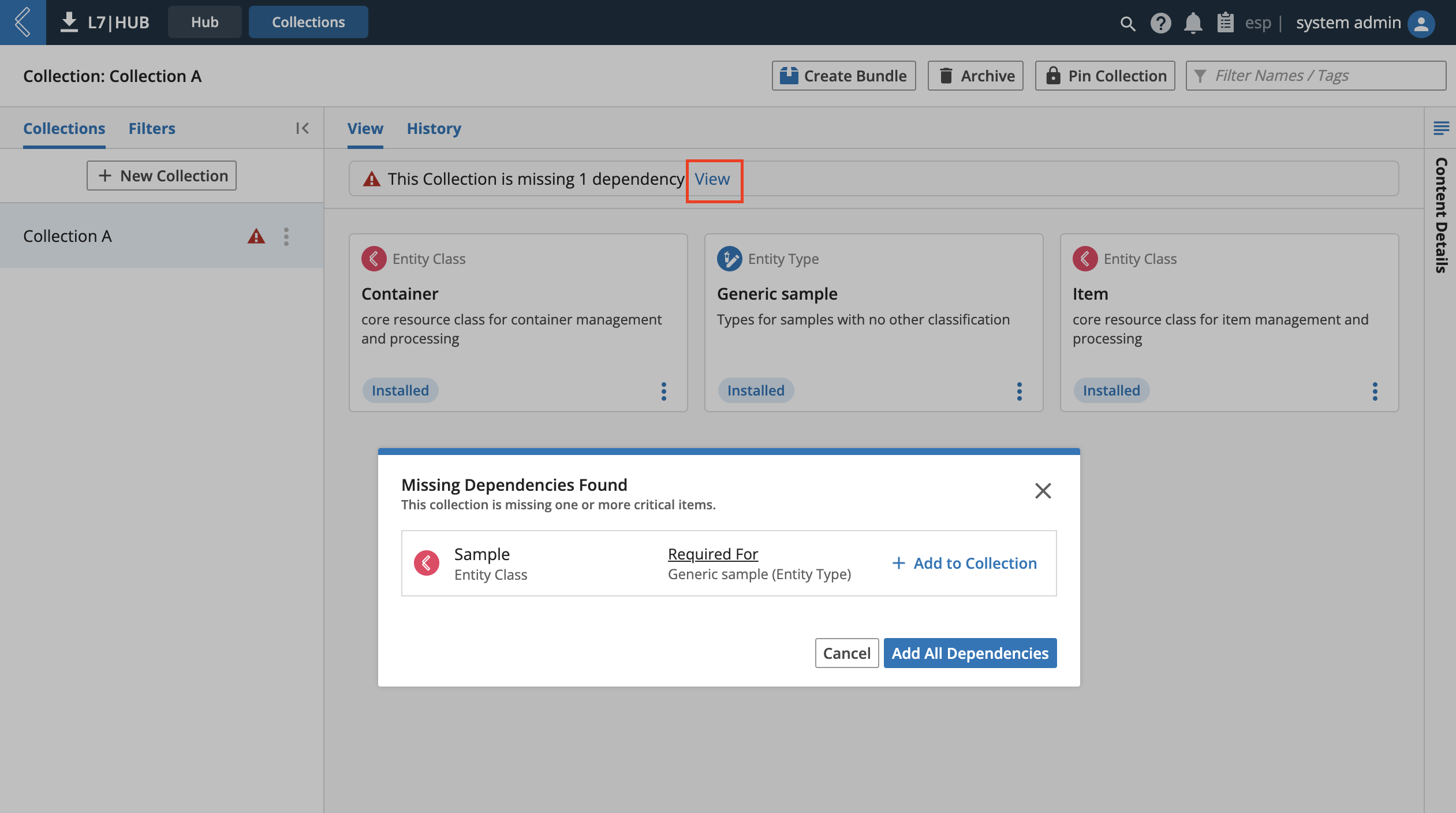
If the collection is currently missing dependencies, clicking the blue View in the notification bar will open the Missing Dependencies Found modal. There a list of missing dependencies can be used to add those dependencies to the collection.
The process of creating a Bundle from the collection can be started by clicking the white Create Bundle button at the top of the page. The three-step Bundle modal in the L7|HUB - Collections tab is similar to the Hub tab, but the differences are:
The initial selection of content to be bundled is always the current content of the collection.
Choosing to add dependencies to be bundled will first add the dependencies to the collection.
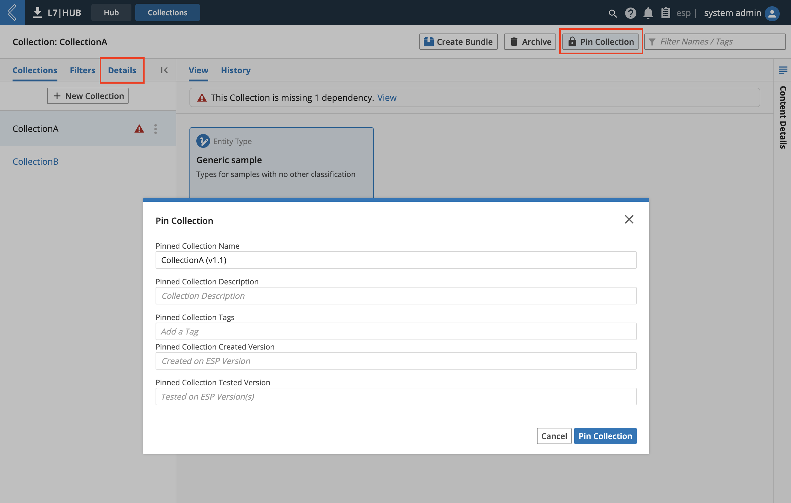
Users can pin a collection by clicking the white Pin Collection button at the top of the page. Pinning works similar to Workflows, meaning that the current state and content of the collection will be saved as a permanent version using the details specified in the Pin Collection modal. Once multiple versions of a collection exist, a newly displayed Details view at the left can be used to navigate between them.
To archive a collection, click the Archive button at the top-right of the page. This displays a popup asking for confirmation of the archive. Clicking the Yes, Confirm archive button will remove the entity from the UI and collections library.
Collections History
SDS-HUB-5
The History view displays the metadata of actions taken on the current version of the collection. Action details are listed in 3 columns:
Date
Action
Performed By
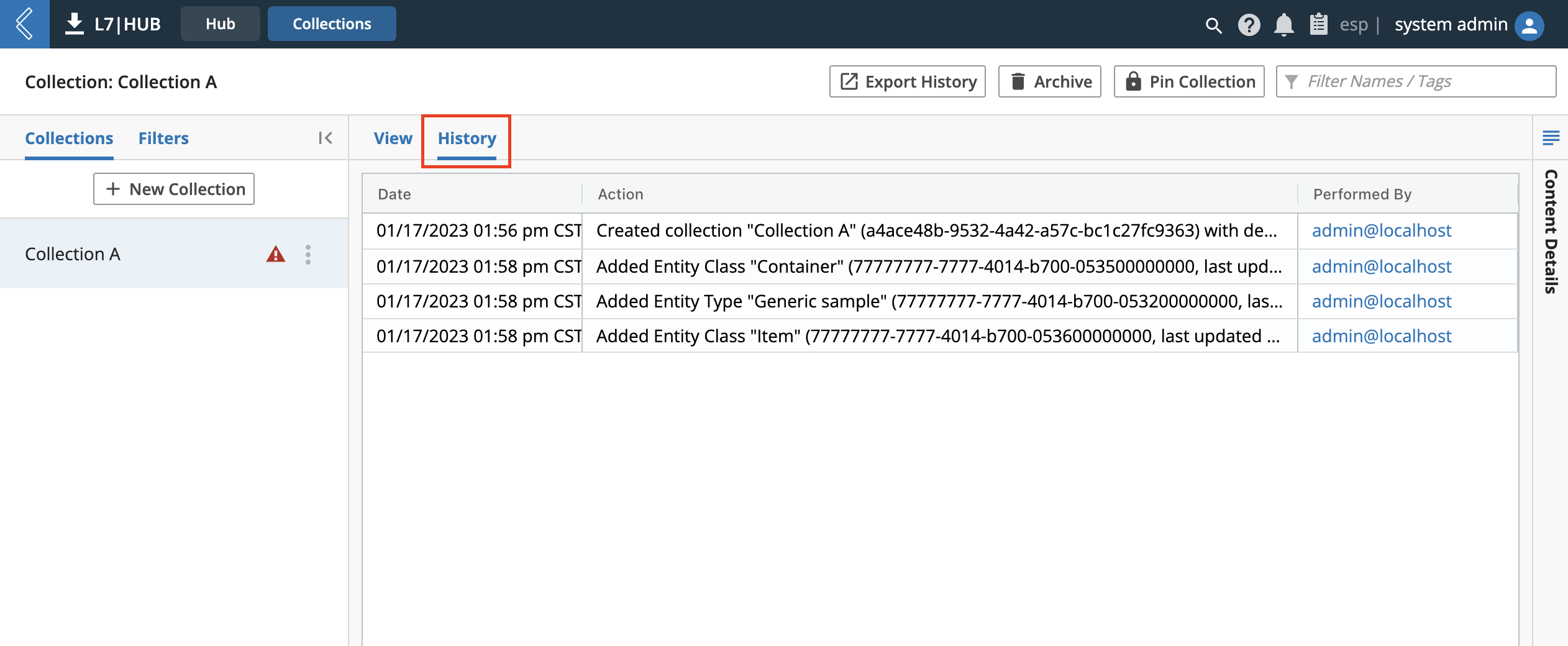
Clicking the Export History button will download a
.csvaudit trail of collection history.
9.24. Notebooks App
The Notebooks app of ESP is centered around the needs of the researcher, providing them the tools to create, document, and execute research plans, along with the platform connectivity to seamlessly move unstructured research plans into structured development.
From the ELN app you can:
Create new Notebook library
Create new Entries
Create new Templates
Dynamically link Entries to L7|ESP data sources
Use existing Protocols within Notebooks App
Add comments
Sign-off with e-Signatures (Signature Flows)
Share Documents (PDF generation and printing of Notebooks)
Lock and/or complete Entries
- From the Home menu, click Notebooks.
The Notebooks App is organized into a two-level hierarchy of Notebook Libraries containing Entries. There are four tabs in the Notebooks app:
My Entries
Entries
Library
Templates
9.24.1. My Entries
Clicking on My Entries from the Notebooks App opens the landing page.
It displays the entries that have been created or the entries that need some action by the logged-in user.
A high-level overview of Notebook Entries by status (Editing, Under Review, Rejected and Completed) is shown on this page.
There is a section “Continue where you left off” which displays top 10 recent activity of the logged-in user. Click on these links to use as a shortcut navigation option to various pages visited.
Click on each card on My Entries page to filter entries based on status. The various notebook entries status are as follows:
Editing – Notebook entries being edited by the logged-in user.
Under Review – Notebook entries created by the logged-in user and currently under review process.
Rejected – Notebook entries created by the logged-in user but rejected during the review process.
Completed – Notebook entries where the review is done, all signatures have been completed and are locked for further editing.
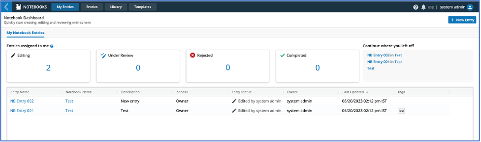
In the grid displaying the notebook entries, the user can click on the entry name to navigate to the entry details page and can click on the Notebook Name link to view the details of the library within which the entry resides.
The Entry Status column shows the status of entry as follows:
Edited by Username - This status is displayed for “In Progress” entries where the entry has not been submitted for review at any time. Username of the user who performed the most recent edit is displayed.
Locked by Username - This status is displayed only if the user has explicitly locked the entry by clicking on “Lock Entry” for the entry. The username of the user performing the lock operation should be displayed.
Under Review by Username - This status is displayed for entries that have been submitted by the logged-in user for review by another user. The username of the user who is currently expected to review the entry is displayed.
Rejected by Username - This status is displayed for entries that have been submitted by the logged-in user but rejected by another user. The username of the user who has rejected the entry is displayed.
Completed - This status is displayed when the entry has been approved and signed by all signing parties. Username is not displayed in this case.
Hovering on the Entry Status value shows a tooltip with the signature flow and its progress only for entries that have a signature flow assigned to it.
Right clicking on the grid provides the option to export the data into excel and csv.
Click on +New Entry button to create new entries.
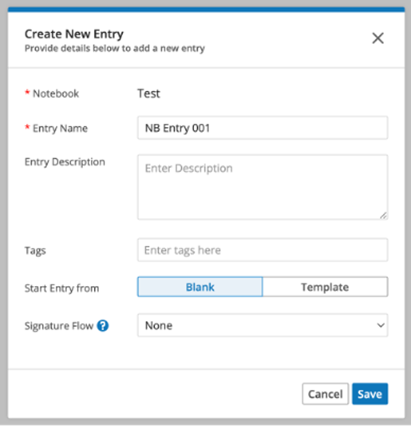
9.24.2. Create New Entries
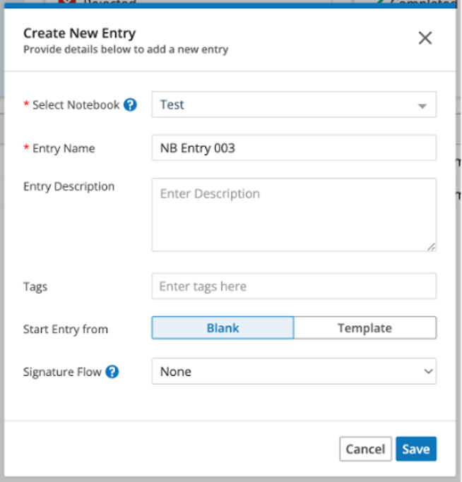
Click on +New Entry button in My Entries or Entries page to create a new entry.
In the new entry modal select the Notebook Library within which the new entry will be created.
A notebook library should be created first in case no library exists before a new entry can be created.
The Entry Name is pre-populated if a naming template is selected during the library creation else the name is blank. The pre-populated name can be modified, as needed.
9.24.3. My Entries
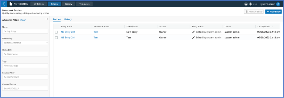
Click on the Entries tab to view a list of existing notebook entries, search through, filter, manage and create new notebook entries, if needed.
The History tab on this page displays the audit trail of user activity on the notebooks page for all updates to entries.
In the grid displaying the notebook entries, click on the entry name to navigate to the entry details page and click on the Notebook Name link to view the details of the library within which the entry resides.
The notebook entries page has filters for the list of notebook entries in the left pane. Filter fields include:
Entry Name - Text field for entering text for searching on the entry name field.
Ownership - Single select dropdown with options to filter based on the following options:
Owned by Me – Will display all entries created by the logged-in user.
Shared with Me – Will display all entries created by other users and logged-in user having at least view access.
All Entries – Will display all entries created by the logged-in user as well as other users irrespective of access permissions.
Owned By – Entering username will filter entries created by the entered username.
Tags - Notebook entries will be be filtered to show records matching the tags entered.
Creation Date – Notebook entries will be filtered for creation date based on the entered date values in the From and To fields.
Clear filters will reset the filter values to initial default values and will reset the grid to display notebook entries Owned by the logged-in user.
The Entry Status column shows the status of entry as follows:
Edited by Username - This status is displayed for “In Progress” entries where the entry has not been submitted for review at any time. Username of the user who performed the most recent edit is displayed.
Locked by Username - This status is displayed only if the user has explicitly locked the entry by clicking on “Lock Entry” for the entry. The username of the user performing the lock operation should be displayed.
Under Review by Username - This status is displayed for entries that have been submitted by the logged-in user for review by another user. The username of the user who is currently expected to review the entry is displayed.
Rejected by Username - This status is displayed for entries that have been submitted by the logged-in user but rejected by another user. The username of the user who has rejected the entry is displayed.
Completed - This status is displayed when the entry has been approved and signed by all signing parties. Username is not displayed in this case.
Hovering on the Entry Status value shows a tooltip with the signature flow and its progress only for entries that have a signature flow assigned to it.
Right clicking on the grid provides the option to export the data into excel and csv.
Users having Archive permission should see an enabled checkbox for the entries and selecting these will enable the “Archive Entry” button. Clicking on Archive Entry button will archive the selected entry(s). Once archived, the entries cannot be unarchived.
Click on +New Entry button to create new entries. (Refer to Create New Entries Section for additional details)
9.24.4. Library
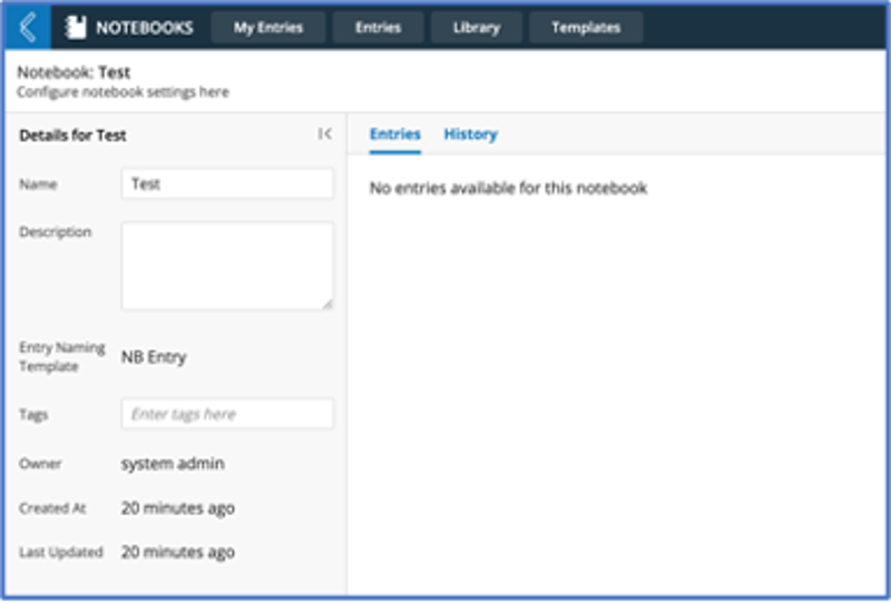
The Notebooks app serves as a customizable document editor of L7|ESP. Each notebook can be any kind of organizational grouping intended, such as a collection of projects, a set of a person’s data, a month of journals, etc. These notebooks each consist of entries, which are the individual items of whatever the notebook grouping represents. For consistent, unified formatting between entries, users can create entry templates.
The Notebooks App is organized into a two-level hierarchy of Notebook Libraries containing Entries. Notebook entries are used to enter details of experiments during research or clinical development.
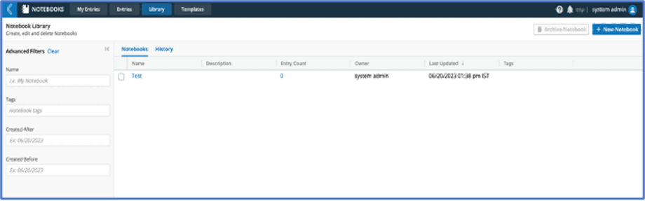
The Library tab can be used to view a list of existing notebook libraries (or folders where entries are organized), search through, filter, manage and create new notebook library, if needed.
The History tab on this page displays the audit trail of user activity on the library page for all updates to libraries.
In the grid displaying the notebook library(s), click on the notebook library name to view the library details page where the list of entry(s) that reside within the library are displayed.
The notebook library page has filters for the list of libraries in the left pane. Filter fields include:
Library Name - Text field for entering text for searching on the library name field.
Tags – Library(s) will be filtered to show records matching the tags entered.
Creation Date – Library(s) will be filtered for creation date based on the entered date values in the From and To fields.
Clear filters will reset the filter values to initial default values and will reset the grid to display all notebook libraries.
Right clicking on the grid provides the option to export the data into excel and csv.
Click on +New Notebook button to create a new notebook library.
Users having Archive permission should see an enabled checkbox for the library and selecting these will enable the “Archive Notebook” button. Clicking on Archive Notebook button will archive the selected notebook library(s) including the entry(s) within those libraries. Once archived, the library cannot be unarchived.
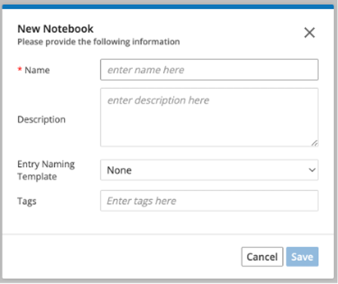
9.24.5. Create New Library
Click on +New Notebook button to create a new notebook library.
In the creation modal, provide a library name, description, select naming template option, if needed, and click on Save to create a new library.
Once the library is created, the library details page is displayed, and entries can be created within the library.
If a naming template has been selected, the new entries created within the library will be named based on the selected template.
Once the naming template has been selected at the library level, it cannot be modified. However, the name of the new entry can be modified as needed in the new entry creation modal.
9.24.6. Templates
The Notebooks app serves as a customizable document editor of L7|ESP. Each notebook can be any kind of organizational grouping intended, such as a collection of projects, a set of a person’s data, a month of journals, etc. These notebooks each consist of entries, which are the individual items of whatever the notebook grouping represents. For consistent, unified formatting between entries, users can create entry templates.
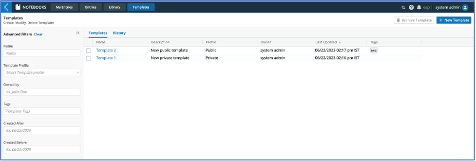
The Templates tab can be used to view a list of existing entry templates, search through, filter, manage and create new entry templates, if needed.
Entry Templates are used to create entries using a pre-defined, consistent format to keep the structure standardized and to avoid duplication of effort in entry creation.
The History tab on this page displays the audit trail of user activity on the templates page for all updates to templates.
In the grid displaying the entry template(s) click on the template name to view the template details page where the template structure can be modified and saved.
The templates page has filters for the list of templates in the left pane. Filter fields include:
Name - Text field for entering text for searching on the template name field.
Template Profile – Picklist to select Private/Public based on which the templates will be filtered.
Owned By – Text field to enter username who has created the template.
Tags – Template(s) will be filtered to show records matching the tags entered.
Creation Date – Templates(s) will be filtered for creation date based on the entered date values in the From and To fields.
Clear filters will reset the filter values to initial default values and will reset the grid to display all entry templates.
Right clicking on the grid provides the option to export the data into excel and csv.
Click on +New Template button to create a new entry template.
Users having Archive template permission should see an enabled checkbox for the template and selecting these will enable the “Archive Template” button.
Clicking on Archive Template button will archive the selected template(s). Once archived, the template cannot be unarchived.
9.24.7. Create New Template
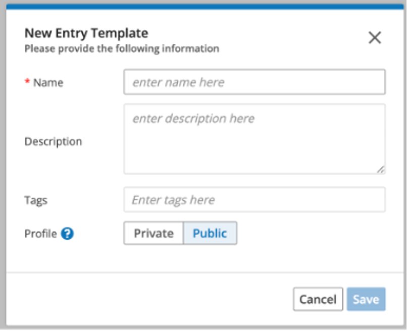
In the template creation modal, provide a template name, description, tag, select public or private profile, as needed, and click on Save to create a new template.
A public template will be available for selection to all users of the Notebooks app while creating a new entry. A private template is available for selection only to the creator.
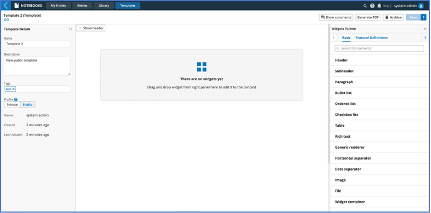
Once the template is created, the template details page is displayed where the template can be modified as needed.
9.24.8. Edit Notebook Entry
Click on an Entry Name in My Entries or Entries page.
The Entry Details page should open with the widget panel from where the widgets can be dragged onto the entry page.
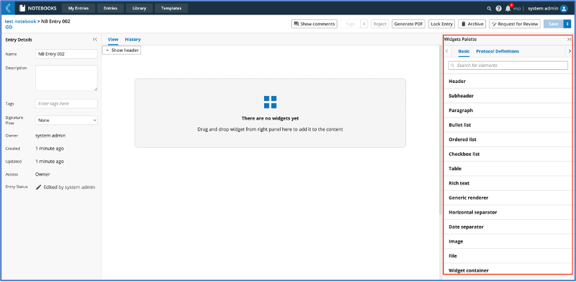
Once the required widgets and details are available on the entry page click on Save to save the entry.
Click on Show Comments button to view comments added or add new comments to the widgets in the entry page.
Each widget has a lock icon that can be togged – when locked the widget cannot be edited.
Click on Lock Entry to lock the entire entry page so that no edits can be made to the page.
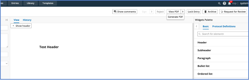
Click on “Request for Review” button to initiate the review process for the entry. (Refer to Review process for Notebook entry)
Click on Generate PDF to generate a pdf of the current entry. An ESP notification is shown once the pdf is generated. Click on the link to view the generated pdf in Data App.
Users having Archive permission should see an enabled “Archive” button for the entry page and clicking on this button will archive the current entry. Once archived, the entry cannot be unarchived.
9.24.9. Review/Signing Notebook Entry
The review process for the notebook entry can be initiated by clicking on “Request for Review” button on the entry page.
If a signature flow is already assigned during entry creation, the review process can be initiated based on the selected signature flow else a new signature flow can be assigned at this step.
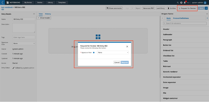
Once the desired signature flow is selected, click on Request to kick-off the review process.
An ESP notification is generated for the user/role/workgroup selected in the first step of the signature flow.
Once the entry is signed by all required user(s) setup in the signature flow, the entry is locked, and a pdf can be generated.
9.24.10. Create/View PDF for Notebook Entry
Click on Generate PDF button to start the pdf generation process.
A message will be displayed “Submitted Entry for PDF generation”.
Once the pdf is generated another message is displayed if pdf generation is successful.
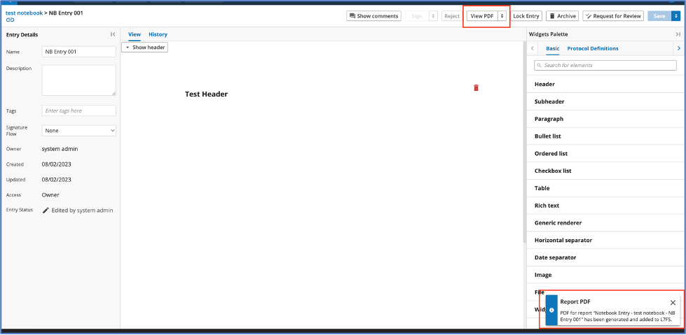
Click on “View PDF” button to view the generated pdf in the Data App.
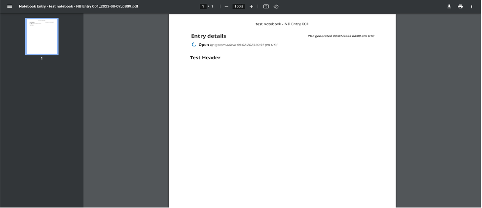
Click on the arrow next to View PDF button to generate another version of the pdf.